HYPE Stock Availability
Stock availability and Website revamp
HYPE is a British streetwear brand known for bold prints and casual apparel with a serious following. When I joined, the e-commerce website was generating a significant volume of negative feedback – customers paying for items only to be told they were out of stock, and then hearing nothing about it afterwards. The Trustpilot rating sat at 3.7.
I was brought in to lead a full UX overhaul, and while not everything made it to launch during my time there, the two most impactful pieces did – and the Trustpilot rating climbed to 4.3.
My role
I was the sole designer on the project, responsible for the full process end to end – research, data analysis, affinity mapping, user flows, wireframes, UI design, prototyping and design system foundations. Everything was built in Adobe XD.
The scope covered stock availability, order communications, account area, navigation, product pages, login flows, a component library and the beginnings of a full design system.
Research:
Data gathering
Before touching a wireframe I went straight to the data. HYPE had Trustpilot, Zendesk and Google Analytics – though Analytics wasn’t properly embedded and the data was unreliable, so Trustpilot and Zendesk did the heavy lifting.
I reviewed three months of feedback, focusing on 1 and 2 star reviews, and started grouping complaints into themes.
The volume was striking. Two issues dominated everything else:
Beyond those two, there were 13 complaints about product quality or incorrect sizing, and 6 about poor customer service.
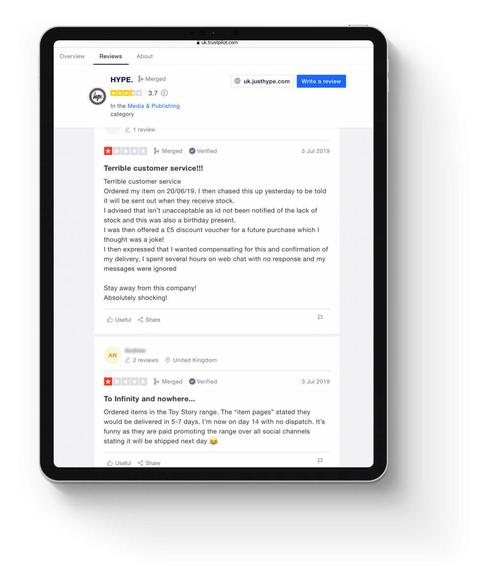
The Trustpilot reviews told the story clearly:
Received an email the following day saying my order had been cancelled and I had been refunded due to no stock availability
Research:
Affinity mapping
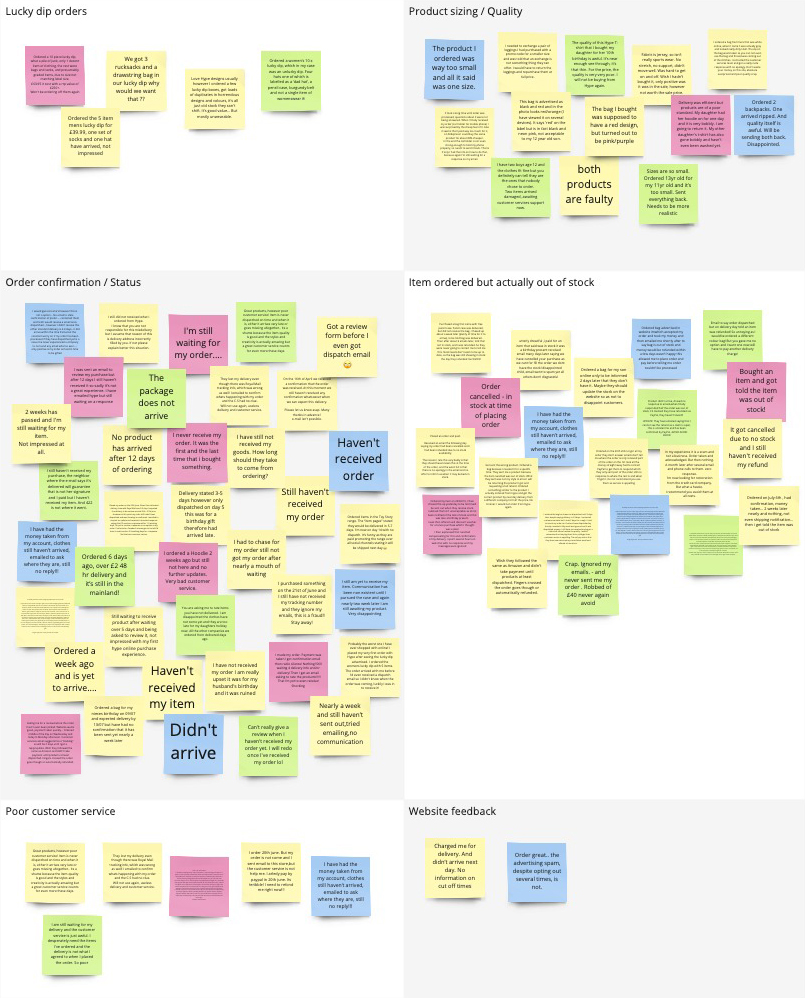
I mapped the complaints into categories to find the patterns – grouping feedback from the three month window under common themes.
Two areas jumped out immediately as the priority: stock transparency and order communication. Everything else was secondary.
Ideation:
Journey flows
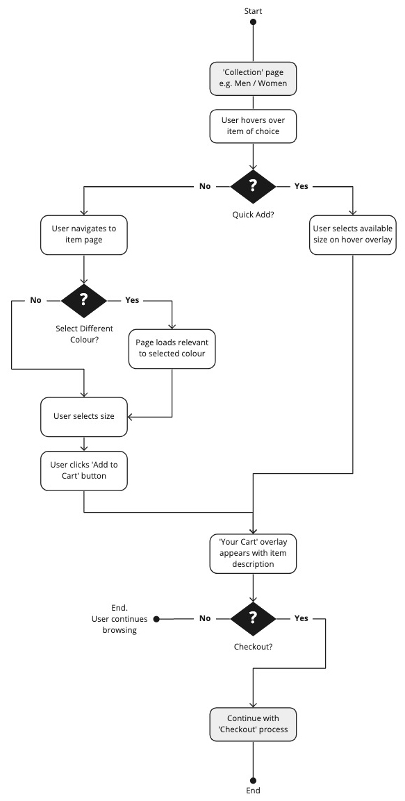
To understand the scale of the problem I mapped out the current checkout journey against a proposed new one – comparing them side by side to highlight where friction could be removed.
Current flow
Click count: 18+
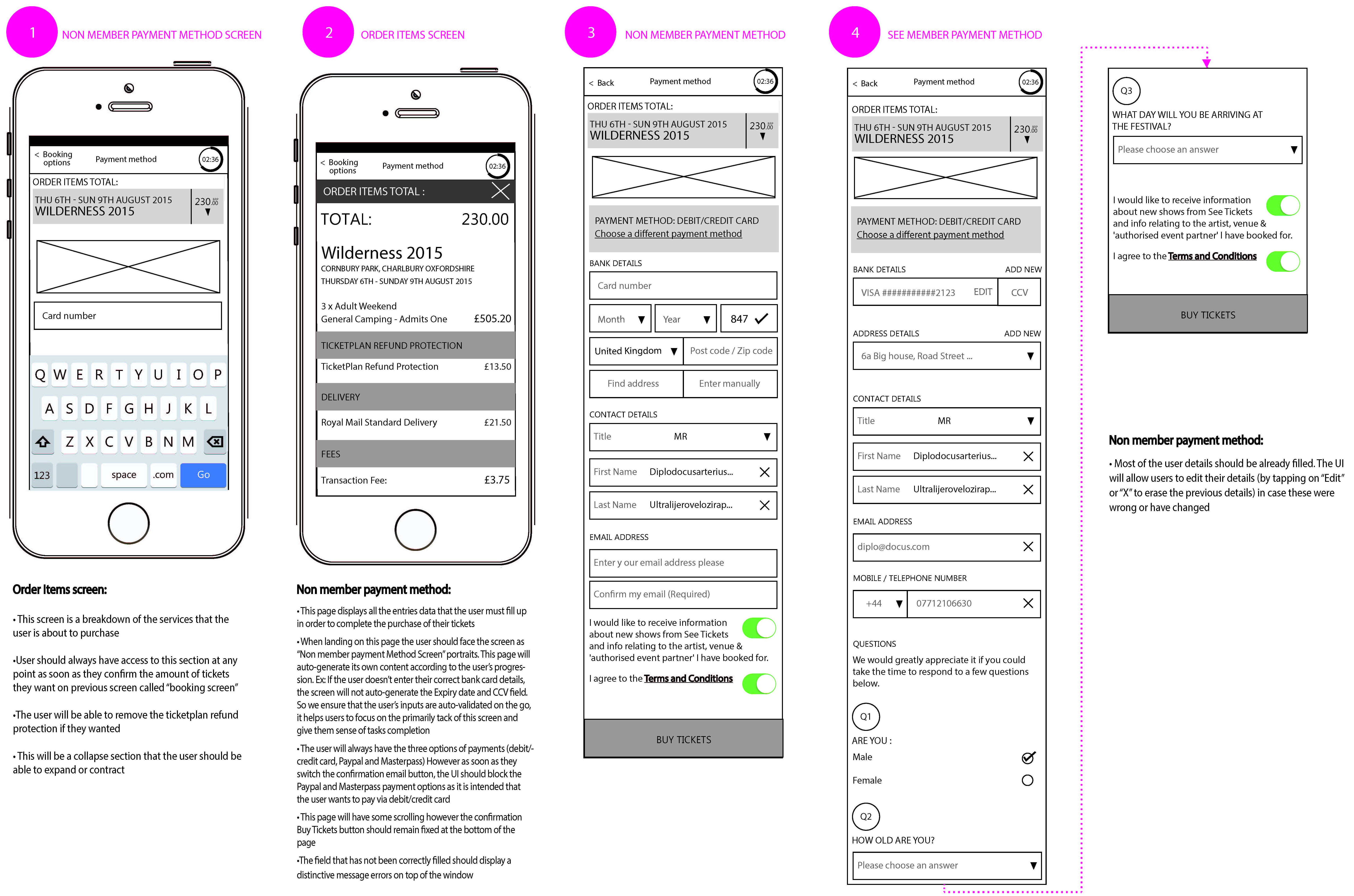
A user selects an item, chooses a size from a dropdown that gives no indication of stock availability, adds to cart, proceeds through multiple checkout screens and enters their full details from scratch every single time – name, email, shipping address, billing address, card number, card name, expiry date, security code and mobile number.
After all of that, they find out the item is out of stock. They’ve already been charged.

Proposed flow
Click count: 4
Hover over an item to see available sizes. Select a size. Choose a saved payment method. Confirm order. Done.
For returning customers with saved details, that’s the entire journey.
Key challenges:
Customers buying items that were out of stock
Challenge
The existing size selector on the product page showed all sizes but gave no indication of availability.
Customers selected a size, added to cart, completed the entire checkout and only after hitting Complete Order were they told the item wasn’t available. They’d been charged.
The refund took 3–5 working days. It’s not hard to see why people were furious.
Solution
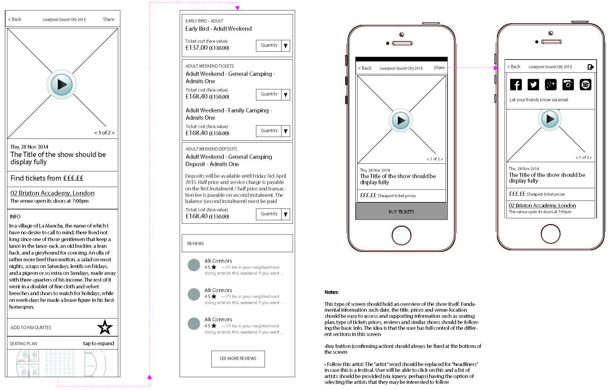
I designed a Quick Add feature for the product card. On hover, an overlay appeared showing which sizes were available for that item, with unavailable sizes shown with a strikethrough.
Customers could see stock status before clicking through to anything. If their size was out of stock, they could tap it to enter their email and be notified when it came back in.
Selecting an available size added it directly to the basket. For logged-in users with saved payment details, the checkout came down to 4 clicks.
Key challenges:
No communication after purchase
Challenge
Once an order was placed, customers heard nothing. No confirmation, no dispatch notification, no tracking. Some customers only received an email asking them to review a product that hadn’t even arrived yet – which understandably made people wonder if it was a scam.
When I dug into the email settings, I found there wasn’t any logic in place driving the communications at all. I also discovered that customers with personalised email addresses outside of Gmail, Outlook or Yahoo were getting bounced entirely — their emails were never sending.
I fixed the settings first, which was an immediate win, then designed a full communication system around it.
Solution
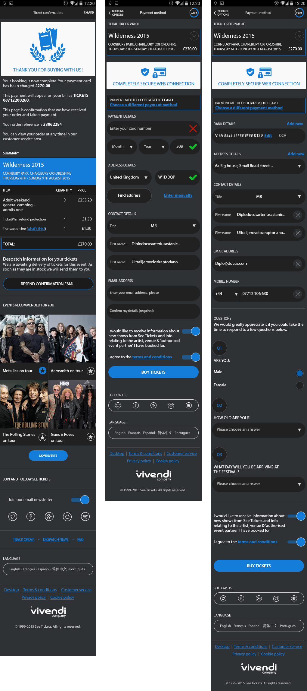
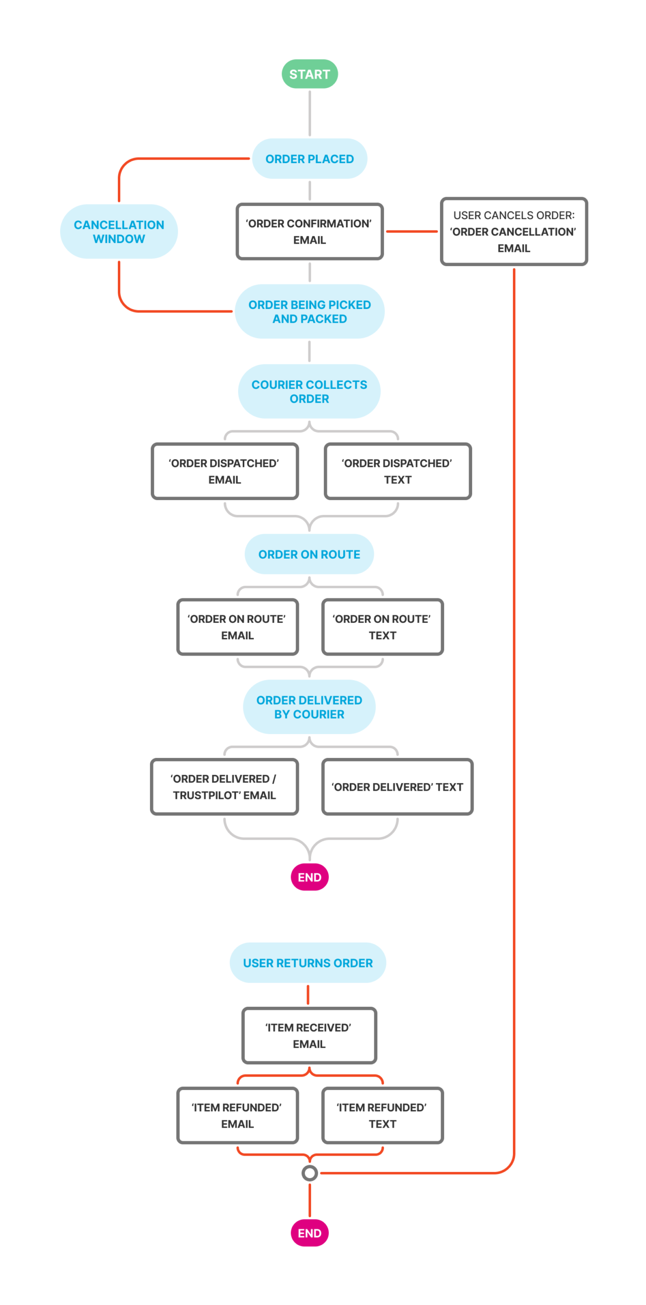
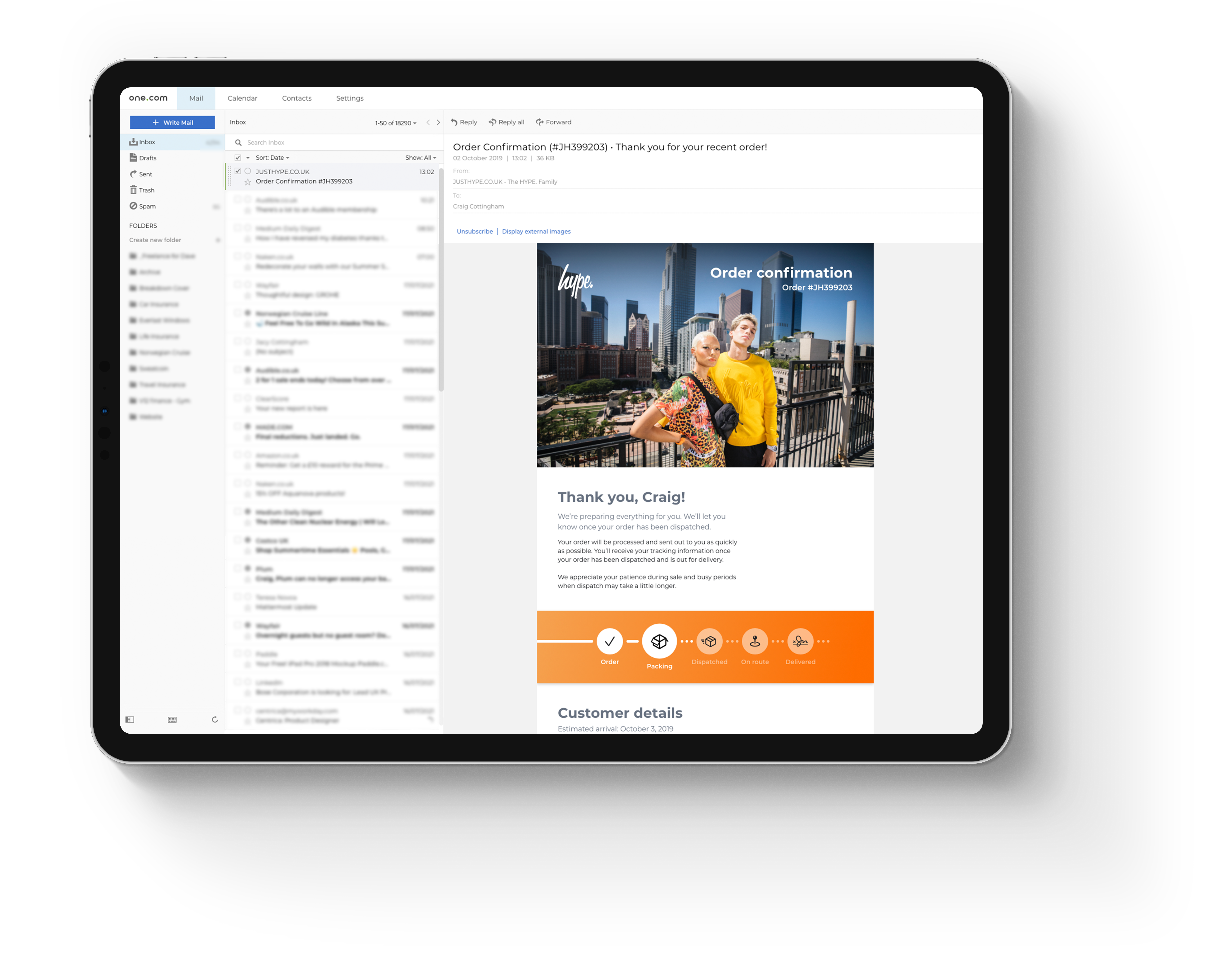
I created a series of email templates covering every stage of the order journey: order confirmation, dispatched, on route, delivered, cancelled, items received for refund and refund processed.
Each email included a visual order tracker showing where the customer was in the journey, what had been completed and what was next.
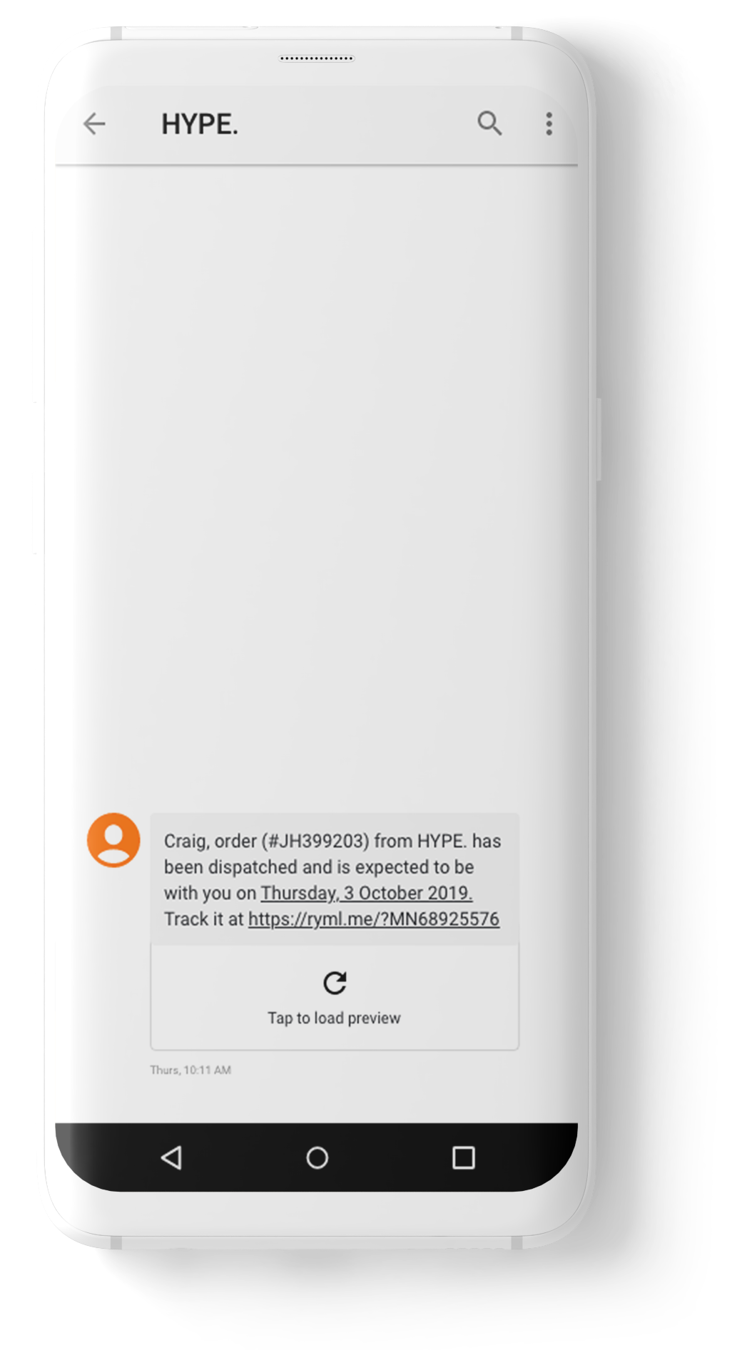
The tone was warm and friendly rather than generic. The dispatched email included a tracking number linking directly to the courier. The delivered email included a discount code and easy routes to customer support.
Prototype:
Quick add – product card
The card component was rebuilt from scratch with a hover state that hadn’t existed before. On hover, an overlay appeared at the bottom of the image showing available sizes. Unavailable sizes were visually crossed out.
The Quick Add feature delivered four clear benefits: full transparency around stock availability, a future-proof component built to scale, a leaner checkout experience and an end to customers purchasing items that were never available to buy.
Designs:
Quick add – product page
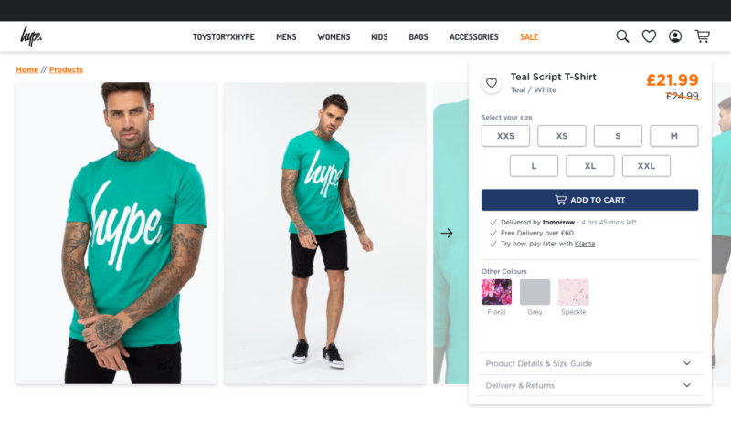
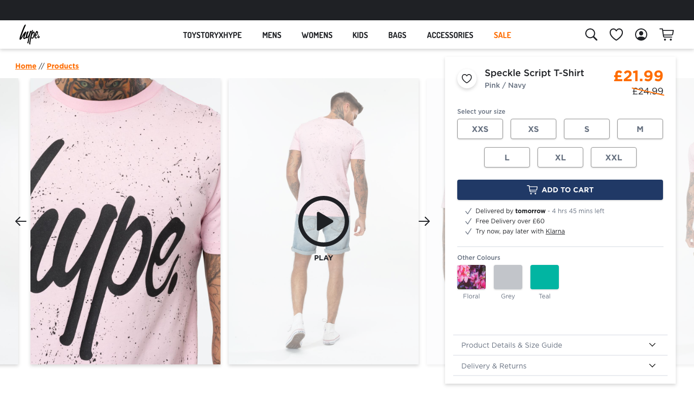
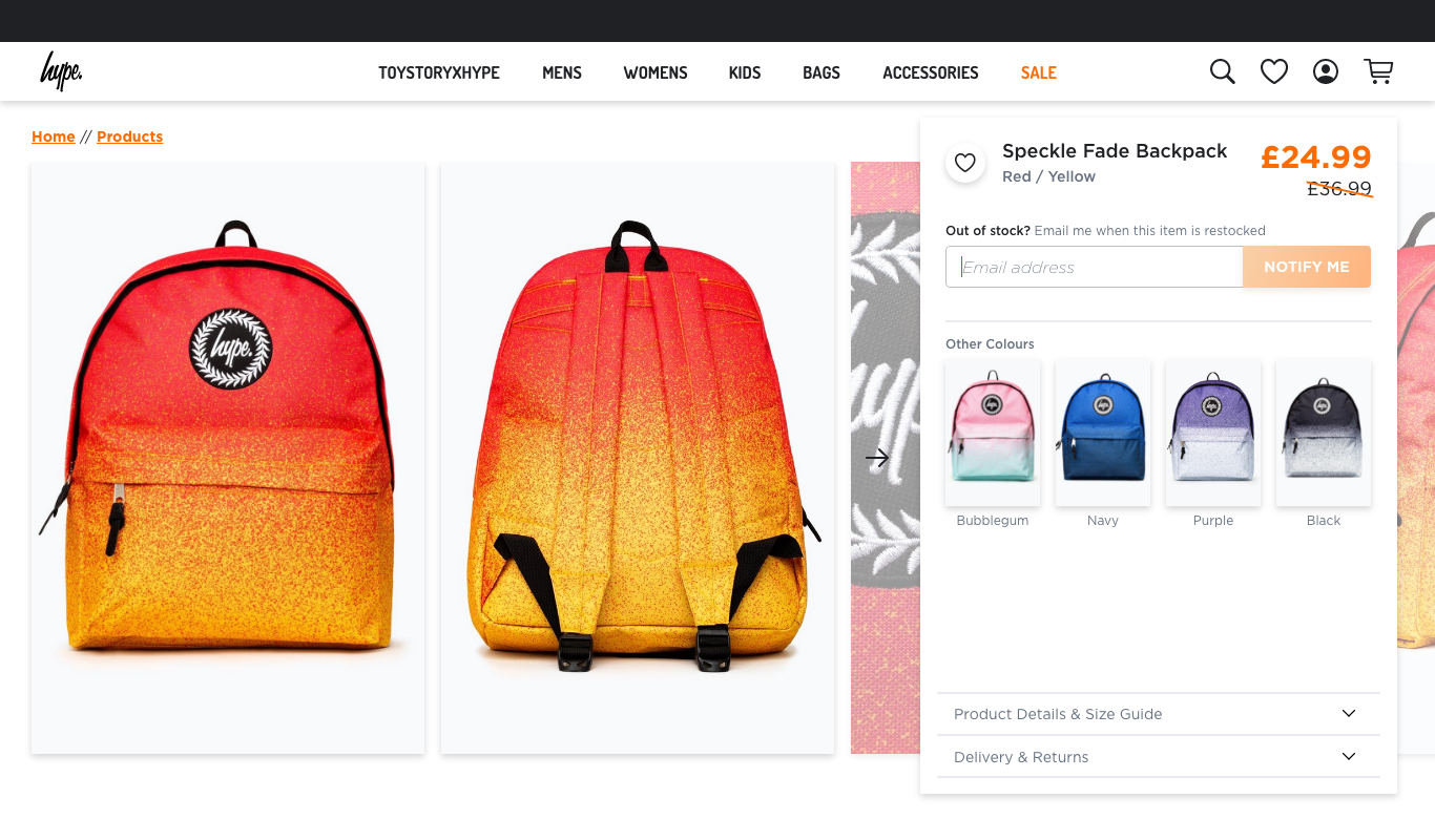
After validating the Quick Add concept on the product card, the same logic was rolled out to the product page. The size selector was updated to show availability clearly, with the out of stock notification flow integrated.
An Add to Cart button remained for customers who wanted to browse first and decide later. Colour variant switching updated the page in real time.
Final designs:
Email communication
Seven email templates designed from scratch with a consistent visual language – order tracker, relevant information surfaced at the right stage of the journey, clear calls to action and a warm tone throughout. The dispatched email linked to courier tracking. The delivered email included a discount code and easy routes to customer support.

Design system:
HYPE DS
As the project progressed I built out the foundations of a component library in Adobe XD – HYPE DS – using Atomic Design methodology.
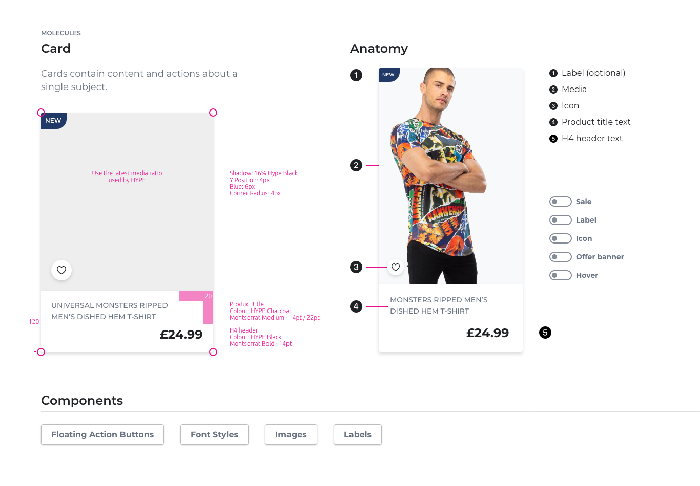
Atoms defined the building blocks: buttons, icons, typography, colours, shadows, spacing. These were combined into molecules – the card component being the most developed, with full anatomy documentation, redline specs and toggle states for every variant including Sale, Label, Icon, Offer Banner and Hover.
The goal was to give any designer or developer picking up the work a consistent, documented starting point – rather than recreating components from scratch each time. Designers could toggle specific sections of a component on and off to see exactly how the design would behave in context.
Proposed features:
Wider revamp work
Beyond what shipped, I designed and documented a significant body of work ready for implementation. This included accessibility improvements across the site – auditing fonts and running designs through accessibility scanners to identify and address any serious issues before they reached production.
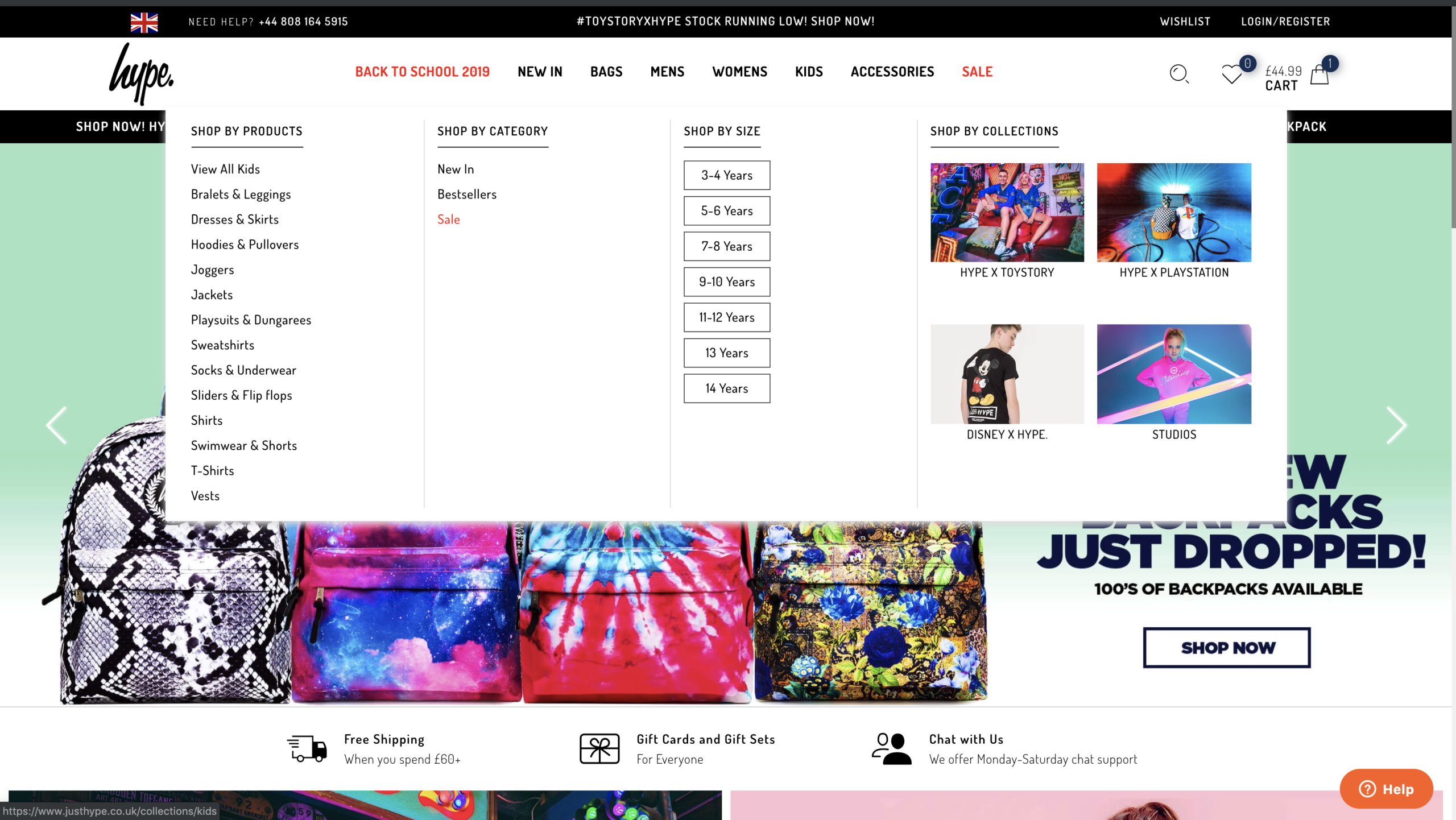
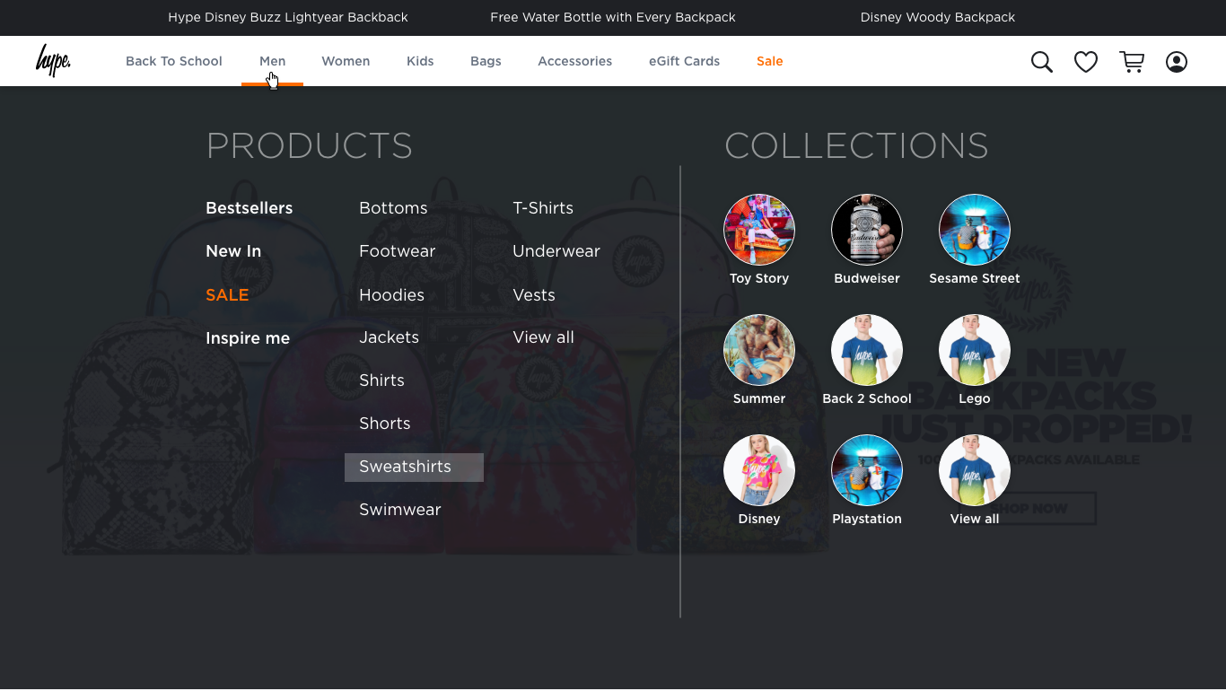
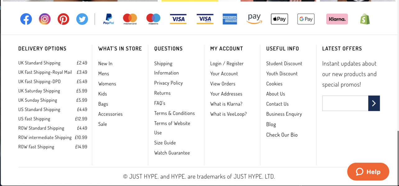
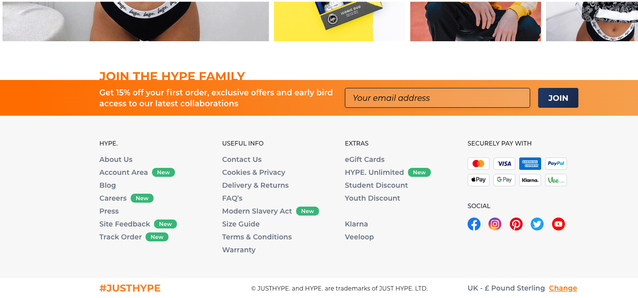
Using the early component foundations from HYPE DS, I started with the elements that touched every single page first – redesigning the global navigation and footer to set a consistent baseline across the site. From there I worked on login and sign up flows, then tackled the wider areas: a full account area, product filtering, homepage revamp, mobile hamburger navigation, loading animation and HYPE Unlimited delivery subscription page.
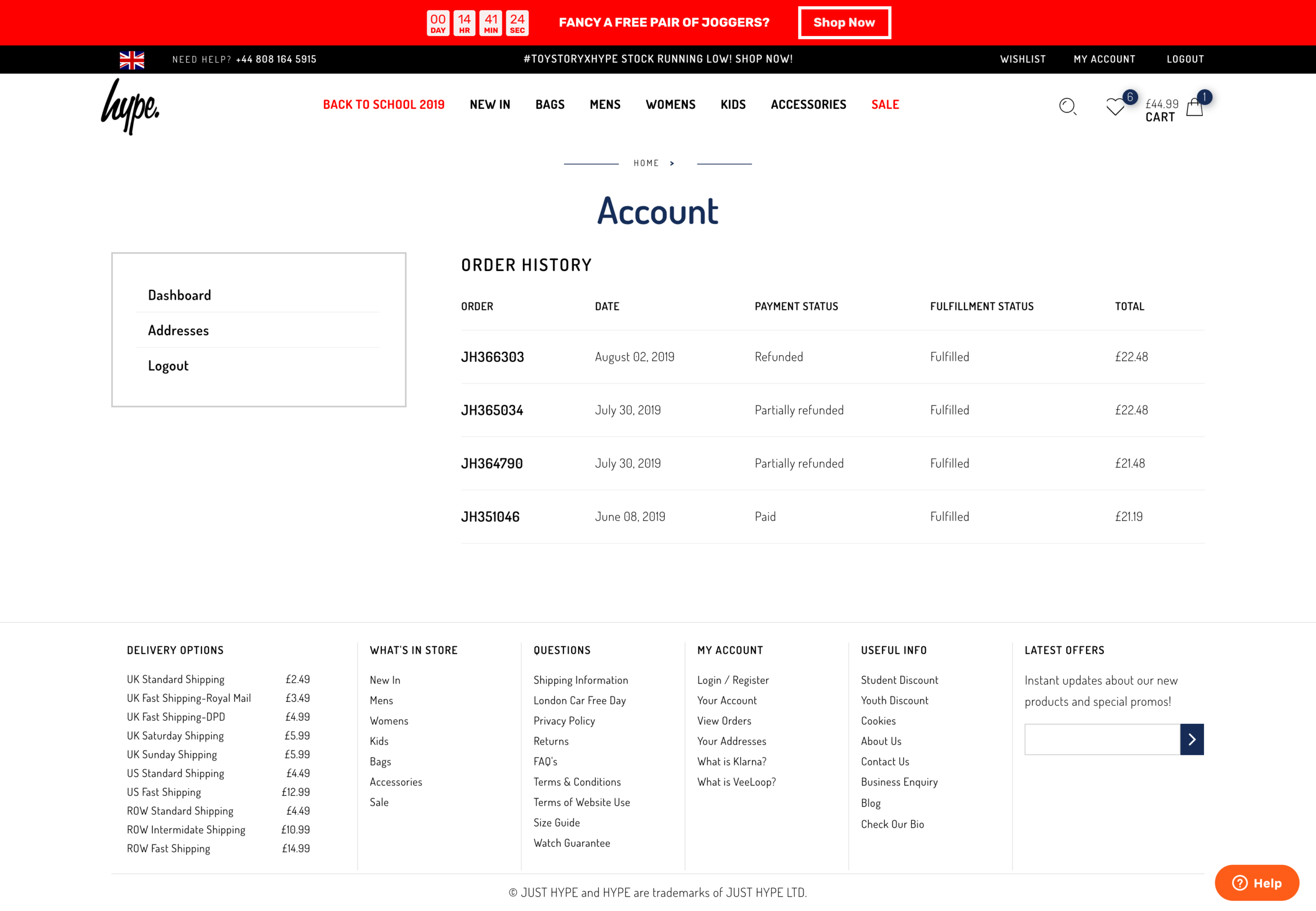
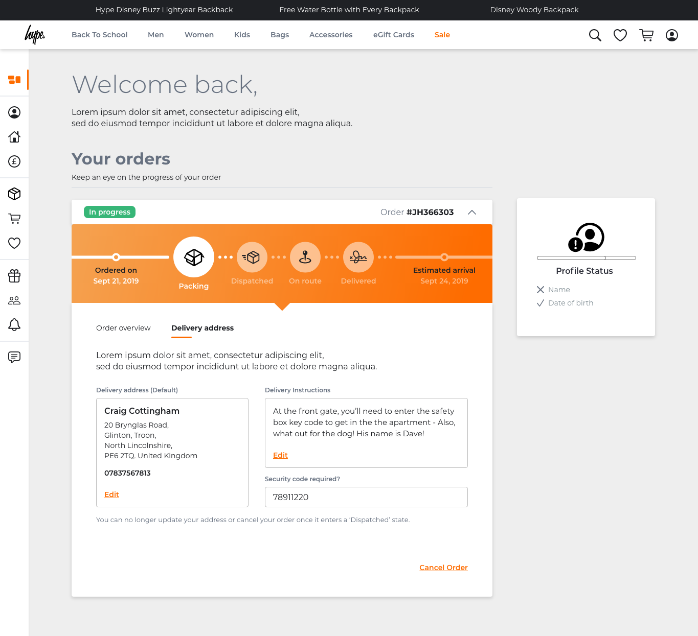
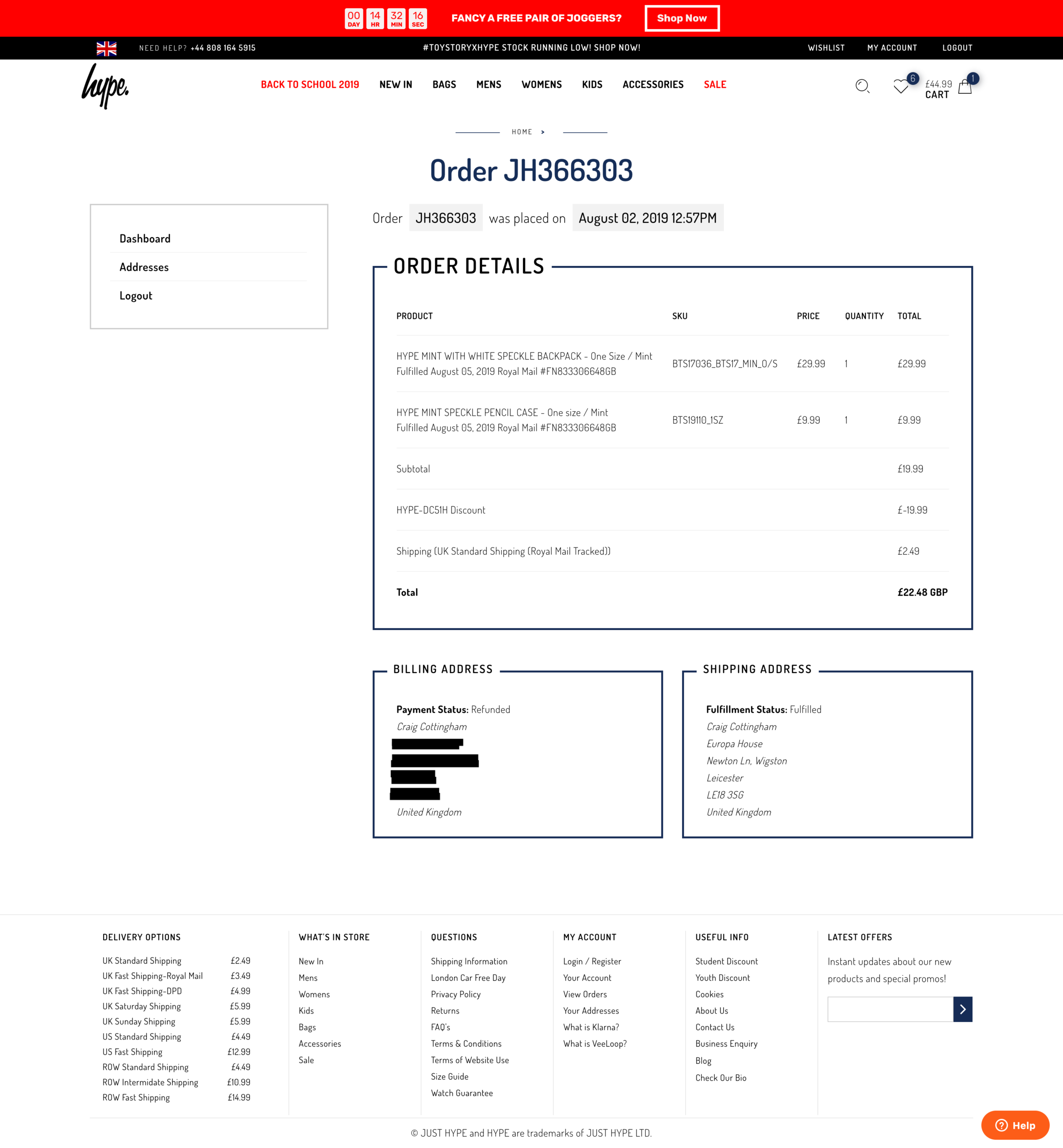
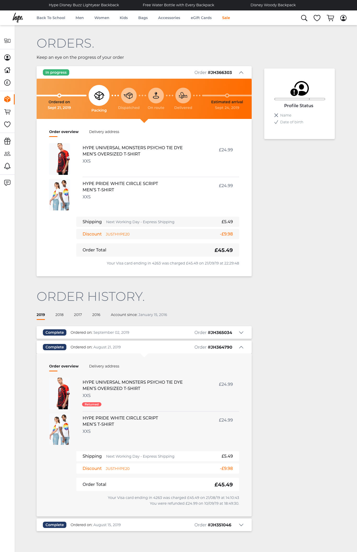
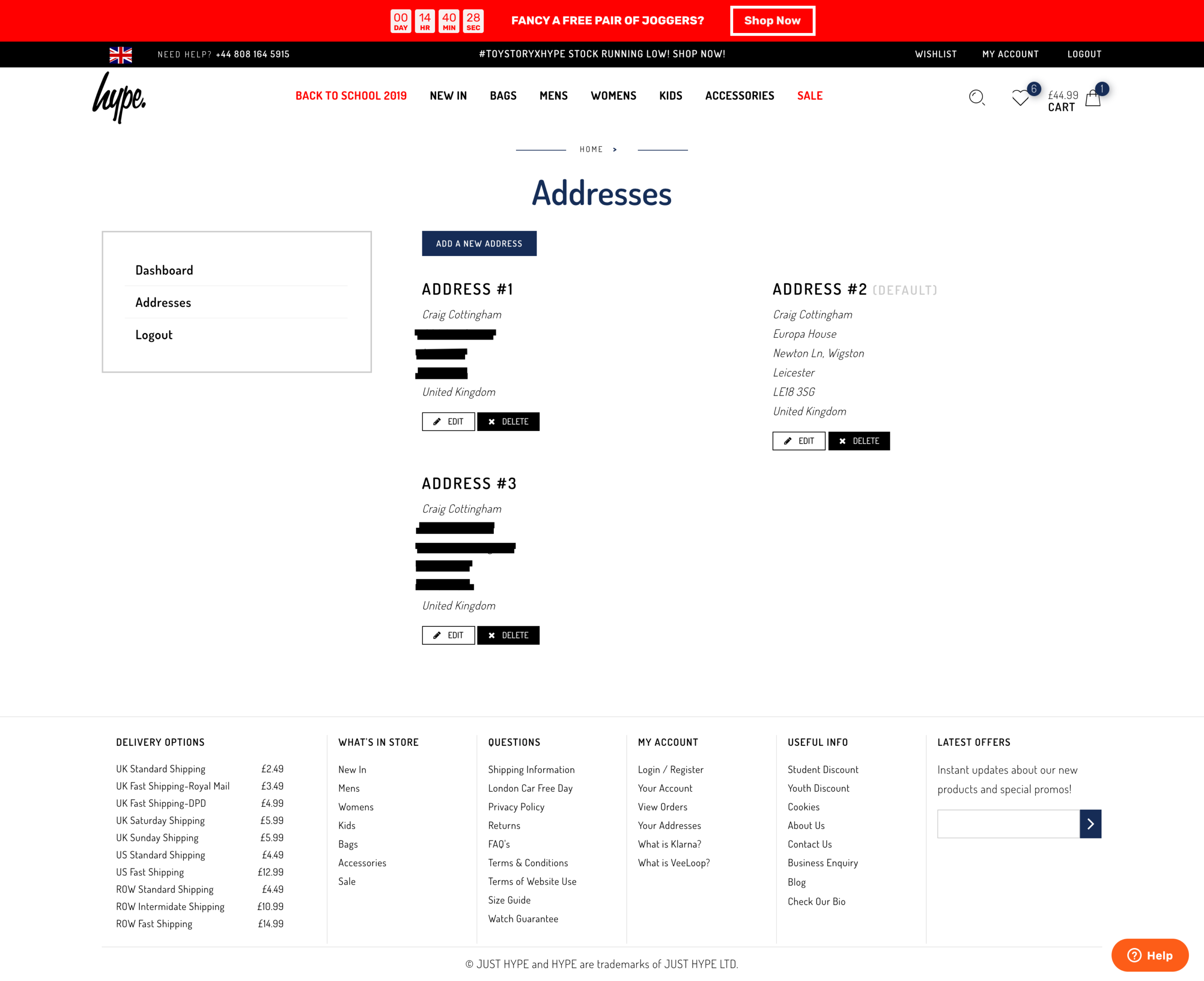
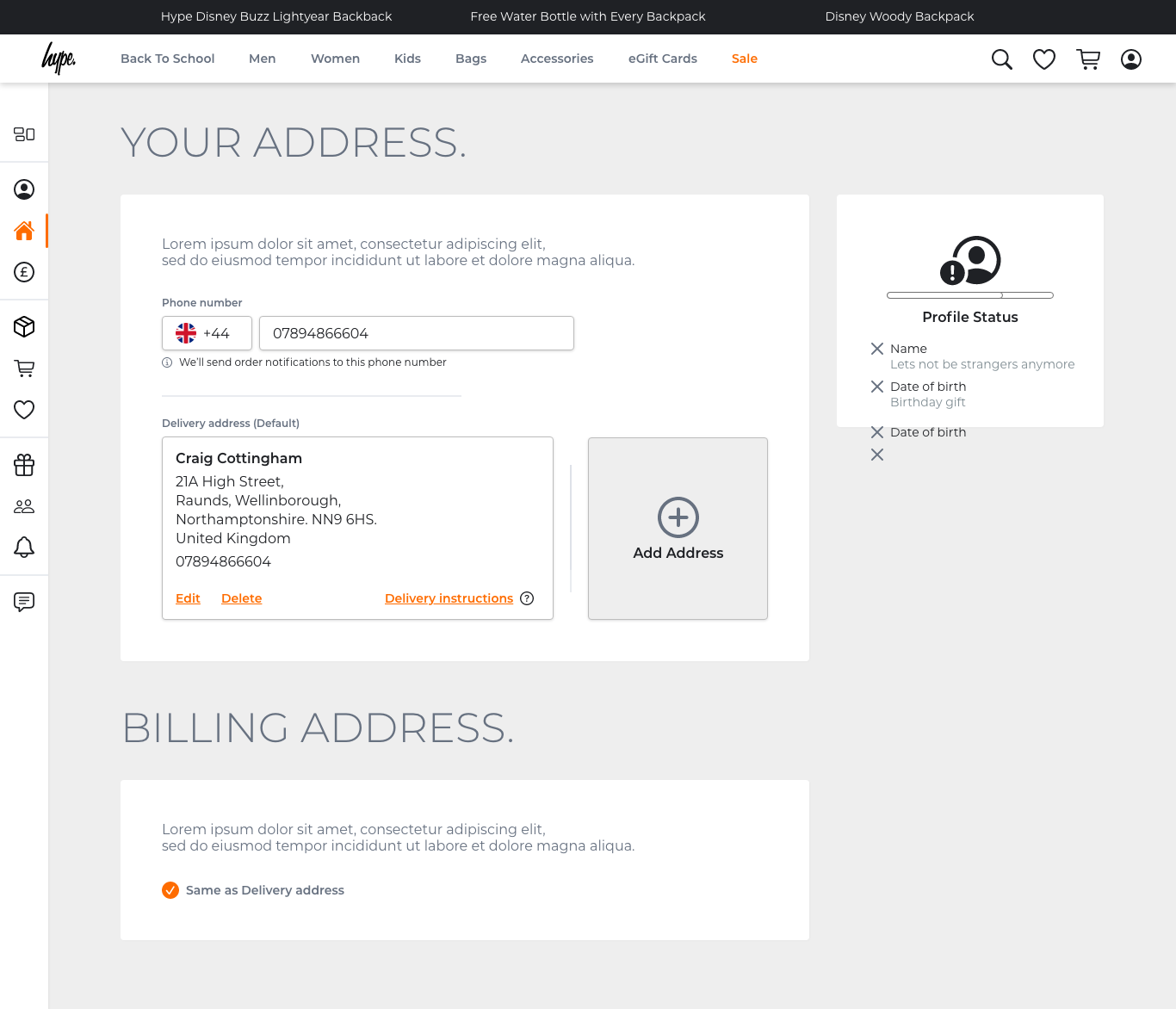
The account area was comprehensive – covering dashboard, personal details, addresses, payment methods with support for Amazon Pay, PayPal, Apple Pay, Google Pay, Klarna and VeeLoop, order history, wishlist, gift cards, referral scheme, notifications and chat support.
Designs:
Global navigation redesign
Before and after
Designs:
Footer redesign
Before and after
Designs:
Account area
Order history
Order detail
Addresses
Designs:
Product page
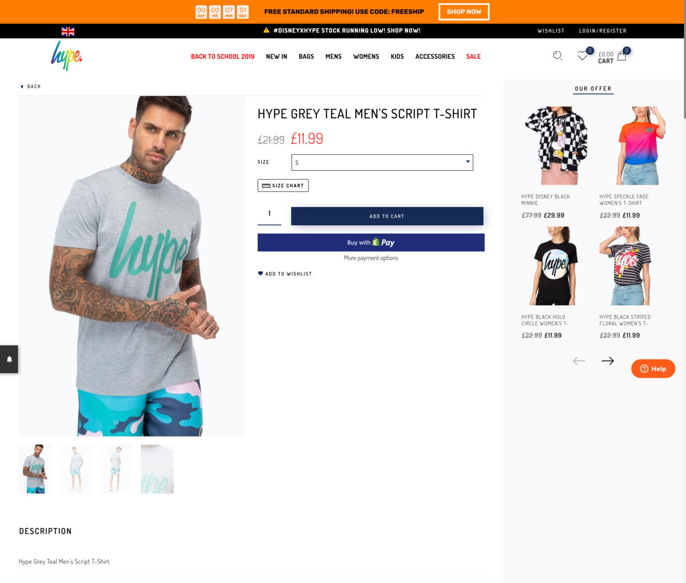
Before designing the new product page, I analysed the existing design and documented the specific issues contributing to poor user experience and lost sales.
The pain points:
Stock availability shown too late
Selecting a size from the dropdown only told you it was unavailable after you'd selected it.
Multiple unnecessary clicks to discover something that should have been visible from the start.
Repeated content
The item name and description appeared three times on the same page. On mobile, all three were visible simultaneously on screen.
Pointless repetition that added noise without adding value.
Broken image thumbnails
To view the next product image, users had to scroll down to click a thumbnail, then scroll back up to see it. A left/right arrow would have solved this entirely.
Size Guide button out of place
Visually prominent but contextually odd, sitting awkwardly without any clear relationship to the surrounding elements.
Clutter and distraction
At the point a user had already chosen an item and navigated to its page, the design felt like it was actively trying to pull them away from buying it.
The Our Offer panel was the most obvious offender - irrelevant offers that didn't adapt based on who was viewing them, shown to everyone regardless of gender or age.
Wishlist buried at the bottom
A feature users actually wanted was hidden at the bottom of the page, out of the natural purchase flow.
Our Offer panel broken on scroll
When scrolling down the page the panel title clipped and cut off, breaking the layout. A visible bug that had gone unaddressed.
Quantity selector blending in
Hotjar recordings showed users regularly missing the quantity input because it visually blended into the surrounding buttons. People were buying single items when they wanted multiples.
Before and after
The redesign addressed each of these directly
Stock availability surfaced upfront via the Quick Add feature, layout decluttered, repeated content removed, wishlist repositioned, and the image navigation.

Outcomes:
The results
The two pieces that shipped – stock availability and order communications – addressed the two biggest sources of negative feedback directly. The impact was measurable.
Stock availability
HYPE is a British streetwear brand known for its bold, vibrant designs, statement prints, and casual apparel that blends urban fashion with pop culture influences. I was brought in to give the website a complete overhaul and improve the UX and simplicity across the website.
My role
I started collecting data to highlight any consistent issues and problems that users were experiencing whilst using the website to make purchases.
We had platforms such as Trustpilot and Zendesk which gave a great overview and allowed me to make a list of the most common issues. We also had Google Analytics, but this wasn’t properly embedded so the data was very unreliable.
Whilst looking through the data, there was an overwhelming amount of feedback highlighting the lack of communication about the order status. People also highlighted after entering all the required details and clicking Confirm to make a purchase, the user then got notified that the item was actually out of stock!
So they never got informed what was happening next and some users were being charged. So the plan was to create a much leaner user flow notifying and informing the users what the state of their orders was.
Key challenges:
Make stock availability transparent for users
Challenge
It was apparent that users were being misinformed about stock availability when it came to buying items from the shop.
Customers would get to the end of the payment journey, make a payment, and then find out later that the item was actually not available to buy due to no stock availability.
Solution
I recreated the card component that was already used on the website. The main update for this component was adding a hover state to the image.
Previously, users could only click the item to go through to the item page.
So to save time for customers, when they hovered over the item they were interested in, they would easily see what sizes were available for that item.
This prevented frustration when clicking the item to then find out it wasn’t available in the required size.
Key challenges:
Improve communication around order statuses
Challenge
Another issue around transparency was the communication side of things that customers recieved when placing an order. There wasn’t any, or if there was, it was absolutely minimal.
Customers didn’t know where their order was in the journey, was it being processed? Or out for delivery? – who knew.
Solution
I sat down and looked at the journeys that other online stores used for online orders.
I created timings and events that triggered specific communication methods to help inform the customers of the progression of their order.
This included emails and text messages (if the user agreed to recieve SMS).
Goals
Improve negative feedback on sites like Trustpilot
When I first joined the company, there was quite a lot of negativity towards the business.
I wanted to drastically change this impression of users by making improvements to the site. Hopefully this would create positive feedback.
Make website more accessible and drastically improve UX
TBC
Research:
Data gathering
I started collecting data from Trustpilot and Zendesk to highlight any consistent issues and problems that users were experiencing whilst using the website to make purchases.
Using these platforms gave me a great overview and allowed me to make a list of the most common issues. We also had Google Analytics, but this wasn’t properly embedded so the data was very unreliable.
Whilst looking through the data, there was an overwhelming amount of feedback highlighting the “lack of communication” about the order status. People also highlighted after entering all the required details and clicking ‘Confirm’ to make a purchase, the user then got notified that the item was out of stock!
Users never got informed what was happening next and some users were being charged. So the plan was to create a much leaner user flow notifying and informing the users what the state of their orders was.

Feedback collected from Trustpilot:
Received an email the following day saying my order had been cancelled and I had been refunded due to no stock availability
Research:
Affinity mapping
I created an affinity map to help highlight any pain points identified by the users. I created a date range of 3 months and purposely selected to view reviews with only 1 and 2 stars.
I grouped these problems under common themes and features for the website.
By doing this mapping session it was quite clear that two main problem areas needed to be looked into.

Order and status updates
In a 3 month period, there was a whopping 38 complaints, lots of people mentioned the ‘lack of any communication’ once the customer’s orders have been placed. Not even a ‘Thank you for your order’ email / text.
Some people also mentioned that they wouldn’t even receive a date from the Royal Mail, the order would just arrive.
As a result of this, customers naturally got suspicious thinking HYPE was a scam company. Especially for people who have never purchased anything from them previously.
Stock quantity not updating
24 complaints in the same 3 month period were made about customers placing an order and afterwards being informed that the item was actually out of stock! – Although I didn’t have any involvement with regards to the stock system that was being used, I was able to create ways in which users could be made aware of stock shortages or items that were out of stock.
Doing this would therefore reduce the anger and frustration caused to the user when buying items that were never available to buy in the first place.
Research:
Journey flows
I created several user journey flows to compare the current design with the new design I proposed.
My approach focused on making user flows as streamlined as possible. If a step can be removed without impacting the user’s ability to complete their main tasks, I aim to eliminate that friction. Fewer clicks typically result in less friction, leading to faster task completion and an overall smoother user experience.
Key findings:
Lean checkout journey
It was clear that I needed to work on a more lean checkout process that informed users of any out of stock items. Alongside this, I worked on a selection of order confirmation layouts that would inform users what step their order is at in the delivery process.
Current checkout flow
Click count: 18+
So the current process is that a user selects what item they want to buy, and on the item page you can select the size which is required through a dropdown.
There are two issues with this:
The dropdown in the item page where you’re supposed to select your required size is poor! Yes, it highlights all the sizes, but it doesn’t actually state if they’re in stock or not at that point.
After you select the size you require, it is still a lottery if the size is actually available. The system is supposed to check if the size selected is available, but according to 24+ complaints across 3 months, I would suggest that this logic isn’t working correctly, or working at all!
So a size is selected, the user clicks ‘Add to Cart’ – you then have a bunch of other clicks to make. When you eventually get to see your cart/basket, you click ‘Proceed to Checkout’
When in the Checkout screen, you still have to click another ‘Checkout’ button, to enter all your details: Name, email address, shipping address, check a box if the billing address is the same as the shipping, enter the long card number, name on the card, expiration date and security code.
Once you think you’re finally done, you also get told to enter your mobile number and finally click (punch, smash) the ‘Complete order’ button.
Phew!
So after filling out all of these steps, you then find out that the item is actually out of stock after this step, not to mention you have just been charged for the item, and a lot of people don’t even get any sort of confirmation that the order has gone through. I understand why people get angry!

Proposed checkout flow
Click count: 4
I took a step back and looked at the current process and noticed that every single time a user wanted to buy an item off the website, they had to re-enter all of their details each time.
This got me thinking, why not just enter your details once, save them onto an account area that is dedicated just for you and then when you return to make another purchase in the future, you can select the same details you have used in the past (with an added step of typing your bank cards security code for protection reasons).
So taking the new flow into account, the user hovers over the item they want to buy, an overlay appears at the bottom of the image of the item showing the sizes that are available for that specific item.
If the item is in stock, the user selects the available size which will get added to their basket. They then click the ‘Checkout’ button which allows the user to select a previous payment method that they have stored on their account. Once selected, the user clicks ‘Complete order’.
The user will then instantly receive an email confirmation giving a breakdown of the items that have been purchased, showing the delivery address, and which payment method was used.

Prototype:
Quick add item panel
The first thing I worked on was the ‘item panel’, these run throughout the whole website and are normally placed to encourage users to view whole sections of that specific range of clothing.
Due to lots of feedback that users were getting through the whole checkout process and then finding out after the money had been taken that the item was out of stock, I thought it would be good to give an overview of the sizes that are available from the start, instead of getting through the whole process to then be disappointed that you can’t get your item.
If the size was unavailable, the user can click on the size they require and they enter their email address to be notified at a later date when more stock is available.
(Why not have a click through the final prototype for this feature…)
Research:
Order confirmation
With the item panel in progress, I started researching into some competitor analysis to see what information could be added/removed from the current email correspondence.

Research:
Customer feedback
Previously lots of customers were unhappy with the lack of communication after purchasing an item. Lots of people highlighted once the item had been bought, it wasn’t uncommon for there to be no communication whatsoever.
Some people even mentioned that the only communication they had received was an email to give a review on the product, which hadn’t even been delivered at that point! I experienced this first hand myself, and it definitely adds to the confusion, because you wonder if the order has actually been delivered and I’ve just missed it, or the postman has put it somewhere that I just haven’t seen.
The plan was to reorganise the current logic that was set up and see what could be done to improve to current processes.
Firstly, there wasn’t any logic in place, so it was no wonder that nobody was receiving any emails.
Secondly, when looking into the email settings, I discovered that if users (like myself) have a personalised email address outside of the usual Gmail / Outlook / Yahoo etc, the system would just bounce and never send an email.
So I fixed the settings so everyone should receive an email when making a purchase going forward! That’s a bit of the battle won!
Feedback collected from Trustpilot:
Final design:
Communication flows
I ended up creating a series of emails that would follow one another in the delivery journey of the items which have been purchased by the customer.
I created an email template that showed users the items they’d purchased, I also created a series of icons that highlighted the current step the order was at.
I needed to take into consideration the point when the order is in transit, the user could possibly get a text message or an email from the Royal Mail / DPD etc.


When working to fix problems that have previously arisen by feedback, it is vitally important to try and tick all the boxes, especially if the feedback is as regular as it was at the time of working on this project.
I personally feel it is important to add transparency and friendliness to any sort of communication between company and customer. Making communication feel personable, not just a copy and paste jobby which gets sent to everyone regardless.
So taking user feedback into consideration:
By adding the orange banner under the header gave customers a clear understanding of the step their order is at and what’s next in that process.
When the customer’s order reached the Dispatched state, the email communication changed to show the customer’s tracking number – the user can click on this number to navigate to the relevant page and track their order.
Adding the details of the order allows the customer to browse over these at the earlier stages, to see if there is anything entered incorrectly (another issue that kept getting mentioned), then they have time to update these details through their account area before it is too late.


