User interface /
impero
remote manager
Operating in two key sectors; Office and Education. I worked on the company rebrand and structure of their products, and branding identity to create a simple to understand and instantly recognisable format for customers.
USER INTERFACE
Designs approved and templates built. Now to populate the app with the new styled icons I created. The app was launched in four languages;
French, German, Arabic, and Dutch.
Icon design
The icons that ran through the app were simple. Each icon had three corporate colours; this helped give the app a modern facelift.
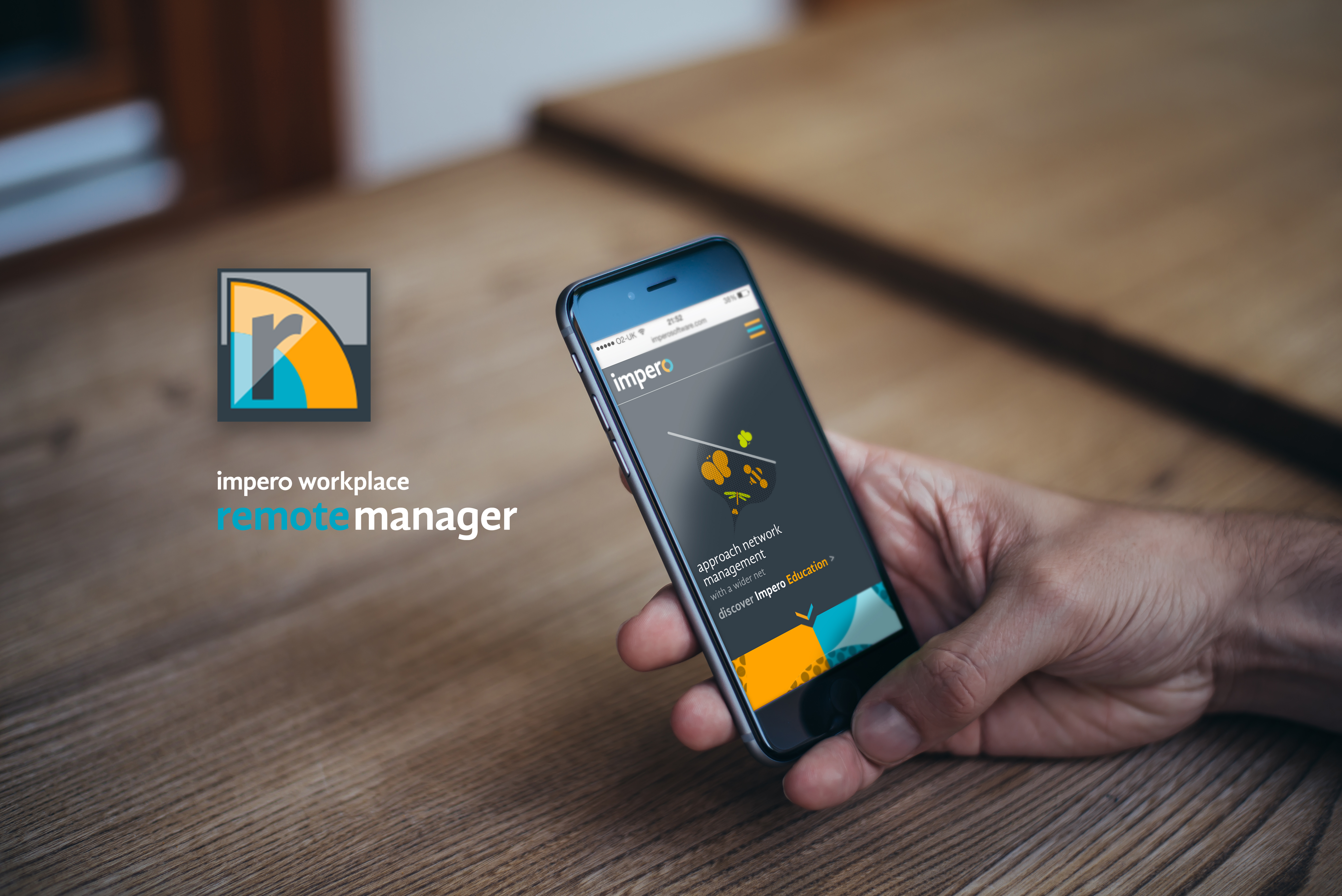
remote manager
Remote Manager is a seamless and innovative blend of online safety, network admin and classroom management software.
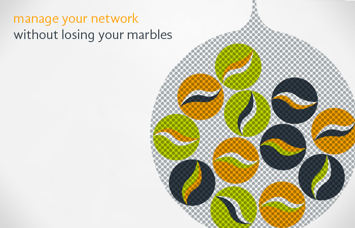
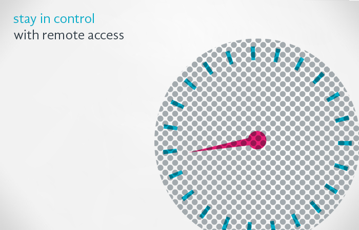
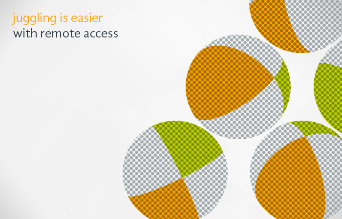
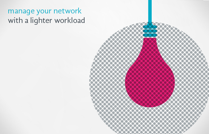
Imagery
It works in conjunction with the Education Pro, Workplace Pro and YouID software.
In doing so, we created a fresher and brighter identity that connects with Impero’s customers and creates a clear vision that flows through all products and sub-brand.
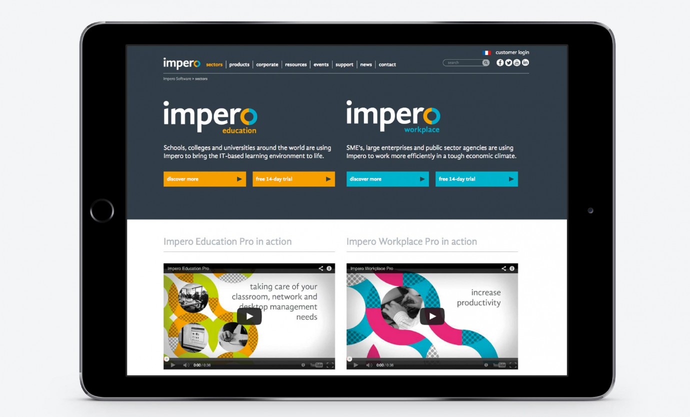
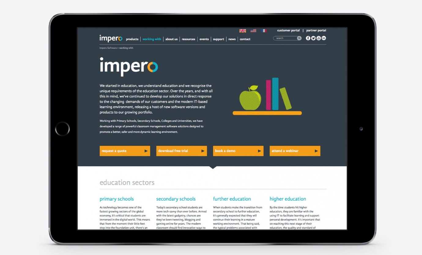
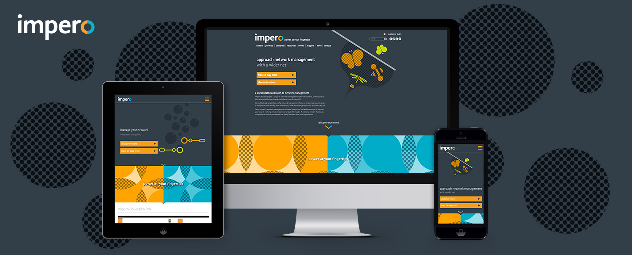
Website
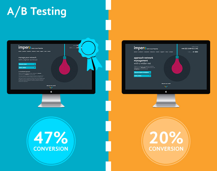
The last thing to get rebranded was the website. During the test phase of development, the site got A/B tested so that we could choose which website layout to use once the official site went live.
imperosoftware.com
The website uses the location of the user. So when a user is in a different region, it loads up that specific regional webpage.
Each region has it’s own tailored visual elements that run throughout the pages.
A/b testing
A/B testing is a method used on many sites to find out how well a design is influencing users’ engagement, particularly in regards to a specific call-to-action.
imperosoftware.com
When users arrive at the site, they are shown one version of the design at random, and overtime statistics are measured to see which design gave the best results. Once a winner is determined, it becomes the design for all visitors.