User interface /
See tickets
mobile site
User interface
By researching, and through personal experiences, people use their phones more during the day, during commutes, and on lunch breaks. It isn’t always easy to have a computer to hand to book concert tickets.
It made sense to create a smooth experience to book through and store users information to their account on. So the next time users wanted to buy tickets, it would be easy enough to do so in no more than four clicks.
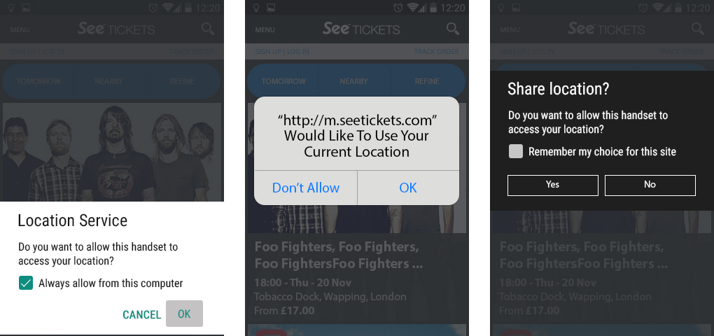
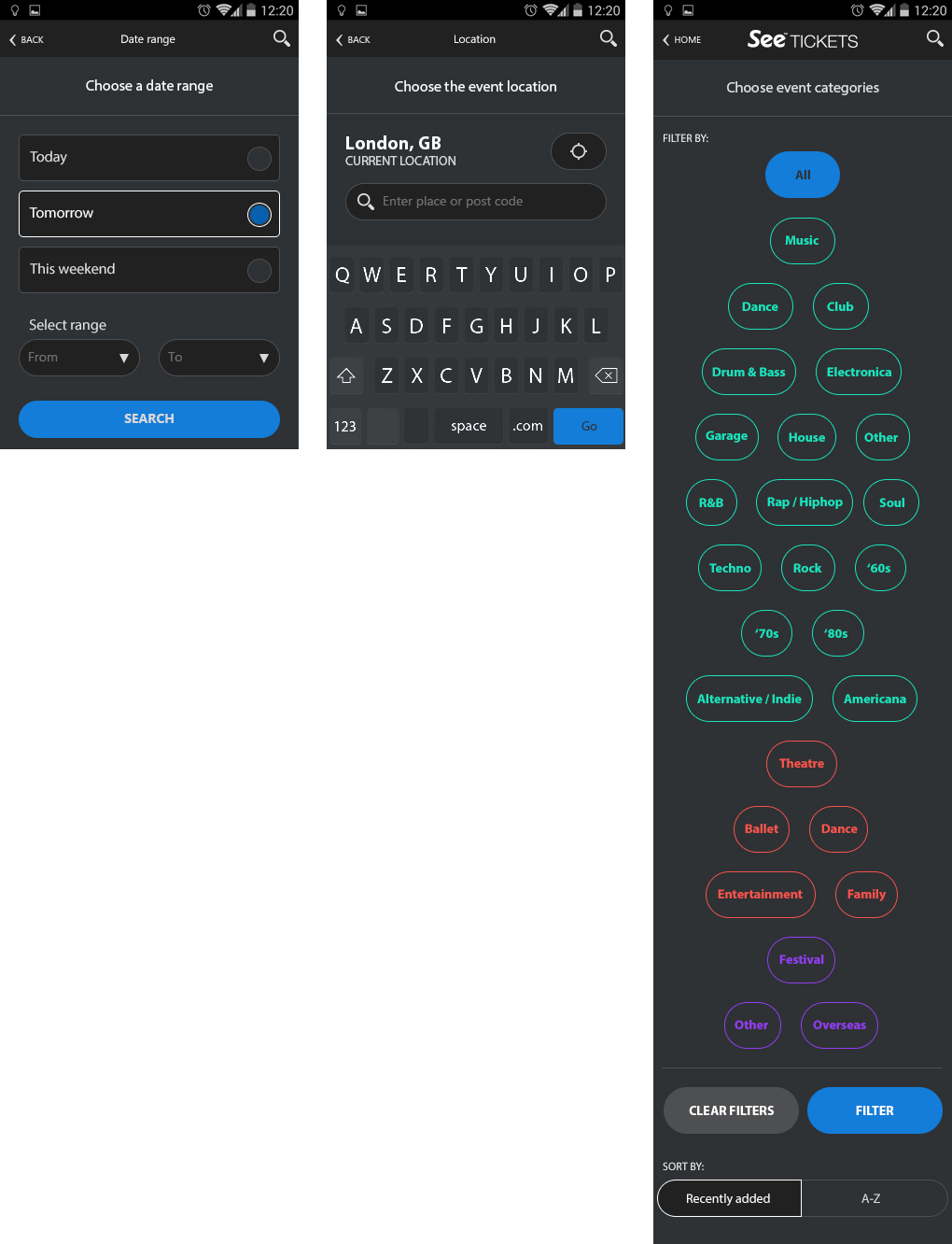
Location screen
When a user first enters the site, they get asked if the site could use the phone’s location. This helped keep events relevant to the location of the user. You could also use the search bar to search for events within a specific city or area.
(Android – iPhone – Windows)
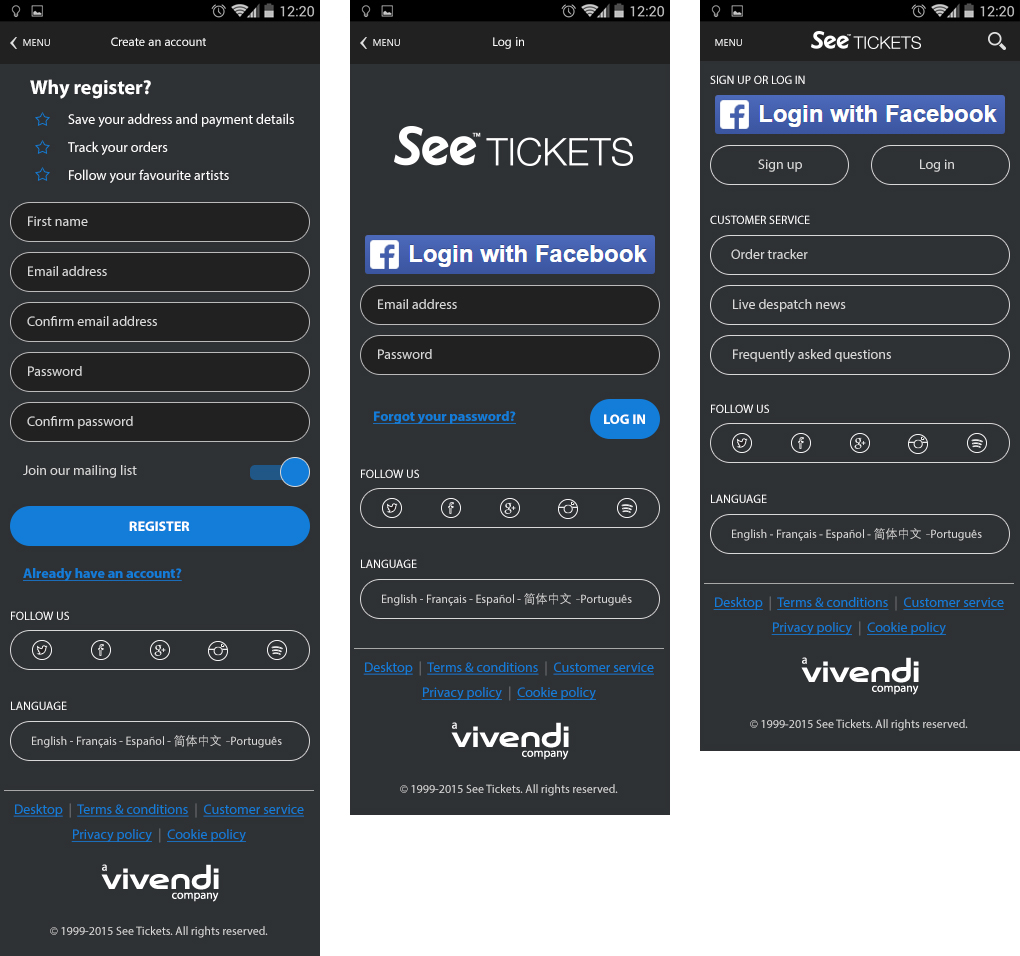
Login & Sign up
We gave users the ability to browse the website regardless of creating an account or not. However, when the time came to buy tickets, users would be required to Login or Sign Up.
Creating an account allowed users to ‘like’ and ‘follow’ events of their choice. Users could also save their details to speed up the checkout process when ordering tickets. As this is time-sensitive, the whole process a lot simpler and easier to complete.
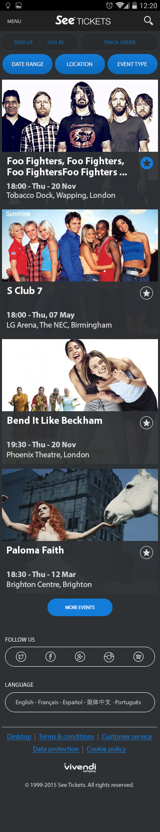
Homescreen
The home screen was designed into different sections to allow users to filter and easily search. You could search for a Date range, Location or Event type. Changing these filters updated the results on the homepage accordingly.
The home screen showed an infinite amount of events, with the ability to add individual events as your favourite. Adding a favourite event allowed users to navigate back quickly to that event at a later date.
When a user adds an event to their favourites, it gives the user the option to receive notifications announcing when tickets went on sale or if ticket allocation was running low. We didn’t want people missing out!
Filtering & Search results
To help users narrow down their search results, we added the ability to search a specific date range, events happening on that day, the following day, or coming up at the weekend.
As well as this, we used geo-location to bring in all the events happening within a set radius of the phone’s location.
Finally, if the user had a favourite genre of music or festival, then they could favourite multiple artists – these would be remembered and filtered for the user on the homepage.
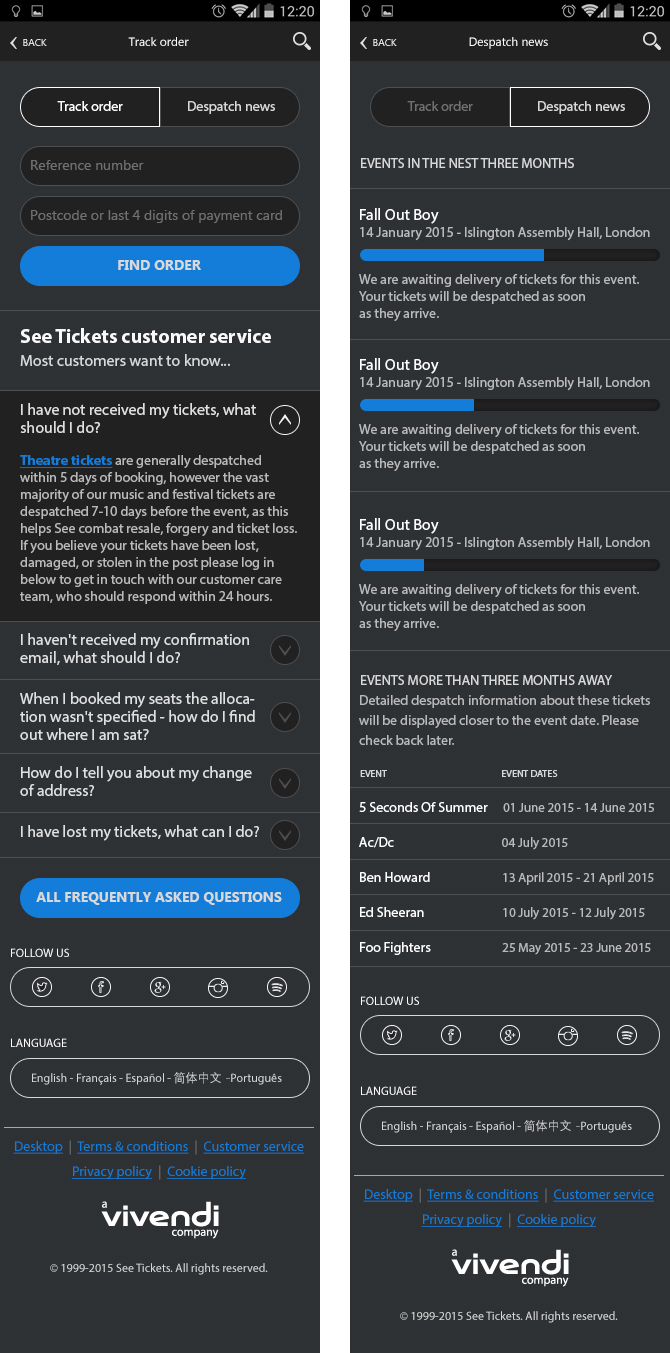
Tracking & despatch
Sometimes tickets took longer to arrive than expected; users could check the state of their order. We created a Tracking and Despatch area, where we added various FAQ’s and outcomes to help the user out.
A progress bar showed users the state tickets were at, and when the tickets will get delivered.
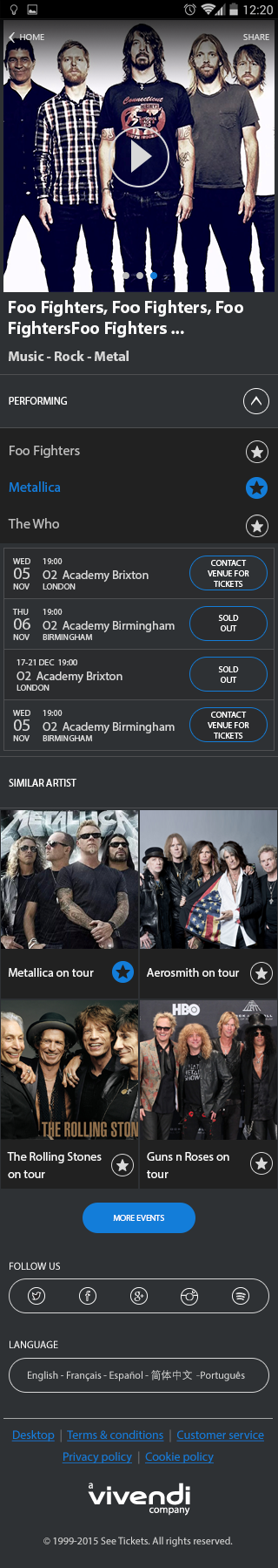
Tour page
The tour page is where users select the date / location that they would like to see an event.
Certain events had promotional videos and pictures you could view by swiping through on the thumbnails. I also added a ‘Similar Artists’ area at the bottom of the page so the user could view other areas and events.
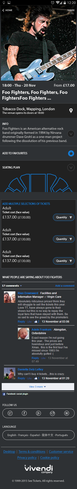
Event page
The event page lets users select the number of tickets they require to add to their basket.
It also has additional information like the Seating Plan, Venue location and the directions.
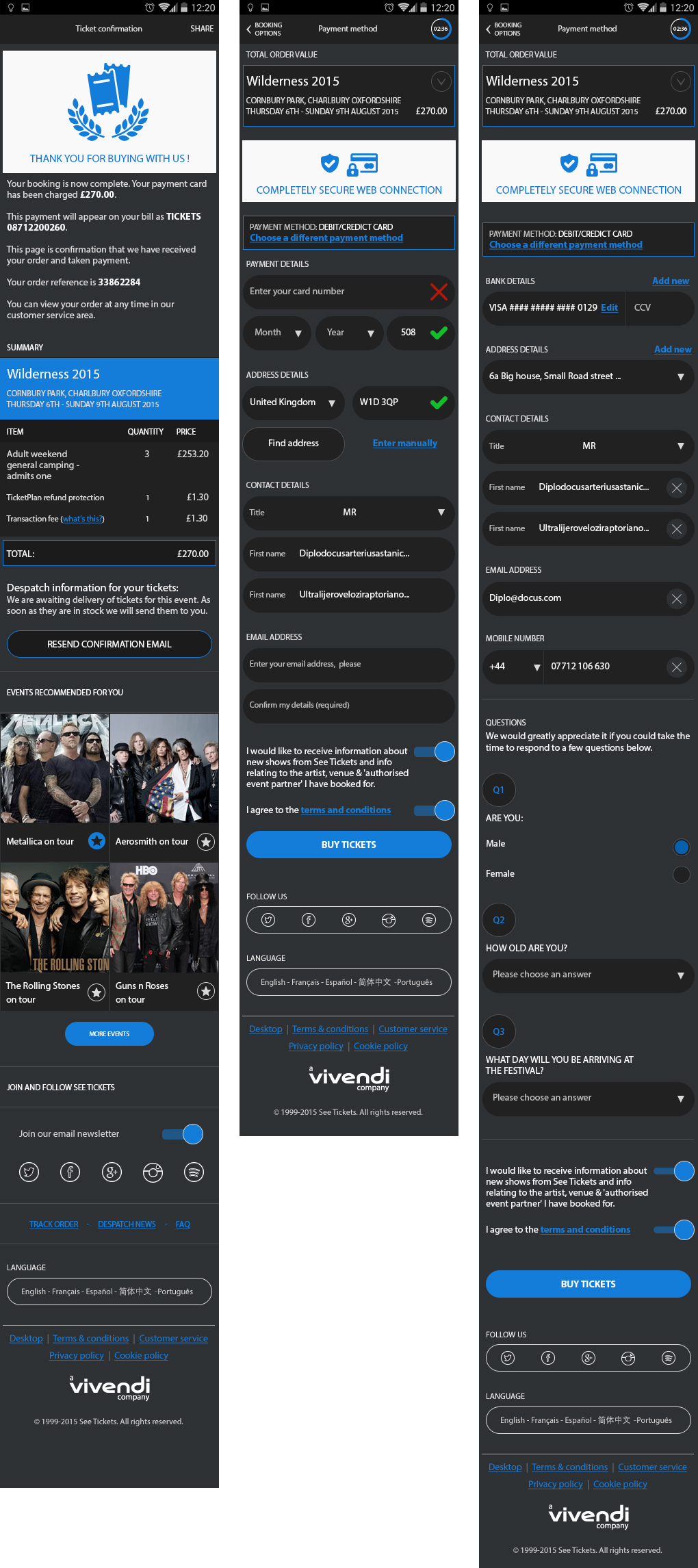
Checkout
The checkout area needed to be straightforward and easy to use as it was time-sensitive.
If the user hadn’t purchased tickets after 5minutes, the tickets then get released, and the user would have to go back to repurchase the tickets. This prevented robots bulk buying tickets, or people adding tickets to their basket and forgetting to purchase them.
Within the Profile area, if a user allocates their bank card, they would only have to click the ‘Buy Tickets’ button – this helped save a lot of time at the Checkout stage.
If the user doesn’t fill these text fields, then they need to do so before being able to complete the purchase.