Experian Insights UX

user experience /

Experian 
insights

the problem

When working for Experian I was tasked to create a data tool that provided real-time reports that allowed customers to create their own unique dashboards and reports based on the users needs and requirements.

This was a product that sat with our flagship product – Experian One.

As Experian One was still in it’s infancy it didn’t really have much structure in terms of where new products would be placed how how they could accessed, so I looked into the navigation and positioning of where and how users would access the new Insights product along with any other products that could be added in the future.

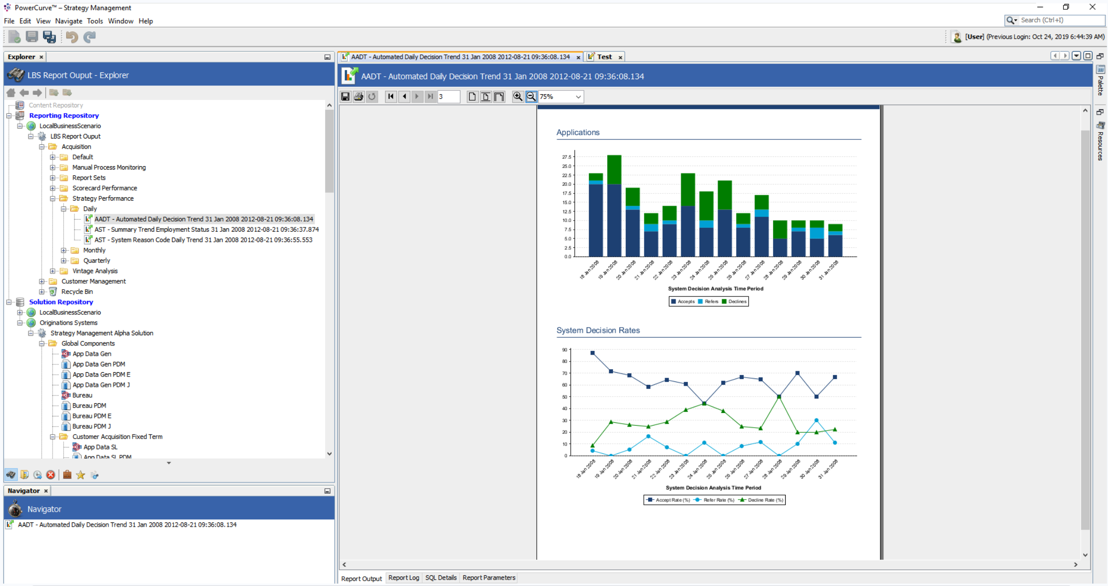
As for the product at the start of this project, the reports were hidden away in a tree structure of a list, this was ok to a point, but the fact the process was very slow, clunky and hard to navigate, open and click between other reports made it almost imposible to just freely view multiple reports quickly and with ease.

My role

User research  //  Affinity mapping  //  Competitor analysis  //  User flows  //  Tree jack  // Wireframes  //  Visual design  //  Prototyping

Strategy management (as is)

So we had two views, a sort of navigation view where you looked for your reports that were (kind of categorised).

When you had finished navigating through the folder structure and clicked on the report of your choice, it would appear in the view window.

These were PDF like and not interactive whatsoever, just static images with different charts on the screens.
 

THE USERS

Currently, Insights (or “BI Reporting” as it was first called), was aimed specifically for strategy designers, analysts and data scientists.

This allowed users to monitor strategy performance across the businesses and compare strategy outcomes against any benchmark data to look at and act upon.

As this was a brand new product, it could potentially have multiple links and additional categories, this could quickly fill up the Experian One dashboard so one of the first tasks was to focus on the navigation to access Insights.

u

Option one: As the link to the application was going to be nested in the Experian One dashboard, do we create a specific section on the dashboard for all reports and categories to be housed?

u

Option two: Or do we allow additional paging so once the application has been clicked users can dive down and navigate into a specific Insights (BI Reporting) page?

I decided to go with option one as I found out that the folder structures that would be required could be appropriately created in the application itself so that means we can keep the Experian One dashboard as simple and streamline as possible.
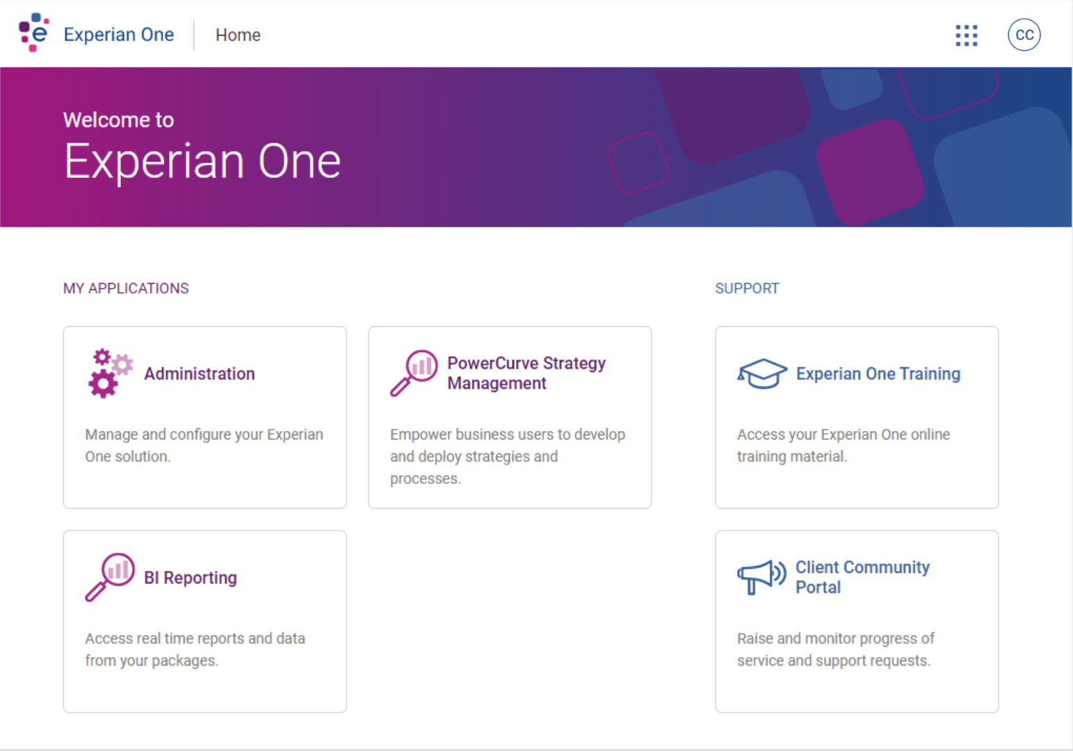
Option one – users click ‘BI Reporting’ and the application opens
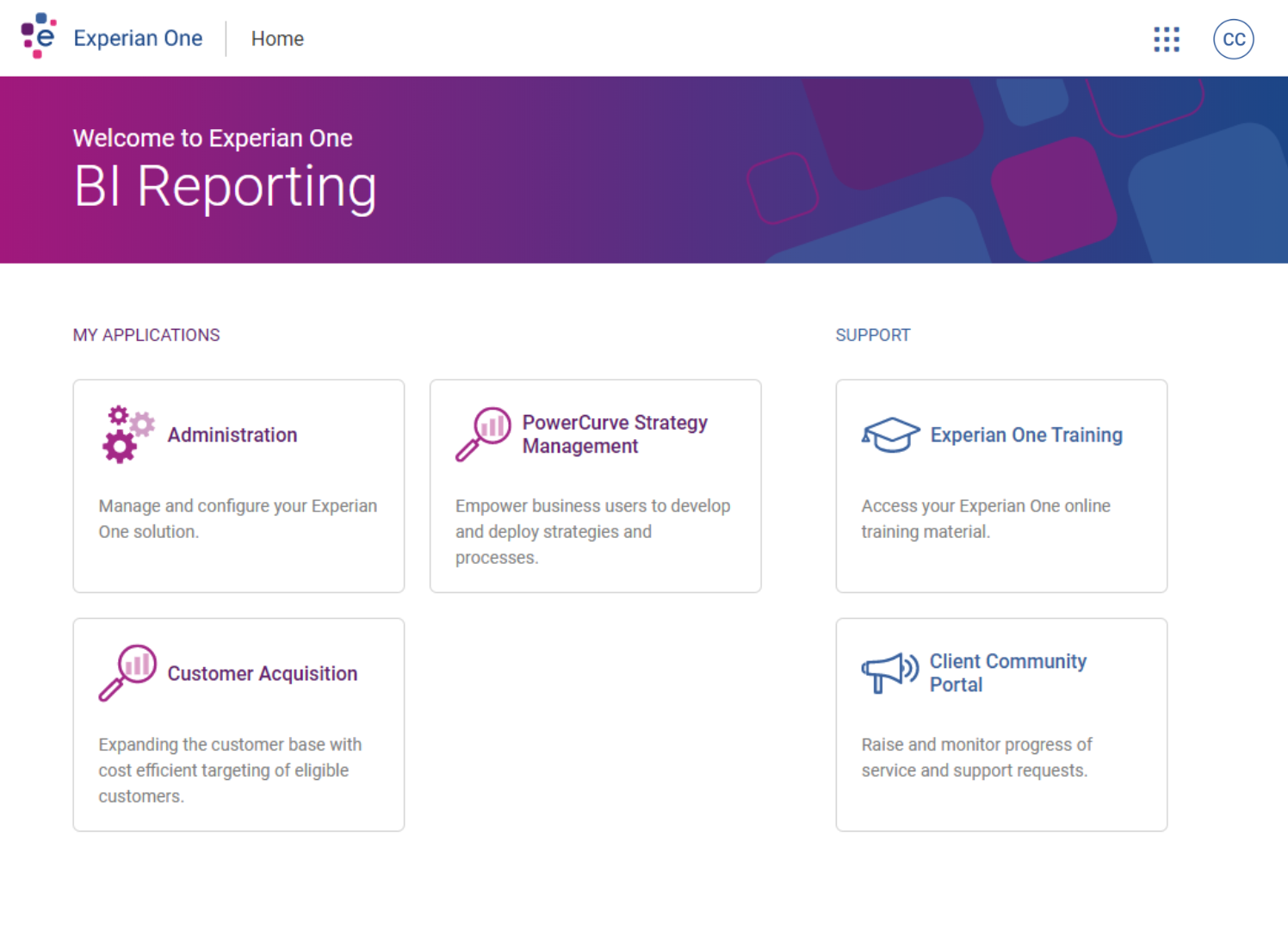
Option two – users click ‘BI Reporting’ on the Experian One dashboard page and get navigated to a specific BI Reporting page

Ideation Process

It became clear that I needed to work on a more lean navigation flow that removed the frustration of navigating through folders to find there were no reports at the end of the journey.

USER JOURNEY FLOWS

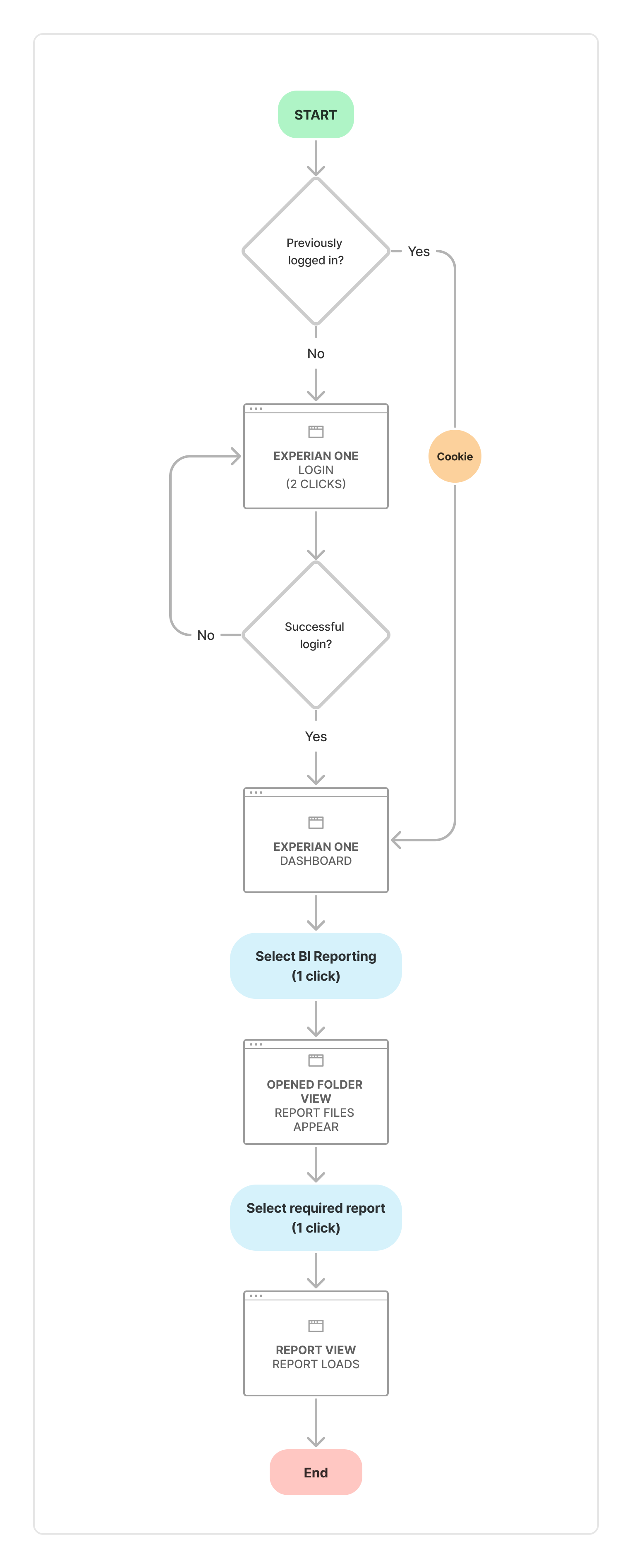
Taking everything into consideration, I mocked up a couple of user flows. One that showed the current journey that a user would take to open up a single report – For security reasons this included logging into the Experian One product which automatically added 2 clicks to the flow (minimum).

CURRENT REPORT FLOW

To access BI Reporting, users will need to sign into Experian One if it is the first time in doing this, if not a cookie is stored to prevent users having to sign in everytime. 

Once logged in, you land on the Experian One dashboard where you can view other applications that you might have on your dashboard. The user can select BI Reporting (Insights) here.

The application then loads and you are greeted with a view of all the folders (servers) and reports that you can access.

r

One of the main issues currently with this flow is that it isn’t obvious which folders have reports in, so you might click on a folder, the page loads, and you are greeted with a “This folder is empty” message, which means you need to navigate your way back to basically start over again. 

Once you’ve actually managed to find a report, instead of finding empty folders, you can click into the report to open the file up.

Once you have finished looking at that report, you can close it down and go back to try and find another file which has reports you can access. 

Current process total clicks: 6-8+

SUGGESTED FLOW

So like the current flow, users still need to go through the Experian One login flow, unless they have already done this in the past.

Once logged in, you land on the Experian One dashboard where you can view other applications that you might have on your dashboard. The user can select BI Reporting (Insights) here.

The application then loads and you are greeted with a homepage of sections that are the folder titles with the reports that would normally be hidden away in the folders – I thought it would be best to take the approach of instead of hiding reports in folders, don’t have the folders at all! 

Doing this removed the frustration of having to constantly click into folders onto to find out that no reports are available to view! This approach probably would be so bad if the navigation to get back was better, but it is so bad, users ended up just closing the window down and starting again.

New process total clicks: 4

While the difference from 6 to 4 clicks isn’t massively different in the grand scheme of things, I believe I have come up with a solution that makes the overall navigation between reports and folders much more simpler to use and navigate.
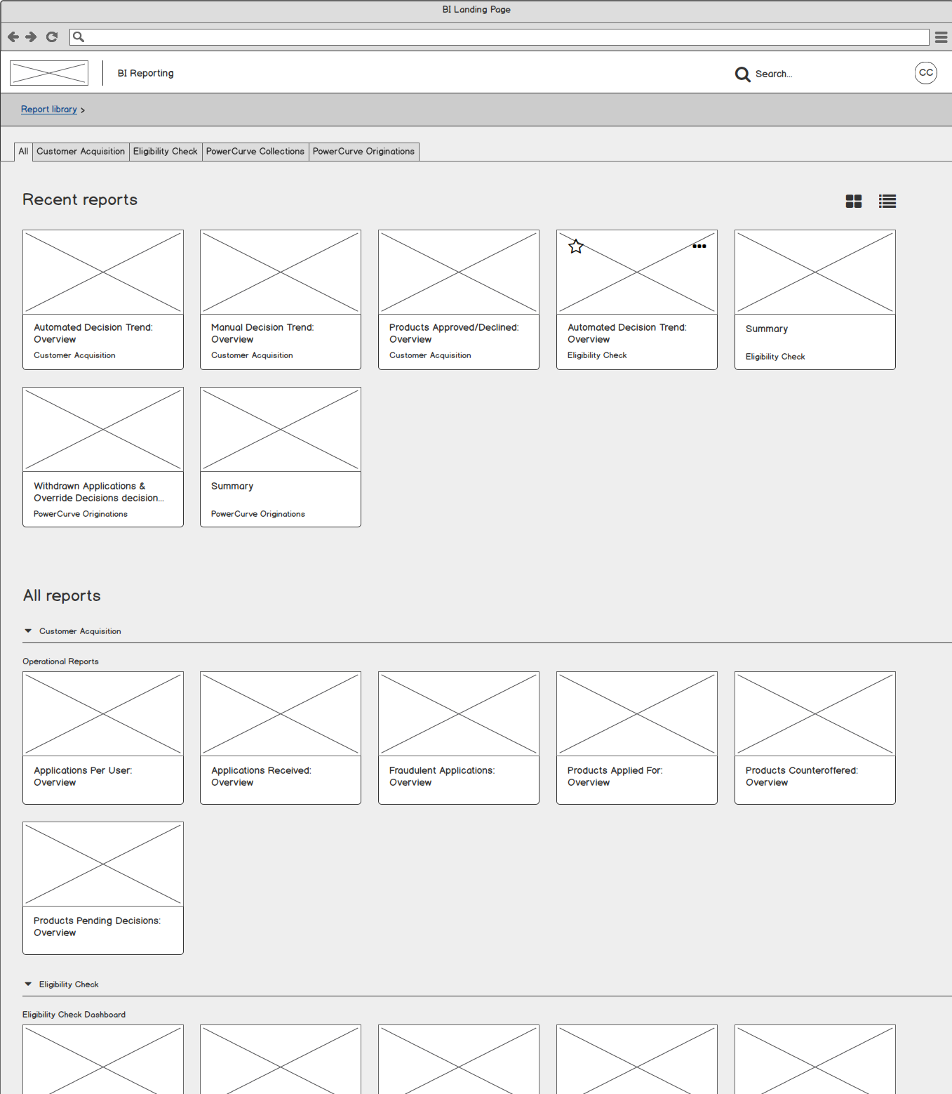
Dashboard Wireframes – v1.0

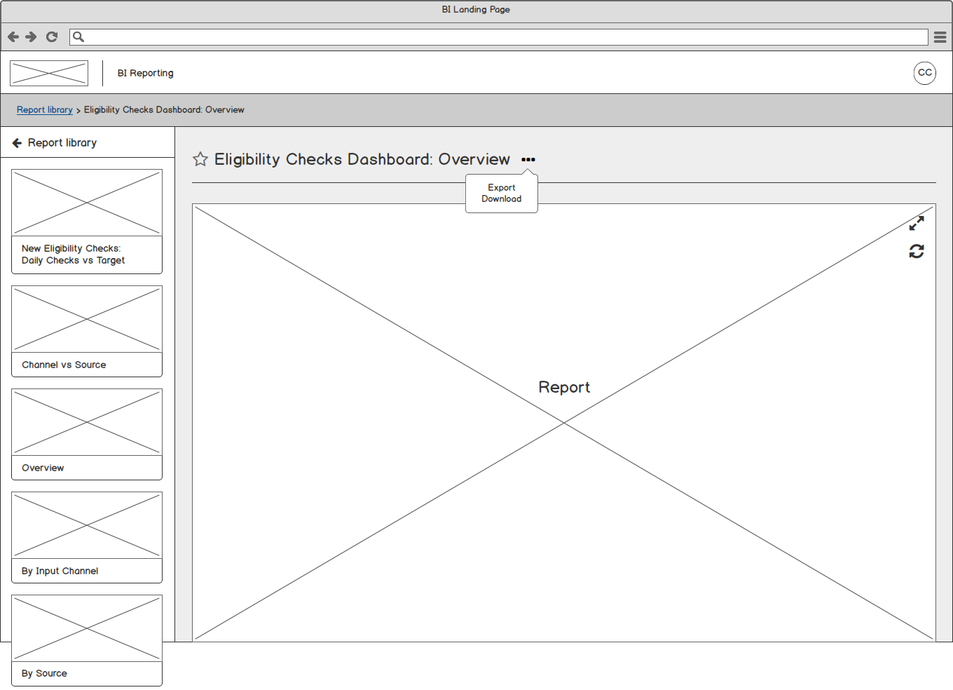
Currently the reports were hidden away in a sort of tree structure of a list, this was ok, but the fact the process was very slow and clunky to navigate made it almost imposible to use with ease.

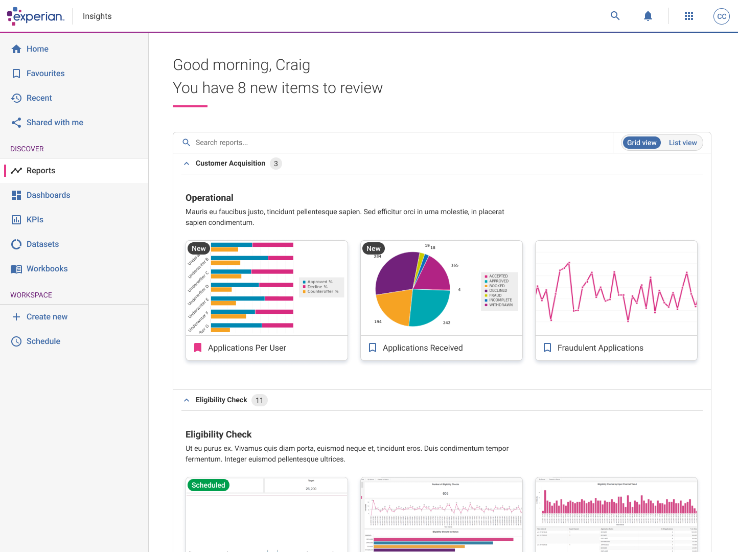
For phase one, instead of working on the tree navigation, I thought it would be good to put all the reports in an opened ‘accordion’ like component. This way it was clear to see from the beginning which ‘folders’ had reports in them.

I also added a tab at the top of the page to easily allowed users to filter down to a specific section easily.
Open report Wireframes – v1.0

Currently the reports were hidden away in a sort of tree structure of a list, this was ok, but the fact the process was very slow and clunky to navigate made it almost imposible to use with ease.

For phase one, instead of working on the tree navigation, I thought it would be good to put all the reports in an opened ‘accordion’ like component. This way it was clear to see from the beginning which ‘folders’ had reports in them. 

I also added a tab at the top of the page to easily allowed users to filter down to a specific section easily.
Tree jack task

After this first pass of wireframes, a decision was made to start allowing users to create new dashboards, reporting schedules and integrate KPIs, Tasks and the ability to favourite reports, as well as a host of other jobs.

As a result of this, it meant that I needed to add a navigation bar into the designs.

w

opinionated design

The product lead emailed me asking if it was possible to add a couple more links into the navigation design, at the time I didn’t think to much of it and agreed to consider adding his suggestions.

Once I’d actually recieved all the links along with a rough sketch of the structure he wanted the navigation to look like, it quickly became obvious that the navigation needed to be streamlined!

I got given a long list of links, which some had double and even triple layers deep and could be infinite links deep as users could add as many reports / tasks / workbooks and datasets as they like. This was obviously not the correct way to structure a navigation.

As a result, I decided to create a tree jack. This is where you provide users with data (in this case, the links for the navigation), and let the users structure and order the links however they wish. Doing this will give an overview of any potential common patterns that need to be considered in the design stages.

The results

I already had in my head a streamlined, easier way that users could navigate and use the navigation bar, but I still wanted to see if the users I tested thought the same about what the product lead was proposing. 

The results were mainly confusion, and highlighting how many links there are to pick from. One user even highlighted that they had 50+ report folders and some have over 100+ reports to select.

If that instance got put into the structure that I was testing out it would obviously break.

Navigation Design

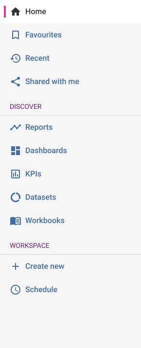
I took all the feedback onboard and decided to structure the navigation into three sections, one to house all the ‘Viewing’ tasks, one to house all the ‘Creation’ tasks and another for any of the little tasks that didn’t fall into either section.

THE OUTCOME

So my initial thoughts after looking at all the links in the tree jack, it became aparant that there were two sections, one for viewing and looking at things, and one for creating and scheduling.

I went with ‘Discover’ and ‘Workspace’. If you click on the Reports link, it would take you to your own created Report library page (as shown in the previous wireframes). This would be the same for viewing dashboards and KPIs for example.

For the Workspace section, you had the ability to create all of the items under the Discover section. Initally I had them flipped so Workspace was sitting at the top, but users primary usecase was to view and look over things over creating things.
Landing page

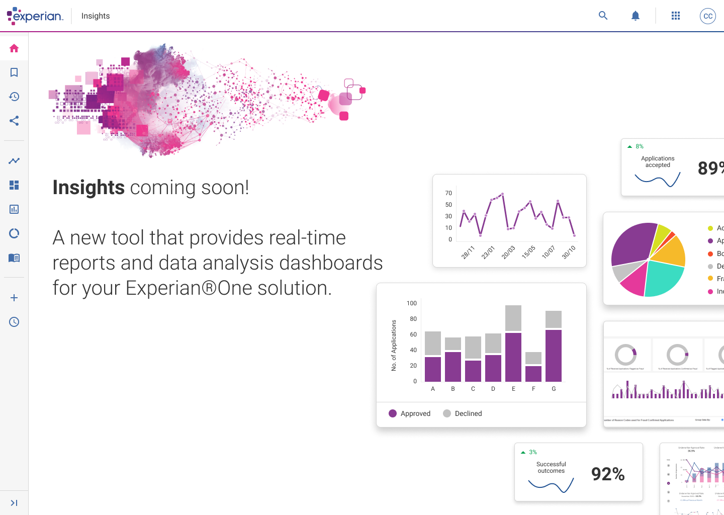
The product started to gain some traction thoughout the business, people started getting excited about the product so the next task was to give BI Reporting a ‘catchy’ name, along with a landing page for people to navigate to after logging in.

The final decision was to call it Insights.

Easier to navigate than the old platform

Intuitive and easy to set up and create new reports

Ability to save and favourite reports

Report library

Experian started using Tableau for their reports, this was a positivie step as it made all the reports more interactive and less static like they were previously – you could hover over specific data and get an exact figure.

USER TESTING

After the design was signed off, I prototyed up the screens so that users could navigate through the visuals as if it was an actual application.

Doing this helped to make the product feel real, you can get good feedback whilst users and navigating through the screens.

We asked the users a selection of questions, and we asked for their opinions on specific areas of the interface, as well as what they liked about the interface and if they had the ‘power’, what would they change if they could.

THINGS TO CONSIDER

Add some sort of filtering and sorting, searching specific dates, types of customers and daily date ranges.

The ability to remove any reports from the dashboard that have been created. Currently they are created by admin staff and they can remove the reports for the users.

A couple of people asked how reports would be added and created so they appeared in the Report library page – need to consider some form of personalisation instead of relying on Admin / Superusers to define everything.

“Very easy to navigate and follow – anybody can use this”

“It’s a lot easier to navigate and I like the thumbnails – they make the reports very easy to identify”

“I like the layout of the reports and you can use the tabs, the graphical thumbnail. The engagement and UX has clearly been considered”

“Much easier to use, well designed and intuitive – would give some of the other BI tools a run for their money!”

“Easy to use and understand. Layout is nicely designed, not complicated and easy to follow without by being
trained”

report viewer

We used Tableau for our reports, this was a positivie step as it make all the reports more interactive and less static like they were previously.

NAVIGATION STRUCTURE

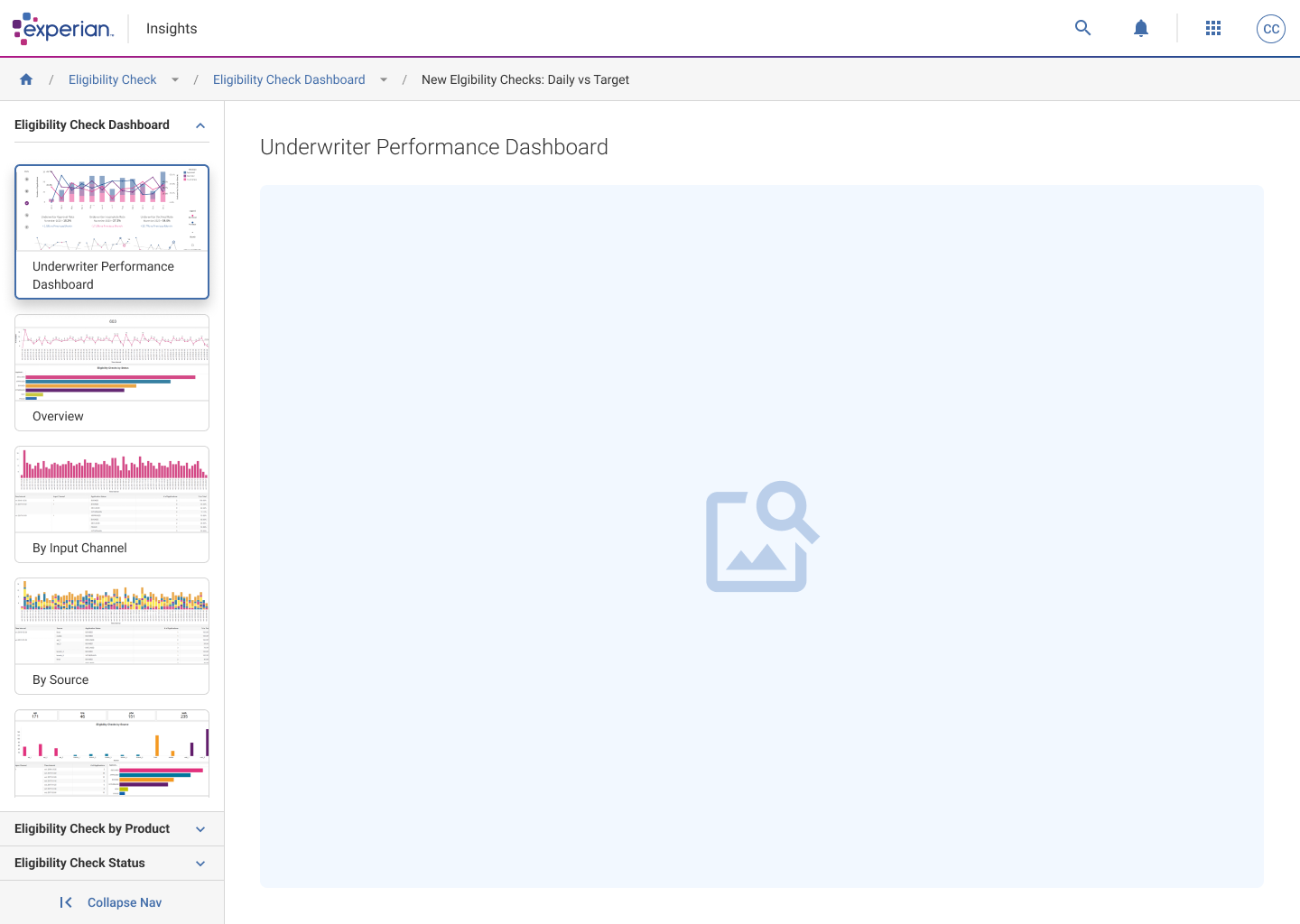
To help save the loading time and constantly having to click back and forth between a report, the Report library and back into another report again, I added the ability to navigate with ease between the different areas by designing a scrollable left panel that housed the different reports in their folders. 

When clicking the accordion, it would open and show the reports available in that section.

When a report was selected, it would appear in the main area, so you can view, and quickly view another report straight away in one or two clicks.

THINGS TO CONSIDER

Add the ability to add different permission based profiles such as Superuser, Can edit, View-only.

Create a sort of community area where members can comment on, share between other members and create some form of schedulling within the report view.

Phase 2 – ‘Create’ area

At the beginning of this journey I started putting together ideas that allowed users to create their own dashboards and reports.

SELECTION

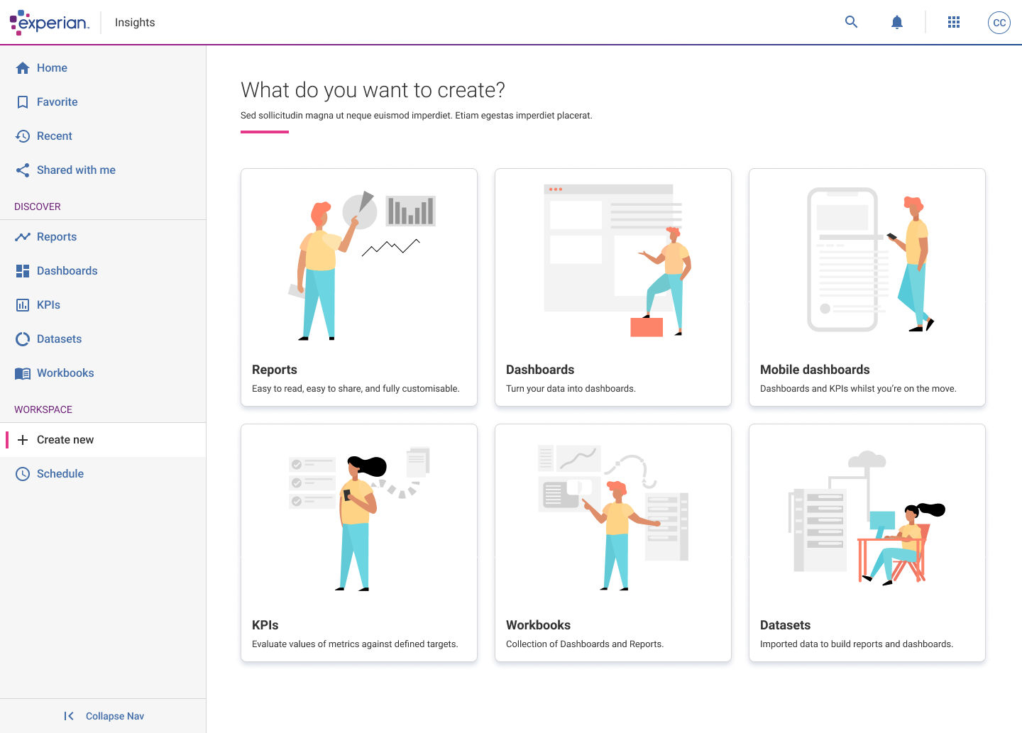
Users land on this page and have a choice of creating Reports, Dashboards, Mobile dashboards, KPIs, Workbooks and Datasets.

Selecting Reports and Dashboards would open up Tableau, everything else was create through the Experian applications.

dashboards

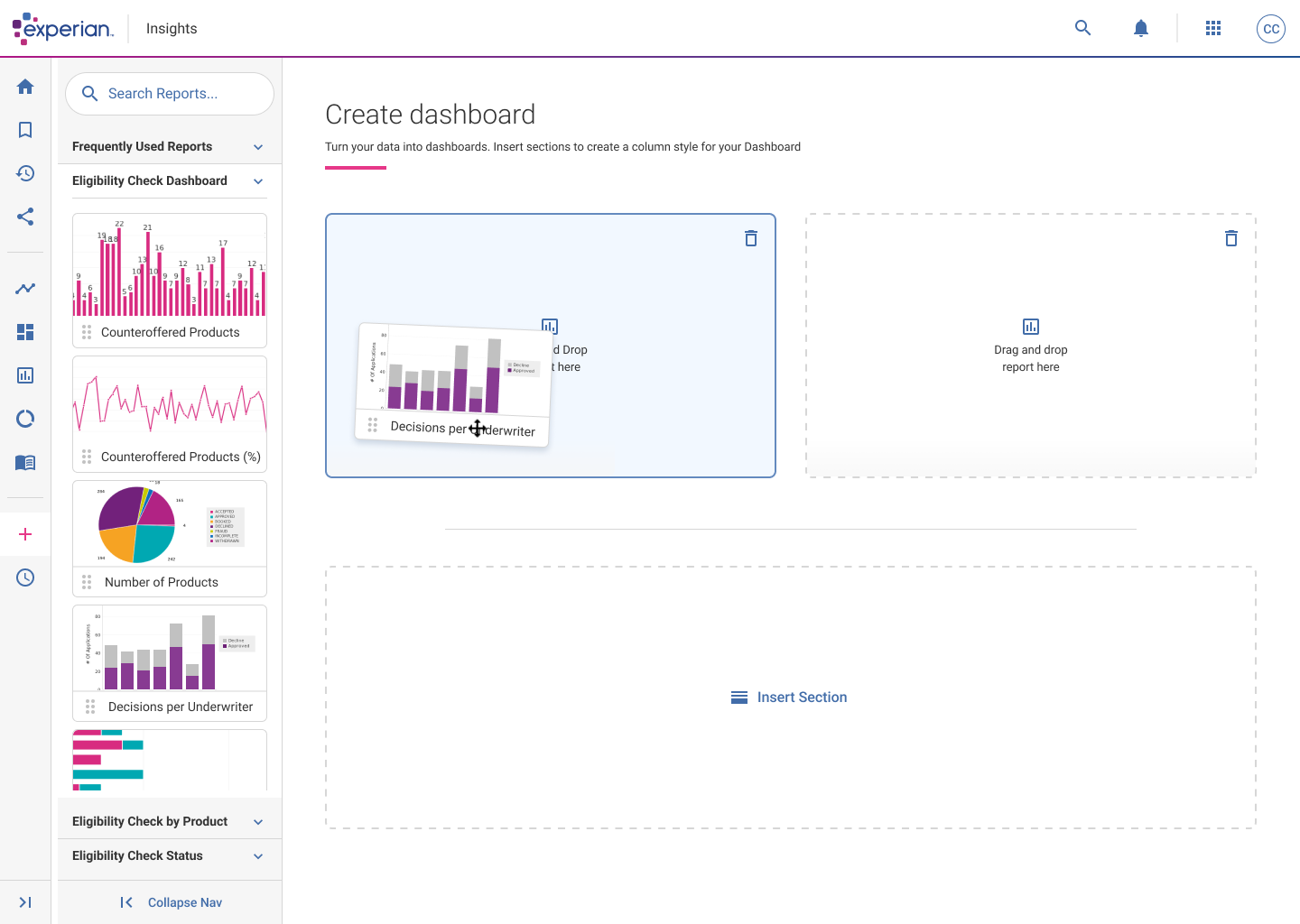
Dashboards are a selection of grouped Reports that users have put together, doing this lets users to see a selection of live reports without the need to navigate back and forth. 

SELECT YOUR LAYOUT

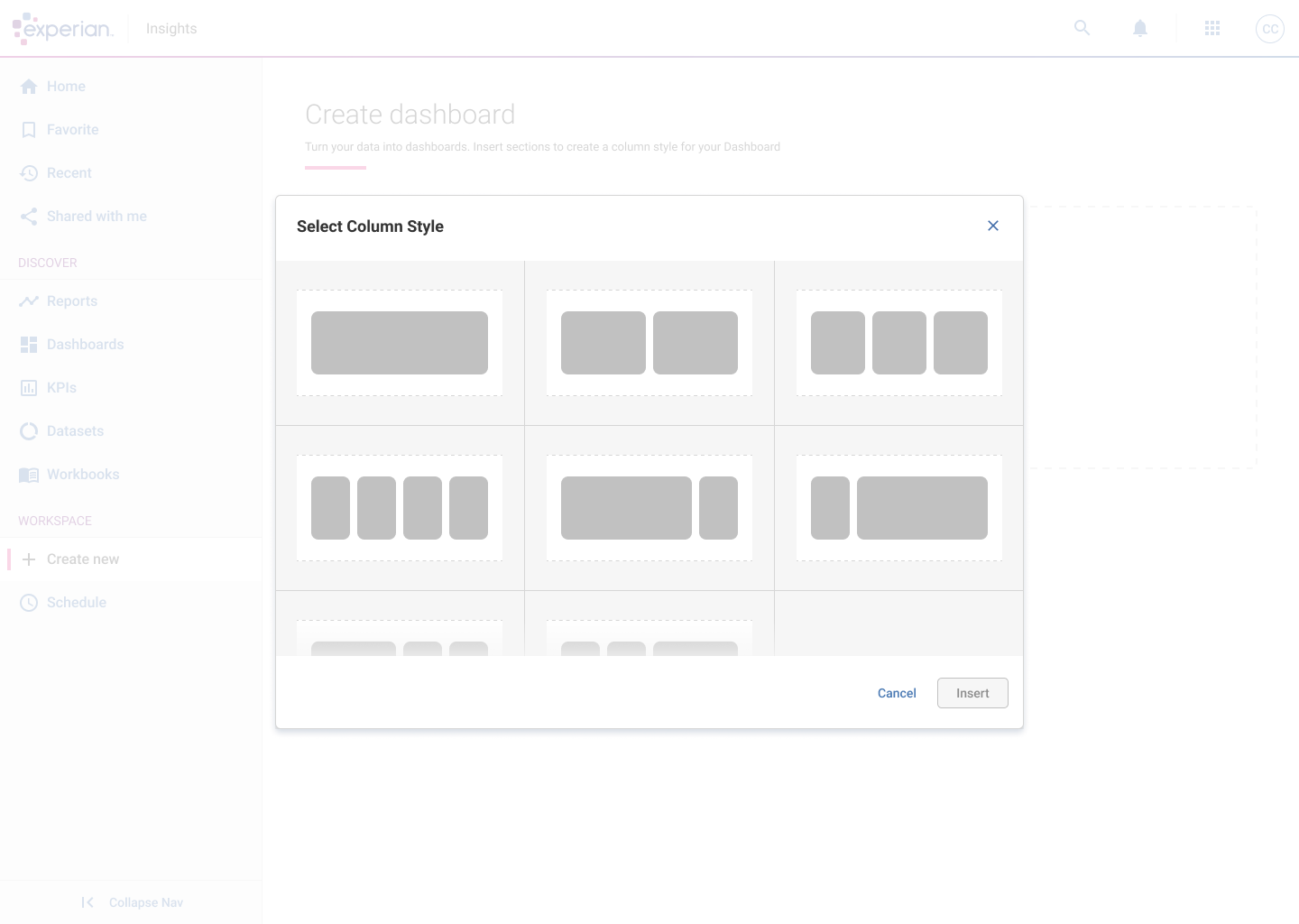
Once selecting ‘Dashboards’ from the Create page, users have the ability to select the layout they want their dashboards to look like.

Users then select what reports they want to go where by selecting manually or dragging and dropping the report thumbnails into their relevant spaces / order they need.


DRAG & DROP

Users can search for any report available and literally drag and drop the thumbnail into a space and the report appears in that gap. 

Users can also click into the space to search for a report on their device.

If another section is needed, click on the ‘Insert Section’ area and the ‘Select Column Style’ modal will appear again.


Mobile dashboards

I created a selection of user journey flows to test out how users could create mobile dashboards easily and view the KPIs on their mobile devices whilst on the move.

DYNAMIC DESIGN

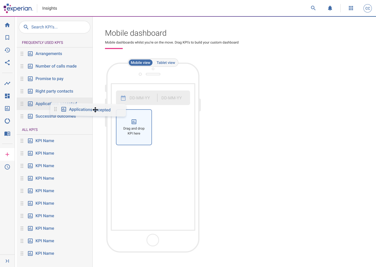
Taking inspiration from the Dashboard builder, I thought of creating something similar (for phase 1) but for a Mobile dashboard builder.

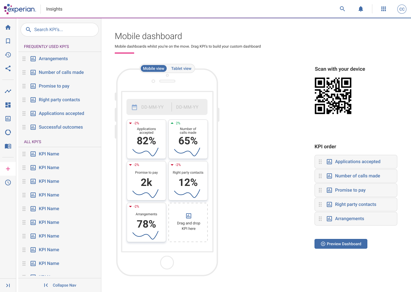
The idea of the Mobile dashboard builder was for managers and business owners to use this application to create their own personalised KPI dashboards so that they can look at real time stats and figures on the go from the comfort of their mobile phone or tablet.

Users drag their KPIs onto the canvas, they can be reordered and adjusted however they wish.

For phase 2, the plan is to allow users to create these dashboards directly from their device.

LINKING TO MOBILE

Once users are happy with their dashboard they can scan the QR code with their device that they want to see the dashboard on.

Users get given a unique link assigned to their account and it will appear on their device to use.

HYPE Stock Availability UX

user experience /

HYPE 
STOCK AVAILAbility

the problem

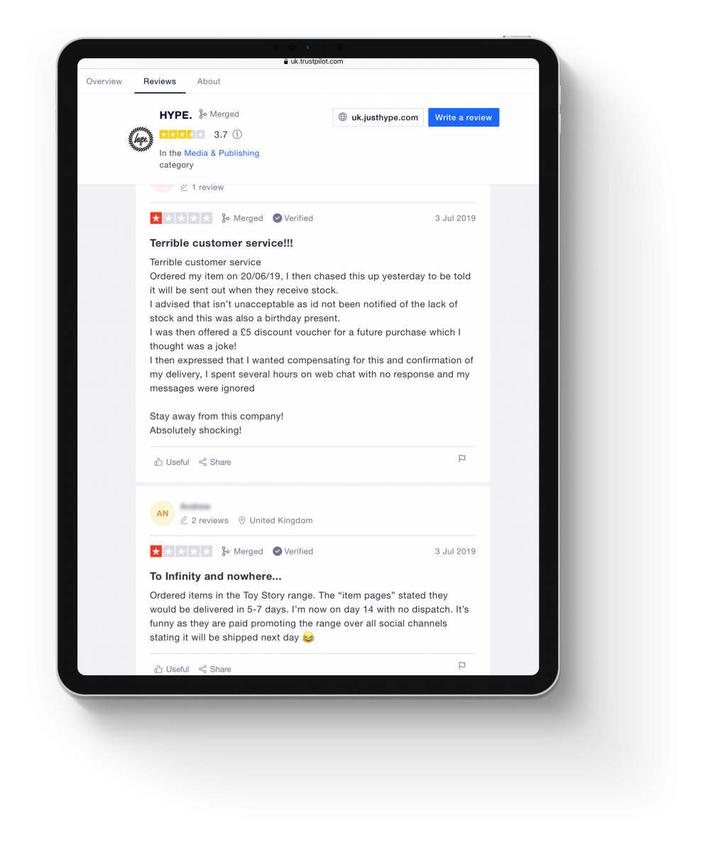
When working at HYPE I started collecting data to highlight any consistent issues that users were experiencing whilst using the website to make purchases. We had platforms such as Trustpilot and Zendesk which gave a great overview, we also had Google Analytics, but this wasn’t properly embedded so the data was very unreliable.

Whilst looking through the data, there was an overwhelming amount of feedback highlighting the number of steps it takes to purchase an item. People also highlighted after entering all the required details and clicking Confirm to purchase their item, the user got notified that the item was actually out of stock, but they never got informed what was happening next. Some users were being charged and others weren’t. So the plan was to recreate a much leaner user flow notifying and informing the users what the state of their orders was.
My role

User research  //  Affinity mapping  //  Competitor analysis  //  User flows  //  Wireframes  //  Visual design  //  Prototyping

Exploration

When I started working at HYPE my first job was to start collecting data to highlight any consistent issues and problems that users were experiencing whilst using or navigating the website to make purchases.

We had platforms such as Trustpilot and Zendesk which gave a great overview and allowed me to make a list of the most common issues. We also had Google Analytics, but this wasn’t properly embedded so the data was very unreliable.

Whilst looking through the data, there was an overwhelming amount of feedback highlighting the lack of communication about the order status. People also highlighted after entering all the required details and clicking Confirm to make a purchase, the user then got notified that the item was actually out of stock!

So they never got informed what was happening next and some users were being charged. So the plan was to create a much leaner user flow notifying and informing the users what the state of their orders was.

Below is a small snippet of customer feedback collected from Trustpilot.

“I was able to purchase an item that was out of stock. Out of stock items should not be available to purchase.”

“Took my money for a top that was out of stock and then don’t bother to tell you it’s out of stock!”

“Product didn’t arrive, chased no response to emails, when finally responded half the order was out of stock, CS claimed they have refunded via PayPal, they haven’t!”

“I never got my order I was so disappointed I had paid for it then got a email to say not in stock.”

“Ordered bag advertised on website which accepted my order and took my money and then emailed me shortly after to say bag is out of stock and money would be refunded within a few days wasn’t happy this allowed me to place order and pay before telling me order couldn’t be processed”

“I have had the money taken from my account, clothes still haven’t arrived, emailed to ask where they are, still no reply!!!”

“Ordered my item, then chased this up to be told it will be sent out when they receive stock. This isn’t acceptable”

“I had to chase for my order still not got my order after nearly a month of waiting”

“Placed an order and paid.

Received an email the following day saying my order had been cancelled and I had been refunded due to no stock availability.”

“3 separate orders and 3 times you have refunded me and cancelled my order because you can’t fulfil it. All 3 orders were showing in stock at the time.”

“Not happy as payed for items then got message saying out of stock.”

“Ordered a bag for my son online only to be informed 2 days later that they don’t have it. Maybe they should update the stock on the website so as not to disappoint customers.”

Insights

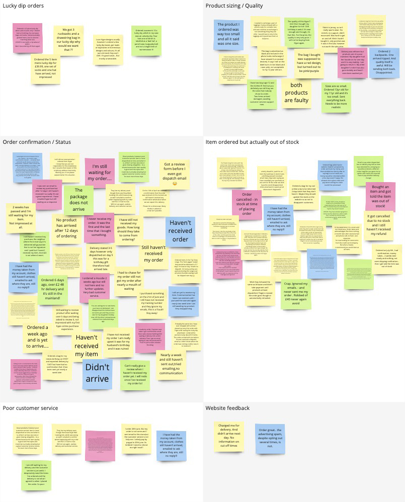
I created an affinity map to help highlight any pain points identified by the users. I created a date range of 3 months and purposely selected to view reviews with only 1 and 2 stars.

I grouped these problems under common themes and features for the website.

By doing this mapping session it was quite clear that two main problem areas needed to be looked into.

Order / status updates

With a whopping 38 complaints, lots of people mentioned the lack of any communication once the customer’s orders have been placed. Not even a ‘Thank you for your order’ email/text.

Some people also mentioned that they wouldn’t even receive a date from the postman, the order would just arrive.

As a result of this, customers naturally got suspicious thinking HYPE was a scam company. Especially for people who have never purchased anything from them previously.

Stock quantity not updating

24 complaints were made about customers placing an order and afterwards being informed that the item was actually out of stock! – Although I didn’t have any involvement with regards to the stock system that was being used, I was able to create ways in which users could be made aware of stock shortages or items that were out of stock.

Doing this would therefore reduce the anger and frustration caused to the user when buying items that were never available to buy in the first place.

Ideation Process

It was clear that I needed to work on a more lean checkout process that informed users of any out of stock items. Alongside this, I worked on a selection of order confirmation layouts that would inform users what step their order is at in the delivery process.

CURRENT CHECKOUT PROCESS

So the current process is that a user selects what item they want to buy, and on the item page you can select the size which is required through a dropdown.

There are two issues with this:

The dropdown in the item page where you’re supposed to select your required size is poor! Yes, it highlights all the sizes, but it doesn’t actually state if they’re in stock or not at that point.

After you select the size you require, it is still a lottery if the size is actually available. The system is supposed to check if the size selected is available, but according to 24+ complaints across 3 months, I would suggest that this logic isn’t working correctly, or working at all!

So a size is selected, the user clicks ‘Add to Cart’ – you then have a bunch of other clicks to make. When you eventually get to see your cart/basket, you click ‘Proceed to Checkout’ 

When in the Checkout screen, you still have to click another ‘Checkout’ button, to enter all your details: Name, email address, shipping address, check a box if the billing address is the same as the shipping, enter the long card number, name on the card, expiration date and security code. 

Once you think you’re finally done, you also get told to enter your mobile number and finally click (punch, smash) the ‘Complete order’ button. 

Phew!

So after filling out all of these steps, you then find out that the item is actually out of stock after this step, not to mention you have just been charged for the item, and a lot of people don’t even get any sort of confirmation that the order has gone through. I understand why people get angry!

Current process total clicks: 18

SUGGESTED CHECKOUT PROCESS

I took a step back and looked at the current process and noticed that every single time a user wanted to buy an item off the website, they had to re-enter all of their details each time.

This got me thinking, why not just enter your details once, save them onto an account area that is dedicated just for you and then when you return to make another purchase in the future, you can select the same details you have used in the past (with an added step of typing your bank cards security code for protection reasons).

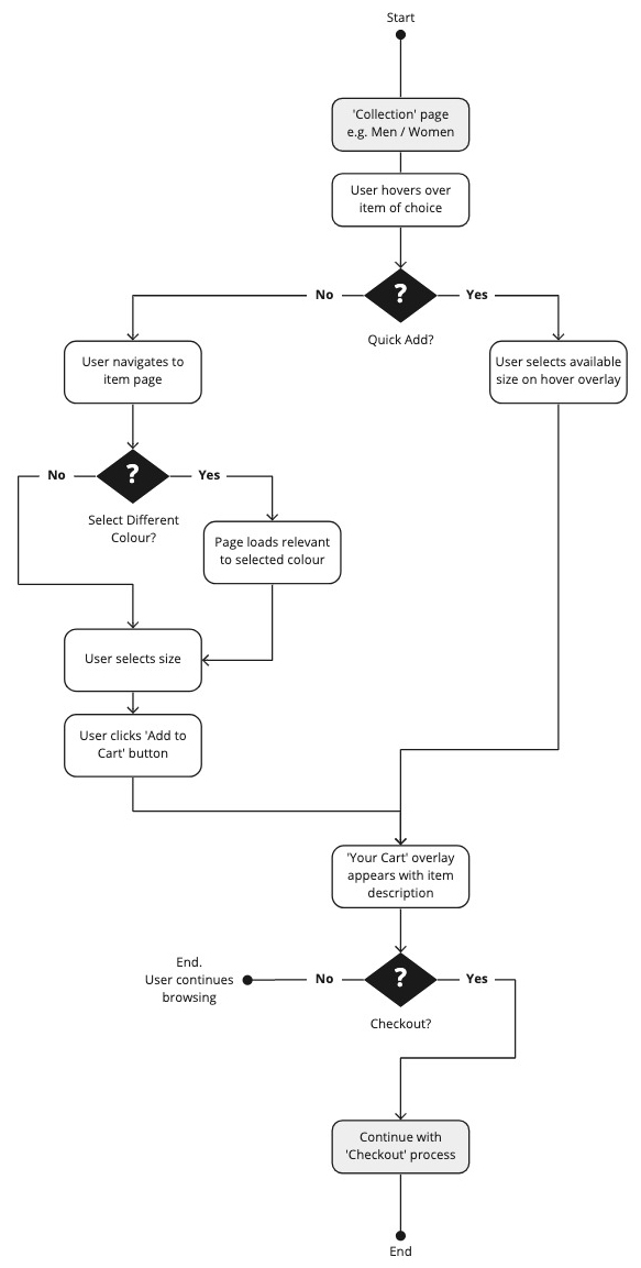
So taking the new flow into account, the user hovers over the item they want to buy, an overlay appears at the bottom of the image of the item showing the sizes that are available for that specific item.

If the item is in stock, the user selects the available size which will get added to their basket. They then click the ‘Checkout’ button which allows the user to select a previous payment method that they have stored on their account. Once selected, the user clicks ‘Complete order’.

The user will then instantly receive an email confirmation giving a breakdown of the items that have been purchased, showing the delivery address, and which payment method was used.

New process total clicks:  4

Quick Add – Item panel

The first thing I worked on was the ‘item panel’, these run throughout the whole website and are normally placed to encourage users to view whole sections of that specific range of clothing.

Due to lots of feedback that users were getting through the whole checkout process and then finding out after the money had been taken that the item was out of stock, I thought it would be good to give an overview of the sizes that are available from the start, instead of getting through the whole process to then be disappointed that you can’t get your item.

If the size was unavailable, the user can click on the size they require and they enter their email address to be notified at a later date when more stock is available.

(Why not have a click through the final prototype for this feature…)

Creates a learner checkout process

Shows transparency and openness

Reduces angry users if the size is unavailable

Order confirmation

With the item panel in progress, I started researching into some competitor analysis to see what information could be added/removed from the current email correspondence.

EMAIL CORRESPONDENCE

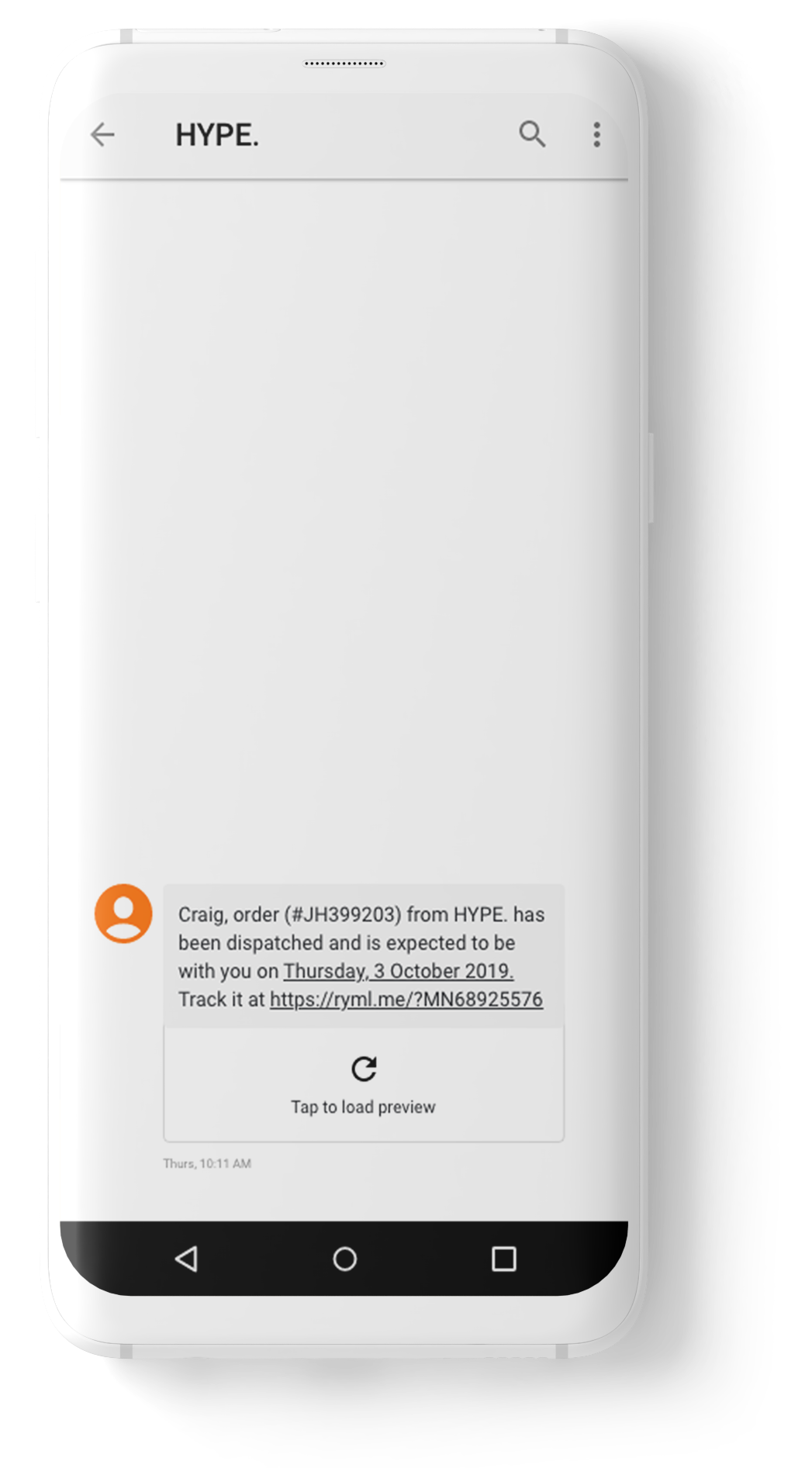
Previously lots of customers were unhappy with the lack of communication after purchasing an item. Lots of people highlighted once the item had been bought, it wasn’t uncommon for there to be no communication whatsoever.

Some people even mentioned that the only communication they had received was an email to give a review on the product, which hadn’t even been delivered at that point! I experienced this first hand myself, and it definitely adds to the confusion, because you wonder if the order has actually been delivered and I’ve just missed it, or the postman has put it somewhere that I just haven’t seen.

The plan was to reorganise the current logic that was set up and see what could be done to improve to current processes.

Firstly, there wasn’t any logic in place, so it was no wonder that nobody was receiving any emails.

Secondly, when looking into the email settings, I discovered that if users (like myself) have a personalised email address outside of the usual Gmail / Outlook / Yahoo etc, the system would just bounce and never send an email.

So I fixed the settings so everyone should receive an email when making a purchase going forward! That’s a bit of the battle won!

“2 weeks has passed and I’m still waiting for my item. Not impressed at all.”

“No email to state order confirmation…. contacted them and told I would receive a email once dispatched.., however I didn’t receive this either standard delivery is 2-3 days.. it did arrive within the time frame but the constant worry on if my order has been processed if they have dispatched yet is a issue I’ve never experienced a company to not send any email what so ever….: only positive is my order arrived in time to be gifted”

“I still am yet to receive my item. Communication has been non existent until I pursued the case and again nearly two week later I am still awaiting my product. Very disappointing”

“The order arrived with me before I’d even received a dispatch email so I didn’t know when the order was coming, luckily I was in to receive it!”

GETTING ORGANISED!

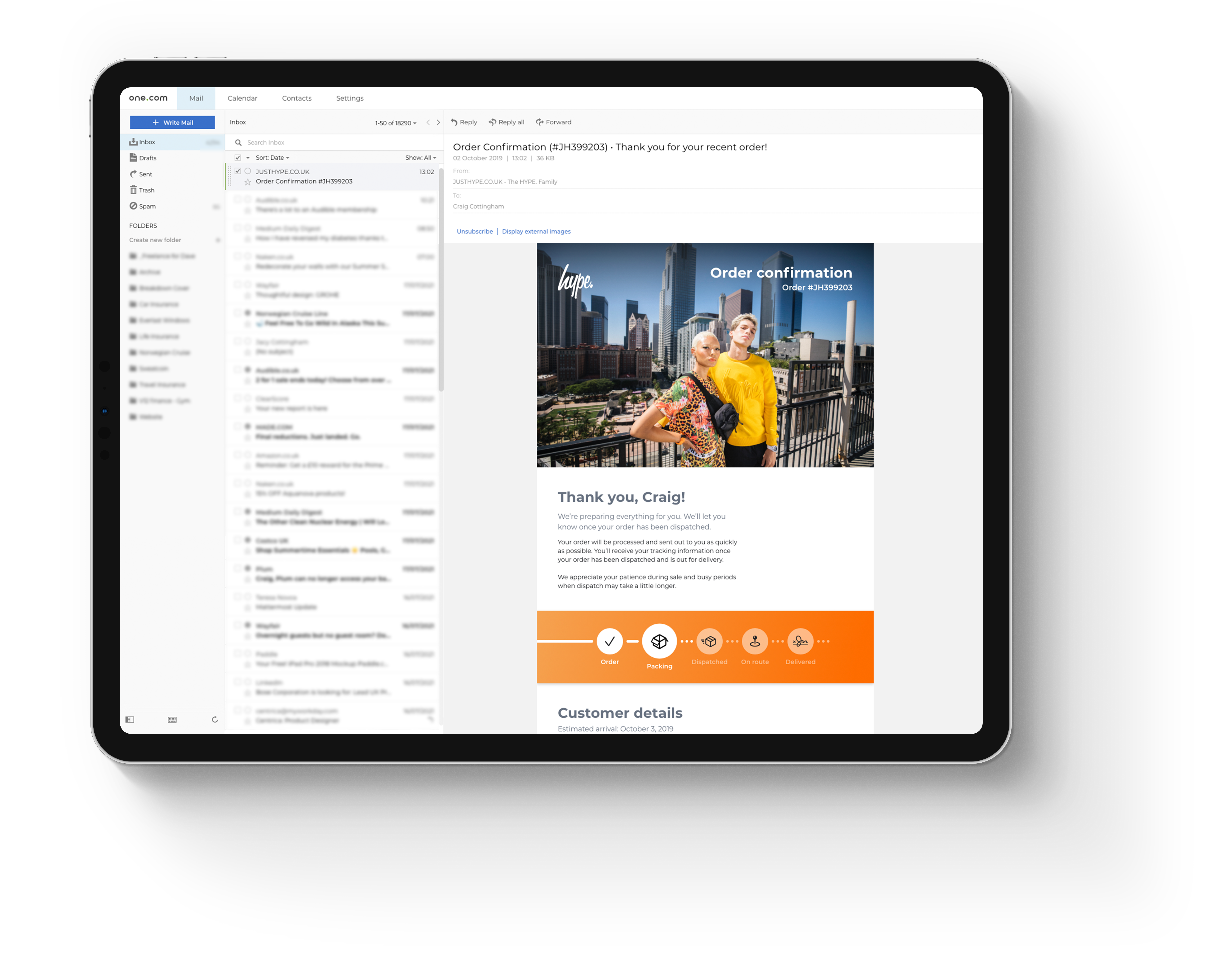
I ended up creating a series of emails that would follow one another in the delivery journey of the items which have been purchased by the customer.

I created an email template that showed users the items they’d purchased, I also created a series of icons that highlighted the current step the order was at. I needed to take into consideration the point when the order is in transit, the user could possibly get a text message or an email from the Royal Mail / DPD etc.

When working to fix problems that have previously arisen by feedback, it is vitally important to try and tick all the boxes, especially if the feedback is as regular as it was at the time of working on this project.

I personally feel it is important to add transparency and friendliness to any sort of communication between company and customer. Making communication feel personable, not just a copy and paste jobby which gets sent to everyone regardless.

So taking user feedback into consideration:

By adding the orange banner under the header gave customers a clear understanding of the step their order is at and what’s next in that process.

When the customer’s order reached the Dispatched state, the email communication changed to show the customer’s tracking number – the user can click on this number to navigate to the relevant page and track their order.

Adding the details of the order allows the customer to browse over these at the earlier stages, to see if there is anything entered incorrectly (another issue that kept getting mentioned), then they have time to update these details through their account area before it is too late.

STERIS Collect & Deliver

User Interface /

Steris
collect & deliver

One of the big projects that was on our road map for 2018 was to create a mobile app for EPOC / EPOD (Electronic Point of Collection / Electronic Point of Delivery).

user interface

We already had the process, but it was done with pen and paper or word of mouth between members of staff collecting and delivering trolleys.

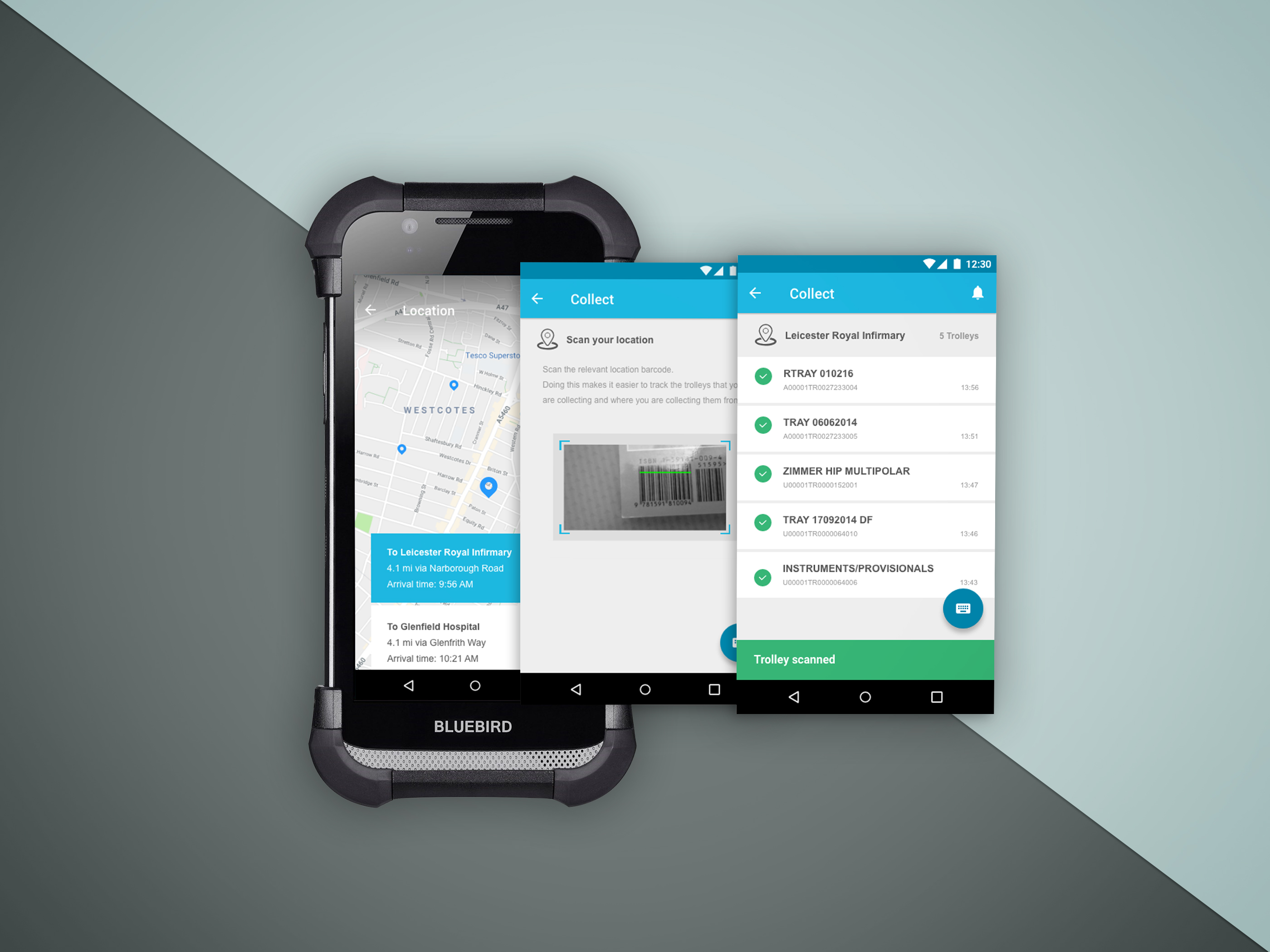
Collect & Deliver application on a Bluebird device

Login

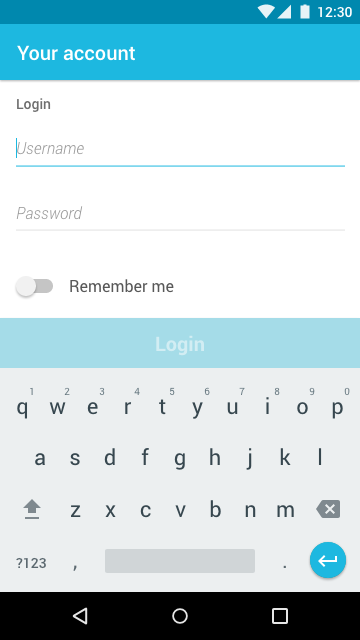
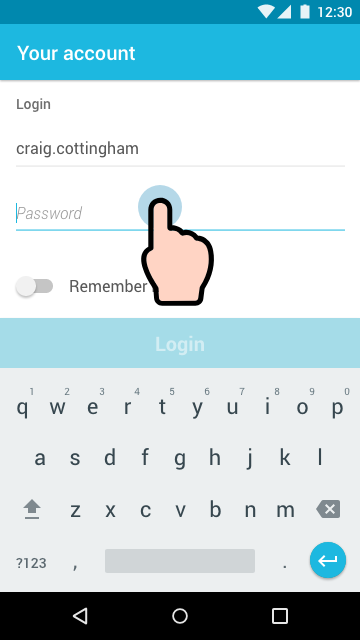
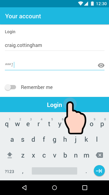
When the user opens the app, the first thing that they have to do is login with their credentials.

The app login had a 10minute inactivity period before it logged the user out of the app. If the user works for a longer time, the user can tap ‘Remember me’, and it will keep them signed in until they decide to log themselves out.

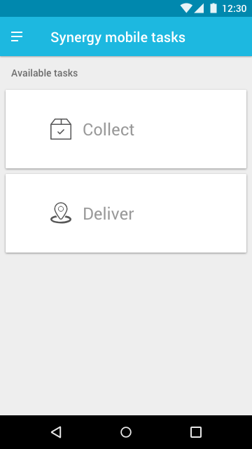
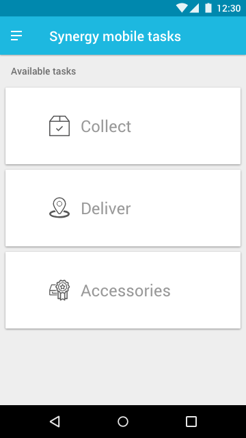
After logging in, the user is taken to their Task page, where they can set up, or do their daily jobs. – Phase 1, started with Collect and Deliver.

Login design flow (1 of 3)
Login design flow - enter user details (2 of 3)
Login design flow - enter details (3 of 3)

Password expired

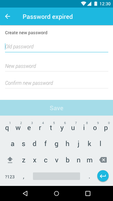
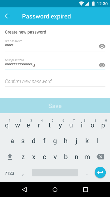
After some time, for security reasons, we made the user enter a new password.

Collect

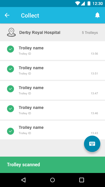
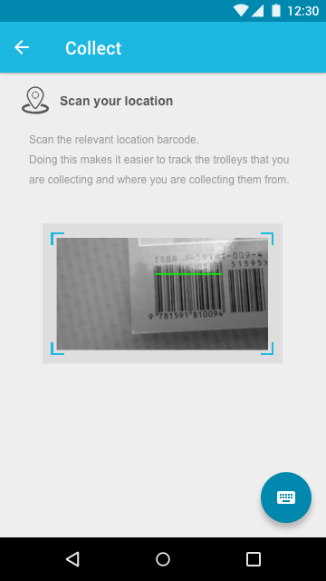
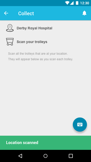
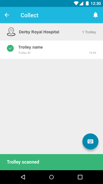
When drivers collect trolleys, they must scan the location that the trolleys are being collected. They then need to scan the trolley IDs for the waiting trolleys.

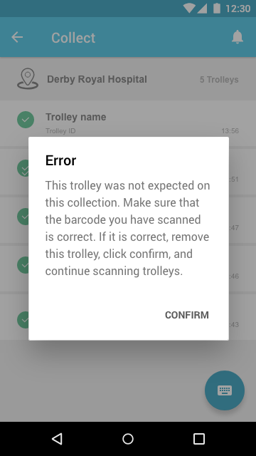
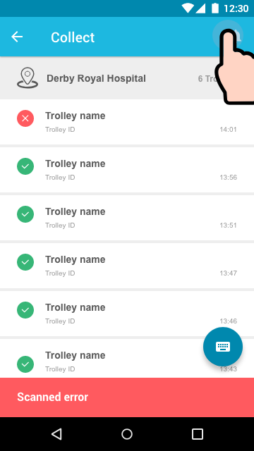
If a trolley is scanned that shouldn’t be collected, then the user will be notified to inform them of an error.

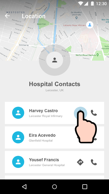
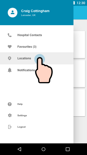
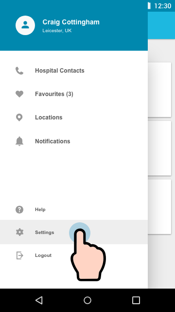
Hospital contacts

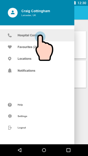
When the driver logs into a device, it populates the contacts page with the staff relevant to the collection and delivery points for that shift.

If something goes wrong during a journey; stuck in traffic, for example, drivers can call the on-site manager, or use the maps to navigate around the traffic to get to their destination quicker.

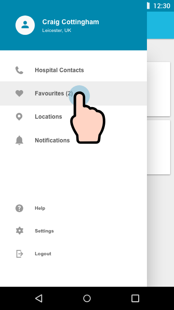
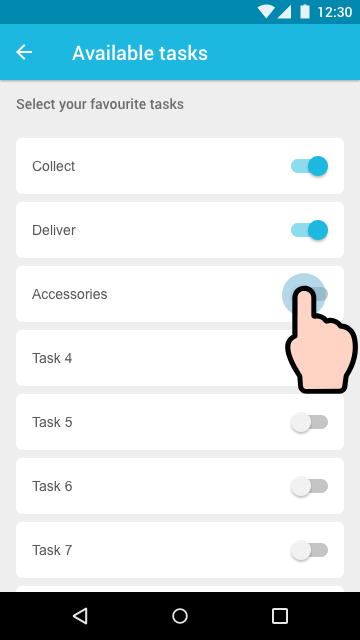
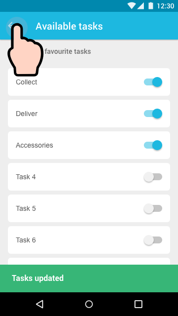
Favourite tasks

The user can edit their tasks depending on what jobs they are doing throughout their shift. This updates the Task page when the user toggles each job on or off.

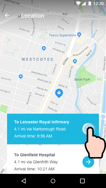
Locations

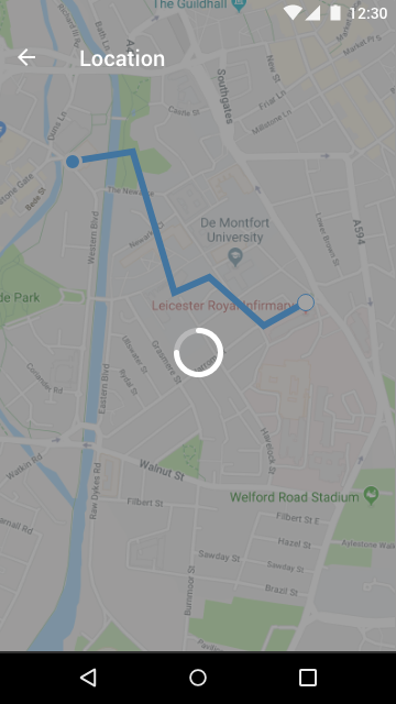
Most drivers have roughly 3 of 4 delivery points that they drive to throughout their shift. Sometimes there can be ad-hoc requests or Fast Track deliveries that are needed as soon as possible. These will notify the user and take them directly to that location as quickly as possible.

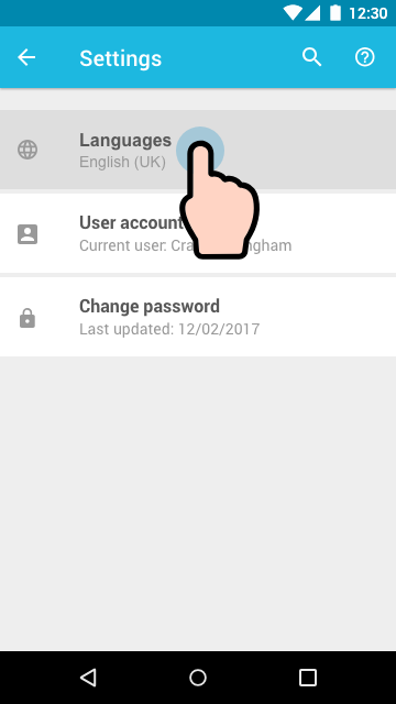
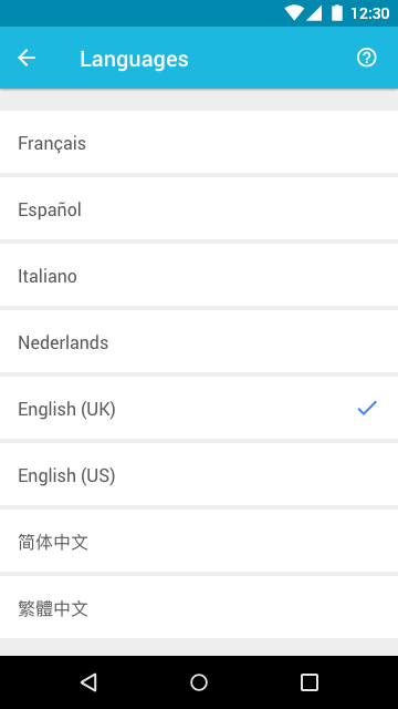
Settings (change language)

STERIS work over multiple countries, so the app needed the ability to allow users to change language settings.

To do this, users go into Settings, select the Languages area, followed by tapping on their language of choice. Once a selection is made, the app navigates back to the Settings page.

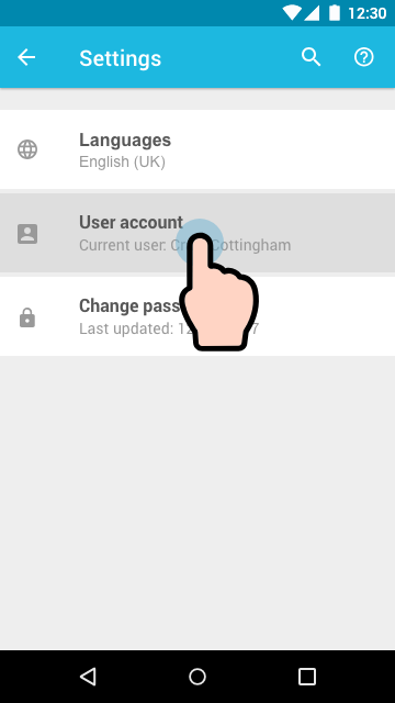
Settings (change user)

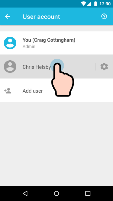
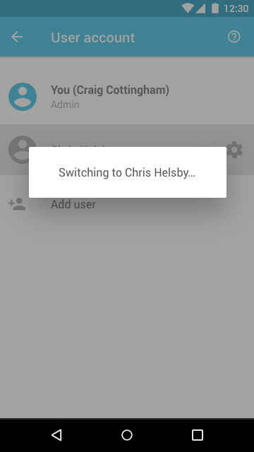
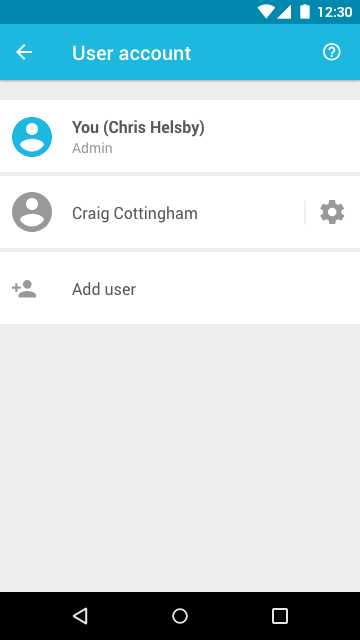
The device is used across multiple users, so we added the ability to switch between accounts quickly. Doing this allowed users to keep their preferred personalised Tasks the same without having to set their Tasks up again every time they logged into that device.

Settings (create new password)

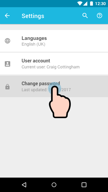
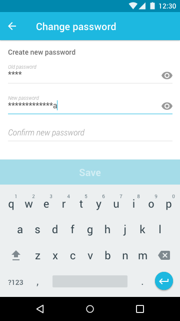
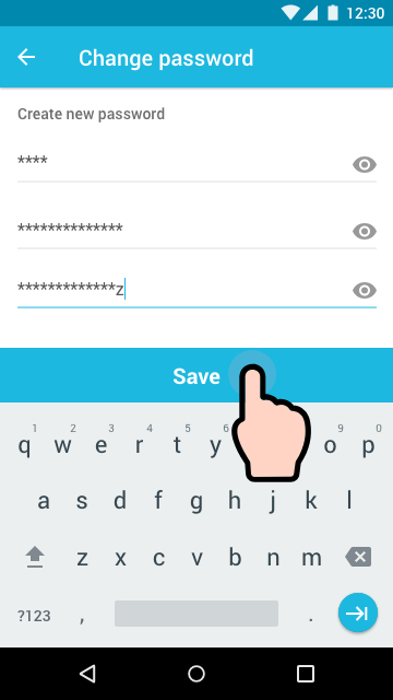
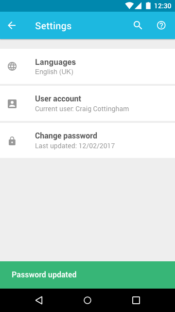
If the user wanted to change their password, all they have to do is enter their current password, followed by entering and confirming their new password. Once the user has tapped Save, the password will be updated.

Byte Ya Matez

User interface /

Hack24
byte ya matez

Hosted by Tech Nottingham, Hack24 is a 24-hour coding competition based in Nottingham City centre.

Teams of up to four people compete for some awesome prizes by starting with innovative ideas and building them into new things.

esendex challenge

Our team, decided to work on the Esendex brief.

The aim of the brief was simple;
“Make communication (and the world) better!” 

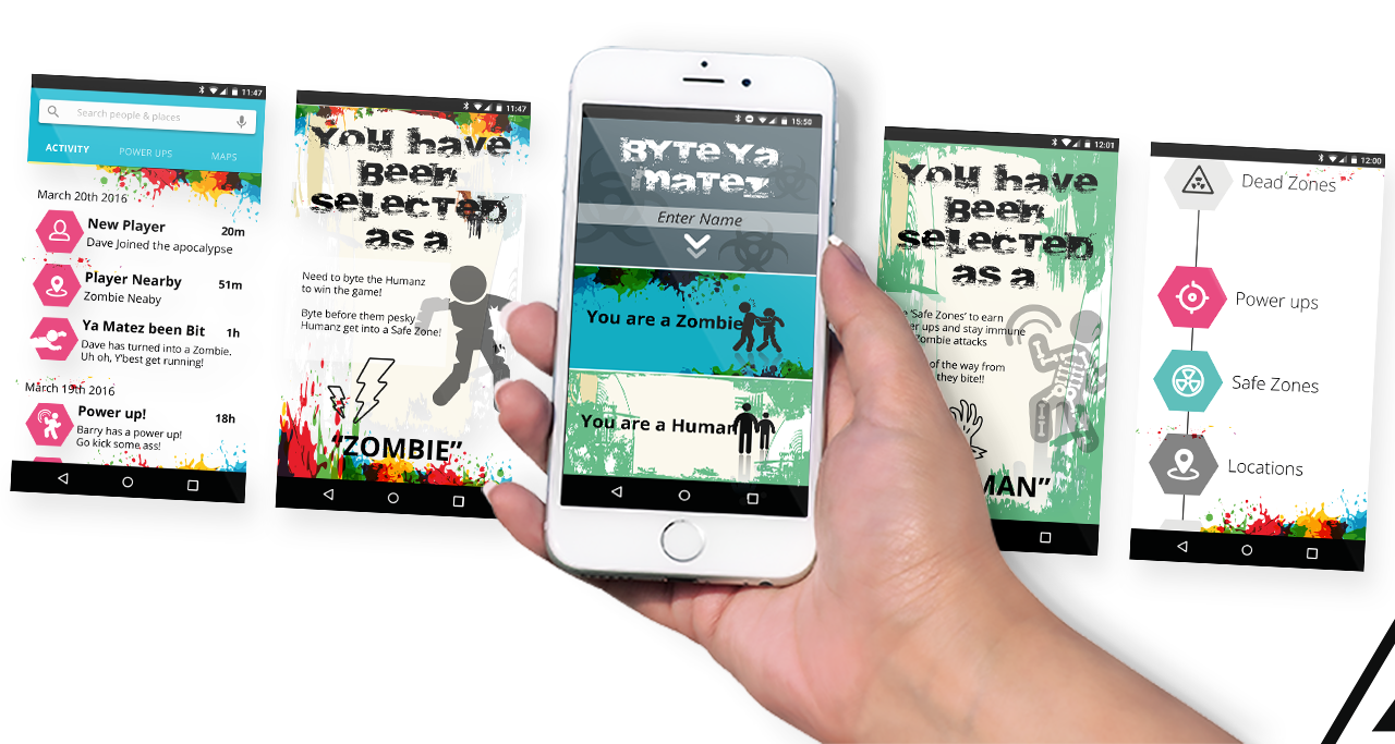
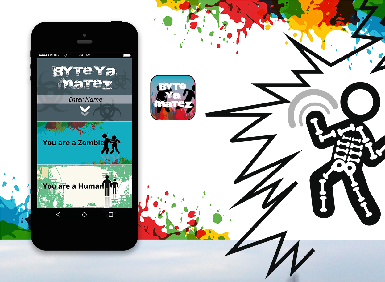
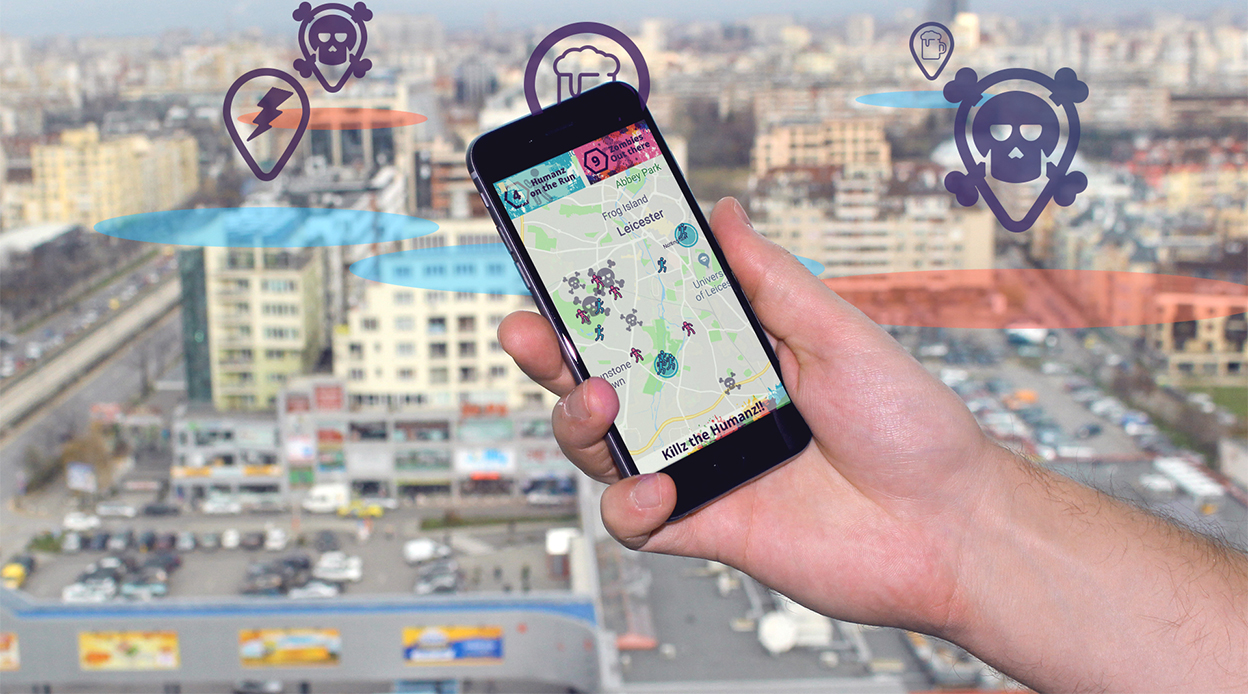
Teams received bonus points for using Esendex products. We used the ‘Esendex Multi-channel API’. This allowed users to interact with each other using their mobile phones. When paired with a mapping API, this allowed us to create a virtual game of ‘tag’ that could be used with friends across the city.

Zombies vs Humans

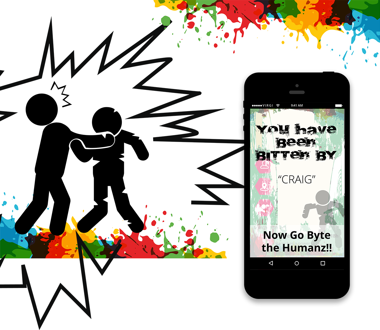
The aim of the game is simple; Chase and Tag your friends around your area. You get allocated a team; Zombies or Humans. As soon as there are no more players for one team left, then the game restarts.

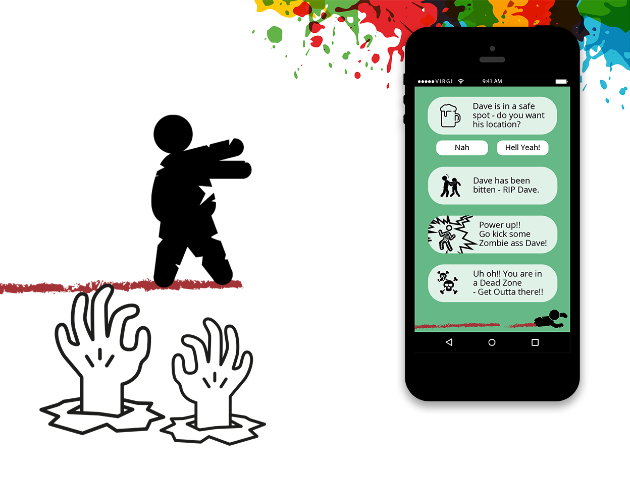
There are ‘Power’, ‘Safe’ and ‘Dead’ zones where you can call out to your friends to help each team to take advantage and swing the pendulum of your side to win the game.

You tag a friend by tapping your phone on the other players device, making sure NFC (Near Field Communication) is active.

Loading…

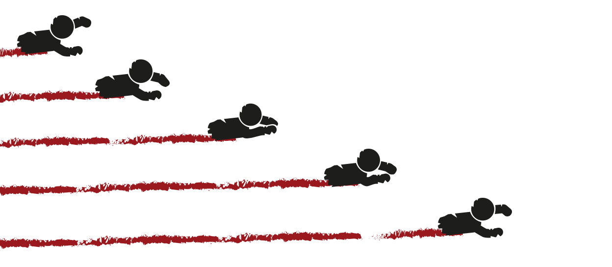
I decided to create a fun twist on the loader for the app. In the true spirit of zombies, the body would crawl across the bottom of the screen whilst the page loads.

Zombie loading bar example

Status bar

These are the status indicators showing the number of players currently on each team. As players swap between groups; the Humans or Zombies counters change.

Notifications

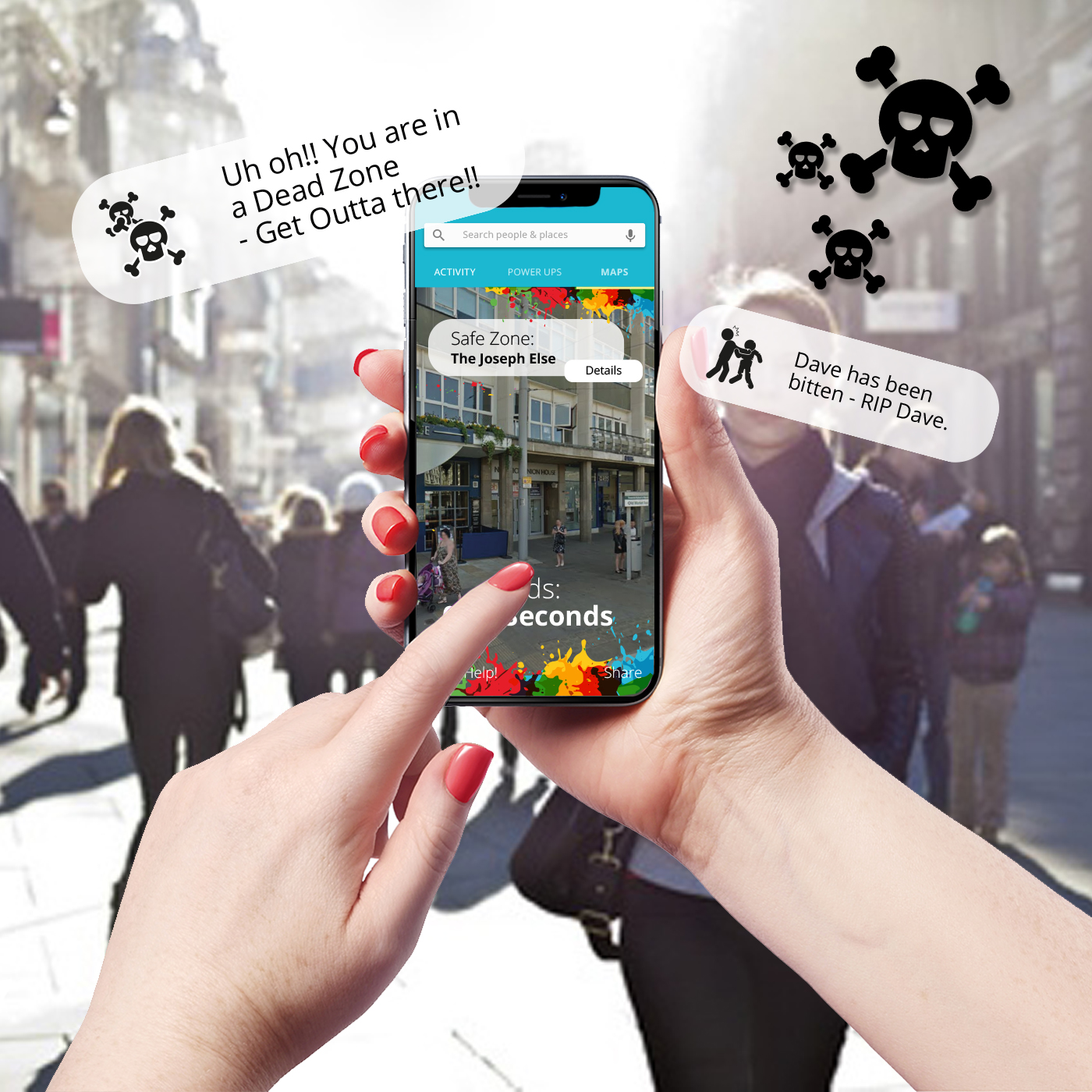
No game is complete without relevant notifications explaining the situation of yourself and friends within your area.

UNiDAYS Native App

User interface /

UNiDAYS
NATIVE APP

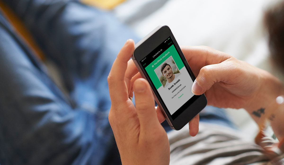
My job over an 8 month period was to think up slick UX / UI and work with my team to develop a native iOS and Android app, ready for the start of the start of the new educational year.

WHAT UNiDAYS DO

UNiDAYS are the world’s leading student network, with access to over 10+ million students worldwide.

Providing multi-channel campaigns and solutions to help reach students – the highest value consumer group of all time.

10 million total verified members

50,000 monthly verified member growth

18.4 million monthly user sessions

48 million monthly page views

6.5 million total monthly engagement

14% average user conversion rate

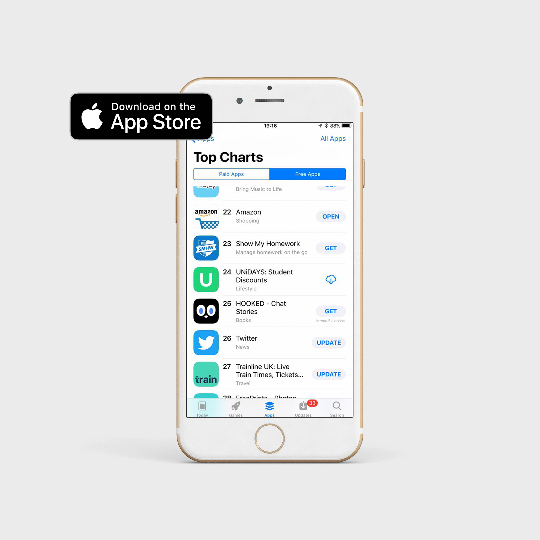
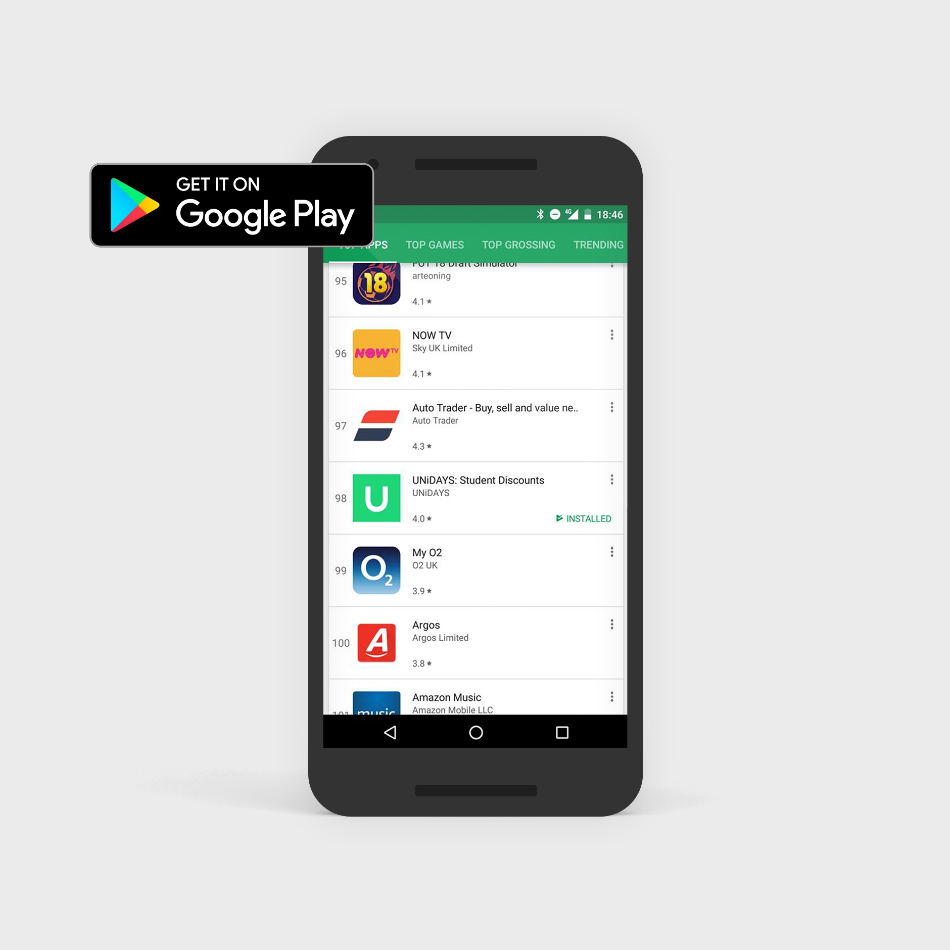
APP STORE & GOOGLE PLAY

It was an incredible moment for everyone when the UNiDAYS app broke into the App Store top 25 and Google Play top 100.

User interface

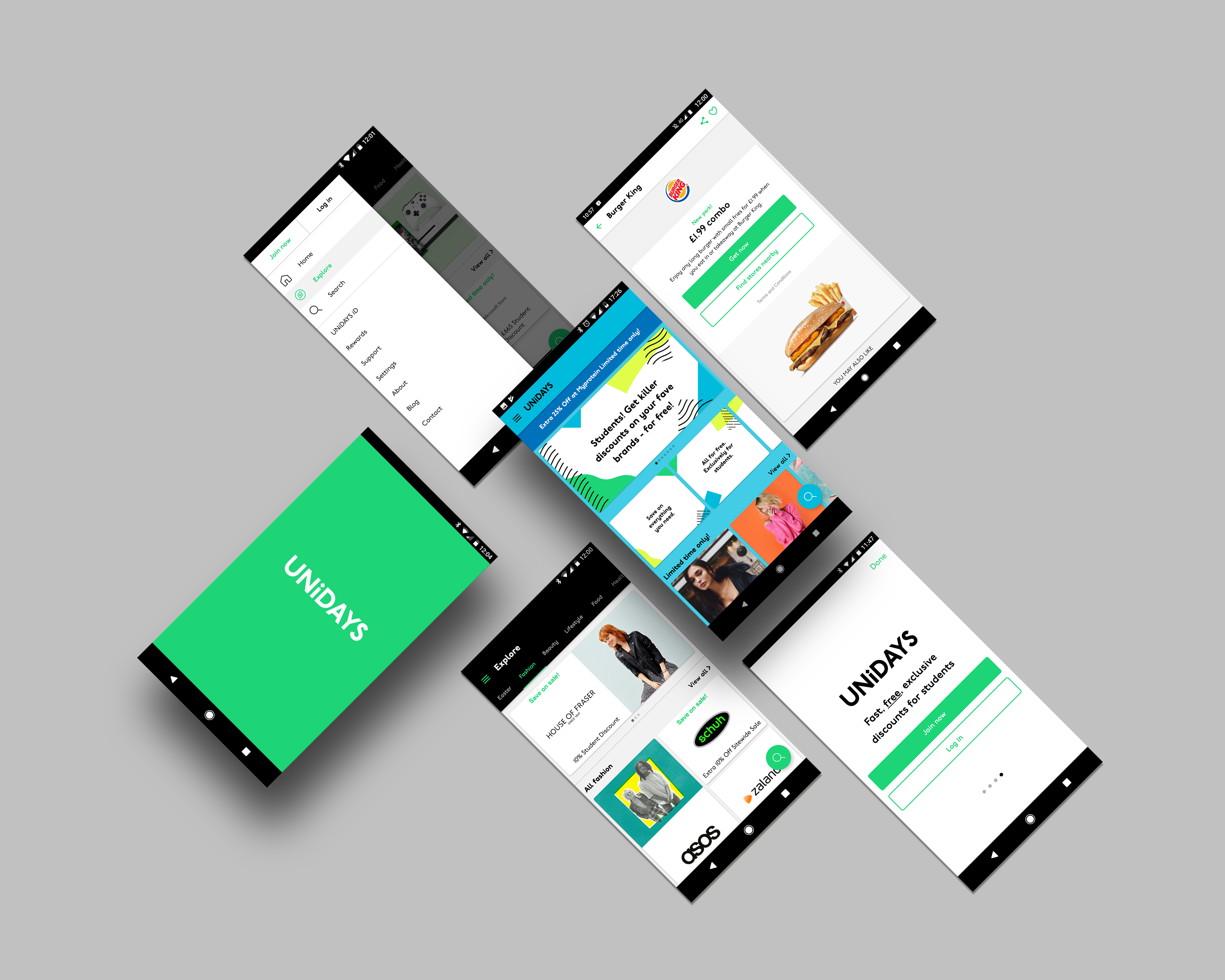
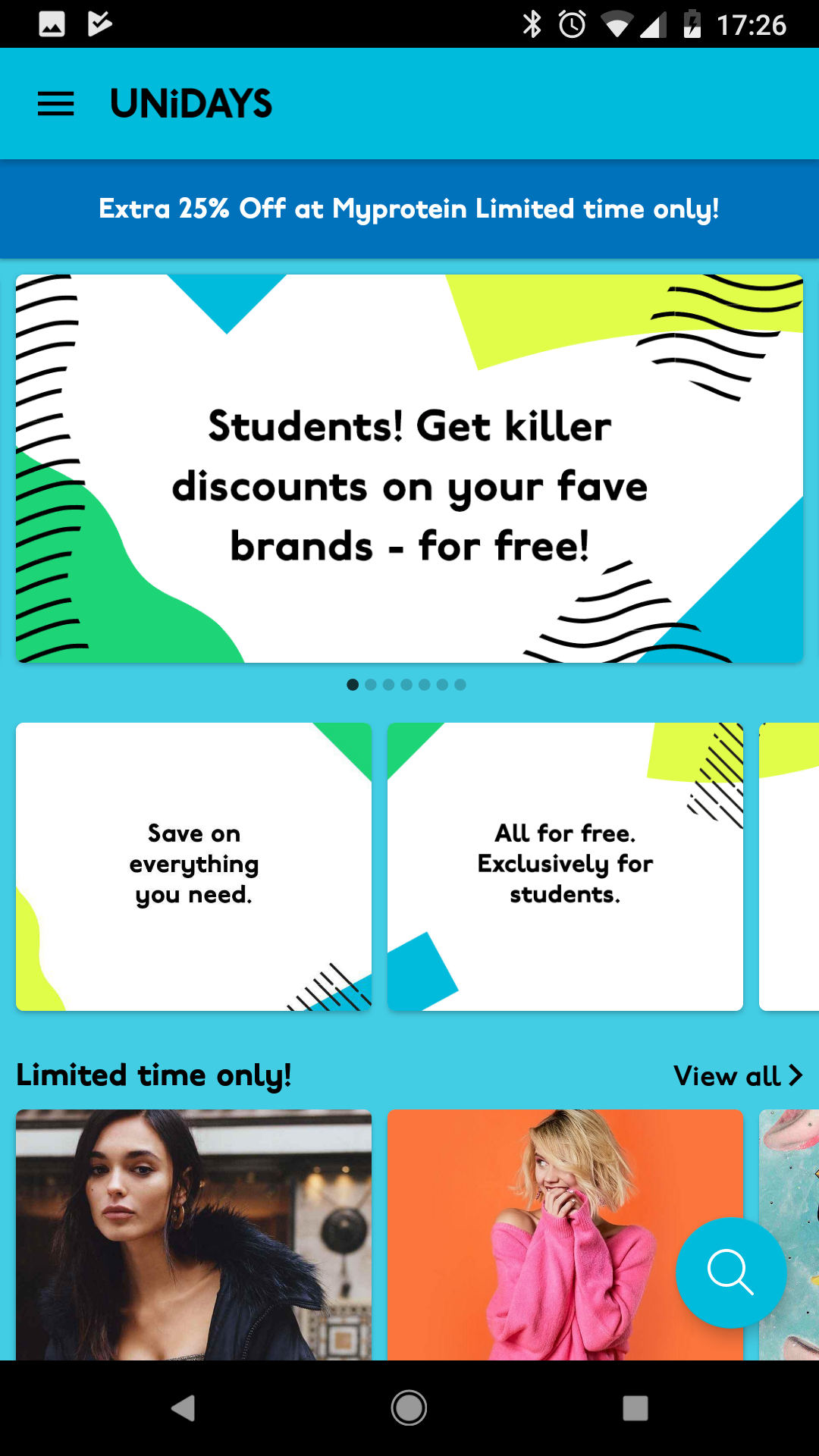
When the app opens, I created a loading animation. This allowed time for the app content to load all the Perks within the homepage. The iD was highlighted in the beginning to represent Student ID.

Introduction screens

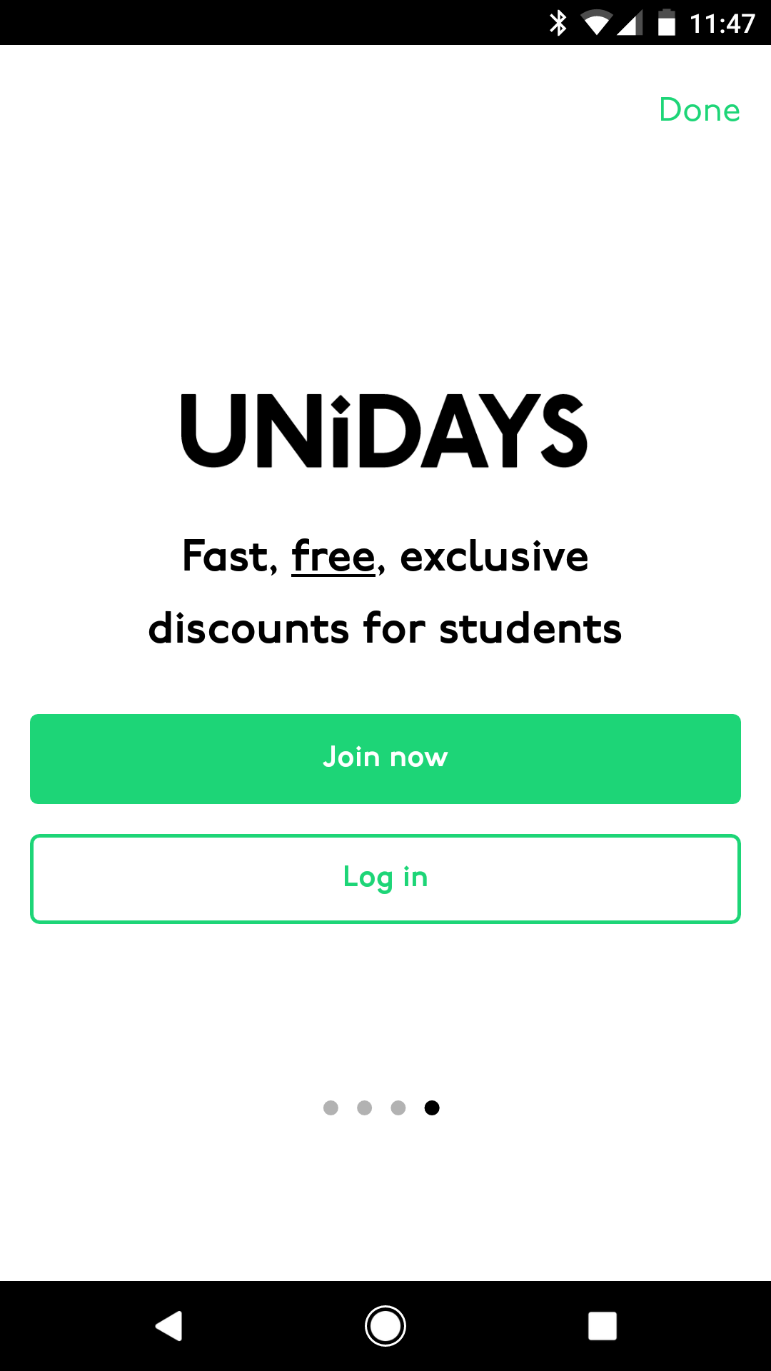
As well as the animation, I created a few introduction screens that explained the benefits of joining and having a UNiDAYS account.

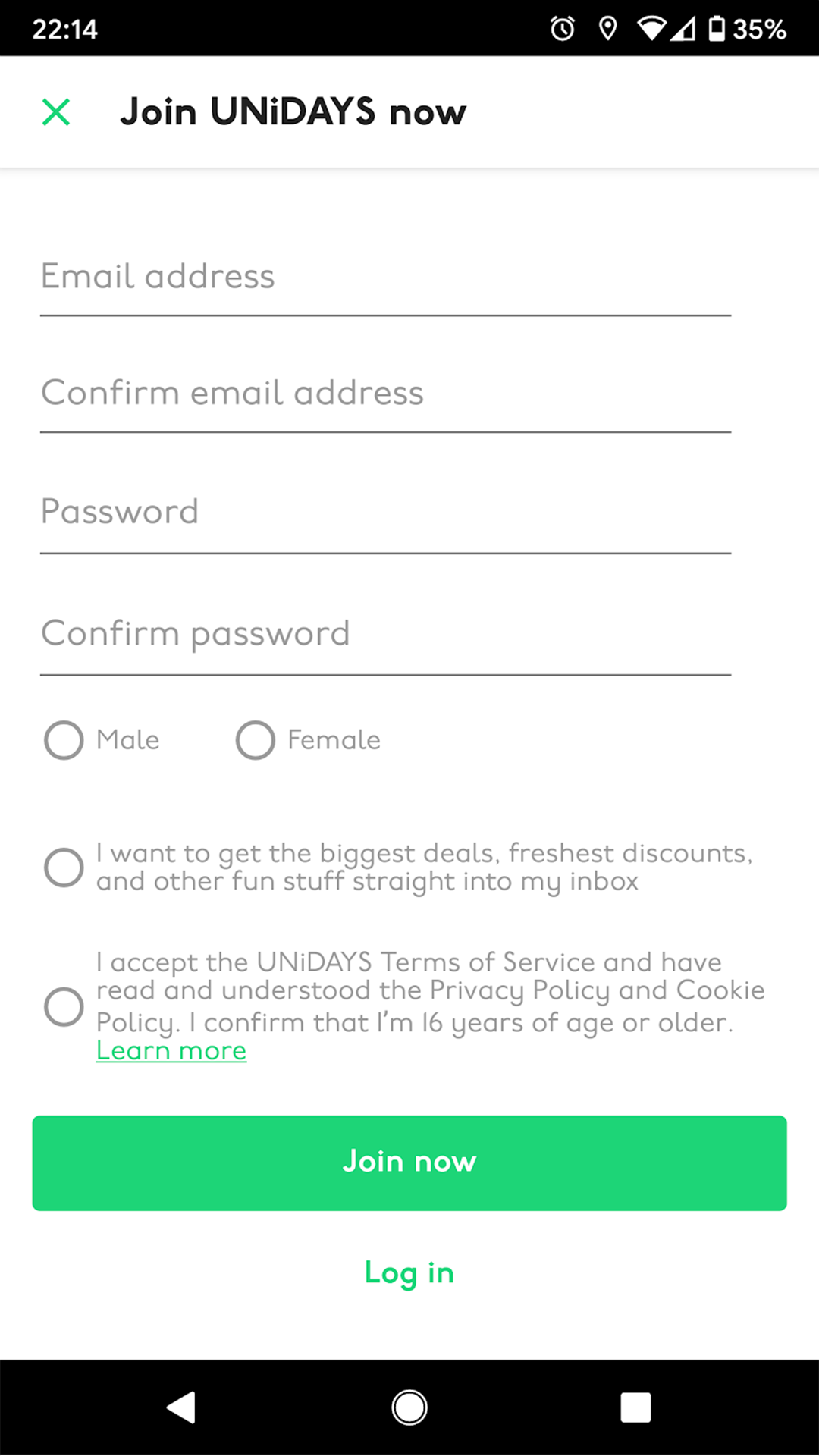
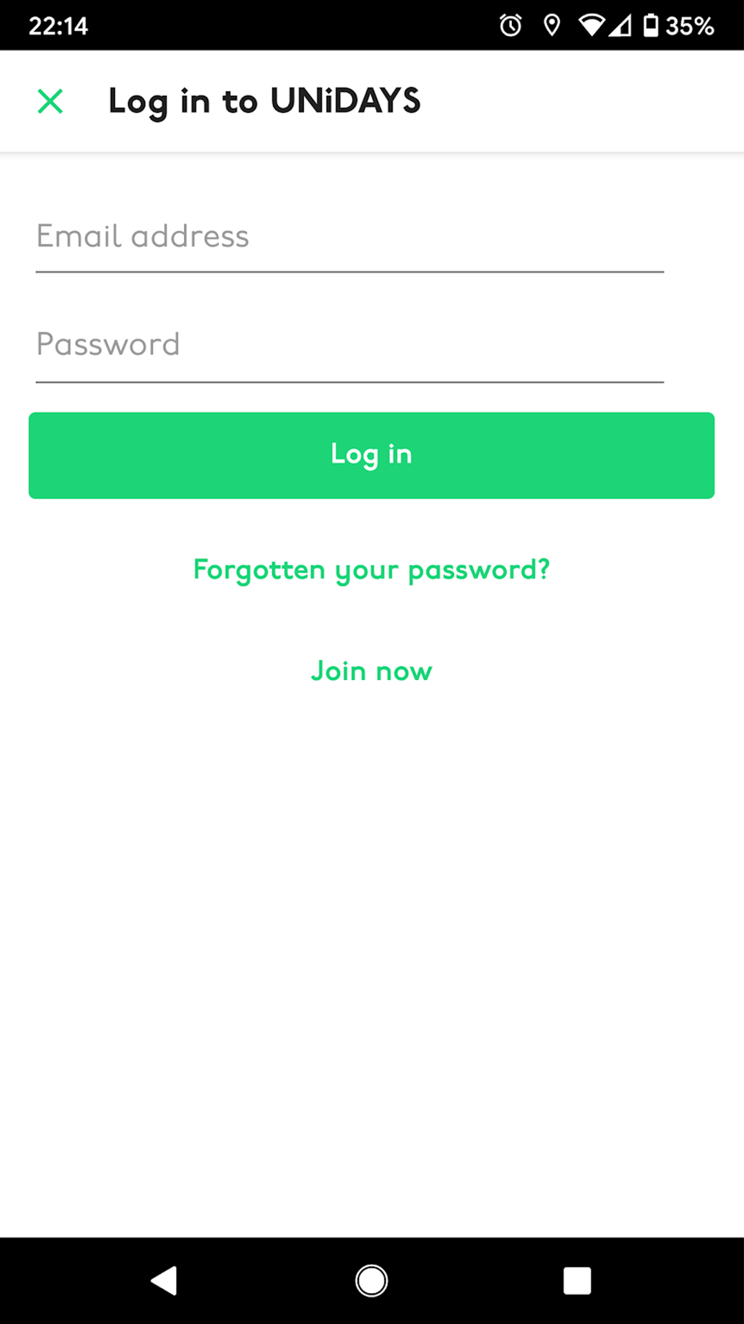
Login screen

Upon logging in, users are taken to the homepage. This is where the main brands pay for exposure, as well as limited-time offers.

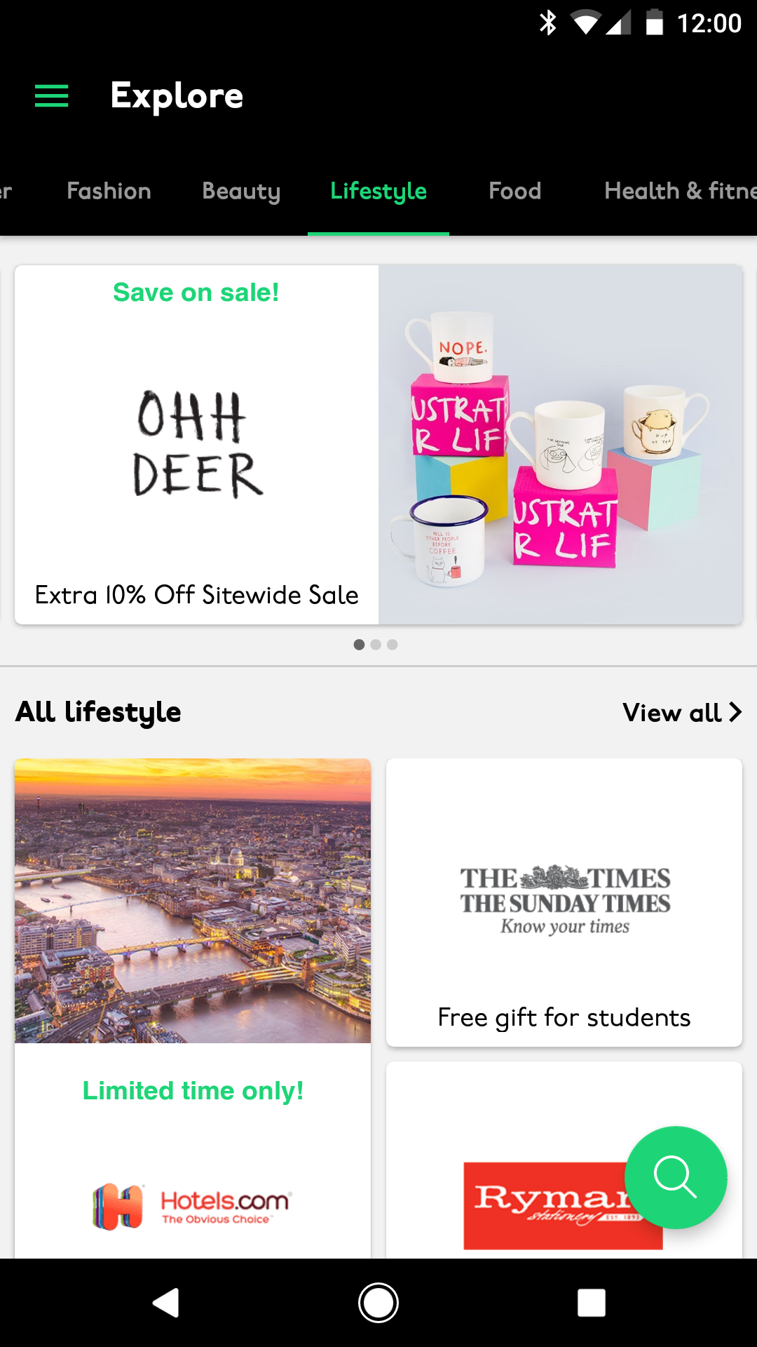
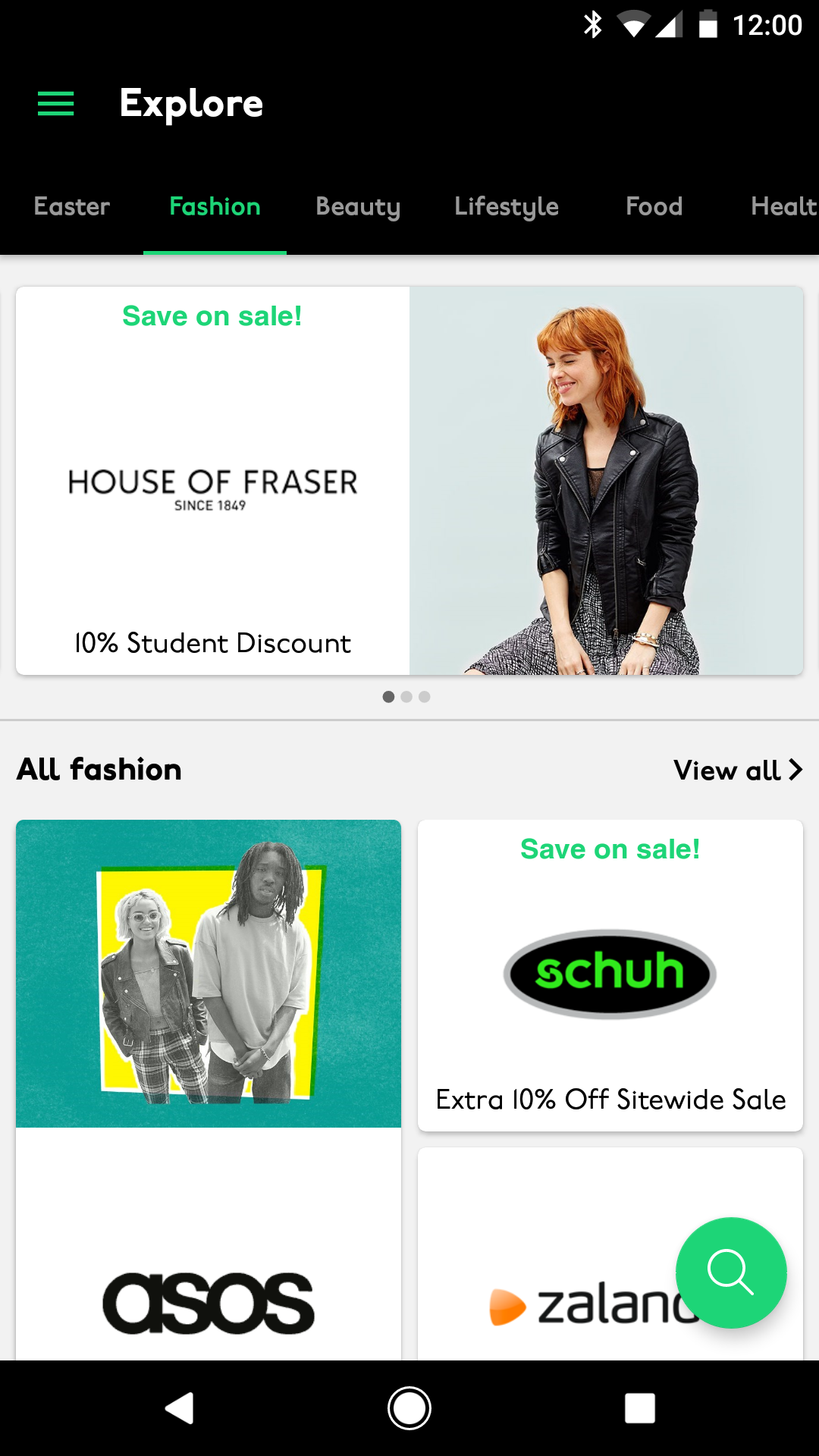
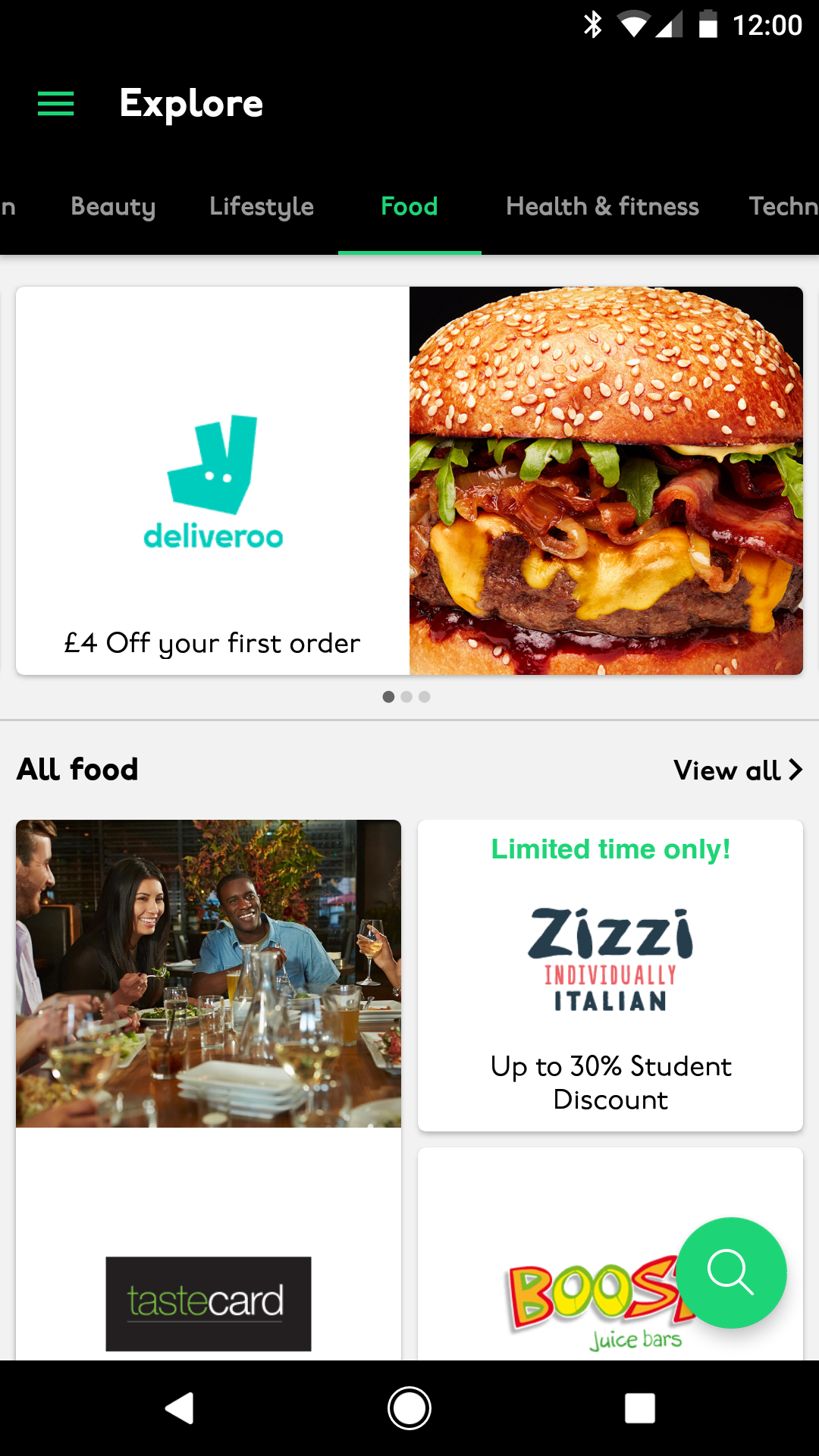
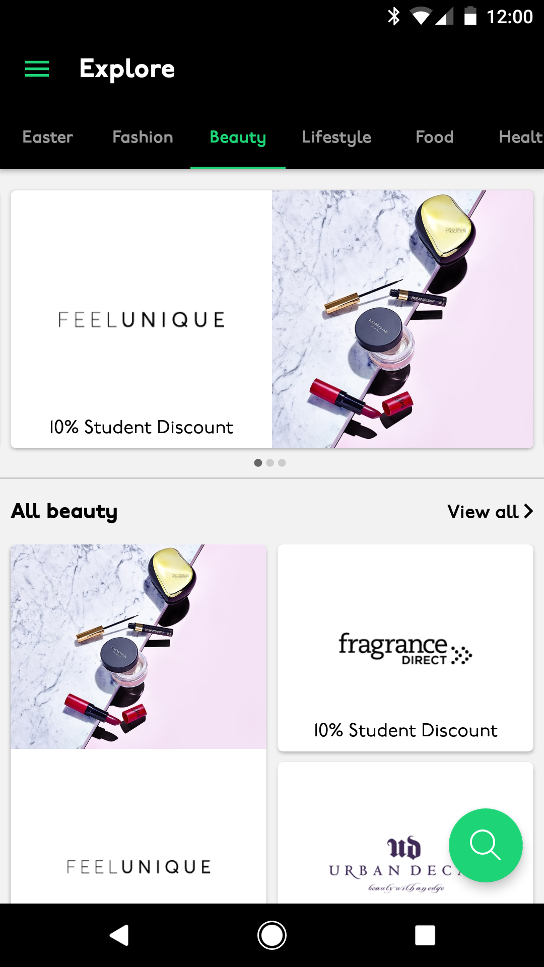
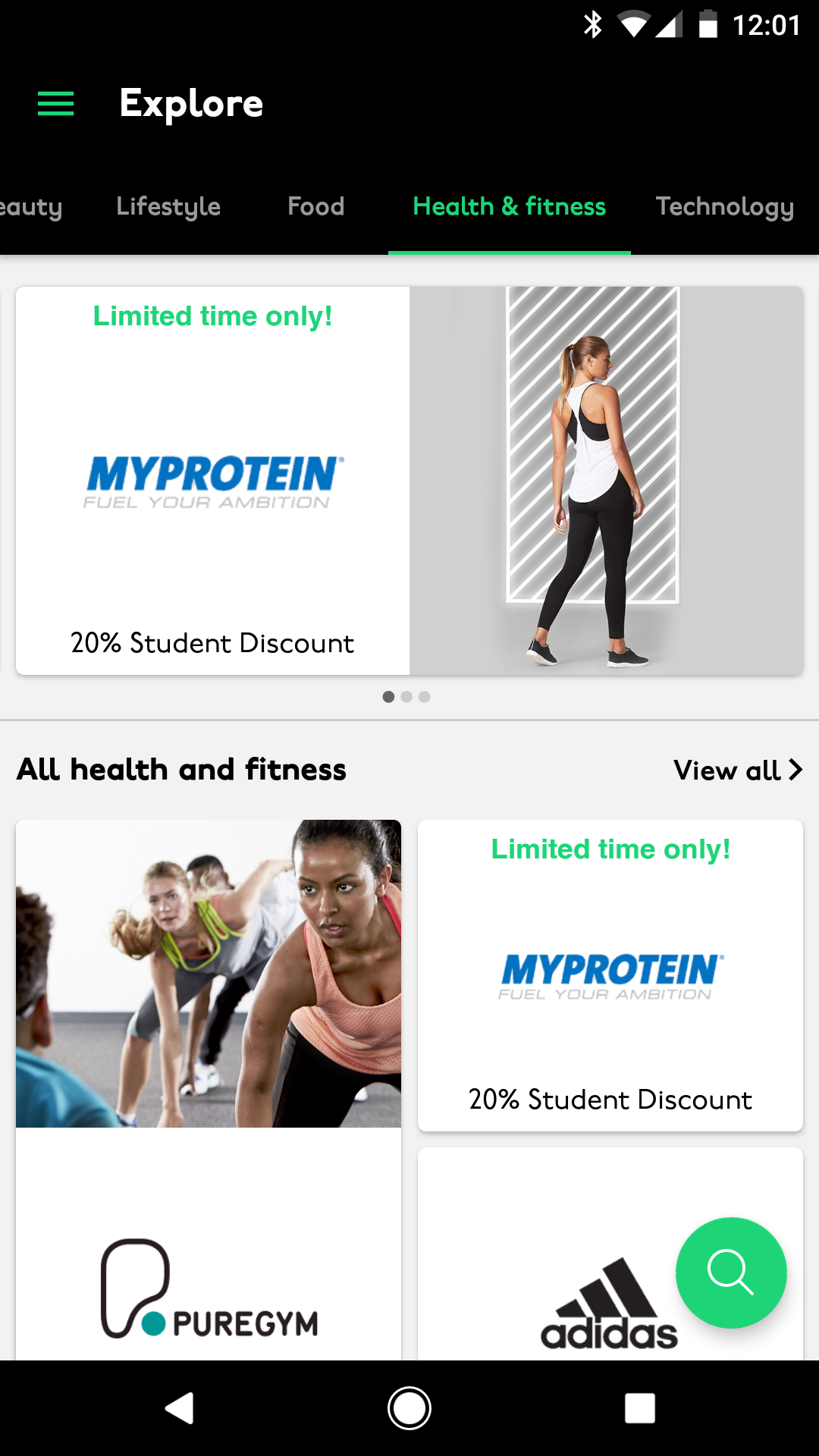
Explore (for Android)

Perks were in groups of type, so users could swipe between the pages to see the other areas.

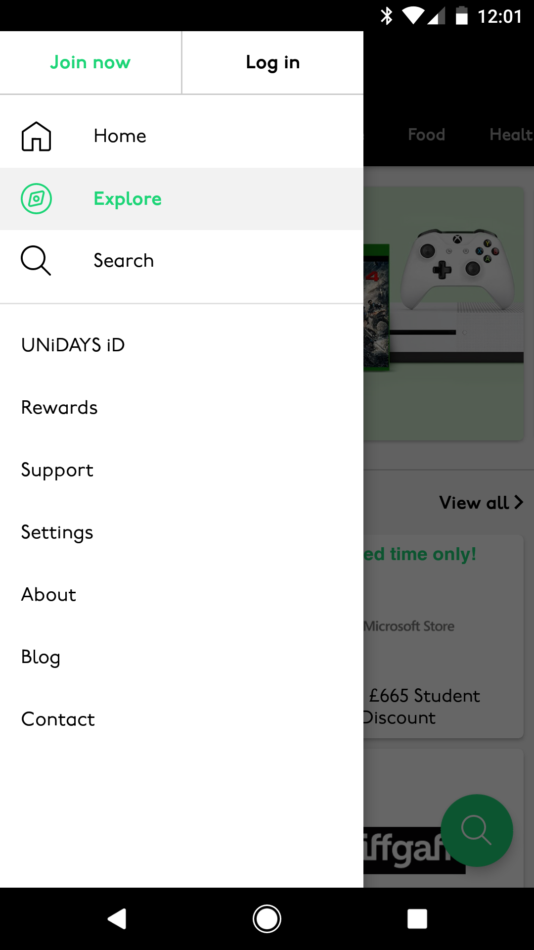
This area was one of the main differences in native UX between Android and iOS. Android interface uses swiping and the Hamburger navigation to get between pages, whereas the iOS interface uses main sections along the bottom navigation.

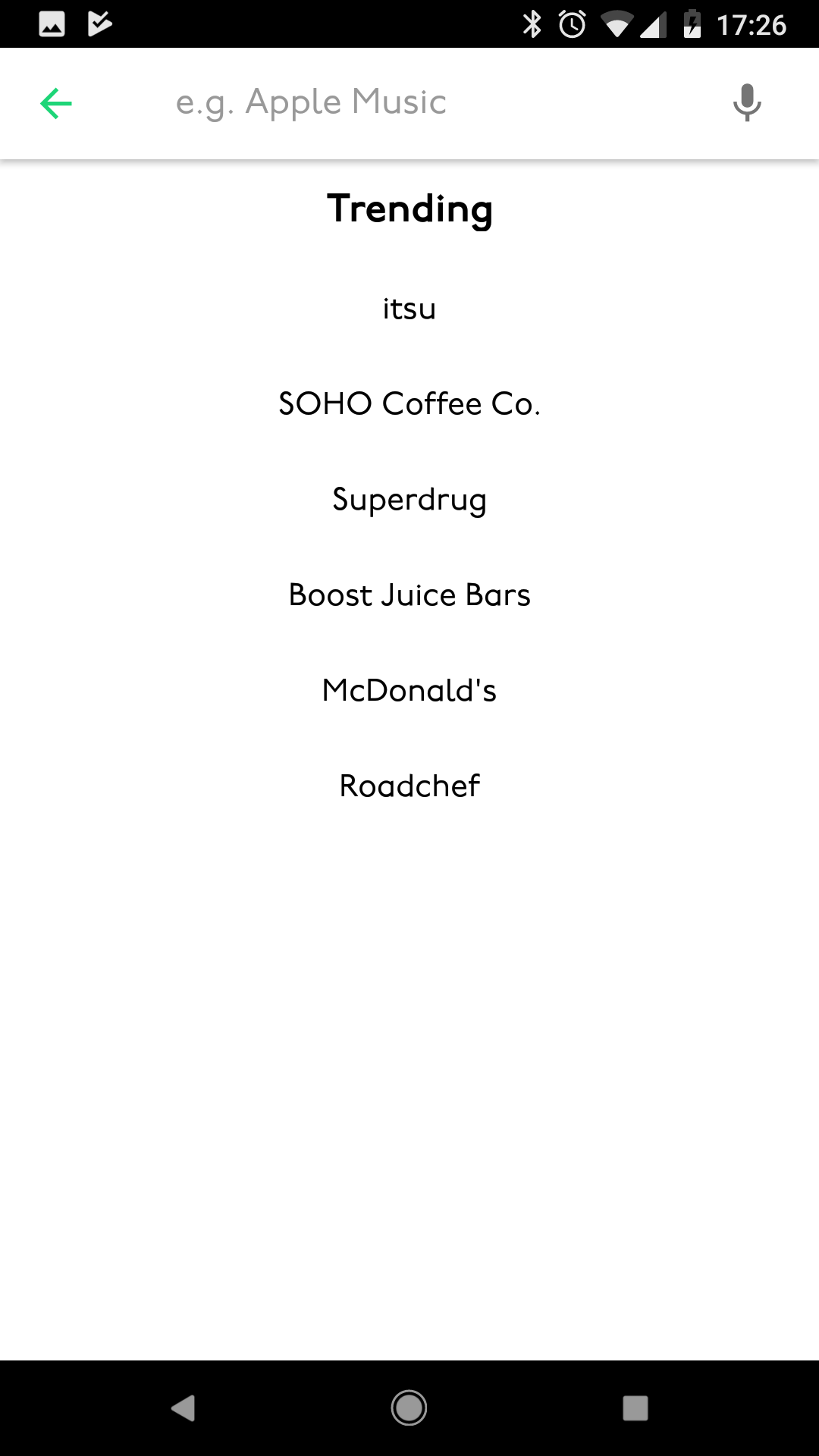
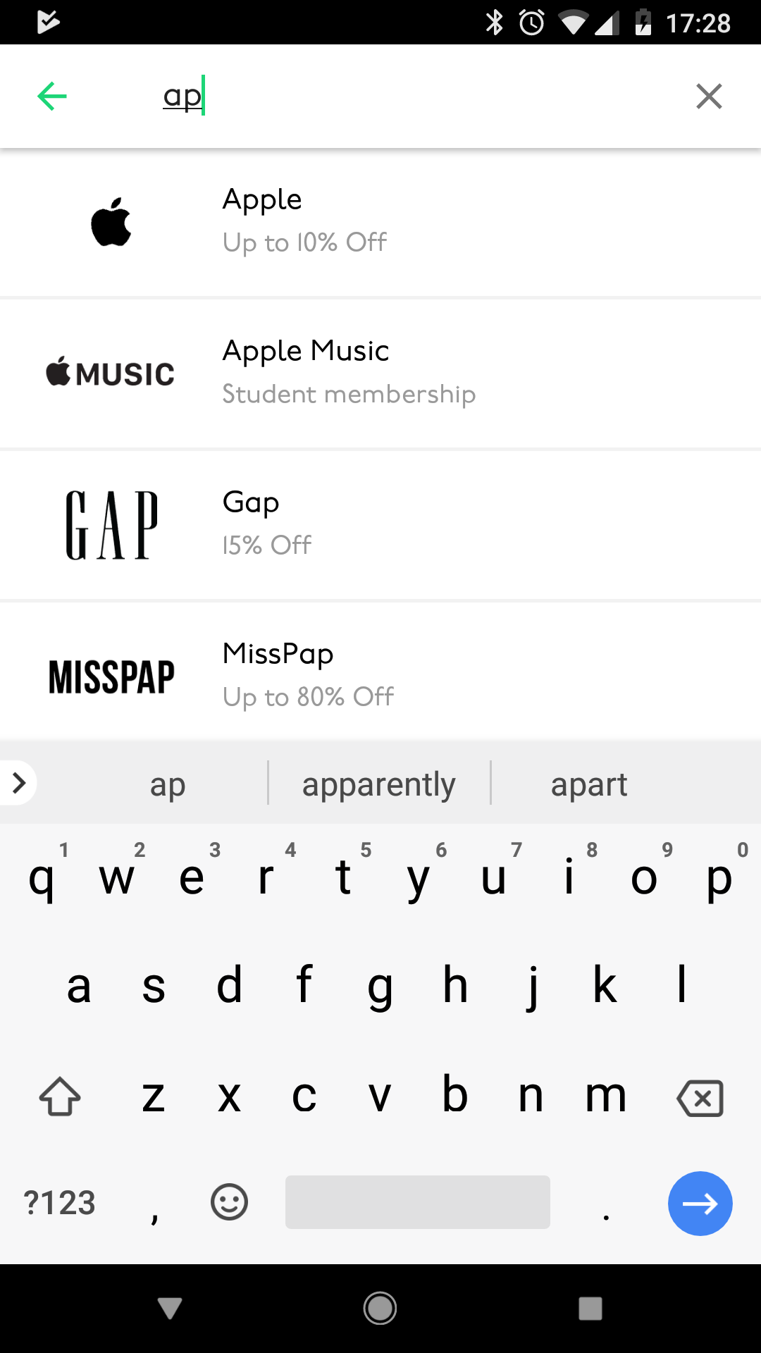
Search (for Android)

Searching within the Android app was done by hitting the floating action button at the bottom right of the screen. Doing this opened up a new page where it showed previous search results.