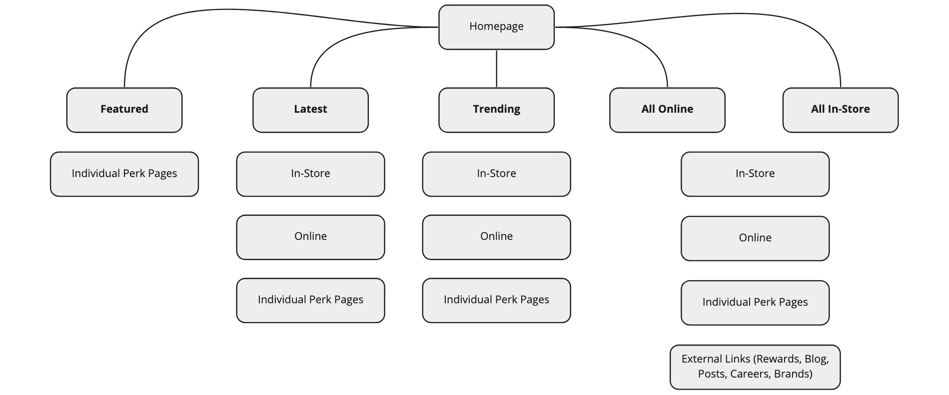
Ikanos Pro Series
User interface /
Ikanos
Pro series
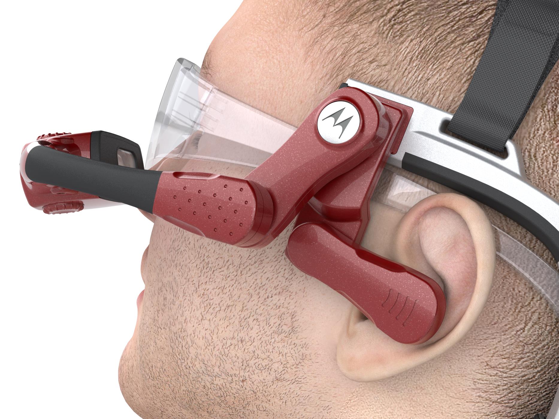
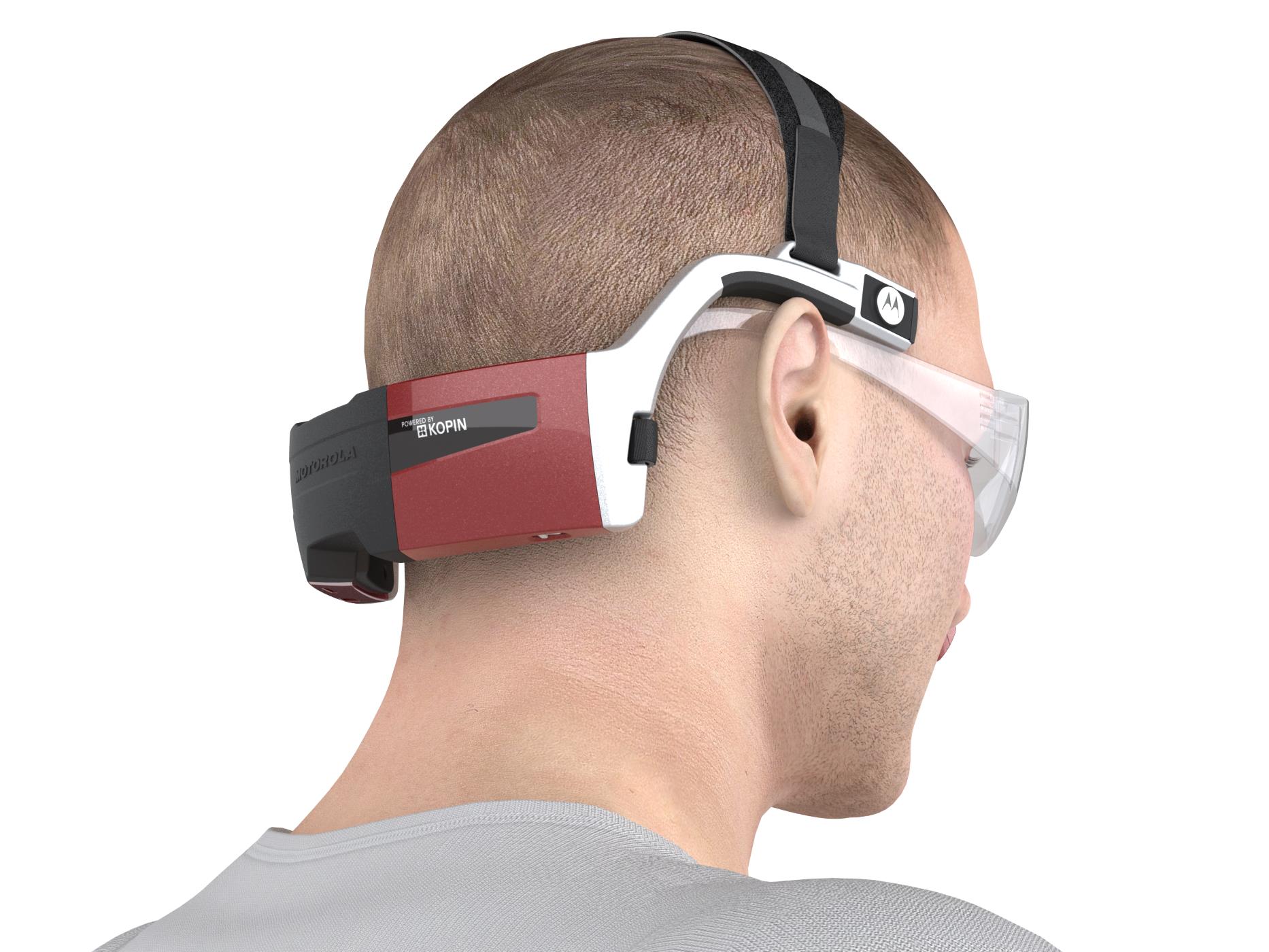
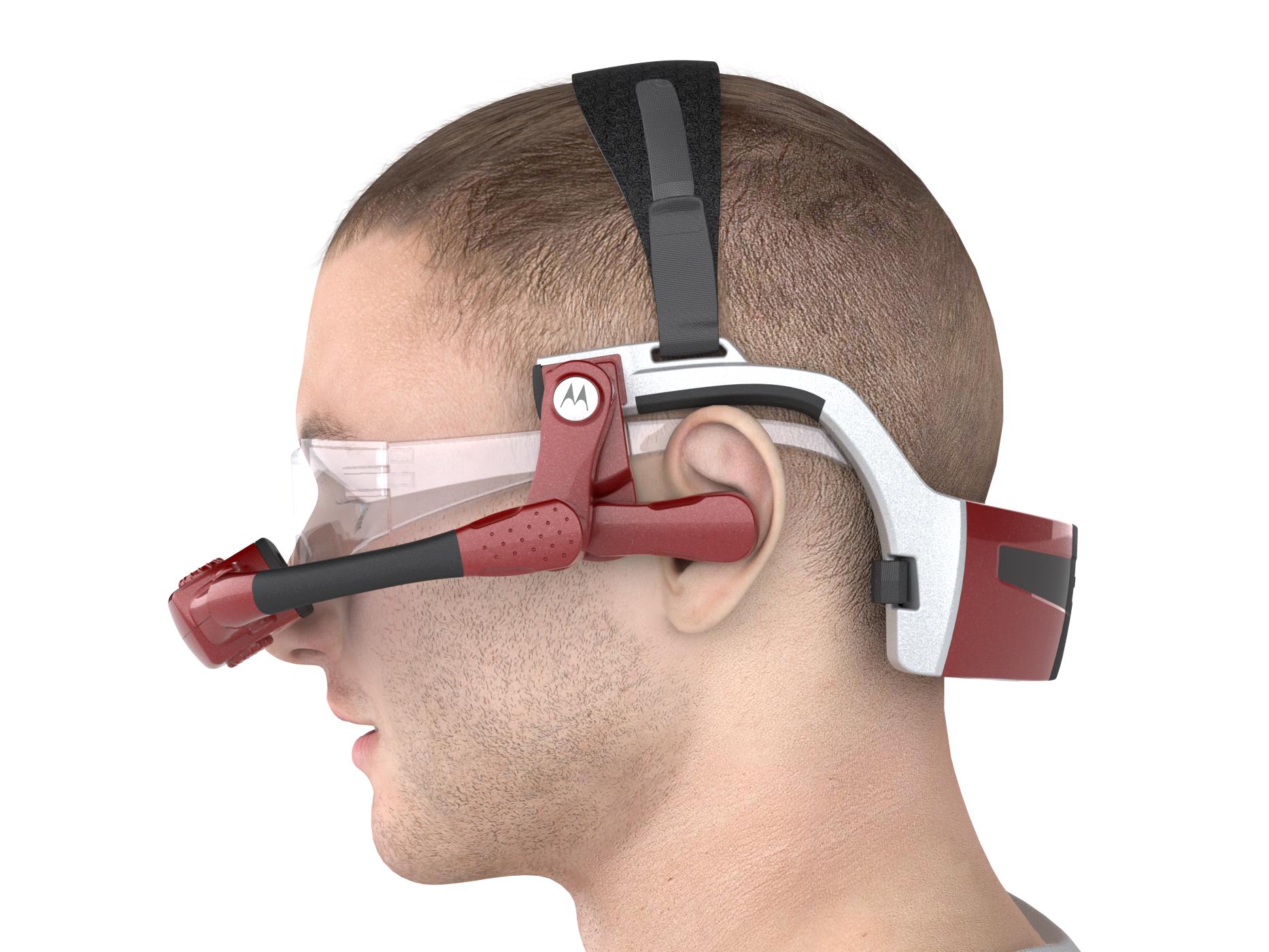
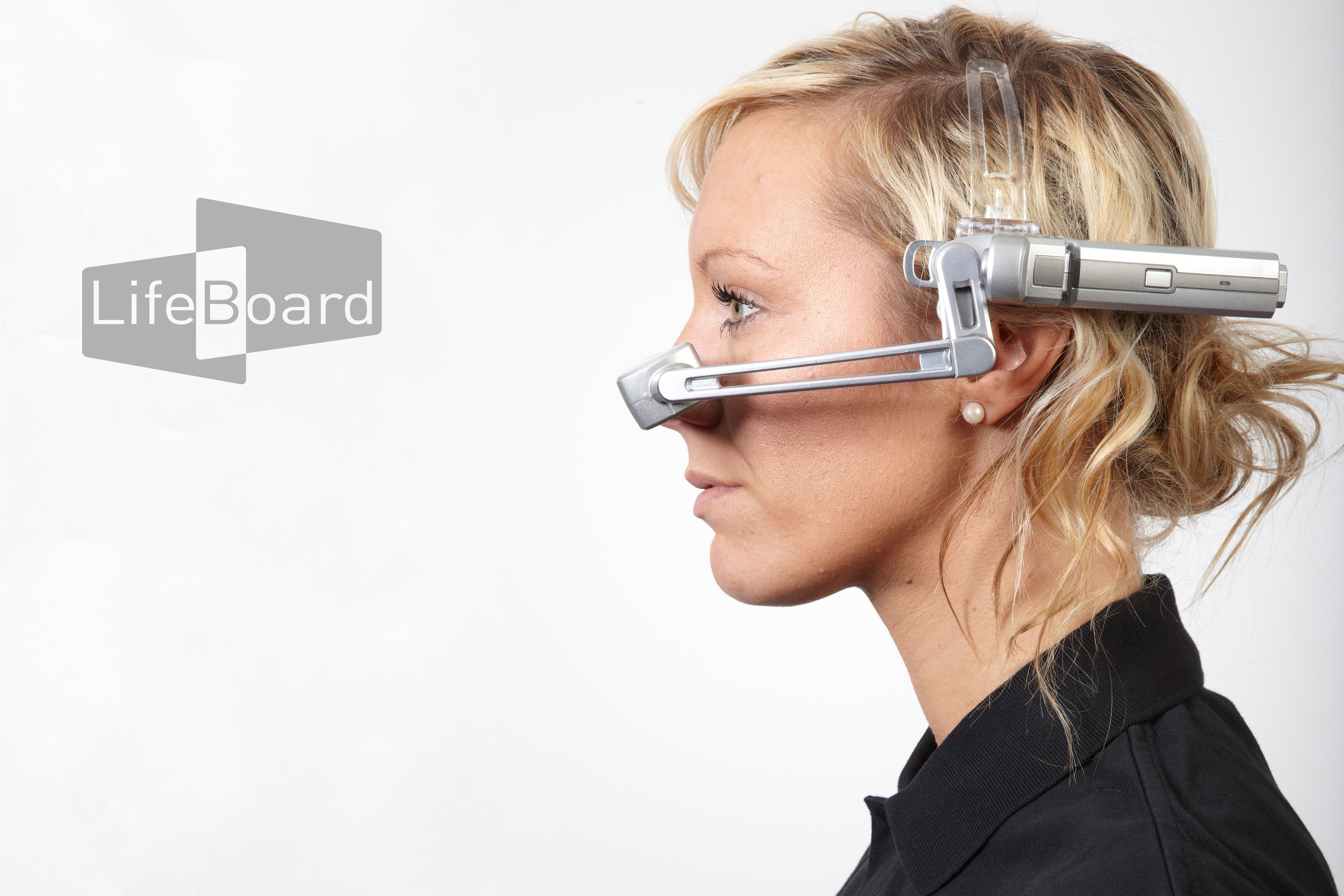
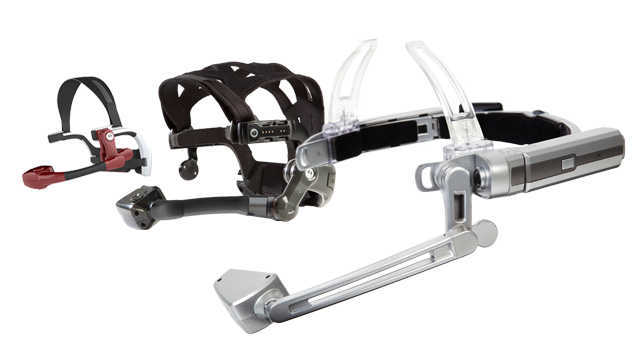
Golden-i is a hands-free computer that you control by voice commands and head gestures. The main aim of this technology is to assist the wearer during their daily jobs, allowing the user to keep their hands free while working.
GOLDEN-i OPERATING SYSTEM
(Gi-OS for short!)
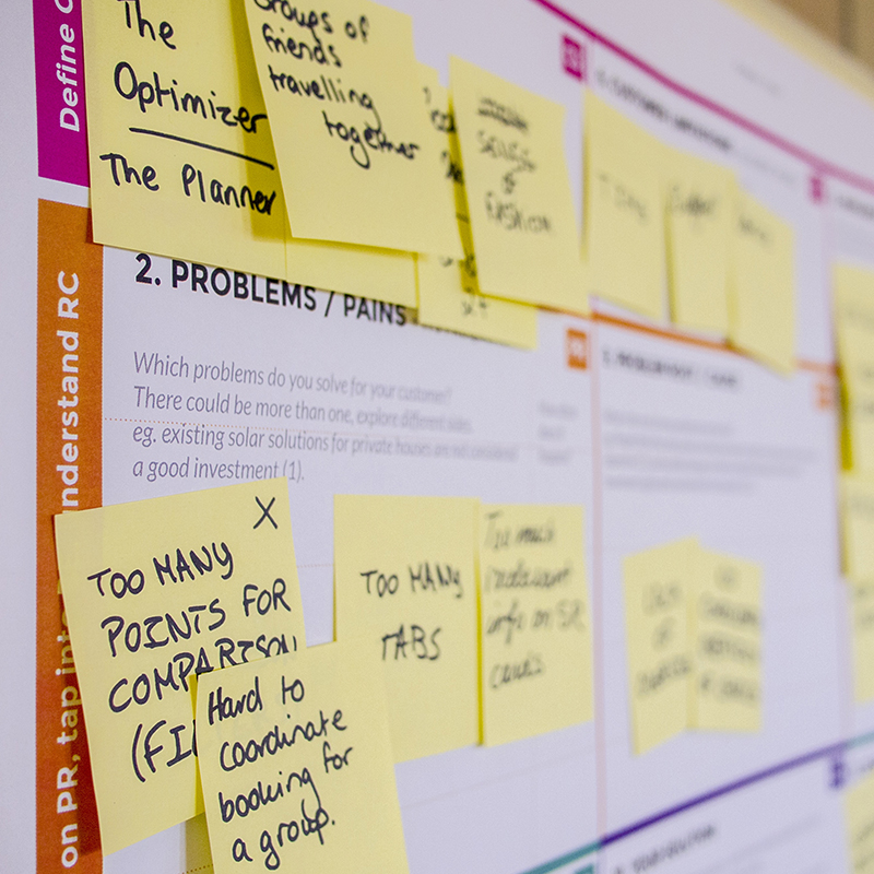
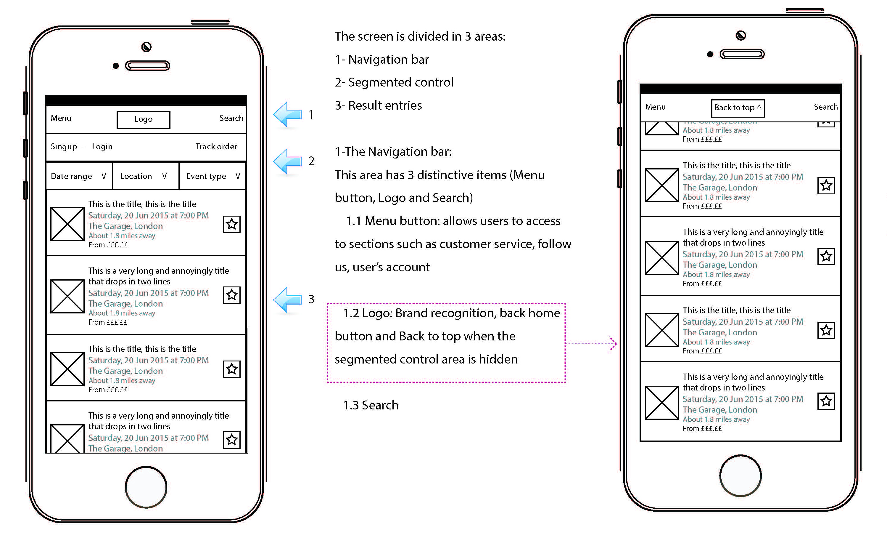
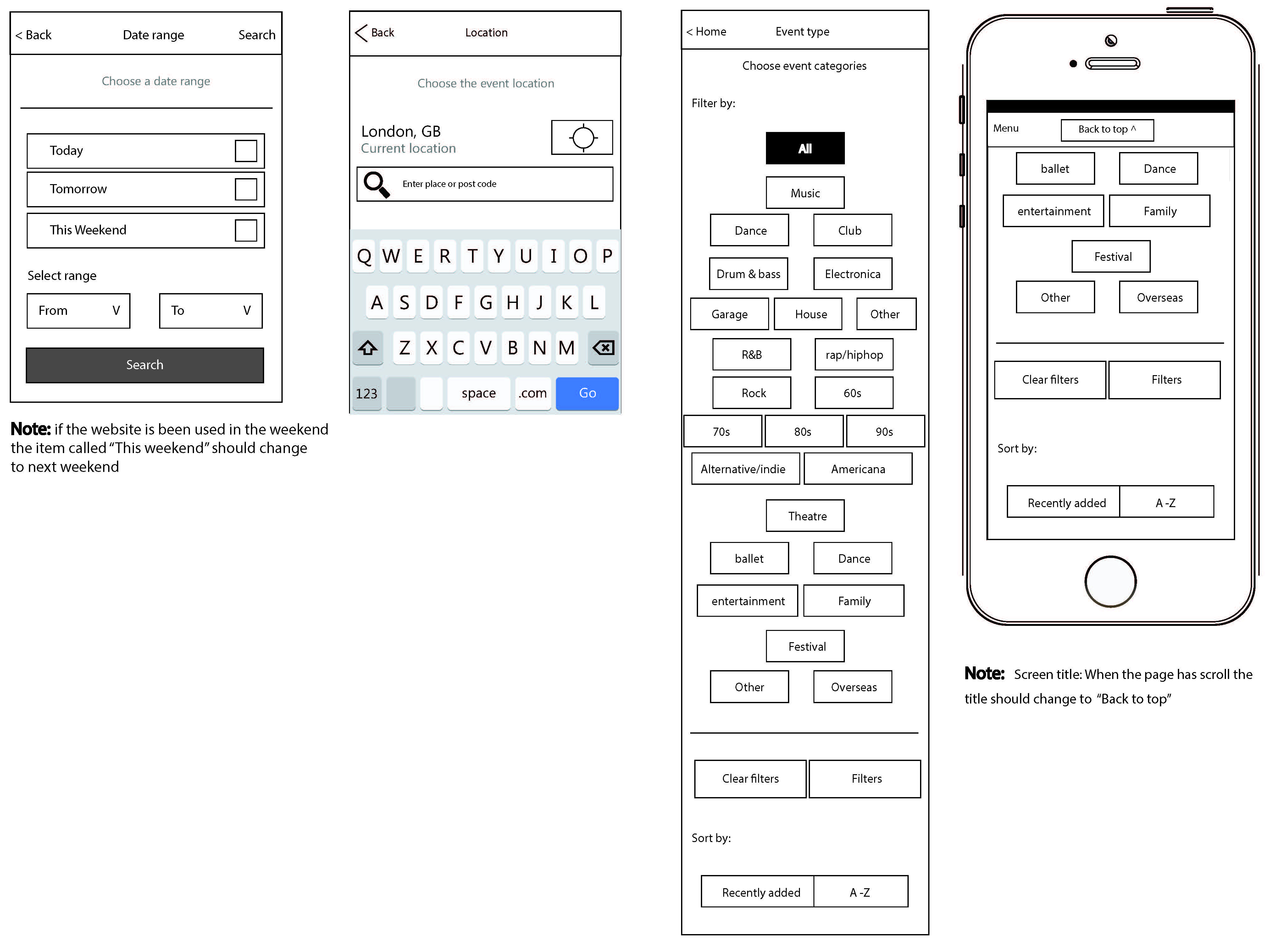
The Gi-OS had to be simple, it was going to be part of something incredibly complicated, so it needed to be easy for the user to use and relate too.
GOLDEN-iOS v1.0


Generating new ideas.
Solving big problems
We created a sophisticated user interface and a comprehensive set of built-in applications to go with it – this set of applications was called the Prosumer Series.
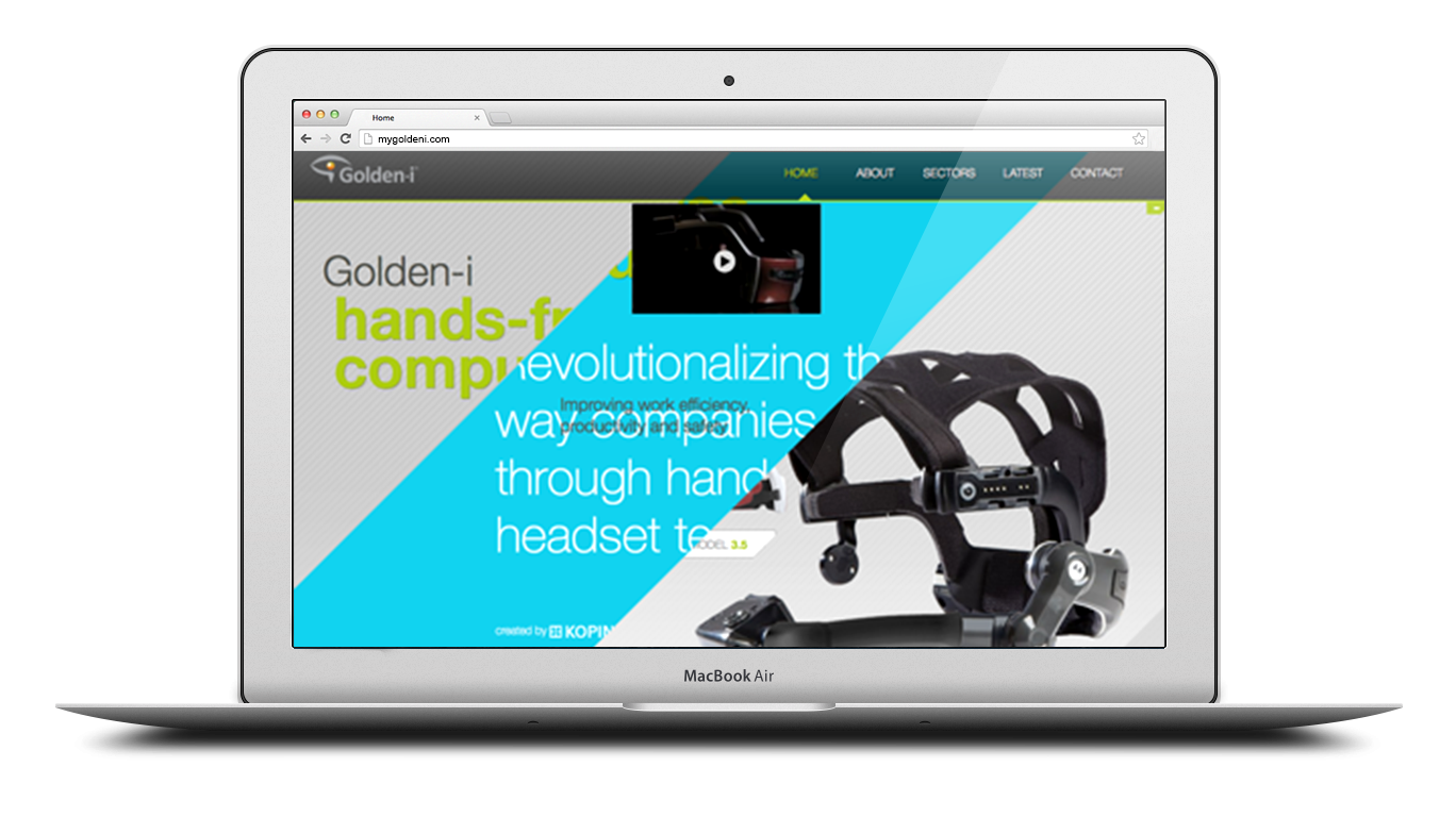
Website
mygoldeni.com
Every January CES (Consumer Electronics Show) takes place, and we wanted to go to impress.
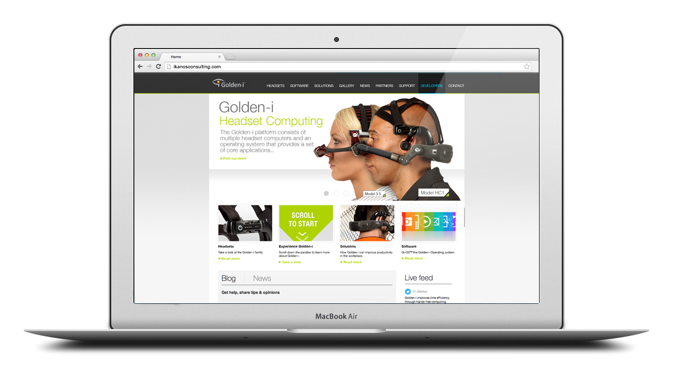
I worked closely with the Marketing team to create web banners advertising the new Ikanos website as well as the new swanky mygoldeni parallax website.


ikanosconsulting.com
In the build-up to CES, I worked on social media to kick up excitement and reveal promotional videos to tease users with future development work.
With this came the official creation of the Prosumer Series, these were a set of built-in applications that worked on Golden-i headsets.


Consumer product
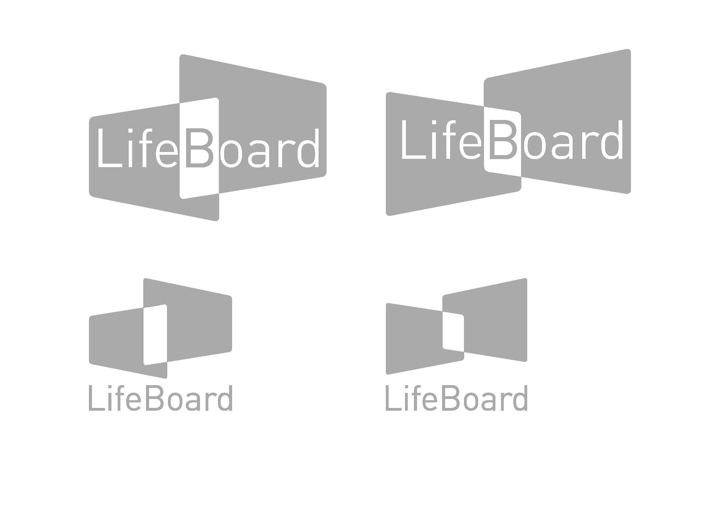
LifeBoard
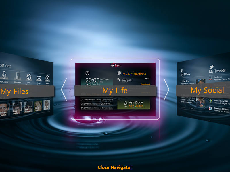
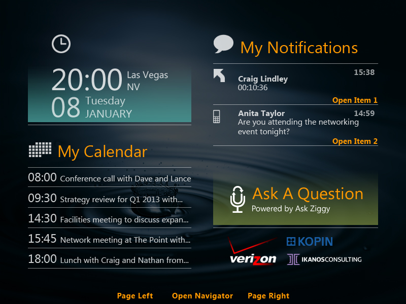
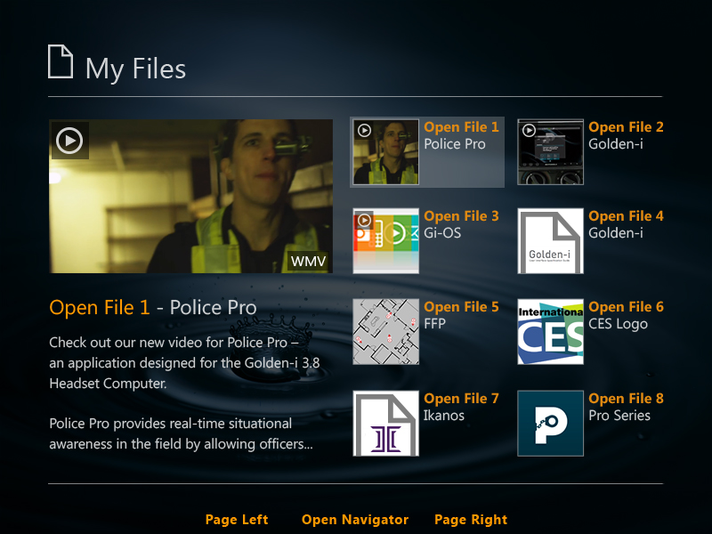
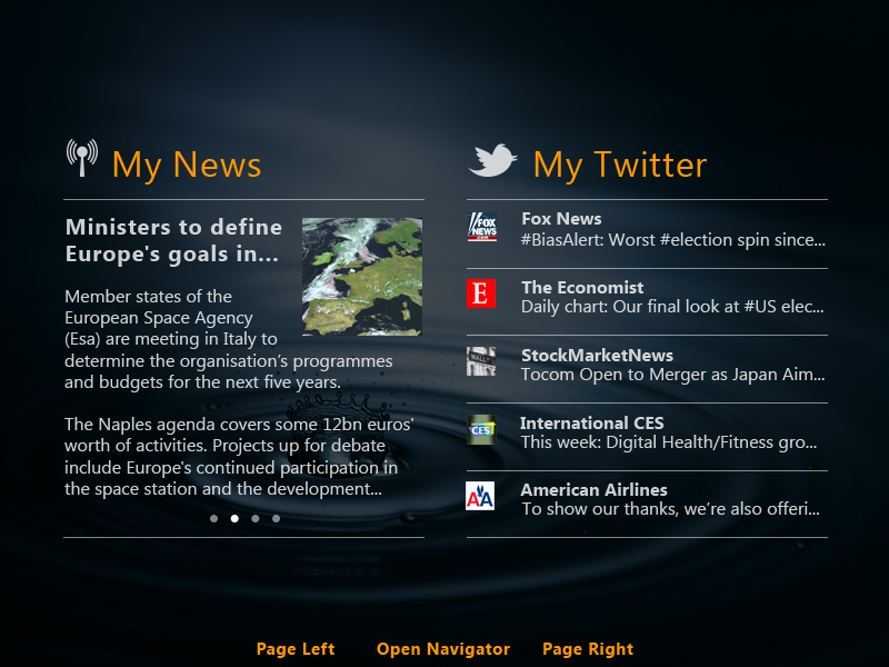
LifeBoard takes Golden-i to a different level, enabling users to customise up to 6 different screens to meet your working preferences. Designed for any working professional, by merely talking to Golden-i LifeBoard allows users to manage their day with ease by showing you your calendar along with the latest news and information:
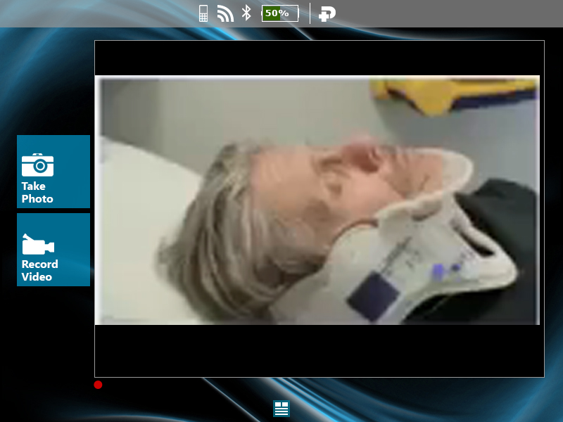
Access files and documents, watch instructional videos and browse the web.
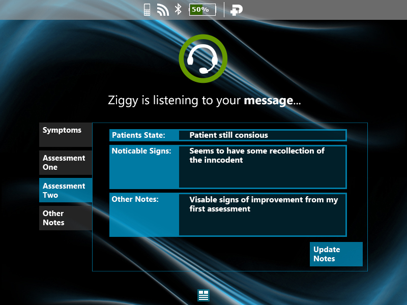
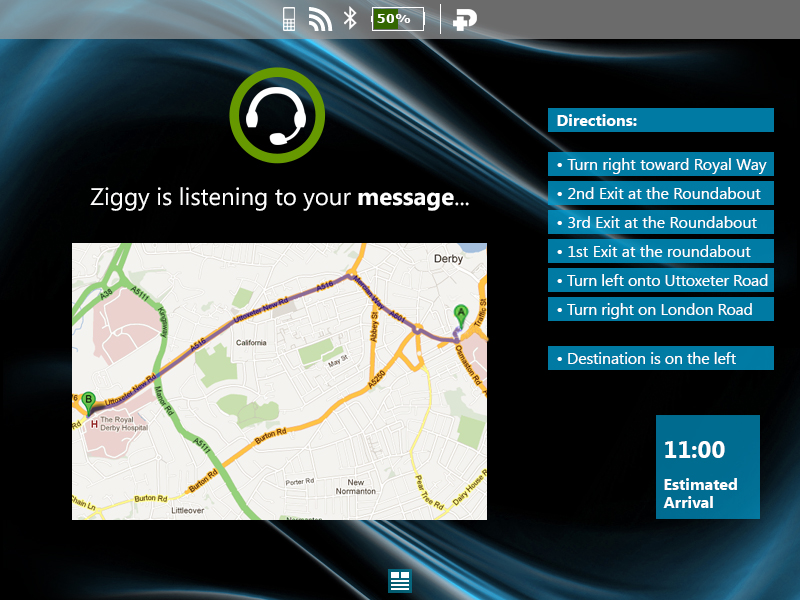
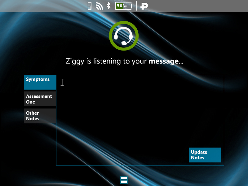
LifeBoard now includes the innovative Ask Ziggy speech-driven virtual assistant. Ask Ziggy allows users to send messages, make calls, set reminders and browse the web by merely talking to your Golden-i hands-free device.
Logo concepts
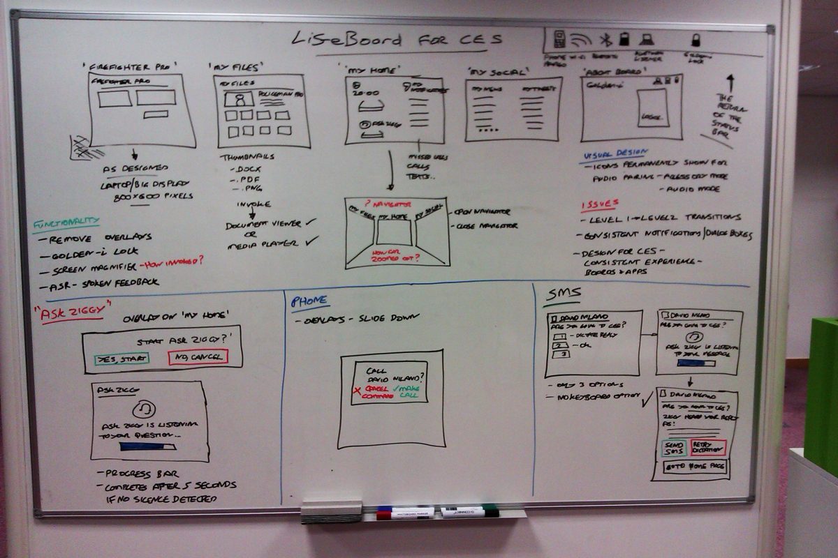
Here are a couple of logo variations for the LifeBoard brand. It needed to be simple, and give a hint of a flavour about the idea behind to concept.
User interface
Users are greeted with 6 customised screens to view personalised content; News, Calendar, File viewer, Phone contacts and Email.
The interface had to be simple, it going to have a lot of information on-screen – notifications and future events from the calendar, as well as call log history.
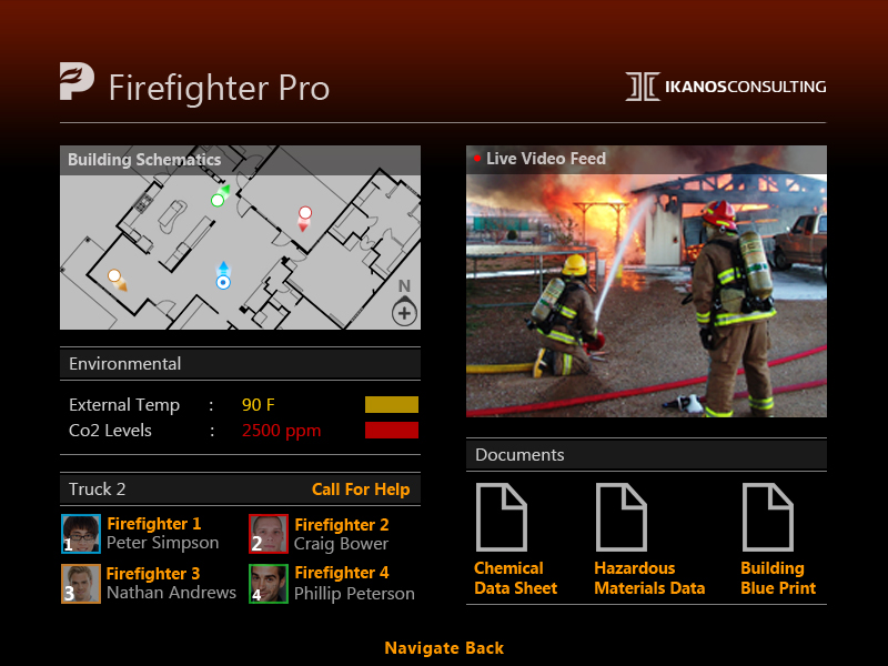
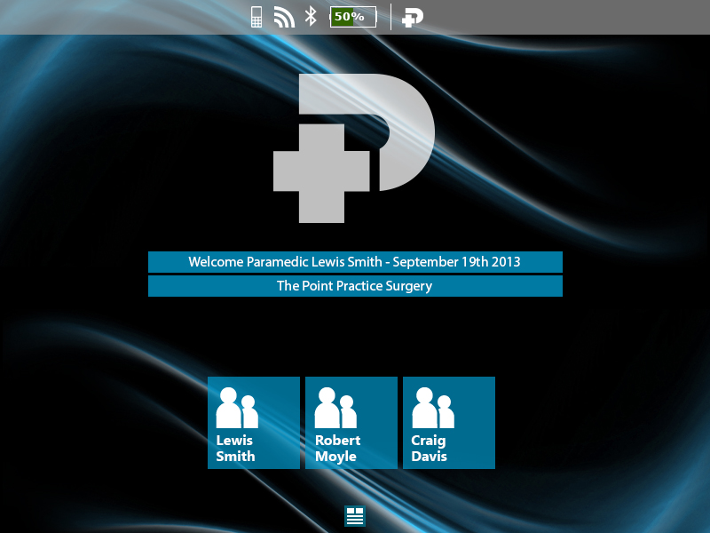
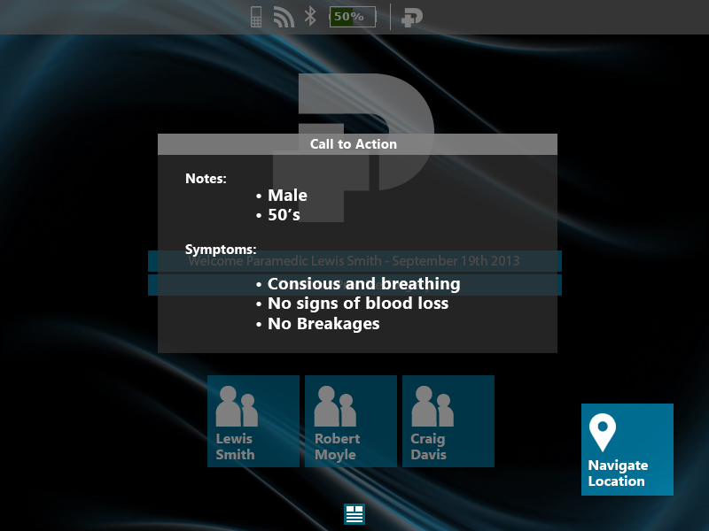
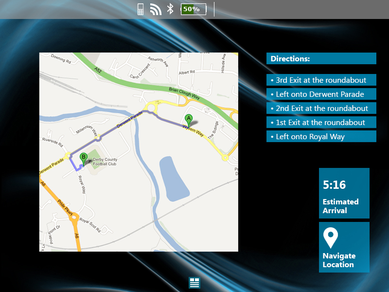
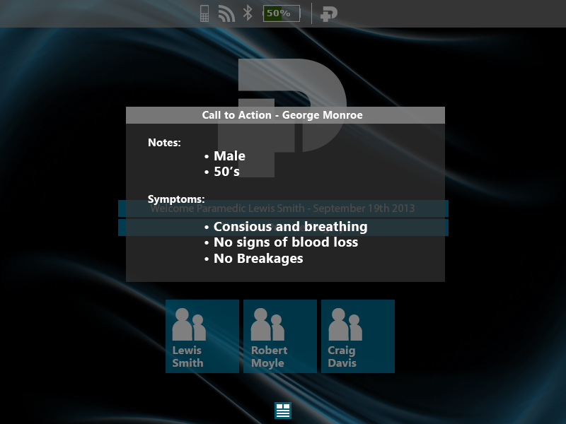
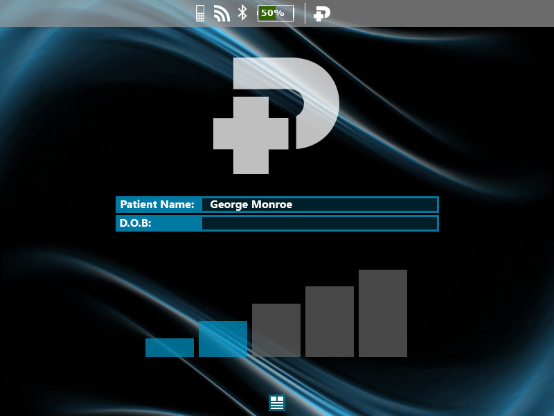
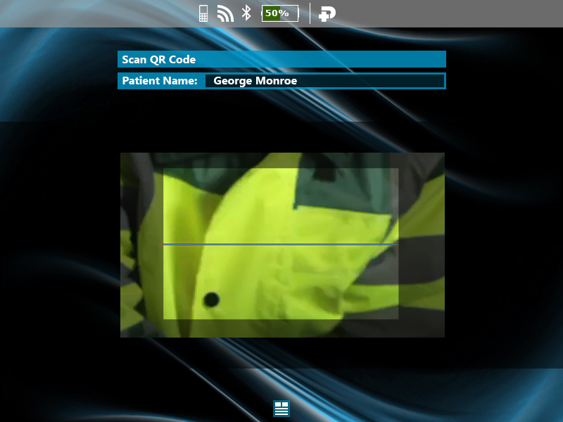
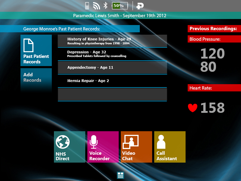
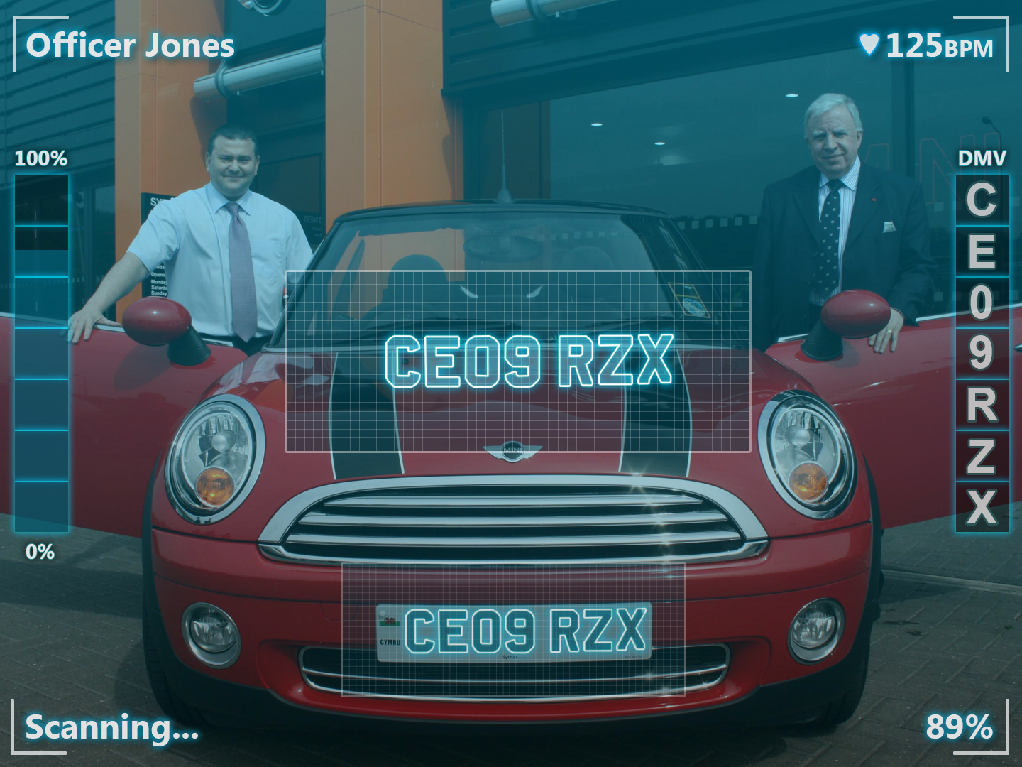
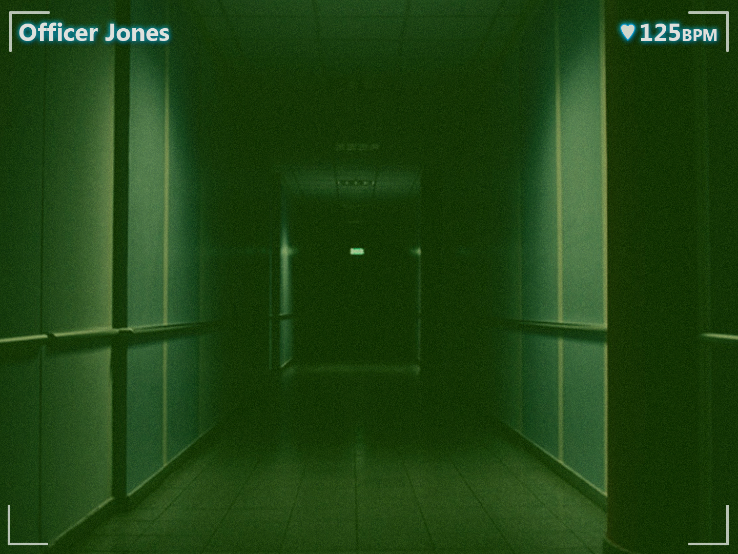
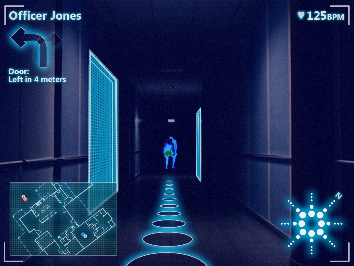
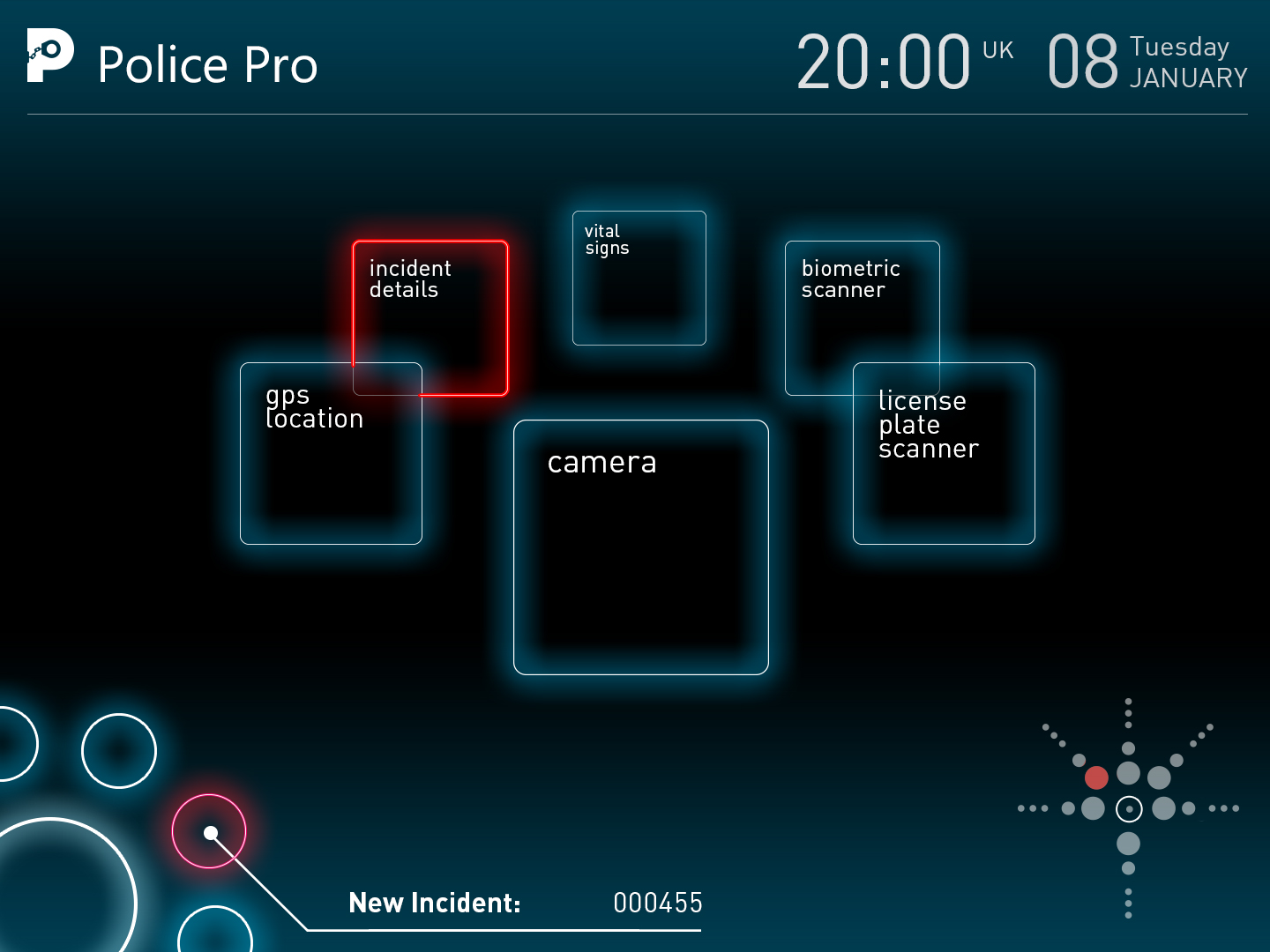
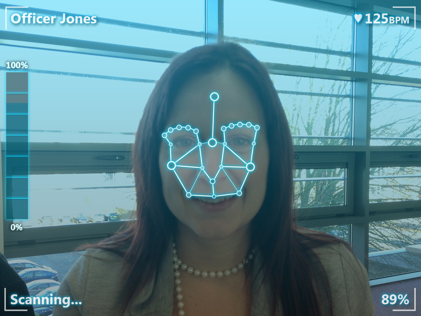
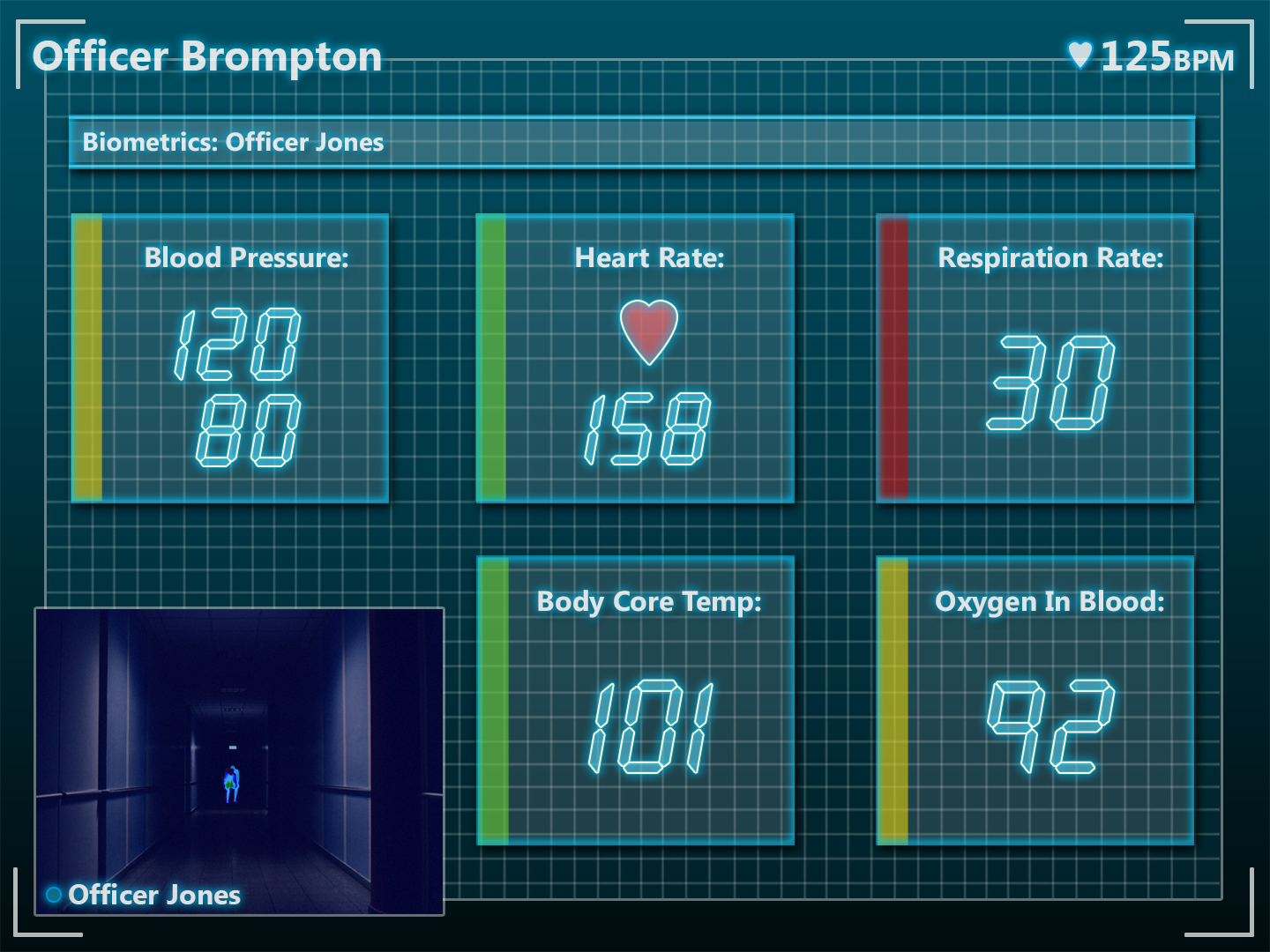
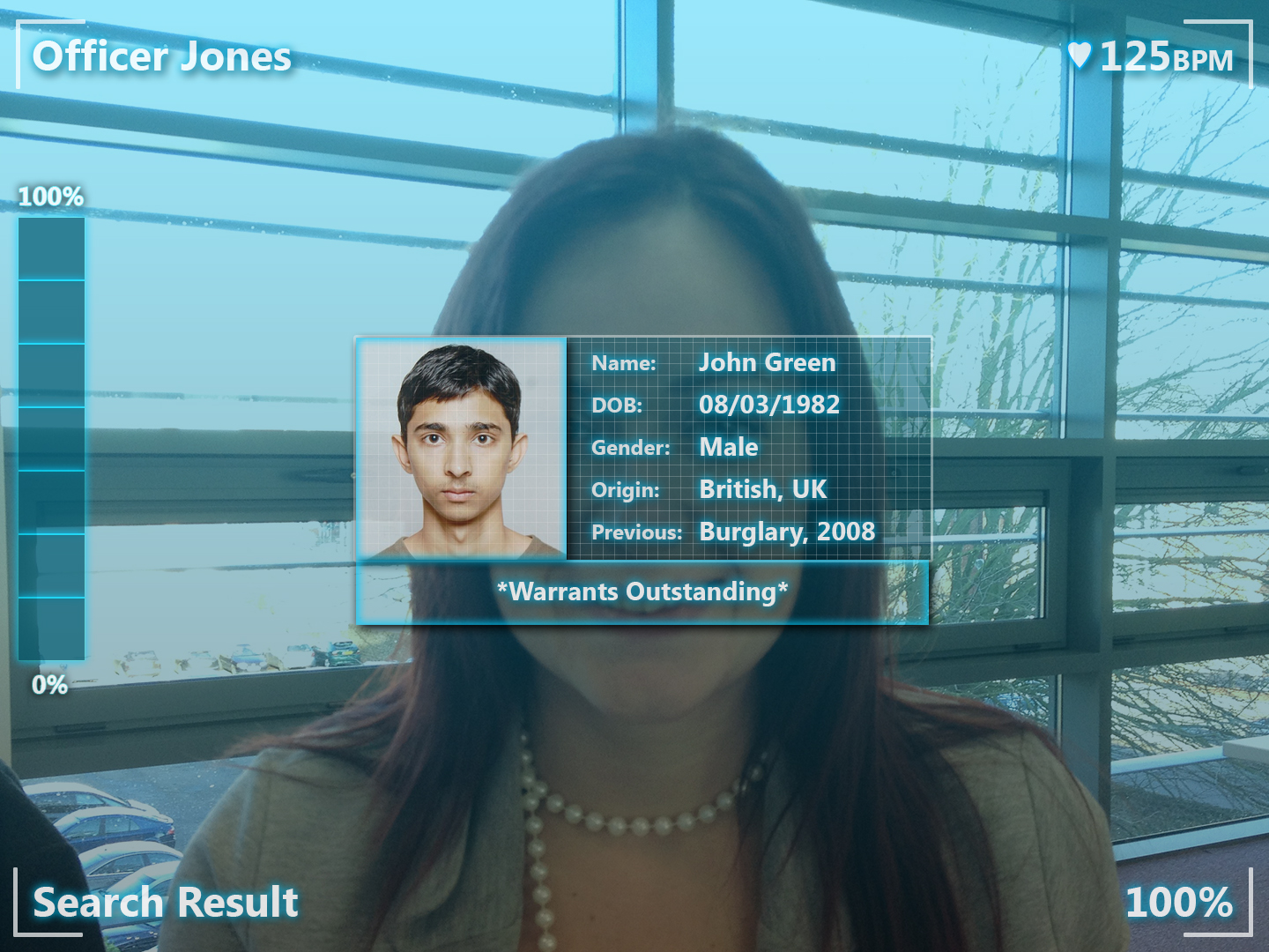
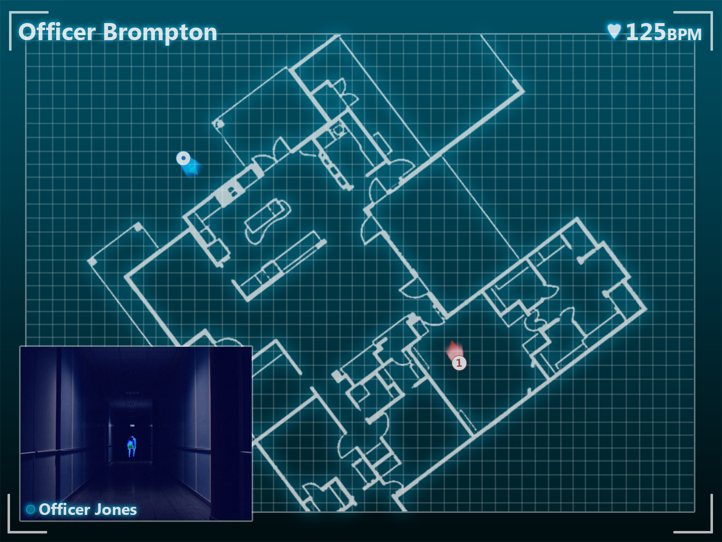
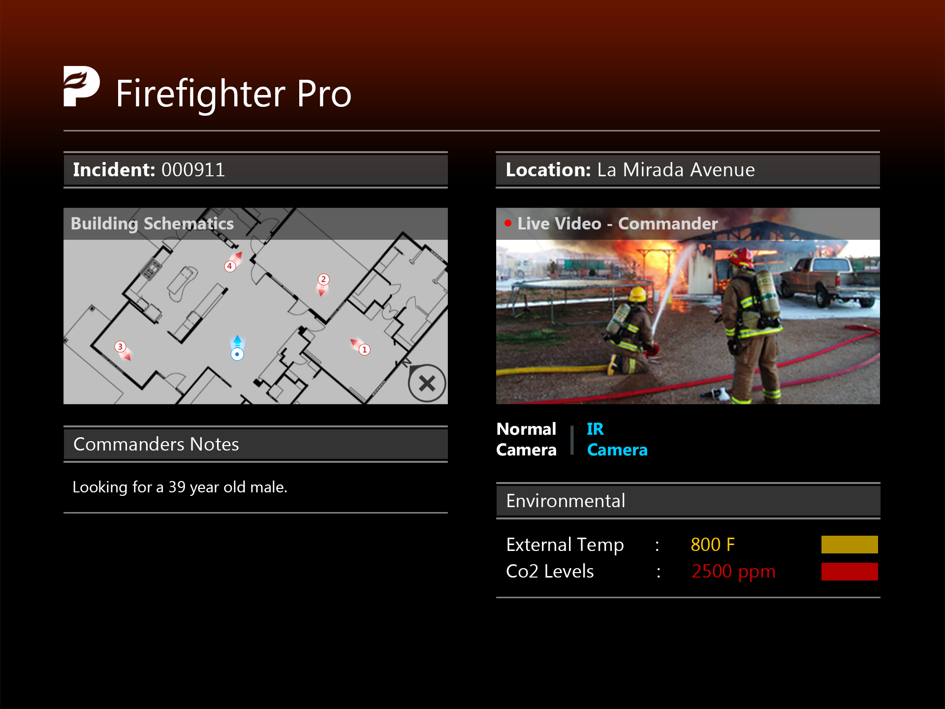
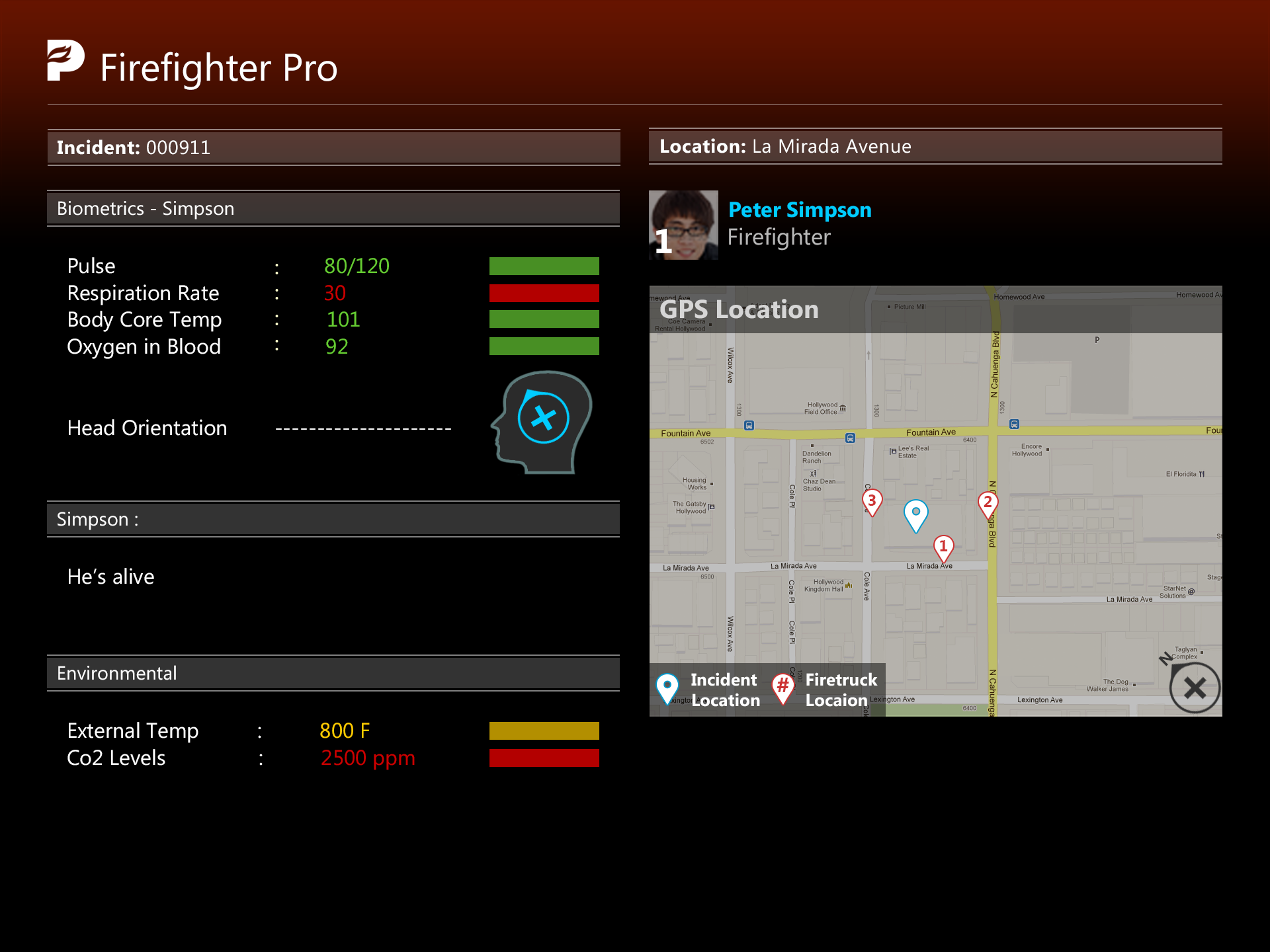
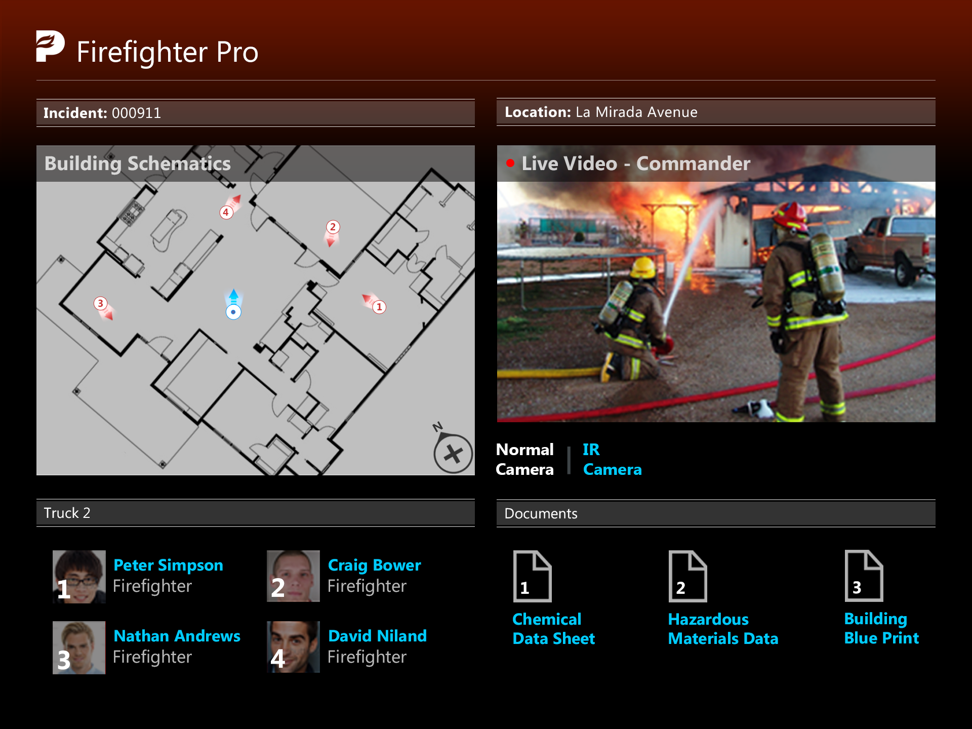
There was also the option of adding previous products that we had developed in the past, such as Firefighter Pro, Police Pro, Paramedic Pro.


