User Experience /
UNiDAys
native apps
the problem
The challenge was to create a native iOS and Android application to replace the current dynamic website that was being used.
The outcome had to use the latest native UX best practices and expected user behavioural patterns to not alienate users. As well as this, the app needed to be as lean as possible.
TEAM
1x Android Developer
1x iOS Developer
My role
Native app research // User flows // Wireframes // Visual design // Prototyping // Testing


Exploration
The current dynamic site had a few areas that needed improving when going forward with the native app. Regardless of what operating system you had on your phone or tablet, you would always get the same design.
Other areas that needed to be taken into consideration were:
A lot of work needs to be considered with the top banner of the site, currently the touchable areas between buttons would fail usability standards.
The discount text at the bottom of each perk is too small as well as the ‘favourite’ icon.

Creative Process
I was responsible for creating the native apps using common practices and expected user behavioural patterns.
To help us create the app that would take the business to the next level, our users would want to download and enjoy its simplicity.
We set out a roadmap to plan to help us gather the right information to set goals to help us deliver a world leading application.
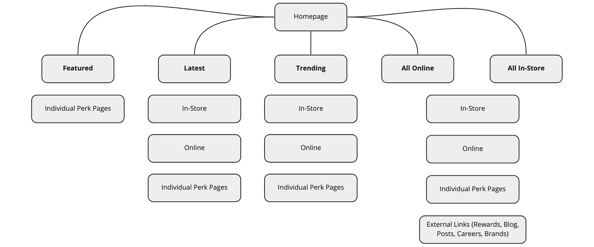
Site Maps
Creating a site map helped me to get an overview of the key user routes that would need to be taken by the user whilst navigating the app.
Behaviour Patterns
Different operating systems require different user patterns, anything out of the ordinary may alienate users and put them off using your app.
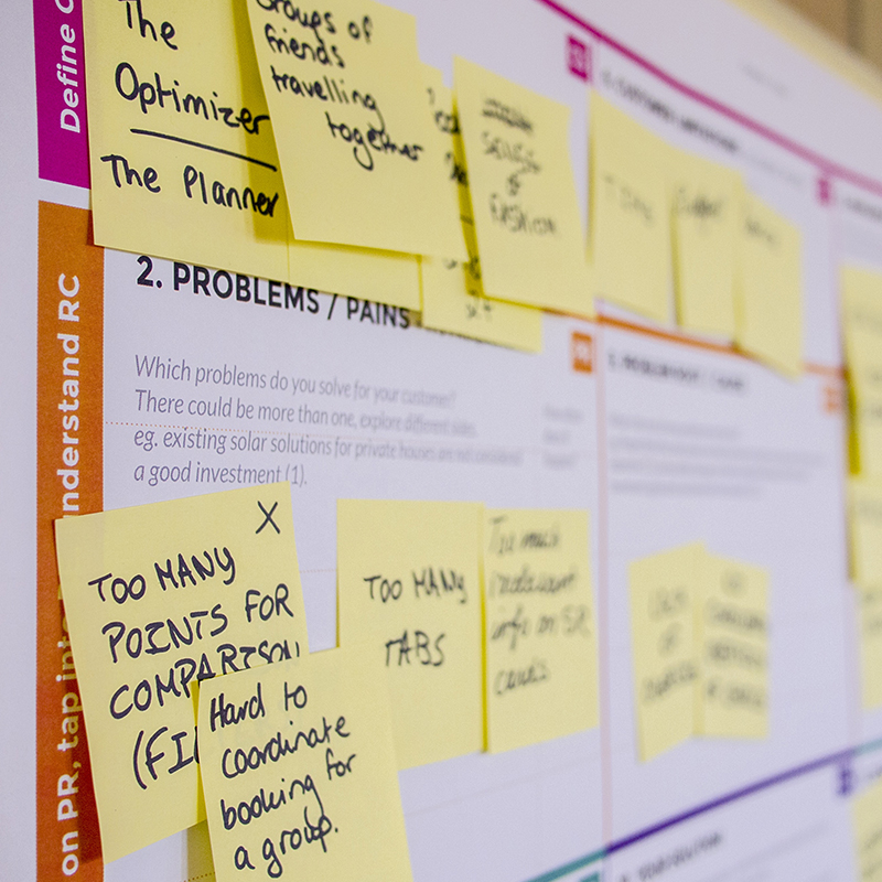
Focus Groups
Having lots of people testing the app at the same time, allowed us to pin point any pain areas during the set tasks we set for the users.
A/B Testing
This allowed us to test specific sections and user flows of the app where we were not 100% sure on which outcome would be best suited for the situation.
Site maps
The very first area I worked on was the site map for the app, creating all the hit points and areas that users will be able to navigate to and use.
This covered the top navigation and the footer for the app.
Focus groups
We thought it would be a great idea to organise a focus group between staff across other departments of the company to try and get extra ideas that we could put towards the creation of the app, as well as to see if there was any consistent issues that we needed to avoid or improve with the current dynamic website that we had.
Brain Storming
Creative Planning
Intuitive Design
A/B Testing
This allowed us to test specific sections of the app and keep an eye on the behavioural patterns of our users when they landed on the relevant pages.
Doing this gave clear results for which design we should use as one would work better than the other. If that was the case, we then phased out ‘Design B’ completely.
Native Design
Geo-Tracking Discounts
Customised Notifications