Ikanos Lifeboard
LifeBoard and Pro Series
Ikanos Consulting are a Nottingham-based software house specialising in applications for wearable technology. I joined to design the software experience for the Golden-i – a hands-free headset computer controlled entirely by voice commands and head gestures. No touchscreen, no keyboard, no mouse. Just your voice and your head.
I worked across two distinct but connected products: LifeBoard, a customisable consumer-facing dashboard for the headset, and the Pro Series – a suite of purpose-built applications for paramedics, police officers and firefighters.
LifeBoard was announced at CES 2013 in Las Vegas alongside the launch of the Golden-i Gen 3.8 headset, covered by outlets including SlashGear, the Daily Mail and Verizon’s own news platform – and the concept I created holds a patent in my name.
My role
I worked on the creation and design of multiple services, including Paramedic Pro, Police Pro, Firefighter Pro and LifeBoard.
My involvement spanned the full design process – from initial whiteboarding and concept development through to user flows, wireframes, full UI design and prototyping. I also worked closely with the marketing team on the websites and social media campaign in the build-up to CES 2013.
Key challenges:
No precedent to work from
Challenge
Designing for a hands-free, voice-controlled headset computer was genuinely uncharted territory.
There were no direct competitors to benchmark against and no established design patterns to lean on.
Solution
We ran extensive user research sessions from the ground up, observing how people naturally interacted with the designs and iterating based on real feedback rather than assumptions.
Every decision was evidence-led because it had to be.
Key challenges:
Designing without touch
Challenge
Every single interaction had to work without a screen tap, swipe or click.
Voice commands and head gestures were the only input methods available – in environments where users couldn’t afford to think twice about how to operate the device.
Solution
I stripped the interface back to its simplest possible form, designing clear visual hierarchy and large readable elements that worked at a glance.
Navigation logic was built around natural head movement and short, memorable voice commands.
Key challenges:
One platform, multiple professions
Challenge
The Pro Series needed to serve paramedics, police officers and firefighters (and more) – three groups with completely different workflows, priorities and working conditions, all on the same underlying hardware.
Solution
I designed a shared core interface logic across all three apps, then tailored the features, terminology and visual language to each profession.
Consistency where it helped, specificity where it mattered.
Key challenges:
Information density vs clarity
Challenge
LifeBoard needed to surface calendars, news, documents, email and video calls across up to six screens – all readable on a near-eye display worn on your face, potentially while moving.
Solution
The layout was built around the concept of users being “submerged” into their own content without being overwhelmed.
Whiteboarding sessions helped establish how much information could realistically live on screen at once before it became noise rather than signal.
Golden-iOS v1.0
Generating new ideas. Solving big problems
We created a sophisticated user interface and a comprehensive set of built-in applications to go with it – this set of applications was called the Pro Series.
The hardware
The Golden-i is a head-worn computer with a near-eye virtual display – effectively a 15-inch screen floating in your field of view. It runs on voice recognition and nine-axis head-tracking, with a built-in camera, noise-cancelling microphones and support for WiFi, Bluetooth and 4G. The HC1 was the rugged industrial model; the Gen 3.8 was lighter, faster and more refined – the one we were designing for at CES.
Designing for this hardware meant throwing out most of what you’d normally reach for. No tapping, no swiping, no hovering. Every interaction had to work hands-free, in potentially high-pressure environments, for users who couldn’t afford to be distracted.


Ideation
Whiteboarding
The initial concept for LifeBoard started on the whiteboard. The idea was that users would be submerged into their own personalised dashboard – three screens visible on the homepage at any one time, with the ability to navigate freely from there.
By using head tracking, users could move their head whilst wearing the headset, look directly at the screen they wanted, and say the word linked to that screen to activate it.


LifeBoard – Consumer product
Control what’s important in your life
LifeBoard was the consumer product – a customisable skin for the Gi-OS operating system that let users configure up to six personal screens and navigate between them by voice. Think of it as a personalised dashboard you wear on your face.
There was no real precedent for this. Competitor research wasn’t an option when nothing quite like it existed, so we leaned heavily on user research sessions – watching how people interacted with the designs, making notes, iterating.
LifeBoard
Interface designs
LifeBoard also included Ask Ziggy – a speech-driven virtual assistant that let users send messages, make calls, set reminders and browse the web, all by talking to the device.


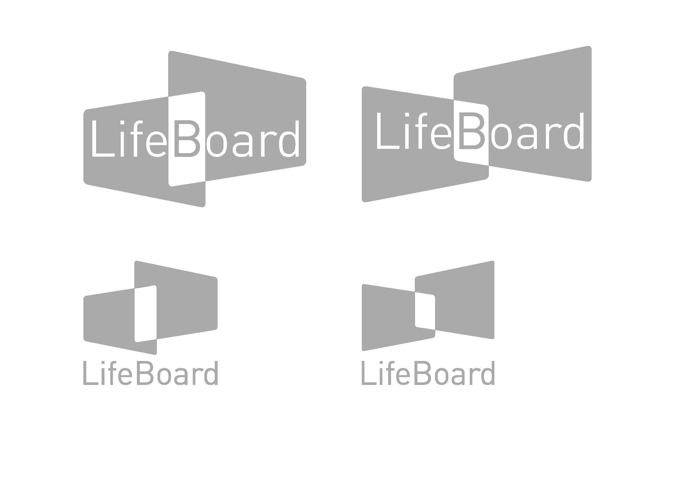
Logo concepts
The logo and brand identity for LifeBoard also came out of this phase, keeping things simple enough to hint at the concept without overexplaining it.
Icons:
Pro Series
The Pro Series took the same platform and tailored it for three specific professions (with more on the horizon) – each with their own demands, workflows and high-stakes environments.

Pro Series:
Paramedic Pro
Paramedics could access patient records, view maps, stream live video and communicate directly with A&E teams while en route. The direct video link between the field and the emergency room meant doctors could start prepping before the patient arrived.
Interface designs


Pro Series:
Police Pro
Officers could record incidents, view live feeds from other headsets, scan licence plates, identify suspects using facial recognition and pull up floor plans and GPS coordinates – all without touching a device. One headset replacing several.
Interface designs


Pro Series:
Firefighter Pro
Firefighters could navigate unknown environments using GPS and floor plans, monitor crew locations, and use the headset’s infrared camera to see through smoke and walls. In situations where seconds matter, having that information hands-free was the point.
Interface designs


CES 2013
Building the buzz
In the build-up to CES 2013, I worked closely with the marketing team to create web banners and build out two websites – the main Ikanos site and the mygoldeni.com parallax site – alongside a social media campaign designed to tease upcoming features and build anticipation ahead of the show.
The HC1 and Gen 3.8 headsets were both on display at CES, along with the full Pro Series and LifeBoard – giving the work a genuine international stage.
mygoldeni.com


ikanosconsulting.com


LifeBoard and Pro Series
Ikanos Consulting are a Nottingham-based software house specialising in applications for wearable technology. I joined to design the software experience for the Golden-i – a hands-free headset computer controlled entirely by voice commands and head gestures. No touchscreen, no keyboard, no mouse. Just your voice and your head.
I worked across two distinct but connected products: LifeBoard, a customisable consumer-facing dashboard for the headset, and the Pro Series – a suite of purpose-built applications for paramedics, police officers and firefighters.
LifeBoard was announced at CES 2013 in Las Vegas alongside the launch of the Golden-i Gen 3.8 headset, covered by outlets including SlashGear, the Daily Mail and Verizon’s own news platform – and the concept I created holds a patent in my name.
My role
I worked on the creation and design of multiple services, including Paramedic Pro, Police Pro, Firefighter Pro and LifeBoard.
My involvement spanned the full design process – from initial whiteboarding and concept development through to user flows, wireframes, full UI design and prototyping. I also worked closely with the marketing team on the websites and social media campaign in the build-up to CES 2013.
Key challenges:
No precedent to work from
Challenge
Designing for a hands-free, voice-controlled headset computer was genuinely uncharted territory.
There were no direct competitors to benchmark against and no established design patterns to lean on.
Solution
We ran extensive user research sessions from the ground up, observing how people naturally interacted with the designs and iterating based on real feedback rather than assumptions.
Every decision was evidence-led because it had to be.
Key challenges:
Designing without touch
Challenge
Every single interaction had to work without a screen tap, swipe or click.
Voice commands and head gestures were the only input methods available – in environments where users couldn’t afford to think twice about how to operate the device.
Solution
I stripped the interface back to its simplest possible form, designing clear visual hierarchy and large readable elements that worked at a glance.
Navigation logic was built around natural head movement and short, memorable voice commands.
Key challenges:
One platform, multiple professions
Challenge
The Pro Series needed to serve paramedics, police officers and firefighters (and more) – three groups with completely different workflows, priorities and working conditions, all on the same underlying hardware.
Solution
I designed a shared core interface logic across all three apps, then tailored the features, terminology and visual language to each profession.
Consistency where it helped, specificity where it mattered.
Key challenges:
Information density vs clarity
Challenge
LifeBoard needed to surface calendars, news, documents, email and video calls across up to six screens – all readable on a near-eye display worn on your face, potentially while moving.
Solution
The layout was built around the concept of users being “submerged” into their own content without being overwhelmed.
Whiteboarding sessions helped establish how much information could realistically live on screen at once before it became noise rather than signal.
Key challenges:
Generating new ideas. Solving big problems
We created a sophisticated user interface and a comprehensive set of built-in applications to go with it – this set of applications was called the Pro Series.
The hardware
The Golden-i is a head-worn computer with a near-eye virtual display – effectively a 15-inch screen floating in your field of view. It runs on voice recognition and nine-axis head-tracking, with a built-in camera, noise-cancelling microphones and support for WiFi, Bluetooth and 4G. The HC1 was the rugged industrial model; the Gen 3.8 was lighter, faster and more refined – the one we were designing for at CES.
Designing for this hardware meant throwing out most of what you’d normally reach for. No tapping, no swiping, no hovering. Every interaction had to work hands-free, in potentially high-pressure environments, for users who couldn’t afford to be distracted.
Ideation:
Whiteboard
The initial concept for LifeBoard started on the whiteboard. The idea was that users would be submerged into their own personalised dashboard – three screens visible on the homepage at any one time, with the ability to navigate freely from there.
By using head tracking, users could move their head whilst wearing the headset, look directly at the screen they wanted, and say the word linked to that screen to activate it.
LifeBoard – Customer product
Control what’s important in your life
LifeBoard was the consumer product – a customisable skin for the Gi-OS operating system that let users configure up to six personal screens and navigate between them by voice. Think of it as a personalised dashboard you wear on your face.
There was no real precedent for this. Competitor research wasn’t an option when nothing quite like it existed, so we leaned heavily on user research sessions – watching how people interacted with the designs, making notes, iterating.
LifeBoard:
Interface designs
LifeBoard also included Ask Ziggy – a speech-driven virtual assistant that let users send messages, make calls, set reminders and browse the web, all by talking to the device.
Logo concepts
The logo and brand identity for LifeBoard also came out of this phase, keeping things simple enough to hint at the concept without overexplaining it.
Icons:
Pro Series
The Pro Series took the same platform and tailored it for three specific professions (with more on the horizon) – each with their own demands, workflows and high-stakes environments.
Pro Series:
Paramedic Pro
Paramedics could access patient records, view maps, stream live video and communicate directly with A&E teams while en route. The direct video link between the field and the emergency room meant doctors could start prepping before the patient arrived.
Paramedic Pro:
Interface designs
Pro Series:
Police Pro
Officers could record incidents, view live feeds from other headsets, scan licence plates, identify suspects using facial recognition and pull up floor plans and GPS coordinates – all without touching a device. One headset replacing several.
Police Pro:
Interface designs
Pro Series:
Firefighter Pro
Firefighters could navigate unknown environments using GPS and floor plans, monitor crew locations, and use the headset’s infrared camera to see through smoke and walls. In situations where seconds matter, having that information hands-free was the point.
Firefighter Pro:
Interface designs
CES 2013:
Building the buzz
In the build-up to CES 2013, I worked closely with the marketing team to create web banners and build out two websites – the main Ikanos site and the mygoldeni.com parallax site – alongside a social media campaign designed to tease upcoming features and build anticipation ahead of the show.
The HC1 and Gen 3.8 headsets were both on display at CES, along with the full Pro Series and LifeBoard – giving the work a genuine international stage.
mygoldeni.com
ikanosconsulting.com


