
iOS and Android apps
My job over an 8 month period was to think up slick UX / UI and work with my team to develop a native iOS and Android app, ready for the start of the start of the new educational year.
My role
The challenge was to create a native iOS and Android application to replace the current dynamic website that was being used.
The outcome had to use the latest native UX best practices and expected user behavioural patterns as to not alienate users. As well as this, the app needed to be as lean as possible.
What UNiDAYS do
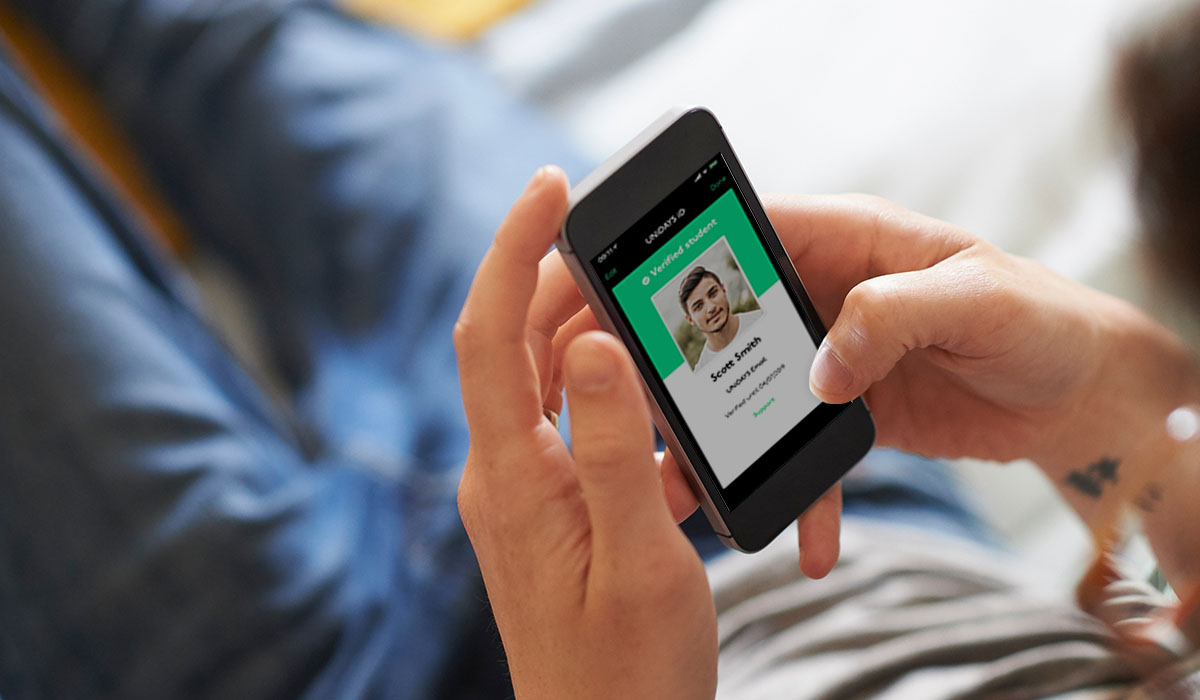
UNiDAYS are the world’s leading student network, with access to over 10+ million students worldwide.
Providing multi-channel campaigns and solutions to help reach students – the highest value consumer group of all time.
App Store and Google Play
It was an incredible moment for everyone when the UNiDAYS app broke into the App Store top 25 and Google Play top 100.


User interface:
Loading screen
When the app opens, I created a loading animation. This allowed time for the app content to load all the Perks within the homepage. The iD was highlighted in the beginning to represent Student ID.

User interface:
Introduction screens
As well as the animation, I created a few introduction screens that explained the benefits of joining and having a UNiDAYS account.


User interface:
Login and register screens
Upon logging in, users are taken to the homepage. This is where the main brands pay for exposure, as well as limited-time offers.


User interface:
Explore
Perks were in groups of type, so users could swipe between the pages to see the other areas.
This area was one of the main differences in native UX between Android and iOS. Android interface uses swiping and the Hamburger navigation to get between pages, whereas the iOS interface uses main sections along the bottom navigation.


User interface:
Search
Searching within the Android app was done by hitting the floating action button at the bottom right of the screen. Doing this opened up a new page where it showed previous search results.


iOS and Android apps
My job over an 8 month period was to think up slick UX / UI and work with my team to develop a native iOS and Android app, ready for the start of the start of the new educational year.
My role
The challenge was to create a native iOS and Android application to replace the current dynamic website that was being used.
The outcome had to use the latest native UX best practices and expected user behavioural patterns as to not alienate users. As well as this, the app needed to be as lean as possible.
What UNiDAYS do
UNiDAYS are the world’s leading student network, with access to over 10+ million students worldwide.
Providing multi-channel campaigns and solutions to help reach students – the highest value consumer group of all time.
App Store and Google Play
It was an incredible moment for everyone when the UNiDAYS app broke into the App Store top 25 and Google Play top 100.
User interface:
Loading screen
When the app opens, I created a loading animation. This allowed time for the app content to load all the Perks within the homepage. The iD was highlighted in the beginning to represent Student ID.
User interface:
Introduction screens
As well as the animation, I created a few introduction screens that explained the benefits of joining and having a UNiDAYS account.
User interface:
Login and register screens
Upon logging in, users are taken to the homepage. This is where the main brands pay for exposure, as well as limited-time offers.
User interface:
Explore
Perks were in groups of type, so users could swipe between the pages to see the other areas.
This area was one of the main differences in native UX between Android and iOS. Android interface uses swiping and the Hamburger navigation to get between pages, whereas the iOS interface uses main sections along the bottom navigation.
User interface:
Search
Searching within the Android app was done by hitting the floating action button at the bottom right of the screen. Doing this opened up a new page where it showed previous search results.