Portal Evolution
Gamma is a leading provider of unified communications services in the UK. As the UK’s #1 SIP Trunks provider, their Portal was the central hub through which channel partners and businesses managed their products, services and orders – but it had grown into something unwieldy. 147 navigation links.
Order journeys requiring up to 88 clicks. No price transparency. No self-service. Users calling support to make even the smallest account changes.
I was brought in to redesign the Portal from the ground up – simplifying navigation, streamlining order journeys and giving users the tools to manage their own accounts without picking up the phone.
My role
I led the UX/UI design on Portal Evolution for the duration of my time at Gamma. I conducted user research, ran interviews, mapped journeys, built wireframes and prototypes and worked closely with product and engineering teams throughout.
The work covered navigation redesign, a new landing page, a self-serve My Products area, a full profile and account area, order journey redesign across all product types and content and terminology improvements across the entire platform.
The UX patterns I defined for the SIP Trunk order journey (the largest and most complex) were refined and rolled out across all order types on the platform.
Research:
Site mapping
The first thing I did was build a full site map of the Portal – going through every single navigation link and making notes on what each page required the user to do. All 147 of them.
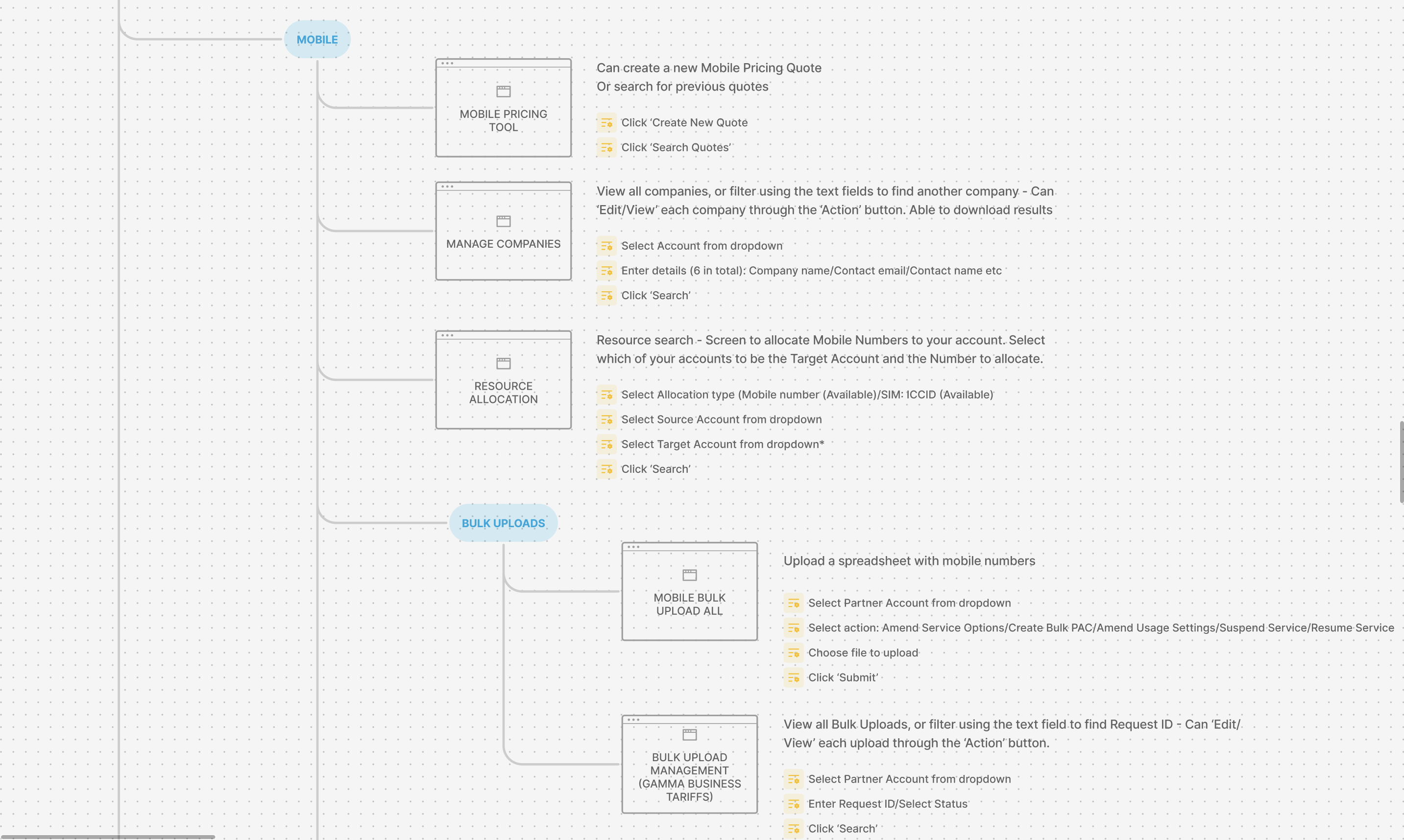
The exercise surfaced some immediate and recurring issues
Beyond the sheer volume, the platform had significant inconsistency problems – buttons labelled as Continue, Next and Proceed across different pages; spelling and grammar errors throughout; Download buttons appearing before a search had been performed; and unusual, inconsistent UX behaviour across the board.
It was clear that rather than having a dedicated page for every individual action, the priority was to consolidate – removing duplicates, merging where possible and replacing scattered functionality with global features.
Research:
User interviews: Creating a new order
To understand the ordering experience firsthand I interviewed users as they created new orders on the platform, observing their behaviour and gathering feedback at each step.
The SIP Trunk order journey was the focus – one of the most common and most complex flows on the platform.
Step 1:
Contact details
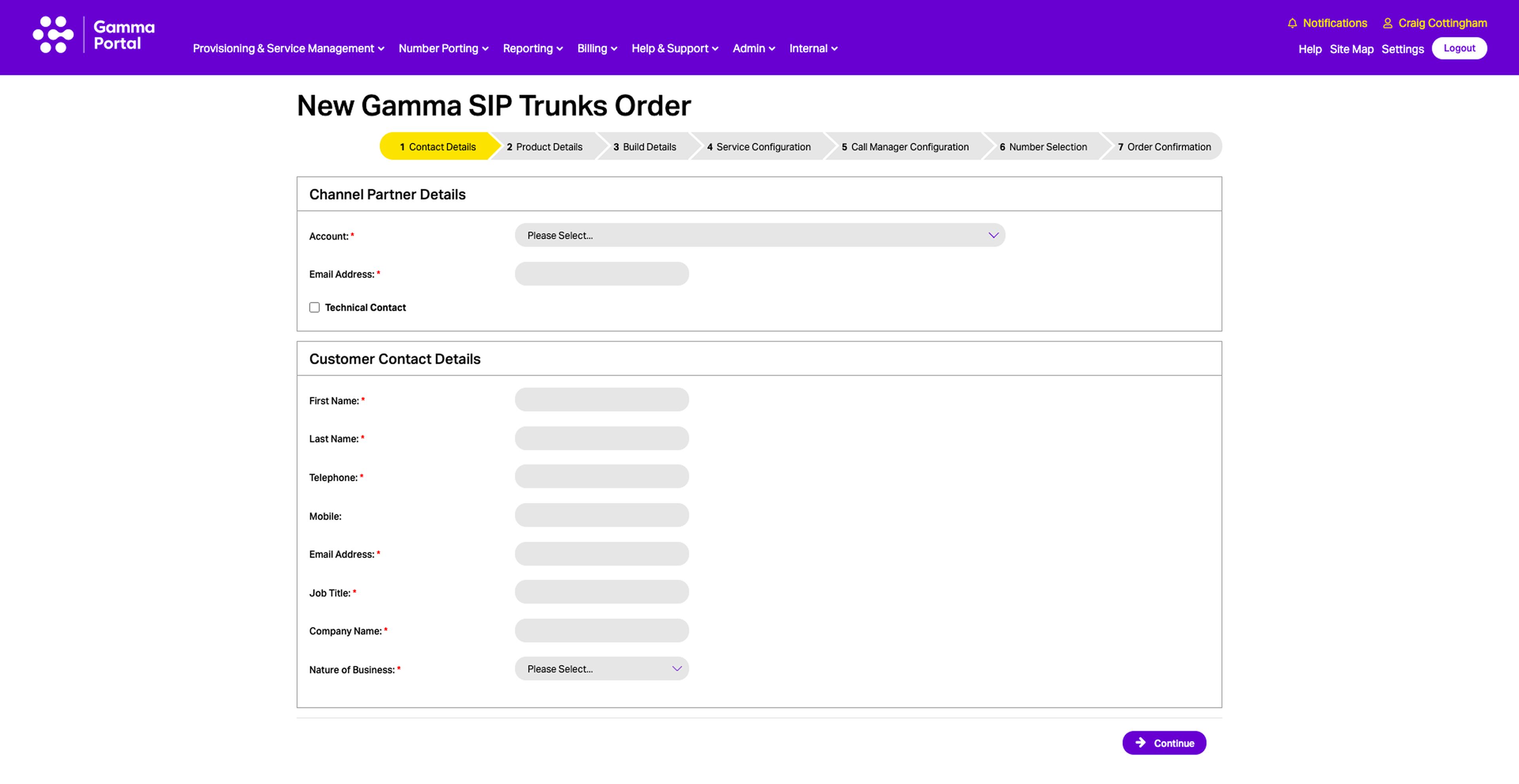
Every order started by requiring users to enter their full contact details from scratch – account selection, email, name, company name, phone and mobile numbers and business type. Every single time.
Step 2:
Product details
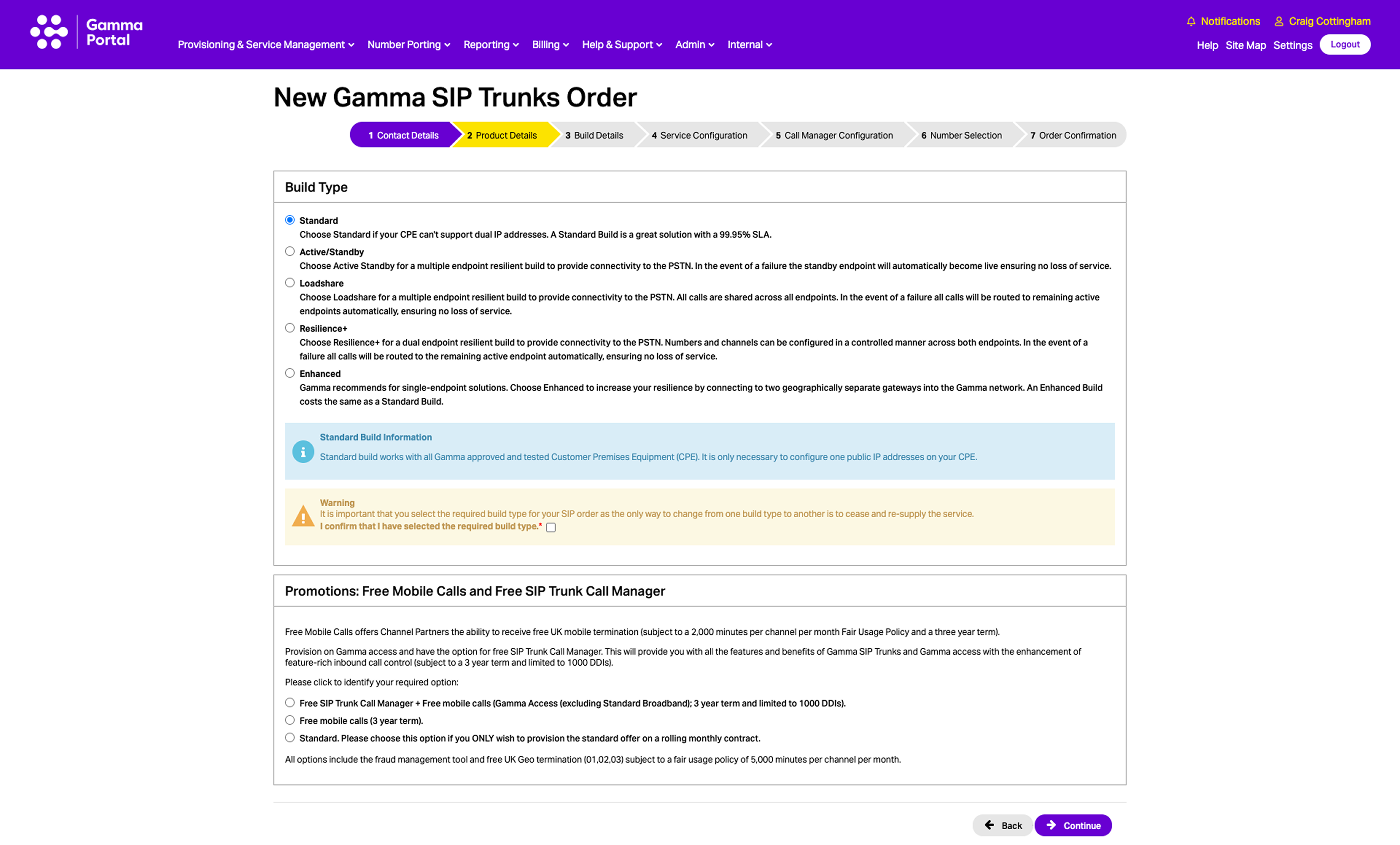
Users had to select a security level for their product from options that were heavily jargon-laden with no clear explanation of what each option included or what the cost difference was.
A mandatory confirmation checkbox was regularly missed because it had been pushed down the page as more content was added over time.
Step 3:
Build details
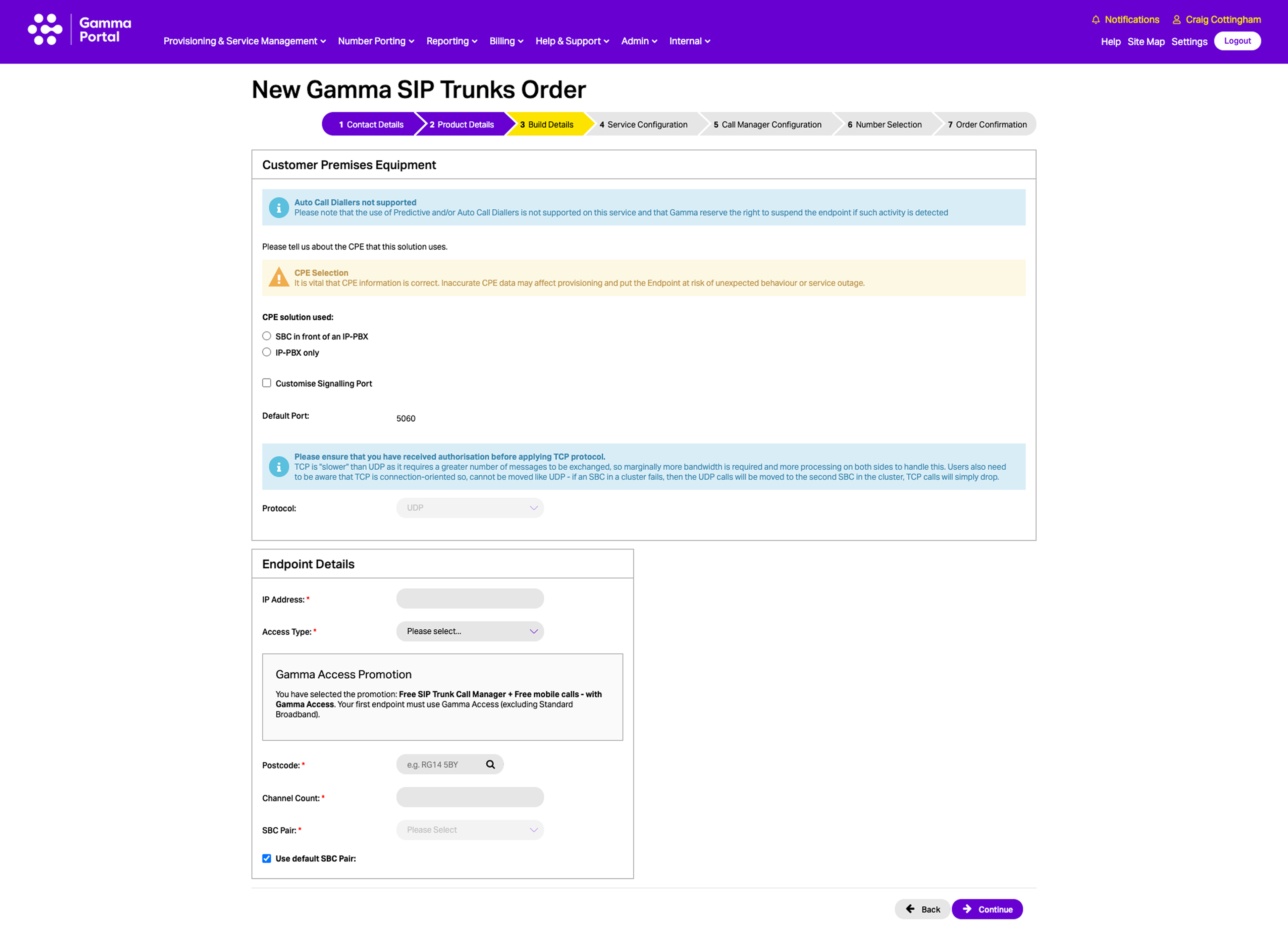
A warning message at the top of the page stated “It is vital that CPE information is correct” – but most users didn’t know what a SBC or IP-PBX was.
Step 4:
Service configuration
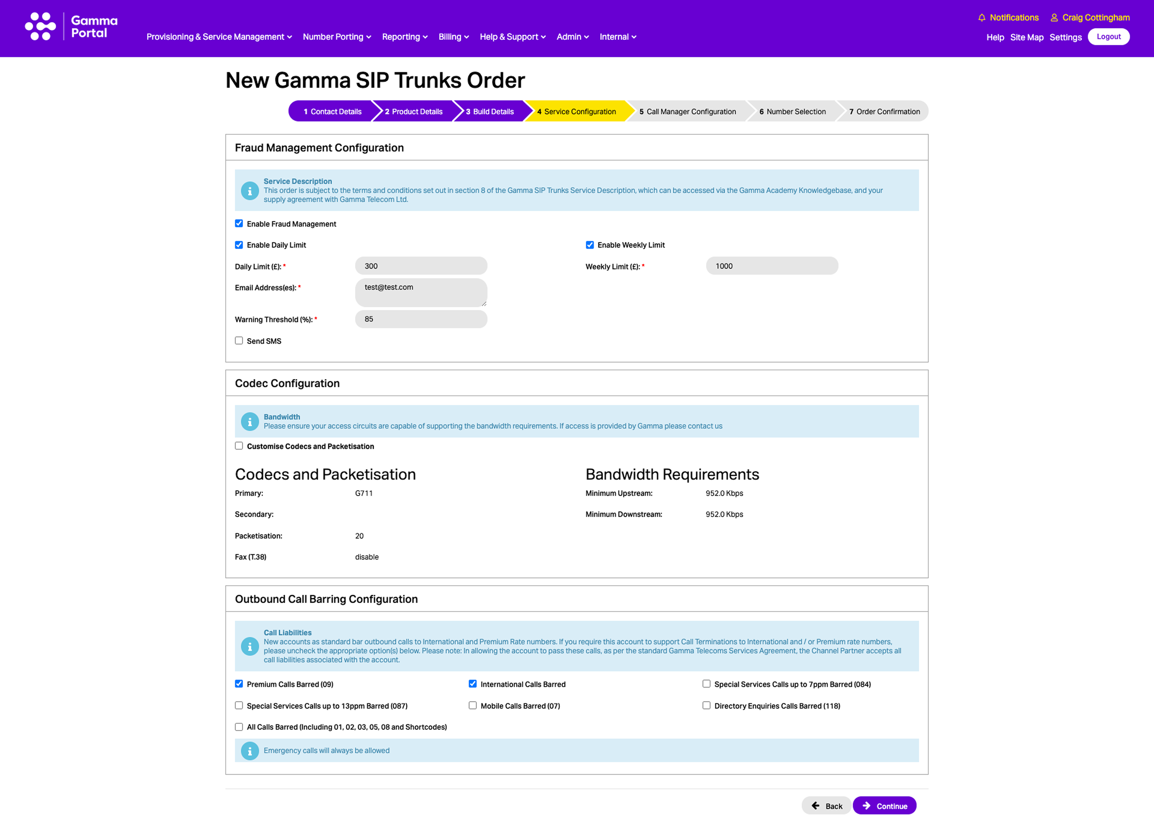
Users set up fraud limits and call blocking preferences. Default fraud limits were considered too high by several users, and the format for entering multiple email addresses was unclear despite the field label referencing it.
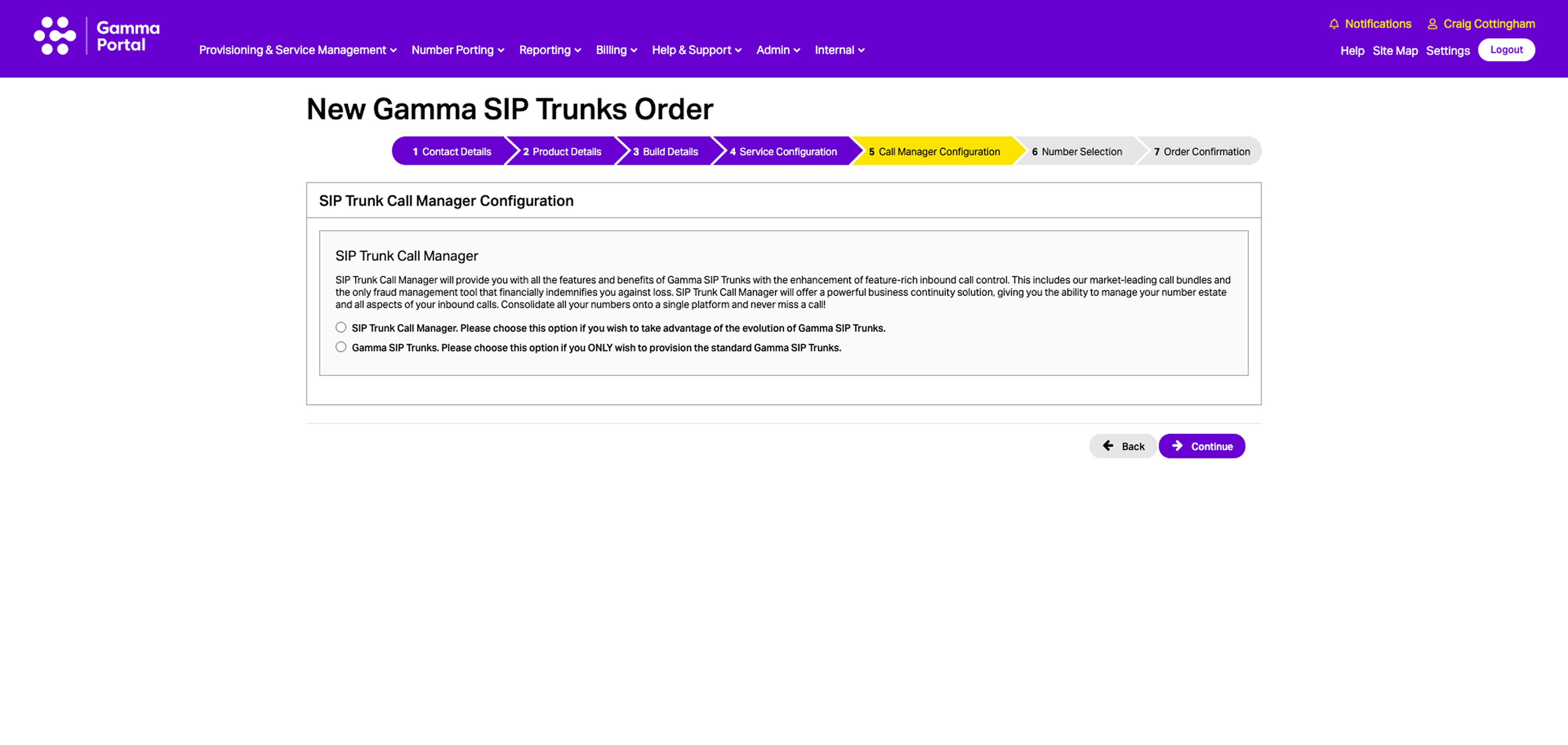
Step 5:
Call manager configuration
An optional upgrade step – but with no indication of what the upgrade would cost.
Step 6:
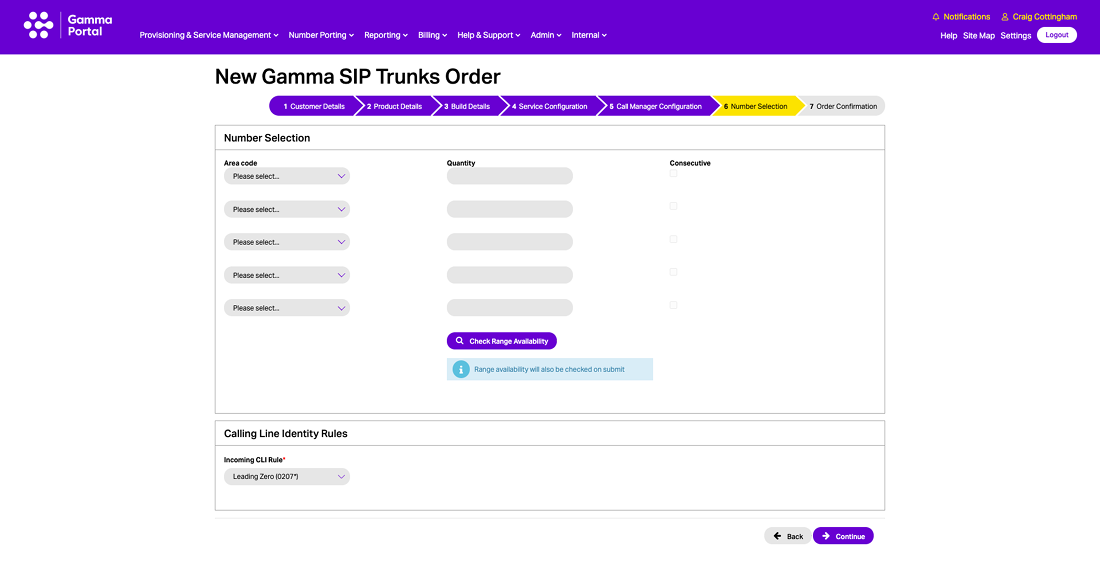
Number selection
Users selected area codes and quantities for phone numbers, with options for consecutive or random ordering.
Step 7:
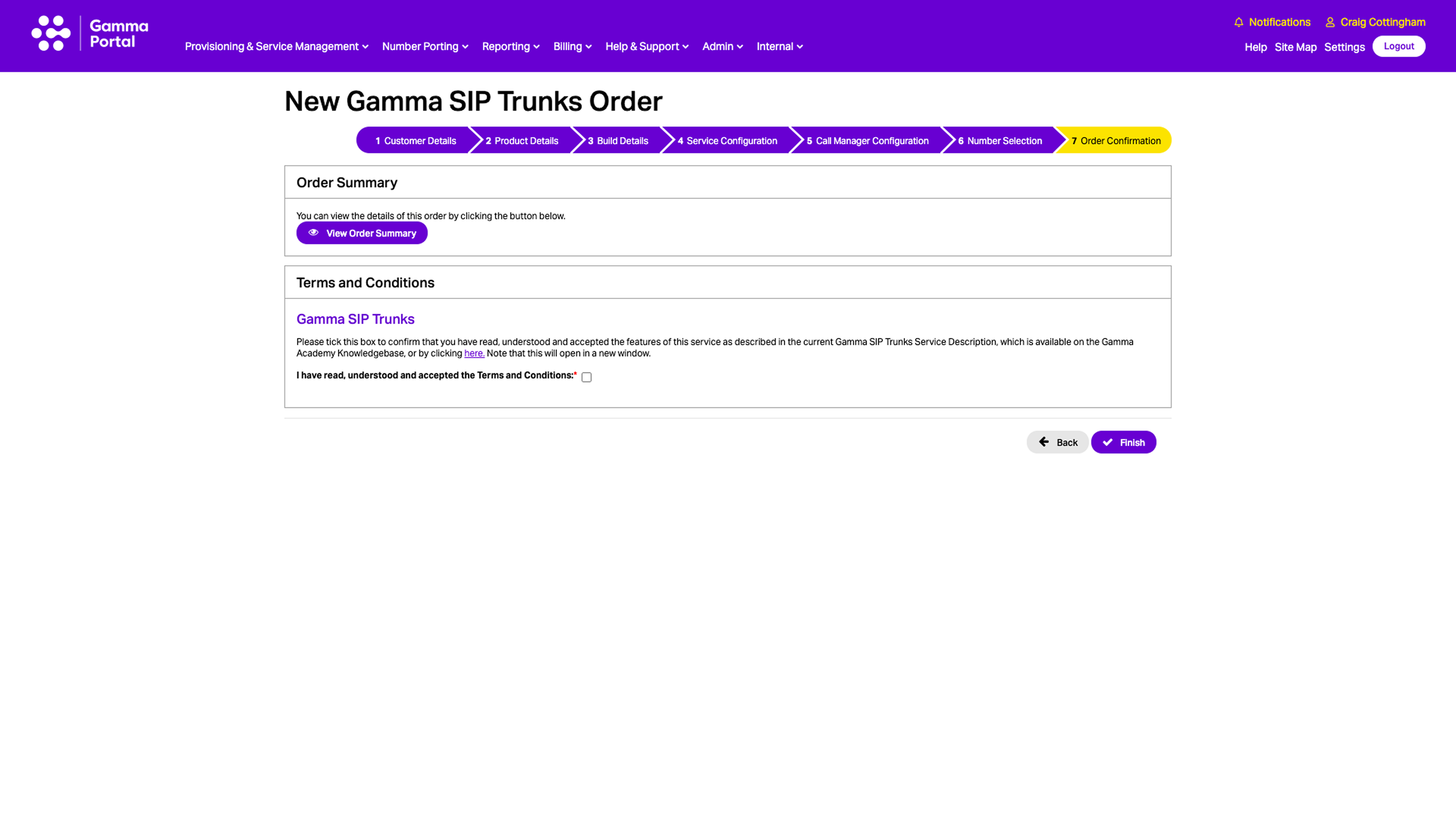
Order complete
After completing all steps, the user accepted terms and conditions and submitted the order – which was then emailed to the accounts team to calculate costs and send an invoice back. Days later.
Research:
Journey mapping
After completing the user interviews I mapped the full current SIP Trunk order journey in detail – every click, every interaction, every optional step – and compared it against a proposed redesigned flow.
Current flow
Click count:
Between 52-88 clicks
In its simplest form the current journey required 52 clicks. With optional interactions it could reach 88.
Users entered the same information repeatedly, navigated blind through a folder structure with no price visibility and submitted orders that disappeared into an email queue for days.

Proposed flow
Click count:
Between 15-30 clicks
The redesigned flow brought the minimum down to 15 clicks.
Pre-populated profile data removed the need to re-enter contact details. Price transparency was built into the flow. Orders were processed in real time rather than sent to accounts.
The same refined UX patterns were identified, documented and rolled out across all order types on the platform.

Key challenges:
147 navigation links with no clear structure
Challenge
Users couldn’t find what they needed.
The navigation had grown organically over time into an unmanageable list of links with no logical grouping.
Solution
I restructured the entire navigation into two clear sections: My Products – where users could view, manage and self-serve their active products and services – and Create New – where users could place new orders.
147 links, two sections. Everything had a home.
Key challenges:
Fragmented, repetitive order journeys
Challenge
Users entered the same information from scratch every time they placed an order.
Journeys were long, jargon-heavy and offered no price transparency until days after submission.
Solution
I designed a profile area where users could pre-populate their details once, ready to be pulled into any order journey automatically.
I reduced and simplified the mandatory fields, removed jargon throughout the platform, introduced real-time price transparency via a receipt-style panel and eliminated the accounts email queue by processing orders directly.
Click count for the SIP Trunk journey dropped from 52-88 down to 15-30.
Key challenges:
No self-service capability
Challenge
Any change to a product, service or account – however small – required users to call or email support.
There was no way to manage anything independently.
Solution
I designed a My Products area giving users full visibility and control over their active services.
Users could upgrade, downgrade, toggle bolt-ons on and off, edit site details and manage equipment – all without contacting support.
Pricing was shown in real time for every change.
Ideation:
Landing page
The vision for the new Portal started with a landing page that gave users an immediate overview of their products, services, sites and locations on login.
The navigation was stripped back to just two areas – My Products and Create New – replacing the sprawling 147-link menu with something users could actually orientate themselves within.
Wireframes and final designs:
My products
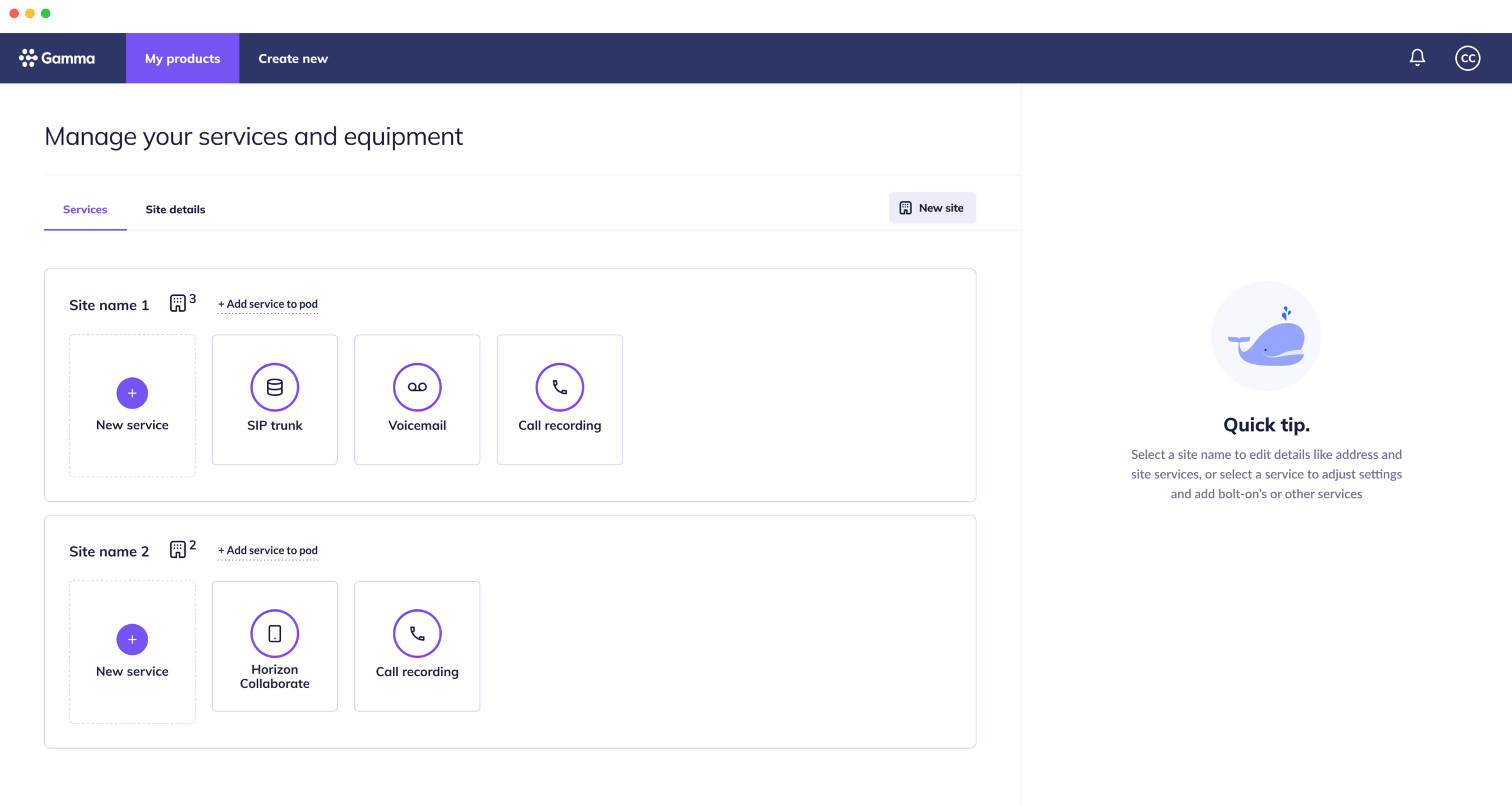
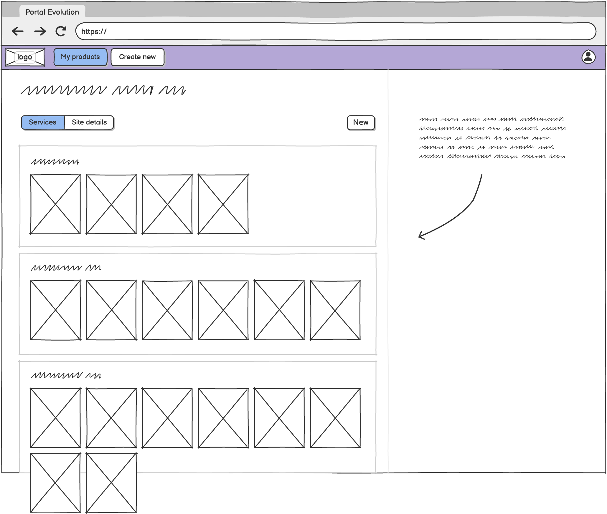
My products page
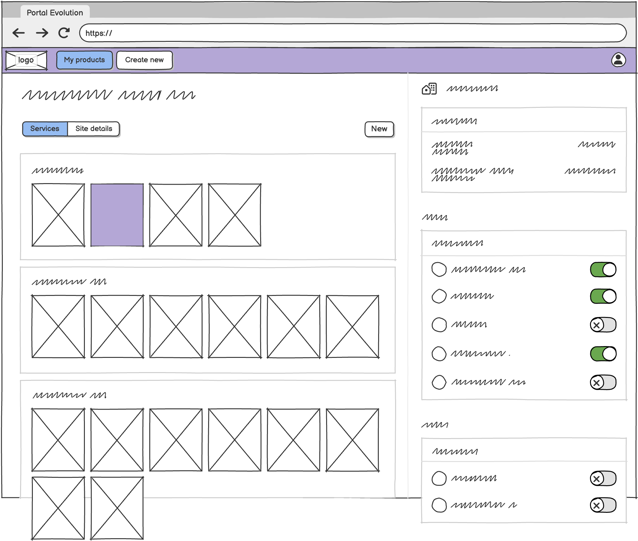
The screen was split into two panels – active services and sites on the left, with the right panel dynamically updating to show relevant details based on what was selected.
If nothing was selected, the right panel provided guidance prompting users to interact with the left.
Edit an active service
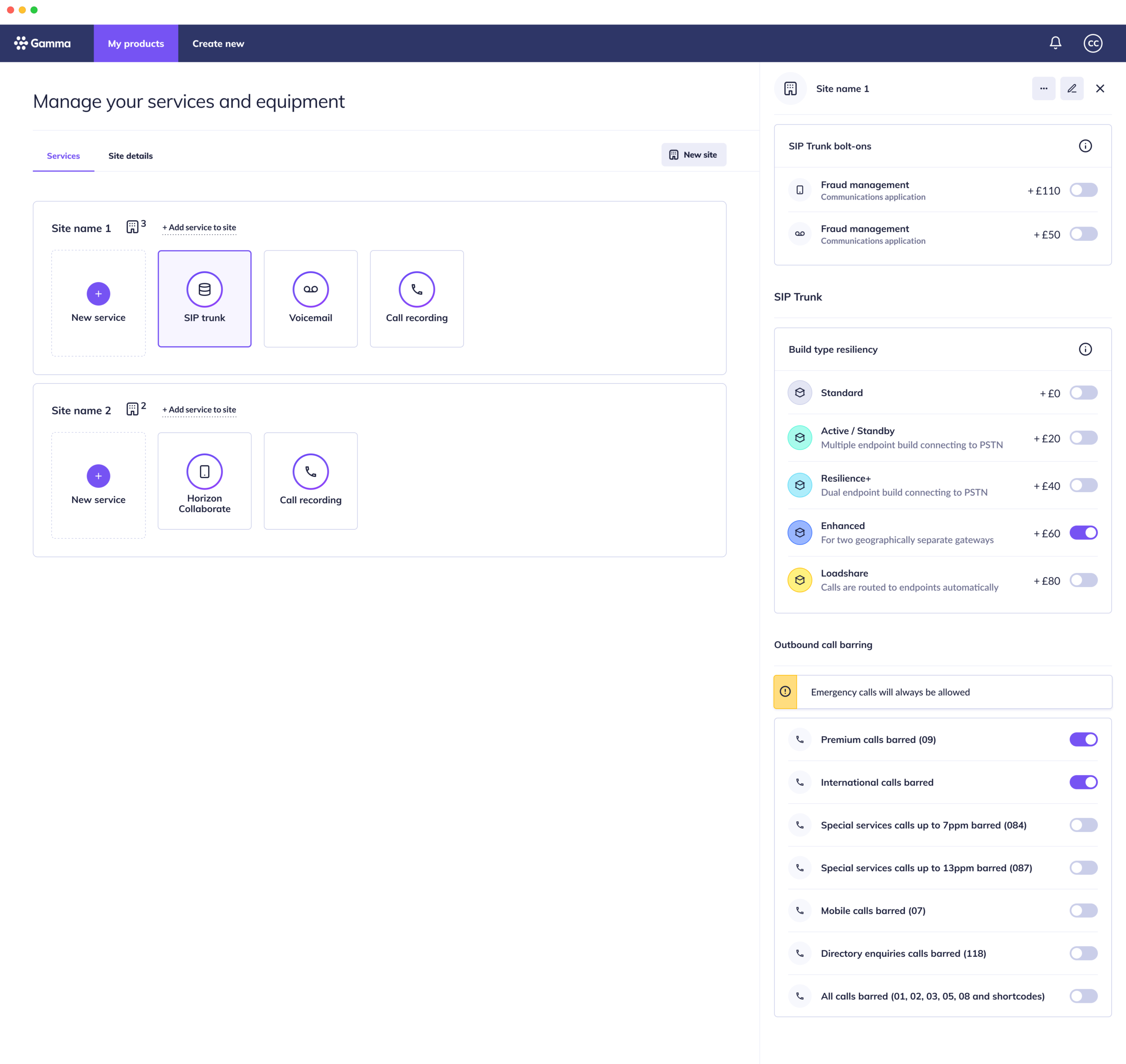
Selecting a specific service revealed its current level, location and any available upgrades or bolt-ons – all with pricing shown clearly.
Users could upgrade, downgrade or toggle bolt-ons on and off themselves, with the cost difference visible at a glance. No more waiting days for accounts to recalculate and respond.
Edit a site
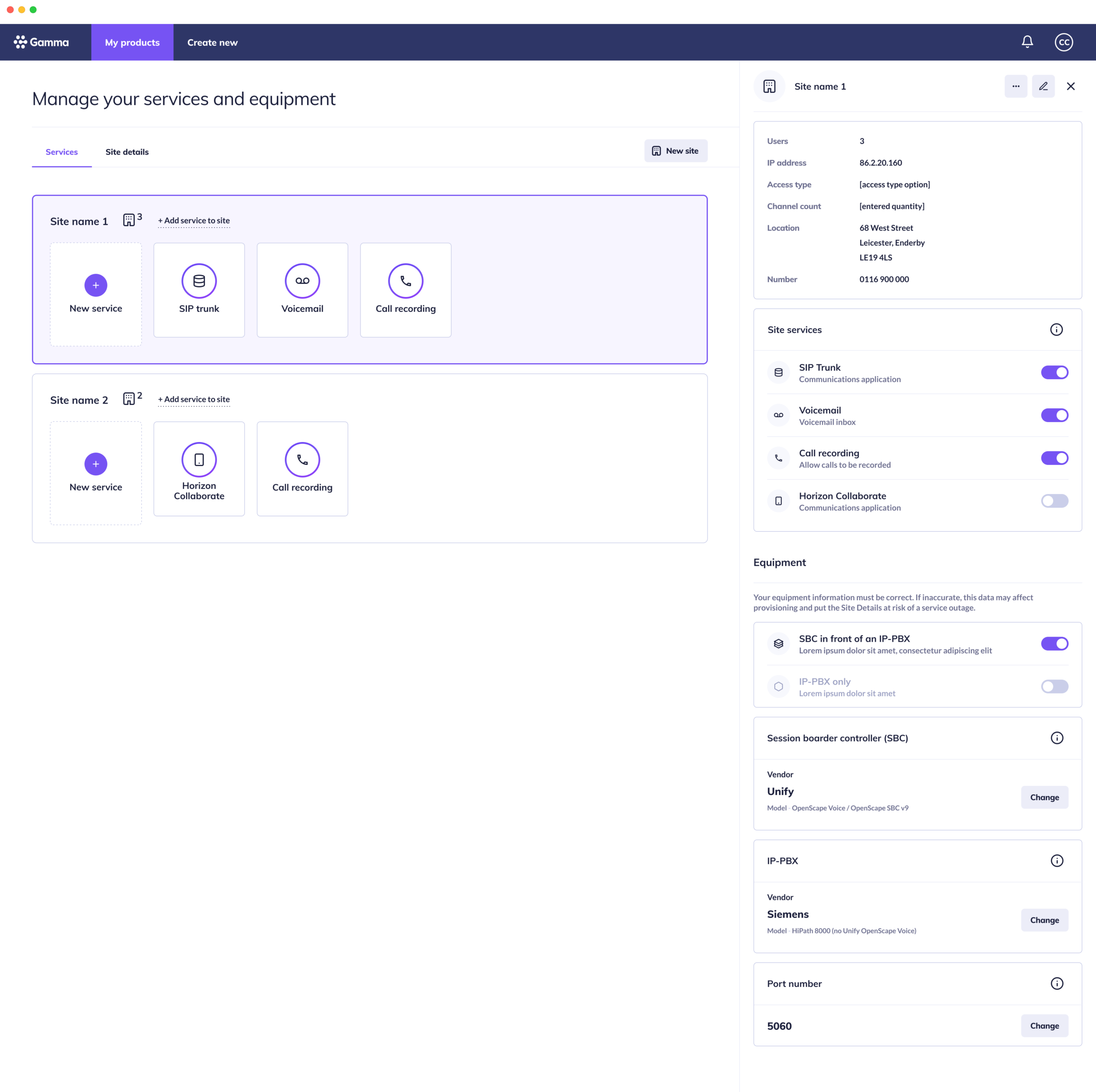
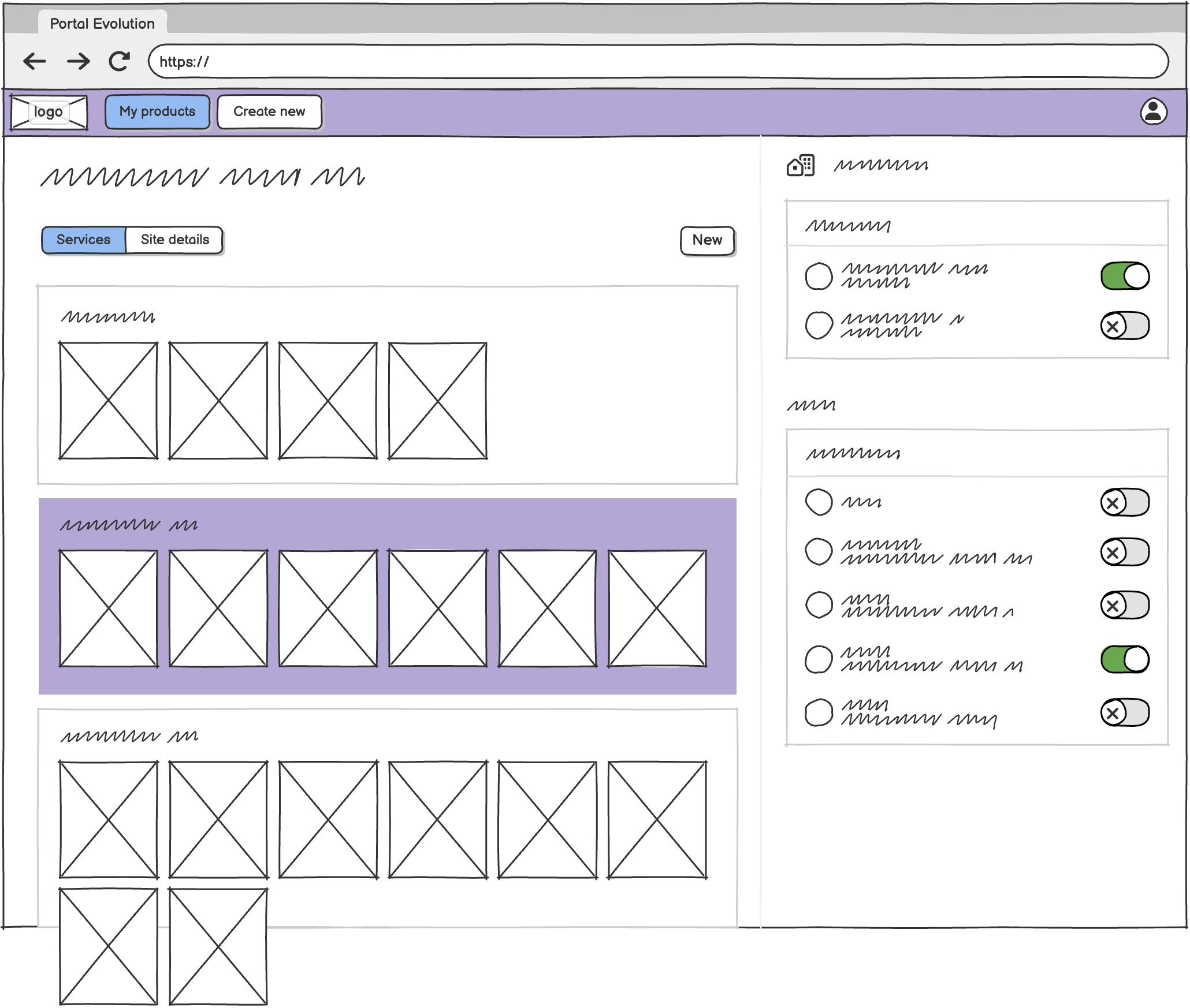
Selecting a site allowed users to edit the address and contact numbers, view all active services at that location and toggle services on or off as needed.
Each site’s equipment was also manageable from the same screen.
Final designs:
Profile area
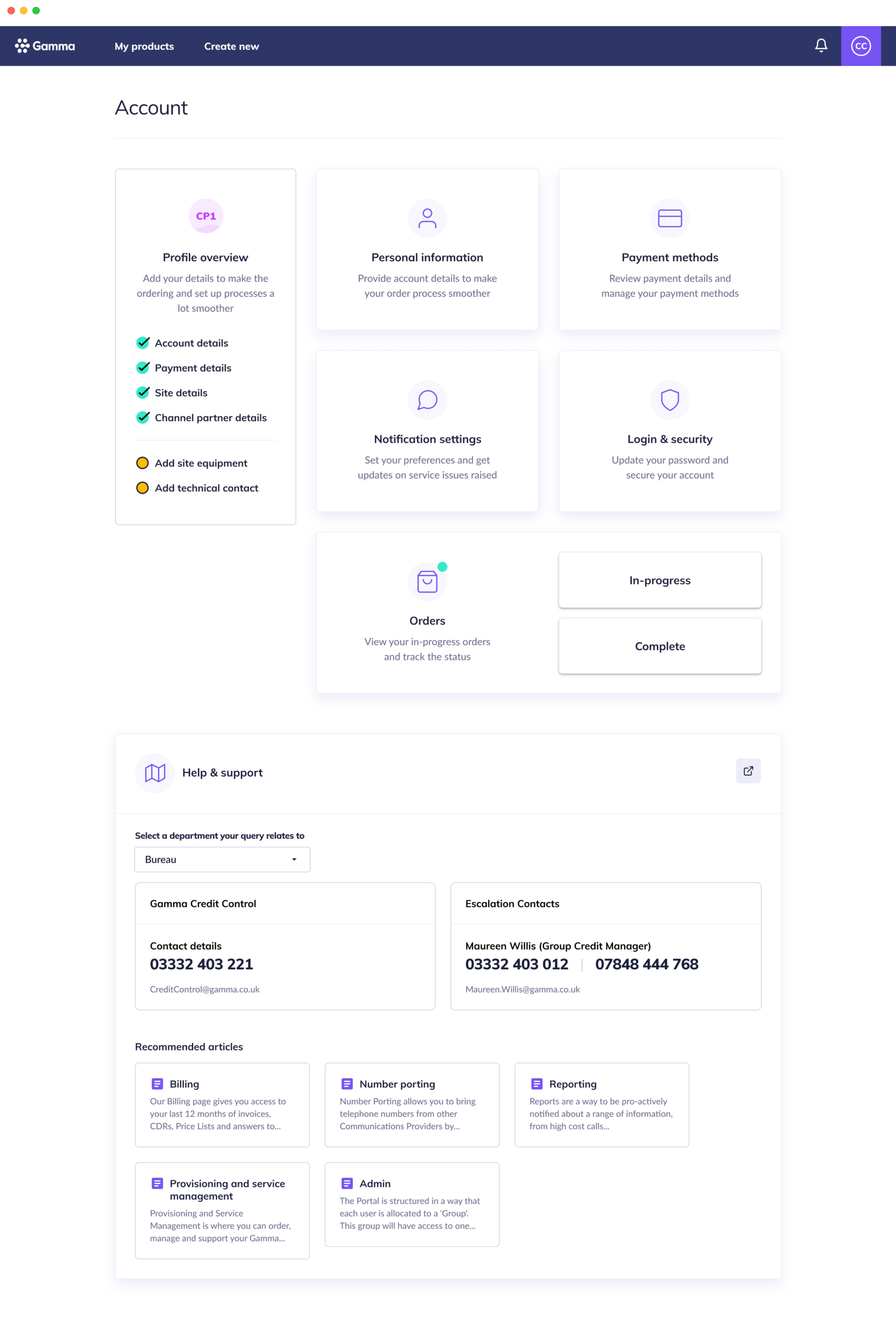
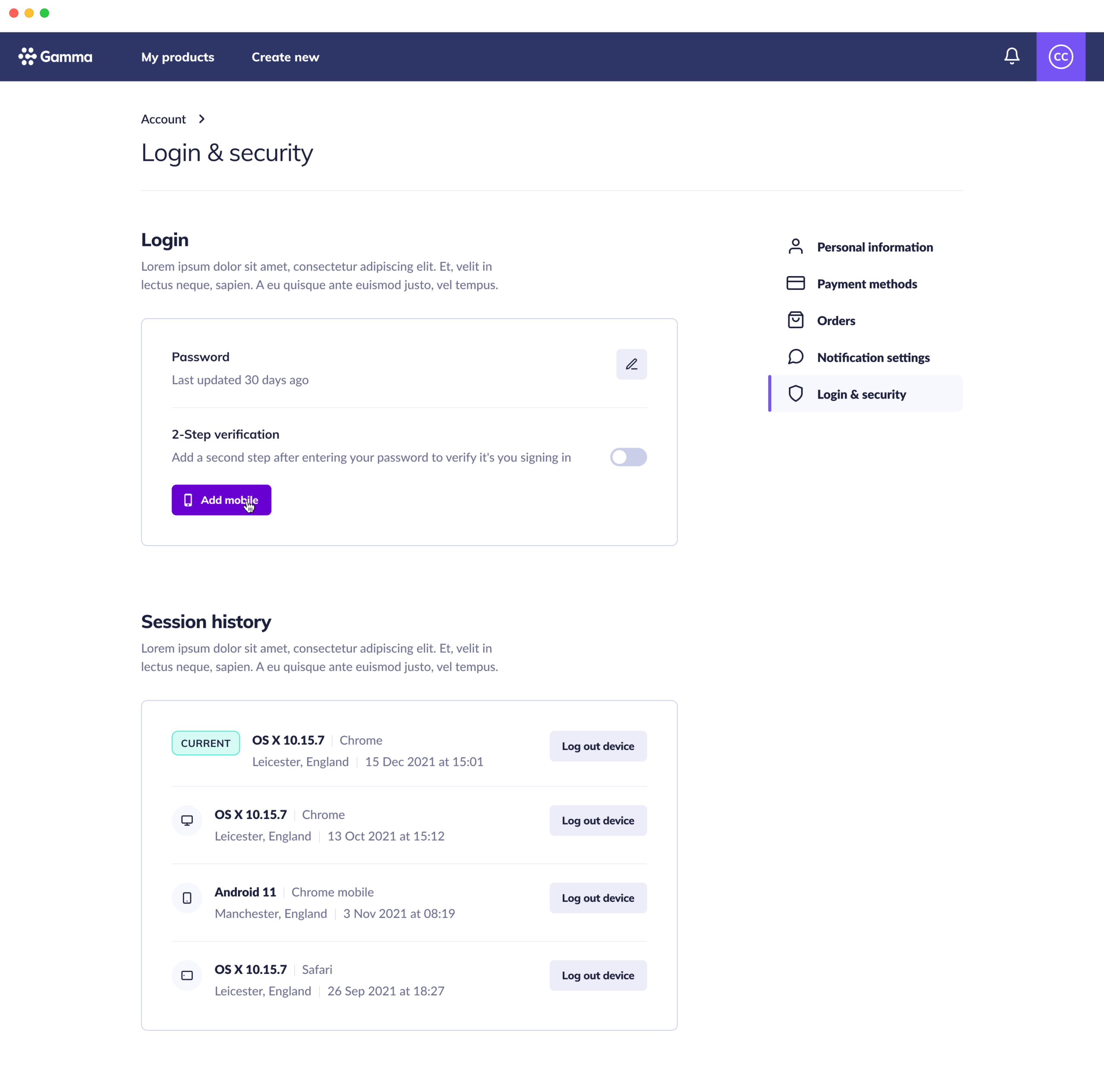
One of the most impactful changes to the order journey was the introduction of a dedicated profile area – a place for users to store their details once, so the platform could pre-populate them automatically whenever a new order was created.
Account overview
A centralised dashboard giving users a summary of their account – active products, recent orders and key account details at a glance.
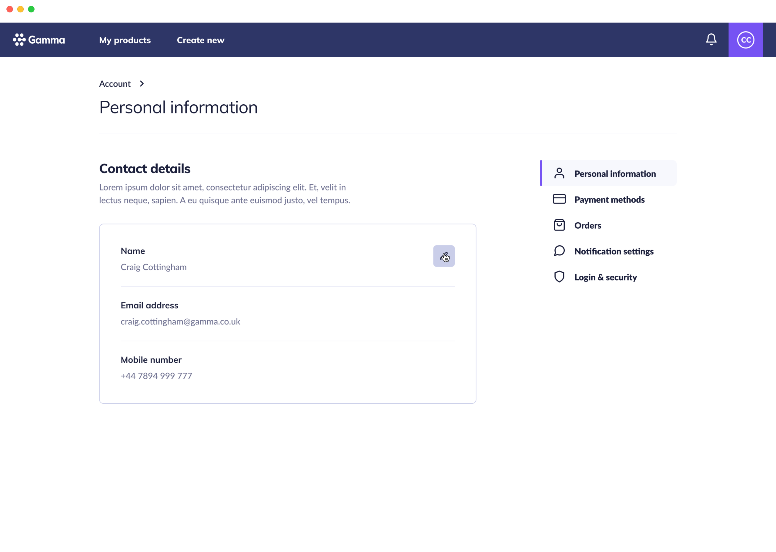
Personal information
Users could store their name, email, phone and mobile numbers and company details here – the same information previously required from scratch at the start of every order journey.
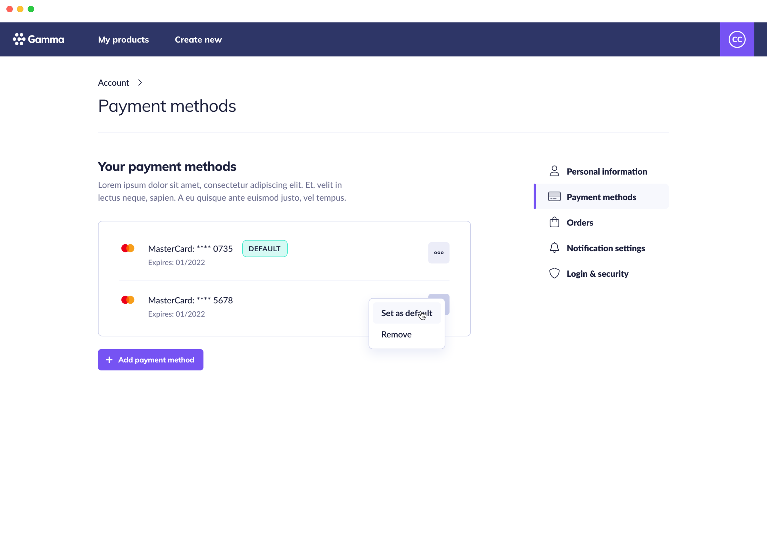
Payment methods
Users could save and manage their preferred payment methods, removing the need to re-enter card or billing details with each transaction.
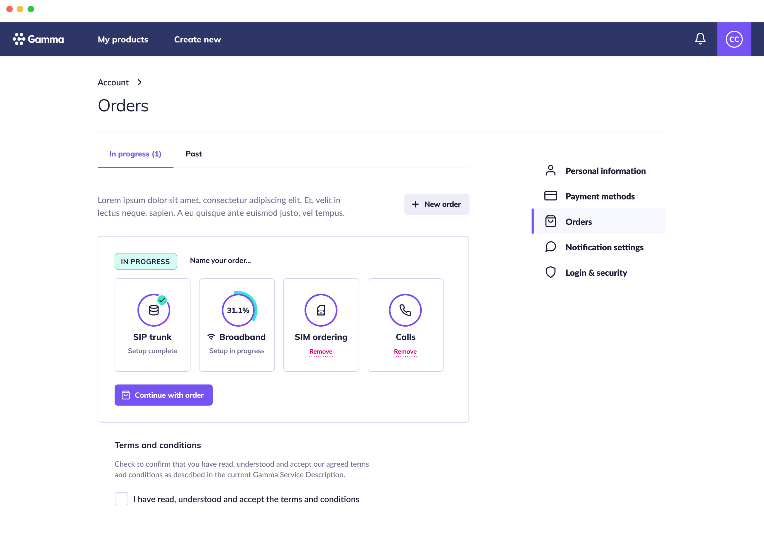
Orders overview
A full history of past and in-progress orders, giving users visibility of where each order was in the process without needing to contact support.
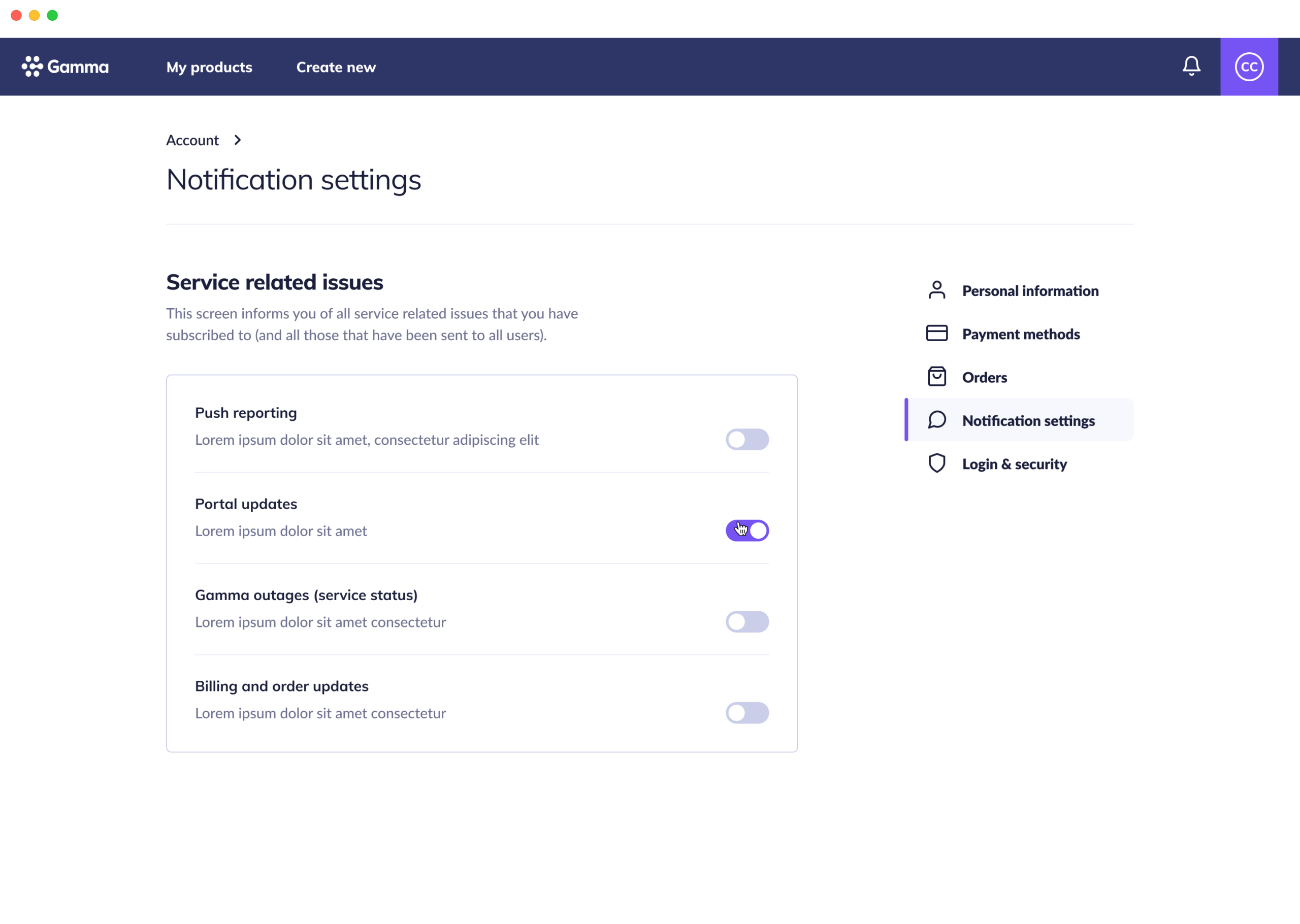
Notification settings
Users could control which communications they received and how – managing email and platform notifications based on their preferences.
Login and security
Password management, two-factor authentication settings and account security controls – all manageable without contacting support.
Final designs:
Create your order
Price transparency
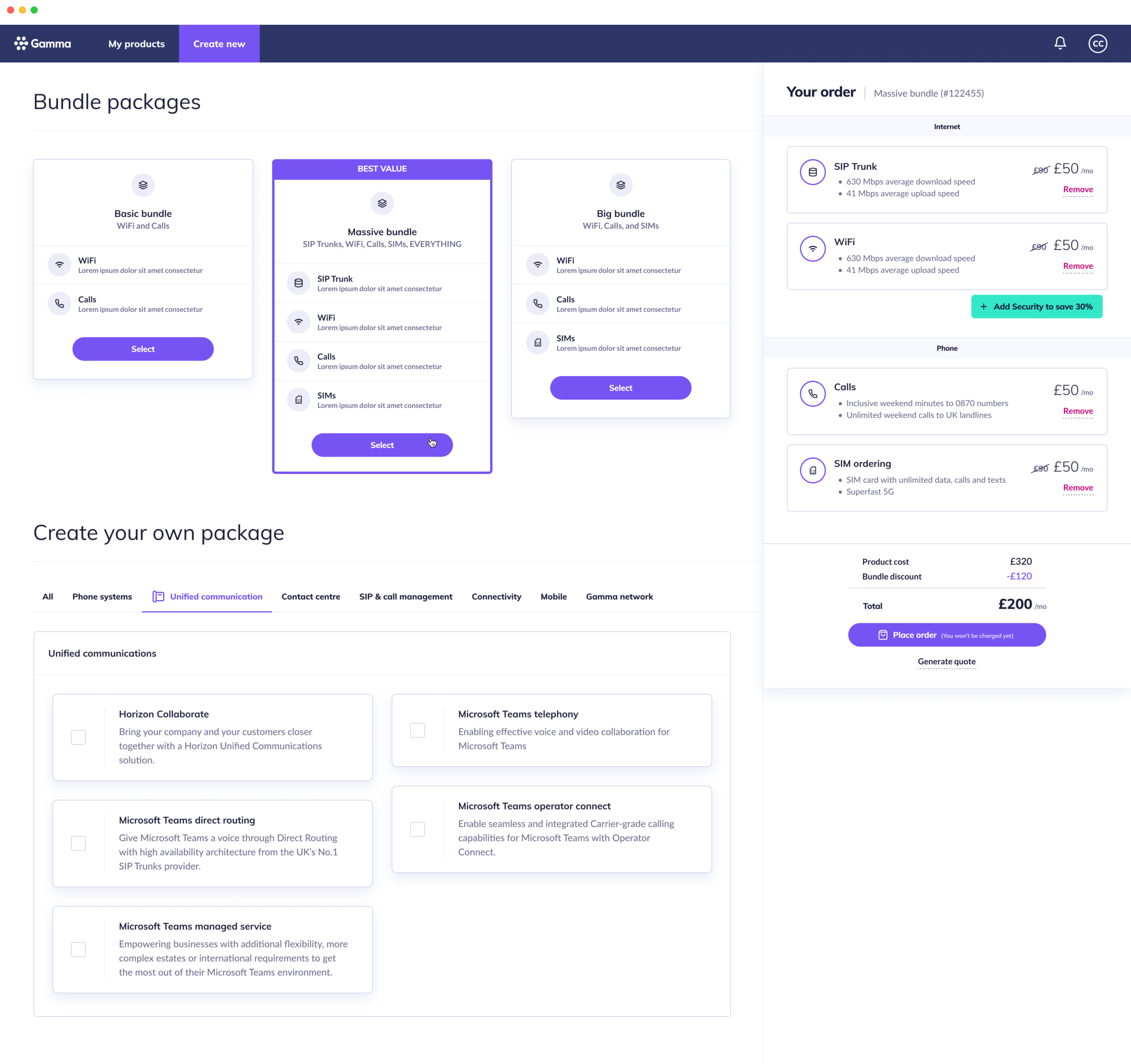
One of the most consistent pieces of feedback across user interviews was the complete lack of pricing visibility during the ordering process. Users submitted orders without knowing what they’d cost – then waited days for accounts to come back with a figure.
I introduced a receipt-style panel that appeared as users built their order, showing the running cost in real time. Upsell and add-on opportunities were surfaced within the same panel, with savings shown clearly when users added complementary products.
Reduced jargon
The Portal was full of technical acronyms, inconsistent terminology and confusing labels that users – even experienced ones – struggled with.
I reviewed and rewrote the content across the entire platform getting policy sign-off, replacing jargon with plain language, standardising button labels, clarifying field descriptions and removing ambiguity throughout.
The goal was simple: if a user doesn’t know what something means, they can’t make a good decision.
Simplified order journeys
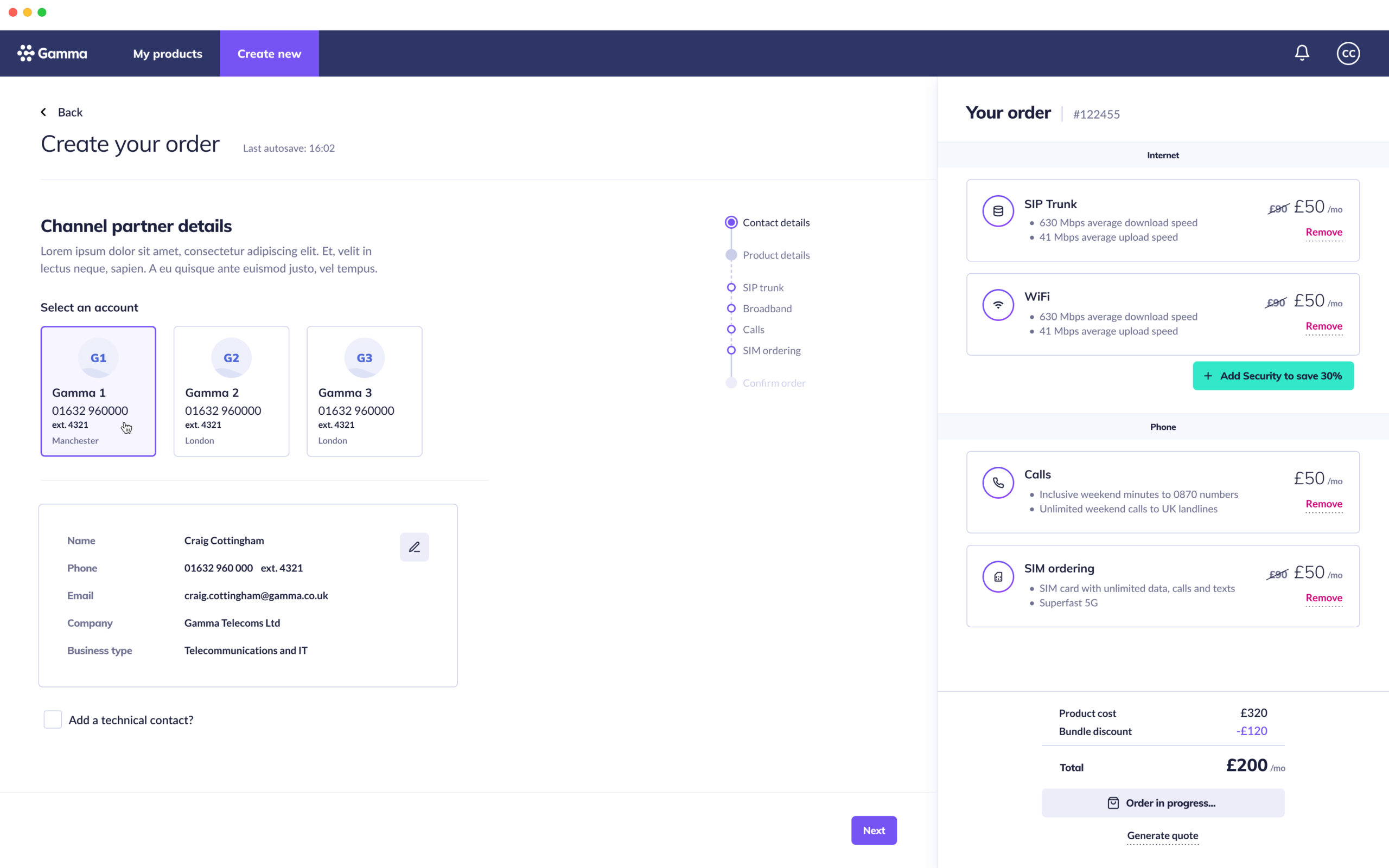
The profile area fed directly into the order flows – with details pre-populated from the user’s saved profile, the need to re-enter information on every order was eliminated.
Users who hadn’t yet set up a profile were given the option at the end of a form to save their entered details to their profile for next time.
For channel partners managing multiple customers, the same approach scaled naturally – users could simply select the relevant customer account and their details would populate accordingly.
The results
Portal Evolution
Gamma Telecoms’ portal improvements make managing services and orders easier, enhance user experience, and support the move to digital communications like unified solutions and the PSTN switch-off.
My role
On the Portal Evolution project for Gamma, I led the design and development of a next-generation platform aimed at streamlining complex workflows and enhancing user engagement. My focus was on creating intuitive, scalable solutions that empowered users to navigate and manage their tasks with ease.
I collaborated closely with stakeholders to identify pain points and opportunities for improvement, conducting user research and usability testing to gather actionable insights. These findings informed the creation of personas, user journeys, and wireframes, which I shared with cross-functional teams to align on a clear vision. By leveraging a combination of research, design, and iterative problem-solving, I delivered a platform that not only addressed immediate user needs but also provided a foundation for future growth and innovation.
Key challenges:
Inconsistent, inefficient navigation
Challenge
The Portal’s overly complex navigation left customers struggling to locate the areas they needed to work on, resulting in frustration, wasted time, and decreased productivity.
This lack of intuitive design not only hindered users from completing tasks efficiently but also contributed to a negative perception of the platform’s usability and reliability.
Solution
I researched into all the sections and pages within the navigation to identify opportunities to separate, group, or merge them. The goal was to simplify the experience and make it easier for customers to find what they needed.
As a result, I created a streamlined experience where users could clearly distinguish between creating and managing orders within a single flow. Previously, these actions were split across separate links, which added unnecessary complexity.
Key challenges:
Fragmented user journeys
Challenge
Users of the Gamma Portal encountered inconsistent user interfaces and disjointed journeys when navigating the platform’s features, including reporting dashboards, ordering processes, and administrative tools.
These inconsistencies made the platform less accessible and efficient, ultimately affecting customer satisfaction and retention.
Solution
I explored specific ways to help customers streamline their ordering processes.
One key area I focused on was reducing friction by encouraging users to self manage within a profile area. This allowed customers to input their information beforehand, so when starting an order, they could simply select a profile. With one click, all the required fields would be automatically pre-filled, making the process faster and more efficient.
To further enhance usability, we added a convenient checkbox at the bottom of the form for users who hadn’t prepopulated their profile. This feature allowed them to transfer the information they entered on the form directly to their profile for future use.
For Channel Partners managing multiple customers, this approach was scalable, as users could easily select the relevant account to streamline their workflow even further.
Goals
Improve navigation across the platform
The navigation was excessively large, with over 147 individual links!! Users found it difficult to identify which links were relevant to their workflows and how to navigate to specific sections that were important to them when needed.
Simplify all journey flows
Throughout many order journeys, there was significant repetition and unnecessary mandatory fields that had to be completed when placing an order. Many customers believed this was a way for Gamma to collect data from them.
Although these input fields were mandatory, the system was unable to validate whether the data entered was correct. As a result, customers realised they could input anything into the fields to proceed to the next page in the flow.
Reduce pressures on support teams by allowing users to self serve on the platform
When users placed an order or needed to make any changes to their accounts, users were required to call the support line so an agent could make the necessary updates.
No matter how small the task, this was still required.
Research:
Site mapping
After gathering extensive feedback from users across the business, first-hand customers, and exploring the platform myself, I decided it would be best to create a site map.
This process allowed me to review all areas of the site and gain a clear overview of its structure. I also made rough notes describing the actions required on each specific page to better understand the purpose and layout.
Could any of the sections within the navigation be simplified or condensed, as there may be duplications throughout? Surely a navigation menu can be streamlined from 147 links!
Research:
Journey flows
Once I had gained more insight into the platform, I began mapping out the journeys users would take to create orders. Each time an order was created across the business, the user had to log in, select an account, and input their details—followed by additional steps specific to the type of order they wanted to make.
Key findings:
Site map
I wen’t through every page on the site, going through the navigation links and made a brief note of what each page required the user to do to complete the relevant task. (Yes! It was quite a job!)

Key findings:
Site map overview
I grouped all the finding together. This gave me a breakdown of the main areas of focus to start improving.
It was obvious just by looking at the numbers that areas needed to be streamlined, instead of having a page for every single area, lets have one global feature instead.
By streamlining the navigation, I thought it would be a great idea to see if every duplicate page could be removed, if there were reasons to keep that page, I would see if I could integrate that particular part in the grand design so functionality wasn’t being missed out.
Ideation:
Landing page
The idea was to create a landing page when the user logs in. Users can see their products, services, sites and locations easily.
The navigation has been completely stripped back and simplified:
One of the main frustrations when creating a new order was the lack of flexibility to amend or change orders, upgrade services, or even update site details and equipment for each site.
Users had to phone or email to make changes to their account. The same process applied when placing an order: users would endure the laborious task of creating their order, only for it to be emailed to someone in accounts, who would then calculate the costs and send an invoice back to the user.
The whole process felt incredibly outdated and wasn’t very transparent.
Wireframes:
‘My products’ page
I created an area where users could easily self-serve and ‘Manage’ their active products manually, as well as a space where they could easily ‘Create’ a new order if they wanted to add another service.
The screen is split into two sections: the left side displays your active services at each site, while the right side dynamically updates to show specific information about whatever you’ve selected on the left. This could be site details or information about a particular service.
If nothing is selected, the screen provides helpful guidance to indicate that you can interact with the panels on the left.

Edit an active service
If a user selects a specific service, they can see the level of service they have, along with its location.
If the service or product is eligible for an upgrade, users can do this themselves by simply toggling the options on or off. Alternatively, users can also select any relevant bolt-ons for that particular service, with prices clearly highlighted for transparency.
This removes the need to wait for accounts to recalculate everything and get back to the user.

Edit a site
Similarly to selecting a service, the site details could be easily edited or adjusted, and users could view all the products and services active at a particular site.
They could also toggle a service on or off if it was no longer required.

Final design:
‘My products’ page
When the user logs into the Portal, the first thing they see is a breakdown of all the sites that the business has registered on they system.
Sites can be empty if they don’t have any active services. When services are active, you can see them on the page. Users can select the site as a whole or a specific service to update accordingly.
Edit an active service
When a service is selected, you can add bolt-ons or upgrade / downgrade and change settings accordingly based on the service thats been selected.
For transparency, you can see the cost difference for everything at a glance (none of that previous ’email / call’ in to get an updated price).
Edit a site
When a site is selected, you can edit the address and numbers, as well as toggle services on or off – the business has bought the service, so they can distribute the services however they wish.
Each site has it’s own equipment, the same as the site settings, these can be updated and toggled on / off.
Research:
Creating a new order
I began collecting first-hand information and insights on users’ opinions and behaviours of the current platform – specifically creating a new order as this was a common task that users did on the platform.
I noticed there were lots of similarities and repeated tasks for each flow – could I simplify this step in the journey somehow?
I asked users what they liked and disliked about the journey, while also making general notes. I organised these notes into categories:
Along the way, I also gathered suggestions on how the platform could be improved moving forward.
User interviews:
Step 1: Contact details
All users would have to start by entering their details – they would have to select their account, along with information such as email address, name, company name, phone and mobile numbers as well as selecting what the nature of the business was.
These fields felt very accessive and they had to be filled in every time users wanted to create a new order – if the details were linked to the account they’ve selected in the first step then surely the other details could be pre-populated based on the selected account.

User interviews:
Step 2: Product details
Users then have to select what level of security they want for the product. The options were very jargon heavy and wordy – plus I don’t know what the difference is between each choice, what extra am I paying for?
I also noticed users kept missing the yellow “I confirm” checkbox and then clicked ‘Continue’ to progress with the order.
This felt like it used to be at the bottom of the page, but more and more information has been added to the page over time like the ‘Promotions’ section.

The broadband service rental cost is typically lower than the SIP Trunk Call Manager cost because of the cost of DDI's etc, so even if it's not used we do have a couple where they have an existing ethernet circuit and we've put a broadband service in that's not even used just to get the free SIP Trunk Call Manager
User interviews:
Step 3: Build details
The first yellow warning message at the top of the page say: “It is vital that CPE information is correct”, but lots of people mentioned that they didn’t know what a SBC / IP-PBX was.

I've not always been accurate with the information and is hasn't caused me a problem
User interviews:
Step 4: Service configuration
Users would then have to set up their daily fraud limit by inputting a daily amount of their choice and select what calls they can block from being made.

User interviews:
Step 5: Call manager configuration
This was an optional page, but users would select if they wanted to upgrade their product – however it didn’t tell the user what the cost was for the upgrade.

User interviews:
Step 6: Number selection
When users could create phone numbers, they could select the area code they needed, along with the quantity they needed and if they needed to be a consecutive amount or just randomly ordered.

User interviews:
Step 7: Order complete
The last page is literally where the user reads and accepts the terms and conditions.
Once that task is complete, then the order gets sent over to the accounts team for them to review and work out the total costs.

Research:
Journey mapping
Create a new SIP Trunk order
After sorting out the dashboard for Portal Evolution, one of the first projects I worked on involved redesigning and defining the user experience for creating a new oders, specifically for SIP Trunk orders (this was because it was one of the larger journeys.
My approach typically involves mapping out the current journey and documenting every interaction required to complete the task, including optional interactions. For example, I note that the user lands on the login page and needs to click on the email address input field to begin entering their email address.
This detailed process allows me to create a clear before-and-after comparison, where a reduction in clicks highlights a simplified and more efficient task, ultimately saving time for the user.
You might notice the term “Between” in the analysis – this accounts for the optional interactions users can make. For instance, the current flow in its simplest form required 52 clicks, while the redesigned flow reduced this to just 15 clicks.
Current click count: Between 52-88 clicks

Suggested click count: Between 15-30 clicks

Final designs:
Profile area
One of the larger pieces of work that fell out of these flows was to create a profile area for users to add or update their details.
Currently, there wasn’t anything like this on the platform – the aim of creating the profile area was for users to enter the details that were asked throughout the ordering flows.
These details could then be prepopulated during the order journeys, reducing the users need to constantly input information over and over again.
Account overview
TBC
Personal information
TBC
Payment methods
TBC
Orders overview
TBC
Notification settings
TBC
Login and security
TBC
Final designs:
Create your order
I noticed when users wanted to create a new order they couldn’t add multiple services to their order.
It was literally a case of having to add all the details and information into the system multiple times, depending on how many services they wanted to place in the order.
Phase 1 – Price transparency
One of the main points I kept hearing from users and team members was the absolute lack of transparancy around the pricing of products, services and add-ons.
When a user selects a service – a ‘reciept style’ section appears showing the price (before, the users only saw the cost days after submitting their order).
We also tried to encourage upselling and add-ons, so if a user added another product to their order, they would save more money.
Phase 1 – Reduced jargon
TBC
Phase 1 – Simplified order journeys
One of the larger pieces of work that fell out of these flows was to create a profile area for users to add or update their details.
Currently, there wasn’t anything like this on the platform – the aim of creating the profile area was for users to enter the details that were asked throughout the ordering flows, these could then be prepopulated during the order creation, reducing the users need to constantly input information over and over again.

