Insights
Experian’s Insights platform provides businesses with real-time data analysis, customisable dashboards, and actionable insights. It leverages cutting-edge technologies, including AI and machine learning, to streamline decision-making, enhance customer understanding, and optimise operations.
My role
At Experian, a global leader in credit reporting and marketing services, I designed software to help protect consumers and businesses from fraud and identity theft. My focus was on creating user-friendly designs for key products like PowerCurve Insights and Experian One.
I conducted research and user studies to understand what users needed, turning these insights into tools like personas and user journeys. I shared these findings with Product Management and Engineering teams to ensure we created effective solutions. By combining research, problem-solving, and design skills, I developed adaptable designs that met current needs and remained useful over time.
Key challenges:
Customisable real-time dashboards
Challenge
I was tasked to create a data tool that provided real-time reports that allowed customers to create their own unique dashboards and reports based on the users needs and requirements.
Solution
I developed a solution that enabled users to create fully customisable dashboards and reports tailored to their specific requirements.
The solution also provided cross-platform functionality, allowing users to view their dashboards and receive updates seamlessly, even while on the go.
Key challenges:
Clunky, inefficient report navigation
Challenge
The data reports were buried within a tree-structured list, which was functional to an extent but had significant drawbacks. The process was slow, cumbersome, and difficult to navigate, making it challenging to open and switch between reports. This inefficiency made it nearly impossible for users to view multiple reports quickly and effortlessly.
Solution
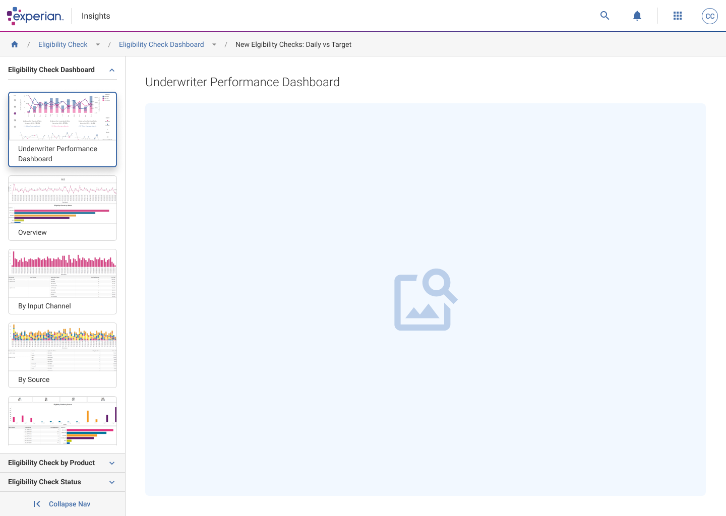
I designed a new navigation system to help users seamlessly switch between and access reports within the same folder, as well as easily explore reports in other folders.
Additionally, I introduced thumbnails, providing users with a clear visual preview of each report for quicker identification and access.
Goals
1: Create a fully customisable experience across web and mobile
Enable users to design personalised dashboards and reports that cater to their unique needs and preferences. This includes providing flexible options for selecting, organising, and displaying data in a way that aligns with their workflows. Ensure the experience is consistent and seamless across both web and mobile platforms, allowing users to access and manage their reports anytime, anywhere.
2: Make Insights intuitive so users can easily navigate and find reports
Develop a user-friendly navigation that simplifies the process of locating and accessing reports. This includes clear categorisation, search functionality, and filtering options to help users quickly find what they need. The design should reduce unnecessary clicks and eliminate frustration, ensuring users can focus on their tasks without being hindered by the interface.
3: Insights needs to feels part of the Experian One platform
Replace the outdated tree structure with a modern, efficient interface that aligns with the overall design language of Experian One. The new interface should allow users to seamlessly view, compare, and interact with multiple reports without unnecessary delays. By integrating Insights more cohesively into the platform, users will experience a unified and professional product ecosystem.
Research methods
Tree jack task
After phase 1, the initial design evolved, and a navigation menu became necessary to accommodate the various links users needed for their daily tasks.
To ensure the navigation was user-friendly, I conducted a tree jack exercise, asking users to organise and group the links based on what they found most beneficial for their workflows. This approach helped me identify common themes and patterns, providing valuable insights into what users prioritised and needed from the design.
User testing
After the design was approved, I developed interactive prototypes of the screens, allowing users to navigate through them as if they were using a real application. This approach made the product feel more realistic and helped me gather valuable user feedback.
I asked users targeted questions about specific areas of the interface, including the new navigation menu informed by the tree jack exercise. Additionally, we sought their opinions on what they liked and what improvements they would make if given the opportunity.
Journey flows
I created several user journey flows to compare the current design with the new design I proposed.
My approach focuses on making user flows as streamlined as possible. If a step can be removed without impacting the user’s ability to complete their main tasks, I aim to eliminate that friction. Fewer clicks typically result in less friction, leading to faster task completion and an overall smoother user experience.
Key findings:
Tree jack task
Navigation design

Given the way users could structure their folders and files, I recommended avoiding the nesting of multiple tasks, datasets, reports, and workbooks directly within the navigation.
While this approach might seem easier for users, as they could see and click on what they needed, it posed significant challenges. For instance, one user mentioned having over 50 folders, with some containing more than 100 reports. This level of nesting could overwhelm and potentially break the navigation.
Instead, it was more effective to guide users to a dedicated area where they could search for the specific file they needed, ensuring a more manageable and efficient experience.
Key findings:
User testing
PowerCurve: Strategy Management
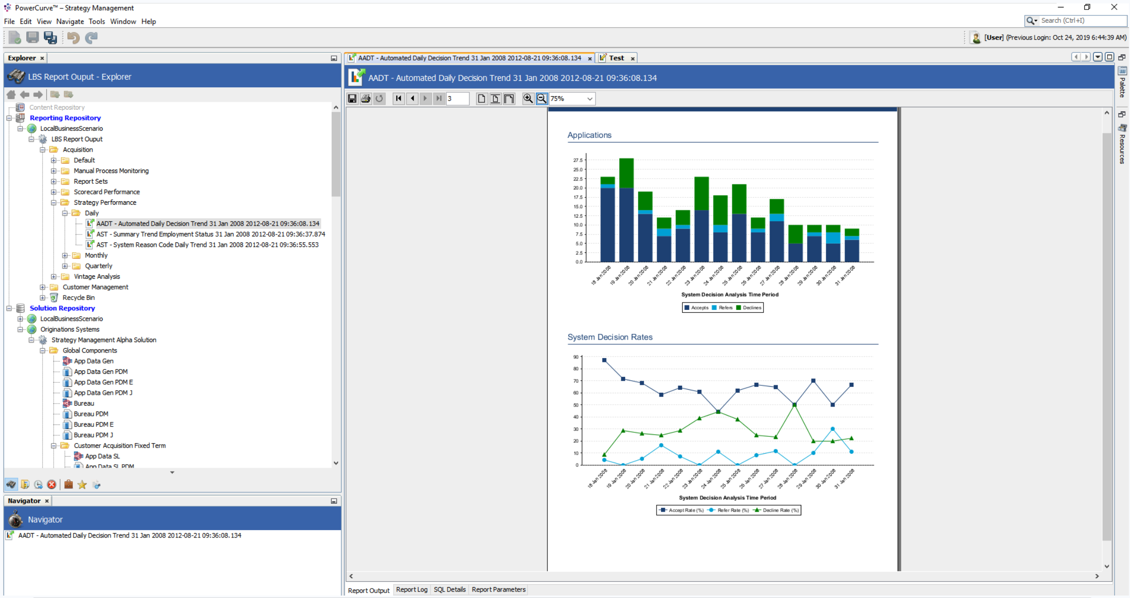
The lack of a dynamic file or folder structure meant that folders appeared full of reports, even when they were empty. Since the folders couldn’t update to show whether they contained files or not, users were often faced with numerous empty folders scattered throughout the tree structure.
This caused significant confusion, as users assumed they could access a specific category, only to find the folder empty. This led to frustration, wasted time, and annoyance as users had to search elsewhere for a suitable report—without any guarantee that other folders contained the needed files.
Users pointed out the absence of a search function for locating specific reports, which forced them to rely on memory to remember where a report was stored and navigate to it manually through the tree structure. This process was inefficient and frustrating, particularly for those managing a large number of reports.
Many users suggested adding a “favourite” feature, allowing them to easily access key reports they used regularly, which would significantly improve efficiency and usability.
Users expressed a desire to customise reports to display only the information they found useful. Currently, the reports were static PDF visuals that cannot be edited or interacted with to view specific figures, data points, or details within graphs. This limitation made the reports less flexible and less effective for their individual needs.
Experian One
Dashboard
The users
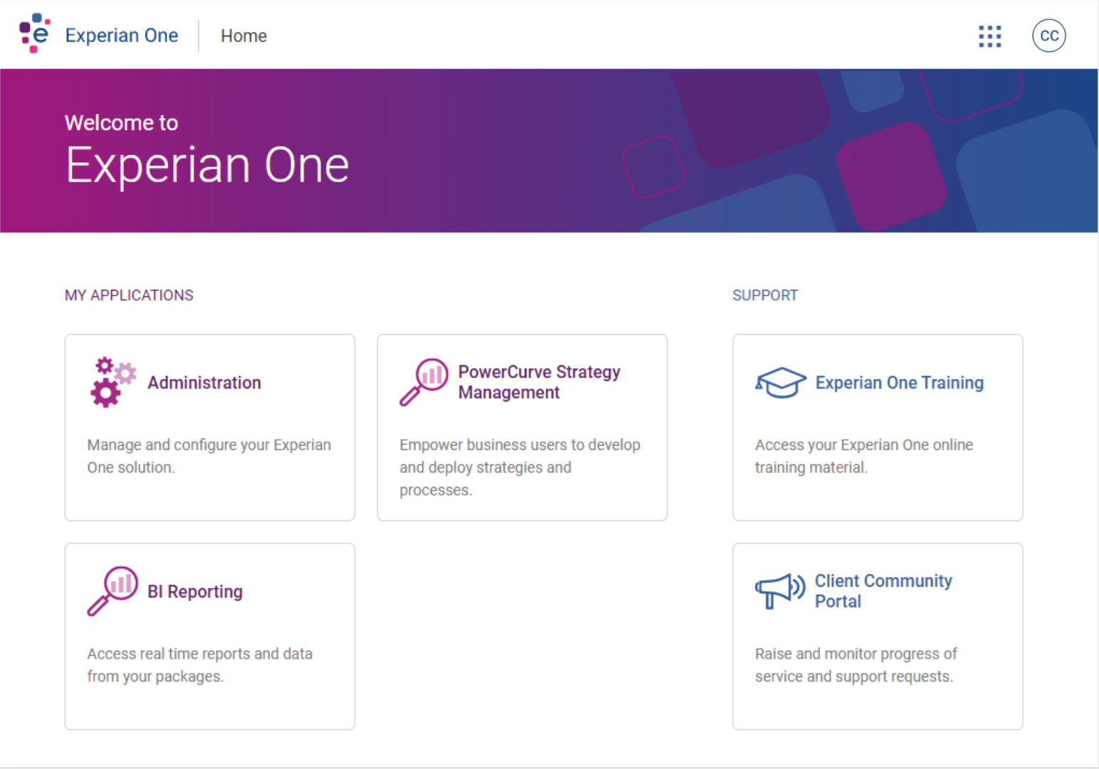
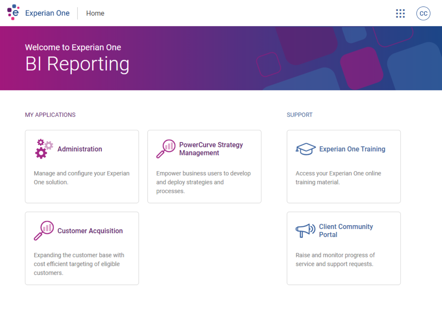
Originally known as “BI Reporting,” Insights was designed specifically for strategy designers, analysts, and data scientists.
The tool enabled users to monitor strategy performance across various businesses and compare outcomes against benchmark data, providing actionable insights.
Since this was a brand-new product with the potential for multiple links and additional categories, there was a risk of quickly overcrowding the Experian One dashboard. As a result, one of the initial priorities was to streamline navigation for accessing Insights.
Option 1
Since the link to the application would be nested within the Experian One dashboard, it would make sense to create a dedicated section on the dashboard to organise all reports and categories. This approach would provide a centralised location for users to easily access and manage their reports, ensuring a more streamlined and user-friendly experience.
By grouping all reports and categories in a specific section, it would also help prevent clutter on the dashboard and make navigation more intuitive, especially as the number of reports and categories grows over time.
Option 2
Allowing additional paging after the application has been clicked would be a practical solution. This approach would enable users to navigate deeper into specific Insights (BI Reporting) pages without overwhelming the main dashboard or the initial application interface.
For example, users could see the high-level categories, and upon selecting a category, they would be directed to a more detailed page with subcategories or individual reports. This would prevent the page from becoming cluttered with too many categories or reports at once, ensuring a cleaner and more user-friendly experience.
After doing a bit of digging around, I found out that users could have upto 100 categories, so this could make the dashboard page overcrowded and unusable.
Because of this outcome, I decided Option 1 was the best solution, helping keep the Experian One dashboard as simple as possible.
Journey mapping
Simplify the folder structure
It became evident that I needed to design a more streamlined navigation flow to eliminate the frustration users experienced when navigating through folders, only to find no reports at the end of their journey.
Taking all feedback into account, I created mockups of a few user flows. One of these illustrated the current journey a user would take to open a single report. For security reasons, this flow included logging into the Experian One product, which automatically added a minimum of two additional clicks to the process.

Current flow
Click count:
Between 6-8+ clicks
To access Insights, users must first sign into Experian One. For first-time users, a login is required, but a cookie is stored to prevent the need for repeated logins in the future.
After logging in, users land on the Experian One dashboard, where they can view and access other applications available to them. From here, they can select Insights.
Once the application loads, users are presented with a view of all the folders (servers) and reports they have access to. However, a major issue with this flow is that it’s not clear which folders contain reports. Users may click on a folder, wait for the page to load, and then be met with a “This folder is empty” message. This forces them to navigate back and essentially start over, creating a frustrating and time-consuming experience.
If users do manage to find a report, they can click on it to open the file. After viewing the report, they must close it and return to the folder structure to search for another file, repeating the process.
Suggested flow
Click count:
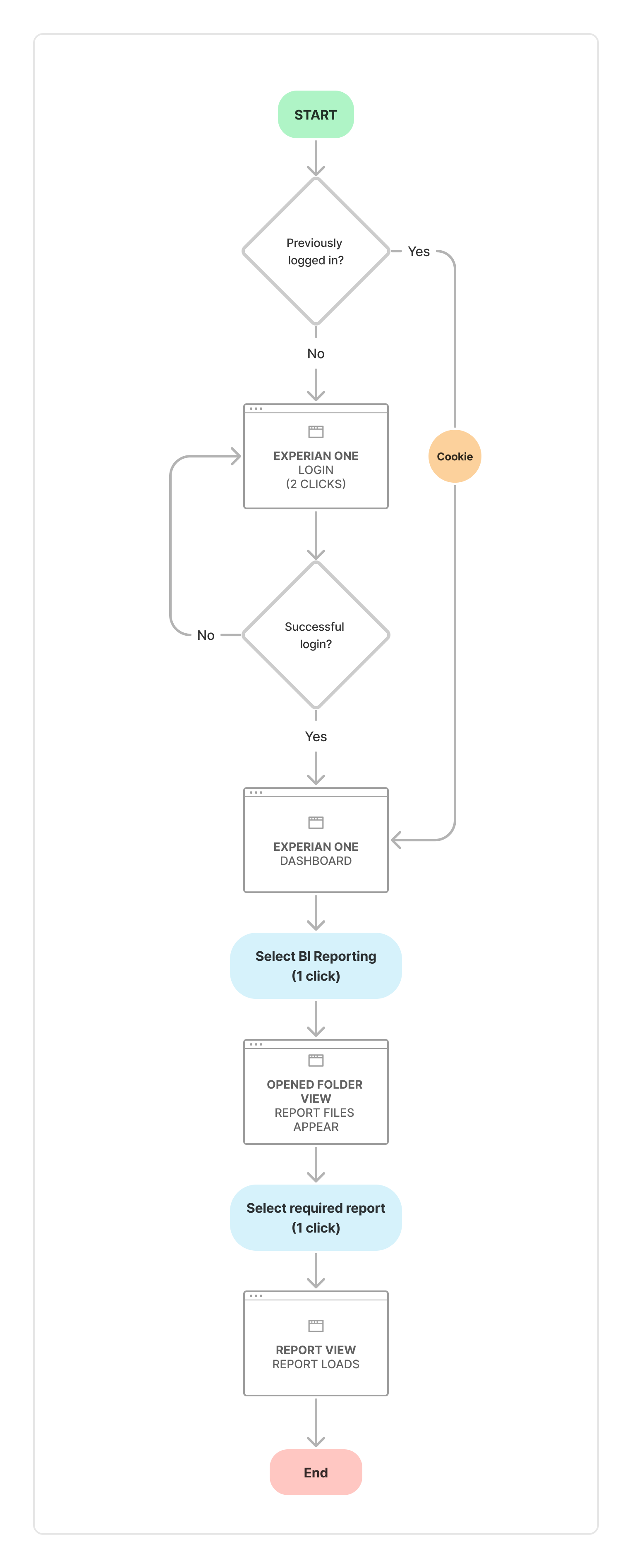
4 clicks
Similar to the current flow, users still need to go through the Experian One login process unless they have already logged in previously.
Once logged in, users land on the Experian One dashboard, where they can view and access other applications available to them. From here, they can select Insights.
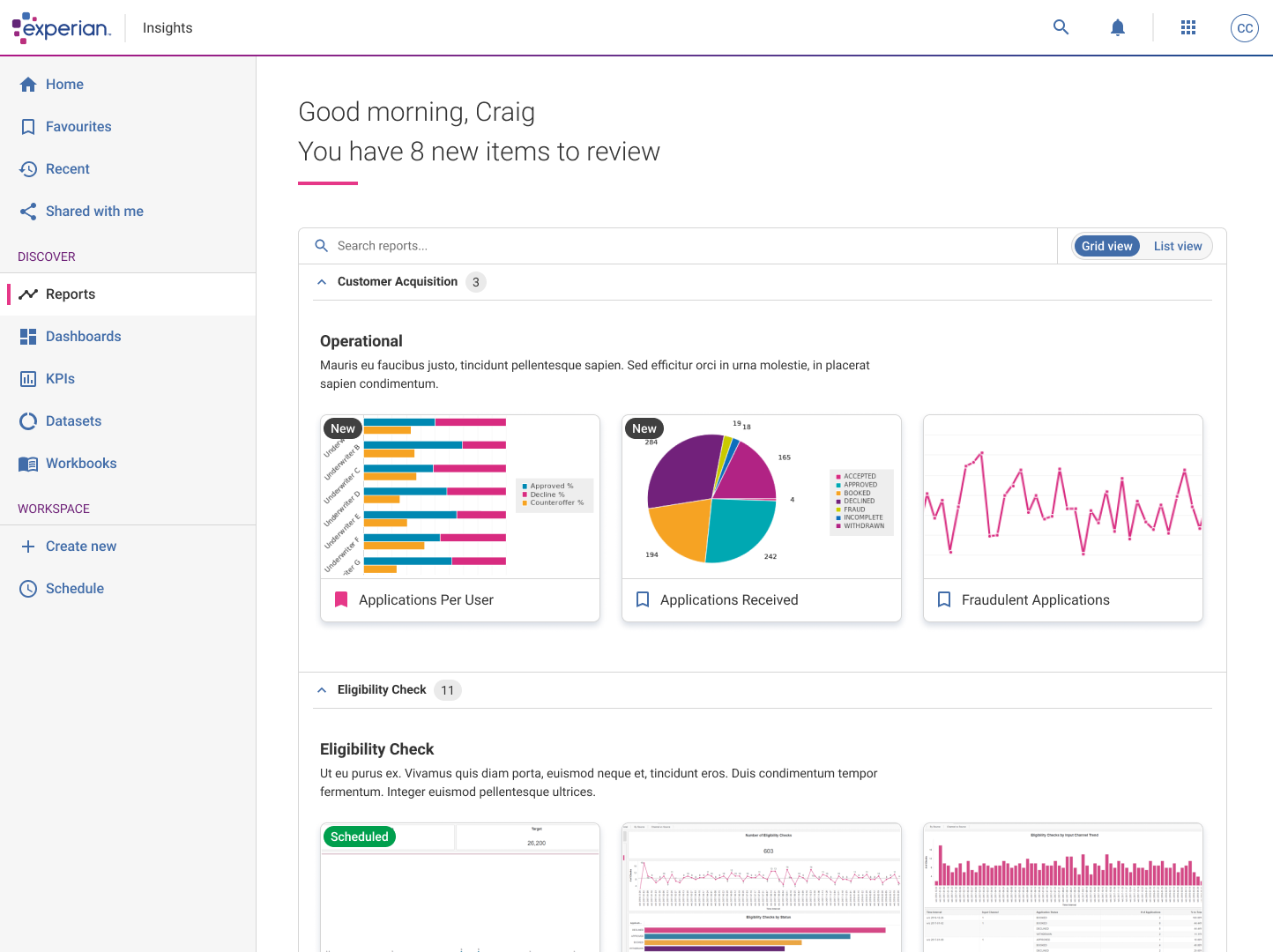
When the application loads, users are now greeted with a homepage displaying groupings that represent the folder titles, with the reports directly visible underneath. I chose to remove the concept of “folders” entirely, as hiding reports within them created unnecessary frustration and complexity for users.
This change removed the need for users to click into folders only to discover they were empty—a common pain point. While this issue might have been less frustrating with better navigation to return to the previous view, the current navigation was so poor that users often resorted to closing the window and starting over.
Although the reduction from six clicks to four may not seem significant, this new approach greatly simplifies the overall navigation. By removing the frustration of endlessly cycling through folders and encountering “This folder is empty” messages, users now have a clearer understanding of where reports are located. The process is far more intuitive, efficient, and user-friendly.
Wireframes
Report library
Phase 1 design
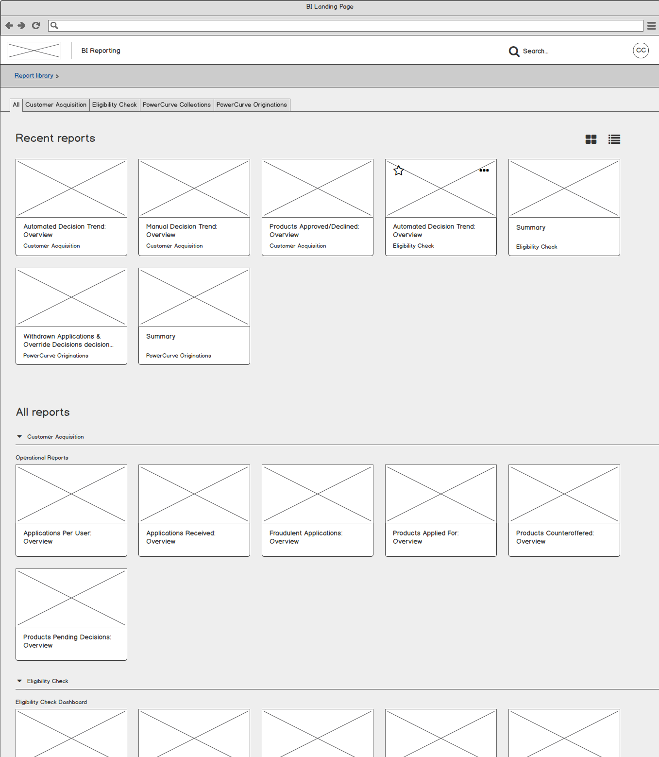
Previously, the reports were hidden within a tree-structured list. While functional, the navigation process was slow, clunky, and difficult to use efficiently.
For phase one, instead of refining the tree navigation, I opted to display all reports within an open “accordion-style” component. This made it immediately clear which “folders” contained reports, eliminating the need for users to click through multiple layers to find what they needed.
Additionally, I introduced a tab at the top of the page, allowing users to quickly filter down to specific sections, further simplifying navigation and improving usability.
Wireframes
Open report
Phase 1 design
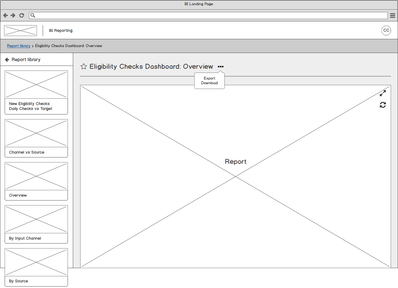
In phase 1 of the Open Report page design, users could select a report from the Report Library page, and the report would open directly.
If multiple reports were grouped within the same “folder,” these reports were displayed and accessible on the left-hand side of the screen. This approach eliminated the need for users to constantly navigate back and forth to the Report Library to open different reports within the same group. It also reduced load times, as there was no need to reload the entire library when switching between reports in the same folder.
While accessing reports from a different section still required navigating back to the library, I observed that users often preferred to explore the group of reports within the same folder before moving to a different section. This design streamlined the process for users who frequently worked within grouped reports, improving efficiency and usability.
Final design
Navigation design
The outcome
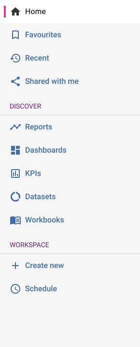
After reviewing all the feedback I received from the tree jack exercise, it became clear that the navigation could be divided into two main sections: one for viewing and exploring content, and another for creating and scheduling tasks.
I named the sections Discover and Workspace. Clicking on a link in the Discover section, such as “Reports,” would take users to their personalised Report Library page (as shown in the previous wireframes). This same structure applied to viewing dashboards, KPIs, and similar items.
The Workspace section, on the other hand, allowed users to create all the items listed under the Discover section. Initially, I placed Workspace at the top of the navigation, but after testing, I realised that users’ primary use case was to view and explore content rather than create it. As a result, I moved Discover to the top to better align with user priorities and improve the overall experience.
Final design
Landing page
Phase 1 design
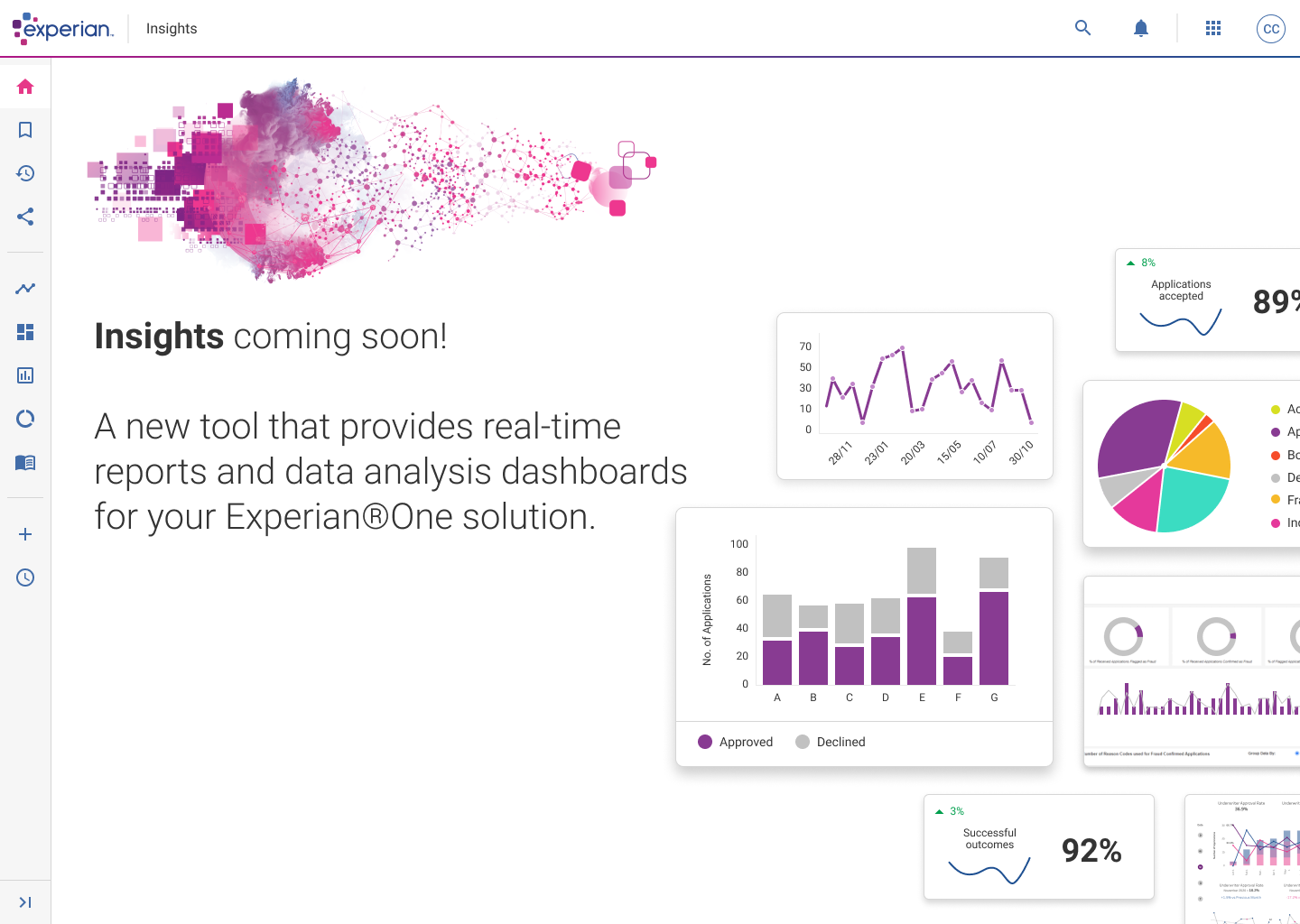
As the product began gaining traction and generating excitement within the business, the next step was to give BI Reporting a more engaging and memorable name, along with creating a dedicated landing page for users to navigate to after logging in.
After considering various options, the final decision was to name the product Insights. This name reflects the product’s purpose of providing users with valuable, actionable data in an intuitive and accessible way.
Final design
Report library
Phase 1 design
Experian’s adoption of Tableau for their reports was a significant improvement, as it transformed the reports from static visuals into interactive tools. This change allowed users to engage with the data more effectively, such as hovering over specific data points to view exact figures. This interactivity enhanced the user experience, making the reports more dynamic, insightful, and user-friendly.
User testing
After the design was approved, I created prototypes of the screens, allowing users to navigate through the visuals as if they were interacting with a real application. This approach helped make the product feel more tangible and provided an opportunity to gather valuable feedback as users explored the interface.
We asked users a range of questions, focusing on specific areas of the interface. We also sought their opinions on what they liked about the design and, if given the “power,” what changes they would make. Key feedback and suggestions included:
Filtering and sorting options
Users requested the ability to filter and sort reports based on specific criteria, such as dates, customer types, and daily date ranges. This would make it easier to locate relevant reports quickly and efficiently.
Report removal functionality
Users highlighted the need to remove reports from their dashboards. Currently, reports are created and managed by admin staff, who also handle their removal. Providing users with the ability to manage their own reports would improve flexibility and control.
Personalisation of Report Library
Some users asked how reports would be added and created to appear on the Report Library page. This feedback emphasised the need for personalisation features, allowing users to define and manage their own reports rather than relying solely on Admin or Superusers to configure everything.
These insights will help guide the next steps in refining the product, ensuring it meets user needs and expectations while enhancing usability and personalization.
Final design
Open report
Phase 1 design
To help save the loading time and constantly having to click back and forth between a report, the Report library and back into another report again, I added the ability to navigate with ease between the different areas by designing a scrollable left panel that housed the different reports in their folders.
When clicking the accordion, it would open and show the reports available in that section.
When a report was selected, it would appear in the main area, so you can view, and quickly view another report straight away in one or two clicks.
Things to consider
Add the ability to add different permission based profiles such as Superuser, Can edit and View-only
Create a sort of community area where members can comment, share between other members and create some form on schedulling within the report view.
Phase 2—depdgjfsk dlkvjdlf
Final design
Landing page
Phase 1 design
As the product began gaining traction and generating excitement within the business, the next step was to give BI Reporting a more engaging and memorable name, along with creating a dedicated landing page for users to navigate to after logging in.
After considering various options, the final decision was to name the product Insights. This name reflects the product’s purpose of providing users with valuable, actionable data in an intuitive and accessible way.
Results & impact
title
TBC

