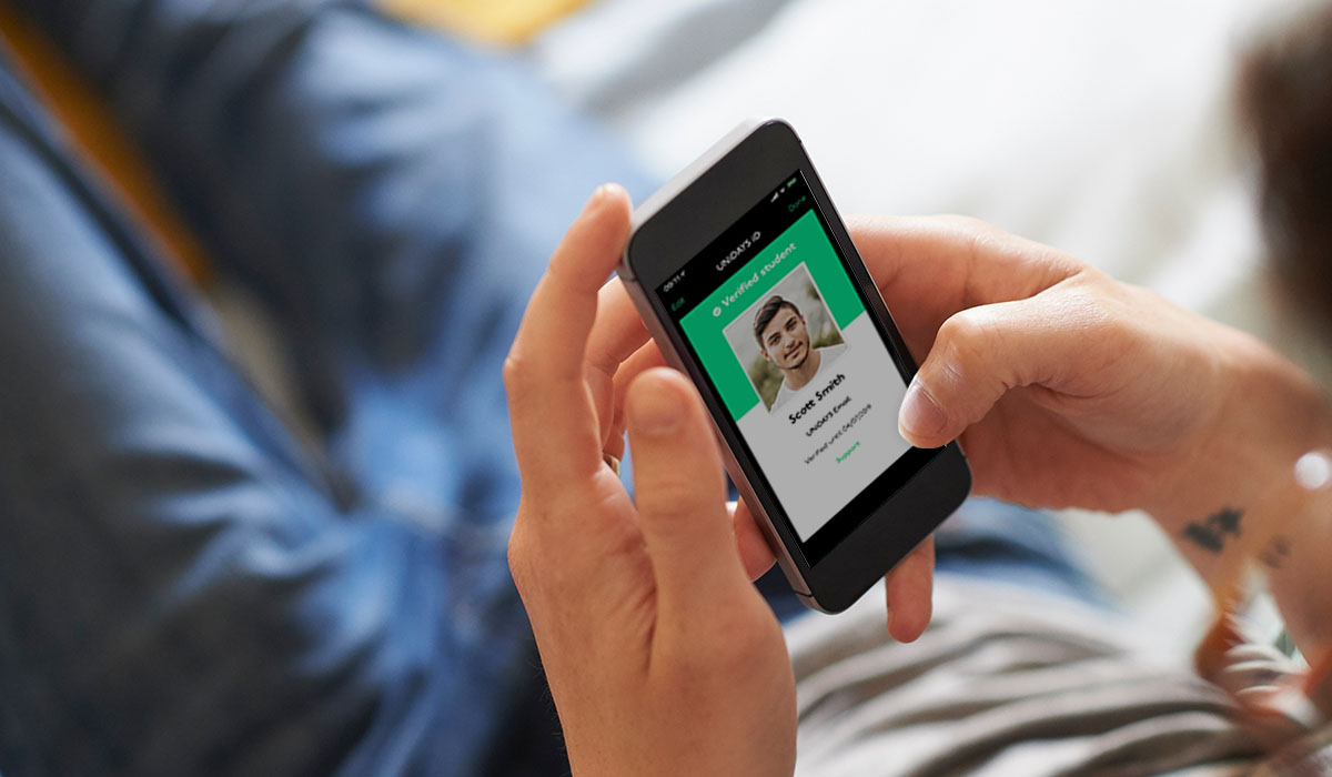
Native iOS and Android app
UNiDAYS is the world’s leading student discount network, connecting over 10 million students worldwide with brands like Apple, ASOS and Levi’s.
When I joined, the platform ran on a dynamic website. The brief was to replace it with a fully native iOS and Android app – lean, accessible, familiar to each platform’s users, and ready to launch in time for the new academic year.
Eight months later, the app launched and broke into the App Store top 25 and Google Play top 100.
My role
I was the UX/UI designer on the project from start to finish – research, site maps, focus groups, wireframes, A/B testing, UI design, animation and development liaison through to launch.
The scope covered both iOS and Android, each requiring their own native patterns and interaction models, designed in parallel without compromising either platform.
Key challenges:
Preserving the commercial ecosystem
Challenge
UNiDAYS’ business model relied on brands paying a premium for higher placement in the feed.
That hierarchy needed to carry over into the app without feeling forced or compromising the user experience.
Solution
I introduced a Featured section as the first thing users landed on when opening the app. This gave premium brands their visibility while feeling like a natural, curated editorial experience rather than an advert.
The rest of the app’s navigation was then built around this, keeping the commercial model intact without it getting in the way.
Key challenges:
One app, two very different platforms
Challenge
iOS and Android users have distinct expectations about how apps behave.
Designing a single product that felt native on both – without building two completely separate things – was a genuine challenge.
Solution
I researched the UX patterns, navigation conventions and interaction models for both platforms thoroughly, then designed platform-specific solutions where they differed.
Android used swipe-based tab navigation and a hamburger menu, while iOS used bottom navigation tabs – both familiar to their respective users, both serving the same underlying content.
Key challenges:
An inaccessible navigation banner
Challenge
The existing website had a top banner with buttons crammed too close together, failing WCAG accessibility standards.
Users regularly tapped the wrong button because the touch targets were too small with too little space between them.
Solution
I researched native solutions for both platforms and designed multiple options, reviewing them with the team before agreeing on an approach that solved the accessibility issue without alienating existing users.
The final solution met WCAG standards and felt immediately familiar on both iOS and Android.
Key challenges:
Keeping the experience lean
Challenge
The fewer steps between opening the app and redeeming a discount, the better.
Every unnecessary tap was a potential drop-off point for a student on their lunch break.
Solution
Every screen, flow and interaction was evaluated for whether it was strictly necessary.
Navigation was streamlined, content was grouped logically by category, and the overall architecture was kept as shallow as possible so users could find what they needed quickly.
Research:
Focus groups
We ran focus groups with students at UNiDAYS events and student lockdown events – getting real users testing real designs under realistic conditions.
Having multiple people testing simultaneously let us pinpoint pain points quickly and spot patterns in how students naturally navigated the app.

Research:
A/B testing
Where design decisions were genuinely uncertain, I set up A/B tests to let behaviour decide.
Specific sections of the app were tested against each other, with the winning design adopted and the alternative phased out entirely.

Research:
Site map
The first thing I tackled was the site map – mapping out every screen, hit point and navigation route across both the top navigation and footer. This gave the whole team a clear picture of the app’s structure before a single wireframe was drawn.

Final design:
Loading screen
The app opens with a loading animation I designed and built in After Effects – the UNiDAYS ‘iD’ highlights first, a nod to the student ID at the heart of the brand, while the app content loads in the background.
Final design:
Introduction screens
First-time users are walked through a short set of introduction screens explaining the benefits of joining and having a UNiDAYS account – setting expectations before they hit the main experience.


Wireframes:
Login and register
On logging in, users land directly on the homepage – where premium brand placements and limited-time offers live. The login flow was kept as short as possible to get students into the app quickly.


Wireframes:
Explore
Perks were grouped by category, with users swiping between them to browse.
This was one of the areas where iOS and Android diverged most noticeably – Android used swipe navigation with a hamburger menu, while iOS used bottom navigation tabs. Both felt right for their platform.


Wireframes:
Search
On Android, search was triggered via a floating action button at the bottom right of the screen, opening a dedicated search page with previous results shown for quick access.


Outcomes:
The results
The app launched in time for the start of the new academic year – the most important window for a student platform. Within the launch period it broke into the App Store top 25 and the Google Play top 100. Not a bad result for eight months’ work.


Native iOS and Android apps
UNiDAYS is the world’s leading student discount network, connecting over 10 million students worldwide with brands like Apple, ASOS and Levi’s.
When I joined, the platform ran on a dynamic website. The brief was to replace it with a fully native iOS and Android app – lean, accessible, familiar to each platform’s users, and ready to launch in time for the new academic year.
Eight months later, the app launched and broke into the App Store top 25 and Google Play top 100.
My role
I was the UX/UI designer on the project from start to finish – research, site maps, focus groups, wireframes, A/B testing, UI design, animation and development liaison through to launch.
The scope covered both iOS and Android, each requiring their own native patterns and interaction models, designed in parallel without compromising either platform.
Key challenges:
Preserving the commercial ecosystem
Challenge
UNiDAYS’ business model relied on brands paying a premium for higher placement in the feed.
That hierarchy needed to carry over into the app without feeling forced or compromising the user experience.
Solution
I introduced a Featured section as the first thing users landed on when opening the app. This gave premium brands their visibility while feeling like a natural, curated editorial experience rather than an advert.
The rest of the app’s navigation was then built around this, keeping the commercial model intact without it getting in the way.
Key challenges:
One app, two very different platforms
Challenge
iOS and Android users have distinct expectations about how apps behave.
Designing a single product that felt native on both – without building two completely separate things – was a genuine challenge.
Solution
I researched the UX patterns, navigation conventions and interaction models for both platforms thoroughly, then designed platform-specific solutions where they differed.
Android used swipe-based tab navigation and a hamburger menu, while iOS used bottom navigation tabs – both familiar to their respective users, both serving the same underlying content.
Key challenges:
An inaccessible navigation banner
Challenge
The existing website had a top banner with buttons crammed too close together, failing WCAG accessibility standards.
Users regularly tapped the wrong button because the touch targets were too small with too little space between them.
Solution
I researched native solutions for both platforms and designed multiple options, reviewing them with the team before agreeing on an approach that solved the accessibility issue without alienating existing users.
The final solution met WCAG standards and felt immediately familiar on both iOS and Android.
Key challenges:
Keeping the experience lean
Challenge
The fewer steps between opening the app and redeeming a discount, the better.
Every unnecessary tap was a potential drop-off point for a student on their lunch break.
Solution
Every screen, flow and interaction was evaluated for whether it was strictly necessary.
Navigation was streamlined, content was grouped logically by category, and the overall architecture was kept as shallow as possible so users could find what they needed quickly.
Research:
Focus groups
We ran focus groups with students at UNiDAYS events and student lockdown events – getting real users testing real designs under realistic conditions.
Having multiple people testing simultaneously let us pinpoint pain points quickly and spot patterns in how students naturally navigated the app.
Research:
A/B testing
Where design decisions were genuinely uncertain, I set up A/B tests to let behaviour decide.
Specific sections of the app were tested against each other, with the winning design adopted and the alternative phased out entirely.
Research:
Site map
The first thing I tackled was the site map – mapping out every screen, hit point and navigation route across both the top navigation and footer. This gave the whole team a clear picture of the app’s structure before a single wireframe was drawn.
Final design:
Loading screen
The app opens with a loading animation I designed and built in After Effects – the UNiDAYS ‘iD’ highlights first, a nod to the student ID at the heart of the brand, while the app content loads in the background.
Final design:
Introduction screens
First-time users are walked through a short set of introduction screens explaining the benefits of joining and having a UNiDAYS account – setting expectations before they hit the main experience.
Wireframes:
Login and register
On logging in, users land directly on the homepage – where premium brand placements and limited-time offers live. The login flow was kept as short as possible to get students into the app quickly.
Wireframes:
Explore
Perks were grouped by category, with users swiping between them to browse.
This was one of the areas where iOS and Android diverged most noticeably – Android used swipe navigation with a hamburger menu, while iOS used bottom navigation tabs. Both felt right for their platform.
Wireframes:
Search
On Android, search was triggered via a floating action button at the bottom right of the screen, opening a dedicated search page with previous results shown for quick access.
Outcomes:
The results
The app launched in time for the start of the new academic year – the most important window for a student platform. Within the launch period it broke into the App Store top 25 and the Google Play top 100. Not a bad result for eight months’ work.